By John Gruber

OpenAI, Anthropic, Cursor, and Perplexity chose WorkOS over building it themselves.
When in Rome
Friday, 7 February 2003
Dave Hyatt bravely (foolishly?) asked on his weblog for suggestions regarding Safari’s GUI. Less than one day later, there are already over 600 comments, most of which are asking for tabbed browsing. Jesus, what a great idea! Why didn’t anyone suggest that before?
[Update: Hyatt disabled comments (but read them all), because there were like two million of them.]
I’ve been keeping a list of Safari interface gripes. Now seems like the time to dump it.
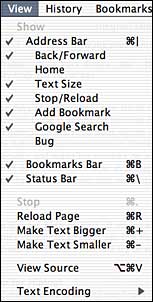
Superfluous “Show” Item in View Menu

The first item in Safari’s View menu is “Show”. It’s utterly bogus. A complete sham. Not only does it not show anything, it simply doesn’t doesn’t do anything at all. It’s just a label that applies to the next few menu items: Show Address Bar, for example.
I don’t know where this little turd came from, but it should be removed. For one thing, it’s an abomination against the HIG. Menu items are commands. No ifs ands or buts. There should never be a menu item that is anything other than a menu item.
Second, even if it weren’t against the rules, it’s unnecessary. The meaning of these menu items is perfectly clear without the “Show”. The name of the menu, View, serves as an implicit verb for these menu items: View Address Bar; View Status Bar. In fact, I’d wager that the vast majority of Safari users have no idea that the “Show” menu item is supposed to be a label for the subsequent items.
Separate Stop and Reload Buttons
Safari currently uses a single button for both Stop and Reload. While a page is loading, the button is Stop; after loading, it is Reload. This sounds quite clever, as the two actions are mutually exclusive, and it certainly saves precious space in the Address Bar. But it’s really a bad idea, as pointed out by Matthew Thomas: Guess what happens if you try to hit Stop, but you’re a fraction of a second too late? You wanted to stop, but the exact opposite happens.
Support for External ‘View Source’ App
In the old days, most web browsers allowed you to specify an external application to be called when you invoked the View Source command. Safari (along with most other OS X web browsers) does not support this. It should. It doesn’t even need to be a visible pref in the Preferences window — an application property accessible via AppleScript or a hidden preference would do just fine. Jeffrey Zeldman griped first and loudest about this.
Separate Bookmark Window
I like the way Safari’s bookmark system works. I like the iTunes-like interface, and I really like the way that you don’t have to display all your bookmarks in the bookmarks menu. Nice.
But I don’t like that the Bookmarks window isn’t its own separate window — like Downloads and Activity are. Instead, the Bookmarks window is displayed inline within any regular browser window. I’ve tried to like this, I’ve really tried, but I don’t. Plus, it’s somewhat confusing. When you’re displaying Bookmarks, the window title and Address Bar still display the name and URL of the web page behind the Bookmarks. But they’re not visible.
Plus, the Bookmarks window doesn’t show up in the Windows list. Let’s say you have a dozen browser windows open. One of them is displaying your Bookmarks. You’re in another application, and you want to switch to your Safari Bookmarks window. You know it’s open, so you click-and-hold on the Safari icon in your Dock. The contextual menu lists all your open windows, but none of them are called “Bookmarks”. Instead, you have to remember the title of the page displayed behind the Bookmarks. I find this highly annoying.
Theme Support for Address Bar Buttons
I use the Graphite appearance color (as specified in the General System Prefs panel). But Safari’s Address Bar buttons aren’t Appearance Manager controls — they’re just image graphics, hard-coded to match the default Blue appearance color scheme.
![]()
This one is niggling, no dispute. But it’d be nice if Safari matched my preferred color scheme. Apple’s HIG agrees:
Avoid creating custom controls for use with textured windows; standard controls look and behave appropriately when used with this appearance.
Abandon Brushed Metal Window Skin
| Previous: | SmartyPants 1.1 |
| Next: | Operatic |
