
By John Gruber

WorkOS Pipes: More context makes for smarter products.
Anti-Anti-Aliasing
Wednesday, 19 March 2003
Or, Way More Than You Ever Wanted to Hear About Anti-Aliasing in Mac Os X Web Browsers
Let’s clarify a few points regarding last week’s “Anti-Aliasing” article. (Note: this article isn’t going to make much sense if you haven’t yet read that one.) Last week I relied solely on the term “anti-aliasing” to describe the problem of Safari’s rendering of small-point monospaced fonts. That’s not really accurate, and I need to clarify this before continuing.
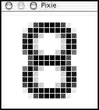
Anti-aliased type uses gradient shades of color to effectively smooth the letterforms. E.g., when displaying black text on a white background, instead of using only black and white pixels, anti-aliasing uses numerous shades of gray. You can easily see this effect on Mac OS X using Pixie, an application from Apple that lets you zoom in on individual on-screen pixels. (Pixie is part of the developer tools, and is installed in /Developer/Applications/.)
For example, this is the digit “8” in 18-point ProFont, rendered with anti-aliasing by Safari:
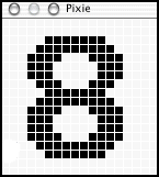
This is the same character in the same font, rendered without anti-aliasing by Camino:
My gripe from last week is that Safari anti-aliases small monospaced fonts such 9- and 10-point Monaco. This is true, but somewhat misguided. The anti-aliasing is an effect of the problem, not the cause. In critical thinking, separating cause from effect is, well, critical.
The cause of the problem is that Safari prefers outline fonts over bitmap fonts, in all cases. Most Mac OS X applications instead prefer a bitmap font, if available, for small-point monospaced typefaces. So, before continuing, we need to understand the difference between bitmap and outline fonts.
Bitmap and Outline Fonts
Bitmap fonts are just pixels. On the original Macintosh, bitmap fonts were the only fonts available, and for any given point size, you needed a specific bitmap font created for that exact size. On the Mac, bitmap font families were usually collected in a single suitcase file. For example, you might have had four sizes in your Times suitcase: Times 9, Times 12, Times 18, and Times 24. You could use Times at any of these four sizes, and it would look great. Each letterform in each size of each font was designed by hand, pixel by pixel. Imagine creating your own font in Photoshop, creating a separate image for each letter, for each size. That’s pretty much what a bitmap font is.
But this means that for any other size, the computer needed to generate the letterforms by scaling from the closest size that actually existed. For example, given the above sizes of Times, if you asked for Times 48, the Mac would use Times 24 and double the size of every pixel. The result was jagged, with each single square pixel in the original Times 24 letterforms translated into ungainly 4-pixel squares in the interpolated Times 48 output. Or, if you wanted 8-point Times, the Mac would take Times 9 and make guesses as to which pixels it could remove. The result was usually illegible.
And so for the most part, in the old days of the Macintosh, you typically limited yourself to the specific sizes of the bitmap fonts installed on your system, seldom specifying an arbitrary font size that didn’t correspond to an installed bitmap font. Bitmap fonts are inherently low-resolution, designed for the roughly 72 DPI original Macintosh display. This sounds wretchedly limiting, but it was in fact much more flexible and expressive than the type capabilities of Apple II or DOS applications. And there weren’t any high-resolution output devices anyway; the ImageWriter printer had 72 DPI output, so these bitmap fonts worked just as well for printing as they did on-screen.
That changed when the LaserWriter appeared. The original LaserWriters offered unprecedented 300 DPI output, lowly by today’s standards, but incredibly high compared to the ImageWriter. Bitmap fonts did not look so good on laser printed output — they looked jagged and pixelated.
Thus, outline fonts. Adobe’s Postscript came first; later, Apple and Microsoft introduced TrueType as a response to Adobe’s Postscript licensing terms. The differences between Postscript and TrueType fonts are not important for this discussion; the general principals are the same.
In an outline font, letterforms are not comprised of pixels. Rather, they are defined using mathematical formulas to describe smooth curves and lines. Whereas bitmap letterforms are like Photoshop images, outline letterforms are like Illustrator EPS files. A single outline font can be scaled to any size, at any resolution.
Outline fonts look great on high resolution devices like laser printers; the higher the resolution, the better outline fonts look.
Outline fonts do not look so great on low resolution devices such as monitors. Computer screens offer incredibly crude resolutions. That the original Macintosh bitmap fonts looked good on-screen was the result of the fact that they were created by hand, pixel by pixel. Outline fonts, on the other hand, when scaled to a mere 72 DPI, looked terrible. In fact, you couldn’t even display Postscript fonts on-screen at all without Adobe’s ATM software.
So, a compromise was struck. If present, the Mac OS would use bitmap fonts for on-screen display, but would use outline fonts for printed output. (This is a drastic oversimplification, but it’s good enough for this overview.) In other words, you might have the same four bitmap versions of Times (9, 12, 18, and 24), but also an outline version (i.e. TrueType or Postscript). On-screen, the Mac OS would use the bitmap versions for those specific sizes. For printed output and for generating on-screen sizes not available as bitmaps, it would use the outline version. (It is worth noting that TrueType fonts can, more or less, contain built-in bitmap versions for on-screen display. This is why Microsoft’s TrueType fonts such as Verdana and Georgia look great on-screen without anti-aliasing, even though they only come in TrueType format, with no separate bitmap font files.)
One of the reasons outline fonts looked terrible on-screen in the old days is that anti-aliasing was not feasible. For one thing, until the mid-90s, many Macintosh displays were black-and-white — not grayscale, but 2-bit black-and-white — and you can’t perform anti-aliasing with just two colors. Worse, anti-aliasing was computationally expensive for the CPUs of the era; even if you had a grayscale or color display, anti-aliasing would have been way too slow to use.
Regarding Mac OS X’s Rendering of Outline and Bitmap Fonts
CPUs are much faster today, such that anti-aliasing is now relatively inexpensive. And so Mac OS X not only displays outline fonts on-screen, it automatically applies anti-aliasing when doing so. The results are generally legible and attractive.
The question, however, is what to do about bitmap fonts. Bitmap fonts, by definition, were designed to look good on-screen without anti-aliasing. That’s not to say, however, that you can’t apply anti-aliasing when rendering them, or that the results would look bad. And so for the most part, Mac OS X just goes ahead and also applies anti-aliasing when rendering bitmap fonts — with the common exception of small bitmap monospaced fonts, such as Monaco.
Understanding this distinction between outline and bitmap fonts is essential to understanding my complaints about Safari’s rendering of small monospaced fonts, particularly Monaco.
Safari engineer Dave Hyatt was kind enough to respond to my “Anti-Aliasing” article. The comments on his article, or at least the first half of them, are worth reading as well, including several technical points from Hyatt himself.
Hyatt proposes giving users control over anti-aliasing via CSS:
That said, what I am investigating is implementing the CSS3
font-smoothproperty. This will provide author-level control of [anti-aliasing] on a site as well as enable users to have control via a user stylesheet, e.g., you could say:body { font-smooth: never; }Ultimately what’s needed is to put fine-grained control of anti-aliasing into the user’s hands, and adding support for this property will give the user that level of control.
You can also specify cutoff points for AA, e.g., say that only 12px or bigger fonts will get AA, e.g.,
pre, tt {
  font-smooth: 12px;
}
Matthew Thomas takes issue with this solution, writing (in the article’s comments):
When all you’re programming is a style system, does every bug start looking like a missing CSS feature?
Unlike MPT, I hope to see Safari implement this feature of CSS3. But that’s beside the point, because it will not solve this particular problem. Why? Because the main problem isn’t that Safari always anti-aliases Monaco 9 and 10, but rather that Safari always uses the outline version of Monaco, and never the bitmaps.
If Safari simply turned off anti-aliasing for Monaco, but still used the outline version of the font, the results would be awful. No one would be happy, because the letterforms would neither be smooth, as when anti-aliased, nor would they be hand-tuned-pixel-perfect, as in the bitmap version.
Rendering an outline font on-screen without anti-aliasing just looks chunky. For example, consider Lucida Grande, the system font in Mac OS X. It’s an outline font, intended from the start to be anti-aliased for on-screen display. However, when you turn off anti-aliasing at small point sizes (either by using the option in the General system prefs panel or by dickying around with TinkerTool), Lucida Grande looks like utter shit. That’s because unlike the Chicago and Charcoal system fonts used on the old Mac OS, Lucida Grande has no corresponding bitmap version — it’s just an outline font. Thus, the only way it looks good on-screen is with anti-aliasing.
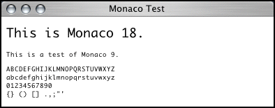
How do I know Safari is using the outline version of Monaco, and not simply applying anti-aliasing to the bitmap version? Well, compare how Safari and Camino render this test document: monaco.html.
9-point Monaco in Safari:
9-point Monaco in Camino:
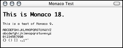
Notice how the letterforms and metrics are significantly different. For example, the capital “I” has serifs in Safari, but not in Camino; punctuation characters like the period are much more subtle in Safari. These are different letterforms, not the same ones smoothed.
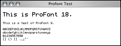
Contrast this with, for example, ProFont. 9-point ProFont is very similar to 9-point Monaco — more of a Monaco derivative than an original typeface. The test document is here: profont.html (although it will only display properly on your machine if you have ProFont installed).
9-point ProFont in Safari:
9-point ProFont in Camino:
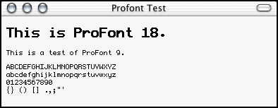
Note that in Camino, Monaco and ProFont are nearly indistinguishable. You need to be at least a bit of a font nerd to notice the subtle differences. But in Safari, Monaco and ProFont look very different, even though both are anti-aliased. That’s because with ProFont, Safari is anti-aliasing the bitmapped version of ProFont, so it uses the same letterforms and metrics that Camino does (along with every other Mac OS X application), but it simply smooths the curves and edges with anti-aliased rendering. Even though Safari anti-aliases ProFont, the effect is much more subtle than with Monaco, because with ProFont it is starting with a 9-pixel bitmap font, not an outline.
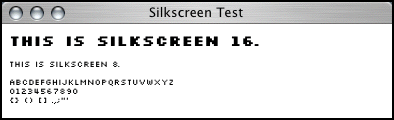
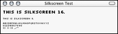
Lastly, one more example, which is the least flattering to Safari (although admittedly somewhat contrived). Jason Kottke’s Silkscreen is a very small bitmap font, intended to be used at a size of exactly 8 pixels. Camino renders it as intended, but Safari’s forced anti-aliasing looks awful. The example document: silkscreen.html (which, like the ProFont example, will only work for you if you have Silkscreen installed).
8-point Silkscreen in Safari:
8-point Silkscreen in Camino:
Regarding Subjectivity
The main point Hyatt made in response to my article is that the appeal of anti-aliasing is highly subjective, and he’s correct. Beauty being in the eye of the beholder, no accounting for taste, etc. It’s also quite polarizing — people generally love it or hate it.
Ignoring (for now) the larger issue of anti-aliased type in general, there is disagreement even on the specific detail of whether to anti-alias small monospaced fonts. Although the feedback I’ve seen indicates that more people agree with me — that Monaco 9- and 10-point are best left as non-anti-aliased bitmaps — there certainly are quite a few people who think the opposite, preferring anti-aliasing for all fonts, at all sizes.
So like any polarizing issue, there is no solution that is going to make everyone happy all the time, and there is no middle ground. Reasonable guidelines need to be created for developers to follow, no matter if some users aren’t going to be happy with them. Consistency is key. The guidelines for Mac OS X are such that with default user preferences, on-screen type is usually anti-aliased, with the exception of small monospaced bitmap fonts. This isn’t like a written-in-the-HIG guideline (or if it is, I don’t know where it’s written), but it’s obvious when looking at other Mac OS X native applications. There is also the global “Turn off font smoothing” option in the General system prefs panel, which Safari ignores completely.
On any issue of subjectivity, it is all too easy to dismiss criticism from someone on the other side of the fence. But not all criticism on subjective issues is itself subjective. Now, if I were to say that non-anti-aliased bitmap Monaco 9 looks better and is more readable than anti-aliased outline Monaco 9, that would be my subjective opinion. You might think the opposite; we all have different eyes and different tastes.
But when I say Safari is wrong to use anti-aliasing for Monaco 9 and 10, I say so not because I don’t like it (even though I don’t), but because it’s treating these fonts differently than do all other well-written applications on Mac OS X.
The guideline — that the bitmap versions of Monaco 9 and 10 should be preferred for on-screen display — is something we can disagree about. I happen to think it’s a good guideline (for reasons outlined in my previous article), but you might not. Such is subjectivity.
But you can’t deny that there exists such a guideline (even if it’s unwritten), and that Safari is going against it. That’s my main point: that Safari should not be treating these fonts differently than every other application does.
Now it ends up that in the grand scheme of things, this is a minor, niggling issue. It’s probably not worth the effort I’ve spent describing it. In fact, according to a comment from Hyatt himself, it’s probably not even intentional, but instead a side effect from a performance optimization in low-level Safari drawing code:
The problem of not obeying the OS setting is actually Safari’s fault, in that we actually measure text using lower level CG APIs than the more commonly used (and recommended) CG APIs. These lower level APIs do not look at the OS setting, but they are faster (especially for measuring), and so ultimately we gained speed but at the expense of honoring the OS setting.
This is actually making even the implementation of font-smooth difficult, since once I turn AA off, I’m still measuring as though AA is on.
Geneva Convention Redux
Lastly, in my previous article I pointed out that Camino prefers bitmap fonts not only for monospaced fonts (like Monaco), but also for any old-school bitmap Mac font, such as Geneva or Times.
As an example, I offered screenshots of the navigation bar from Dan Benjamin’s Hivelogic web site, which is specified as 9-point Geneva. Here they are again:
Camino:
![]()
Safari:
![]()
I also offered my opinion that Camino’s rendering looked better. Once again, that’s subjective, and Hyatt himself admits to preferring the look of Safari’s anti-aliased Geneva.
But the difference in this case amounts to more than just anti-aliasing. The entire size and spacing of the font is different. As rendered in Camino, the text precisely fits the width of the navigation bar (which is what Benjamin intended); in Safari, the text is much smaller and wispier.
Still, I wouldn’t go so far as to say Safari is wrong in this matter (as I do with regard to monospaced fonts). If anything, Safari is probably being more consistent with the Mac OS X spirit of things. It’s just that bitmap Geneva is beautiful, a classic for the ages, but outline Geneva is simply a dreadful Helvetica rip-off.
In Case You Haven’t Had Enough of This Crap Already
Michael Tsai compares Safari’s text rendering to iCab’s, with copious screenshots and insightful analysis.
| Previous: | Code Monkey |
| Next: | Bitmap Like It’s 1989 |