
By John Gruber

WorkOS MCP: Manage your auth platform from any AI agent.
The Problems With Click-Through
Wednesday, 7 May 2003
I received quite a bit of email regarding last week’s commentary on click-through in Safari and iTunes. While most readers agree with my boo-hiss assessment of Safari’s pervasive click-through, a sizable minority disagree, arguing vainly that support for click-through is the Way Things Ought to Be.
Here’s why they’re wrong.
First, though, let’s be clear that click-through is not completely without merit. My argument is not “click-through totally sucks”. Click-through is most definitely useful and appropriate in certain situations (more on these later). What I disagree with, however, is the idea that click-through should be the default behavior system-wide. The case for pervasive click-through goes something like this:
The distinction between foreground and background windows is arbitrary, mostly unnecessary, and unnatural. If your TV remote control is underneath and partially obscured by your DVD player remote, you can click on the TV remote’s exposed buttons without first making it “topmost”. Why should computer windows work differently?
Because click-through is how things work in the real world, it confuses novices when computers don’t support it, as they expect to be able to click on any control they can see.
This line of thinking certainly sounds reasonable at first glance. It pretty much boils down to the idea that users should simply be able to click on any control they can see.
As to point 1, my retort is that this line of thinking is based on a faulty assumption. Mainly, that the distinction between foreground and background windows is unnecessary. Not true at all. Let’s go back to the remote control analogy. The big difference between real-life remote controls and computer windows is that the real world isn’t application modal; a computer is. It’s not a good analogy at all to compare your television and DVD player to computer applications, because in the real world, there is no “active” application.
The concept of the frontmost (or active) application is absolutely essential to understanding how to use a Mac. The frontmost application controls the menu bar and handles all keyboard input, including command key shortcuts. The concept of the frontmost window is related and similarly important. You can click on background windows (thus giving rise to the potential for click-through), but that’s it — everything else you can do with your computer is directed at the frontmost window of the active application.
Because the frontmost window is so important, it makes sense that it should be visually distinct from background windows. Let’s say you have several applications running, with numerous open windows spread across your display. You take a break and come back some time later. It should be easy to tell at a glance which application you’re in, and which window is frontmost.
Click-through prevents this, however. (An assumption I’m making here is that a background window’s appearance will reflect whether it supports click-through: the controls in windows that support click-through should look active because they are clickable; the controls in windows that do not support click-through should look inactive. This is almost always true on the Mac OS.) When background windows look “enabled” because they support click-through, it’s harder to distinguish them from the frontmost window. Whereas when background windows are disabled — i.e. its buttons and controls are dimmed out — they look much different from the frontmost window.
This is yet another example of why blind emulation of the real world doesn’t make for good human interface design.
As to point 2 — that the lack of click-through is confusing to novices — this is a red herring. A lack of click-through might be confusing to novices if background windows looked like they supported click-through but did not — but this is not the case on the Mac OS. As stated earlier, applications that do not support click-through invariably disable the controls in background windows, such that they don’t look clickable. Yes, this still requires new users to learn about the concepts of the frontmost window and active application, but these are essential concepts to achieving basic fluency on the Mac. Thus, I think non-click-through is easier for novices, because the basic rule of thumb is easier to state: everything needs to happen in the frontmost window.
Wildly Tangential Digression on the Idea of Eliminating the Application-Centric Paradigm
Now of course, you could take a step back and say that the problem is that there shouldn’t be any distinction between different applications, that the user shouldn’t have to worry about this app and that app, and should instead only need to worry about doing this and doing that. I.e. instead of using a bunch of distinct applications, you’d use a single unified environment. But if that’s what you want, you’re way beyond arguing over about a relatively minor behavioral detail like click-through — you’re talking about revolution.
The Mac UI is completely application-centric. Apple’s OpenDoc was a major step away from this, document-centric rather than app-centric. But I never saw the appeal of OpenDoc; unlike many Mac users at the time, I was happy to see it fade away. I think the problem with OpenDoc was that it was attempting to build on top of the existing Mac OS, and it never made sense to me how a document-centric paradigm could mesh well with the Mac’s existing application-centric paradigm. So it’s not that I’m opposed to the general concept of a document- or task-centric user interface, but to succeed, you’d need to start from scratch and build a brand new environment. It’s not going to work if you’re building it on top of an existing application-centric environment.
Matthew Thomas has endorsed the idea of eliminating the app-centric paradigm, on the basis that typical users are confused by it. Here he describes a scene from the Internet cafe where he works:
- Her:
- Hi! Can I print out a document from this disk, on one of your computers?
- Me:
- Sure. What form- … Uh … What program did you make the document with?
- Her:
- Windows.
- Me:
- Windows? Er … Do you mean Microsoft Word?
- Her:
- Word, yes, that’s it.
Why, after twenty years, do we still have that bizarre distinction between application programs and operating systems?
But while MPT is correct that users are confused by this distinction, it’s much more accurate to say that Windows users are confused by it. For numerous reasons, the distinctions between different apps are much less obvious on Windows than on the Mac. (This also goes for the plethora of X-Windows based desktop environments, e.g. KDE and Gnome, which sadly but unsurprisingly emulate every significant Windows UI paradigm.)
For one thing, there’s the every-window-gets-its-own-menu-bar thing. Anchoring a single menu bar at the top of the screen famously gives the Mac a tremendous Fitts’s Law advantage over Windows (in short: you can easily put the mouse pointer in the Mac menu bar even with your eyes closed, by simply pushing your mouse “way up”; whereas in Windows, the menu bar is a very narrow horizontal strip). But another advantage to the Mac’s single menu bar is that it makes it much easier to identify the frontmost application. And for new users, it’s a big reinforcement of the concept that there is one and only one frontmost application. You might have dozens of windows visible on screen, but there is always only one menu bar, in a known location; thus, you can always determine where you are (i.e. which application is active) with a quick glance at the top of the screen.
Plus, in my experience, most Windows applications tend to look very much alike — they all look like the apps in MS Office, all sporting nearly-identical icon toolbars that are bigger than the menu bar. (And how long are they going to stick with the antiquated “floppy disk” icon for the Save button, anyway?) A personal example: After not having used Windows for about six years, I spent a few weeks using Windows XP at the end of last year. It took me two weeks to notice that when composing email with Outlook, I was actually using Word. In other words, when I hit Reply or New Message in Outlook, the message editor was actually a Word window, not an Outlook window. If it took an interface nerd like me two weeks to notice this, imagine how blurry the distinction is to normal people.
Visually, the Windows paradigm is much more window-centric than it is application-centric. (Hence the name “Windows”, I suppose.) The whole idea behind the Windows paradigm is simply that you have a bunch of windows on screen (or minimized into the taskbar). Compare and contrast to the Mac paradigm, which is that you have a bunch of apps running, and the apps have windows. On the Mac, you get a list of running applications — on OS 9, in the top-right application menu; on OS X, in the Dock — whereas on Windows, you get a list of open windows.
So the Mac paradigm enforces a three-level hierarchy: you’ve got the system, which runs applications, which display windows. The Windows paradigm tries to eliminate the middleman, presenting a system, which displays windows — i.e. the idea is not that your windows belong to applications, but that they belong to the Windows system itself. The problem with this is that it’s an illusion, in that Windows is still very much an application-centric system. It just doesn’t look like it. When it comes right down to it, Windows is almost every bit as application-centric as the Mac, but the Windows human interface attempts to disguise this, ostensibly to make things simpler.
Microsoft and Apple diverge along similar lines in their marketing. Microsoft typically promotes the idea that Windows does this, and Windows does that, whereas Apple heavily promotes the individual applications that ship with Mac OS X. Even Microsoft’s application names — “Windows Movie Maker”, “Windows Messenger”, “Windows Media Player” — are a not-so-subtle push in this direction.
And so but even if you have decided to eliminate application-centricity as the primary conceptual paradigm of an ideal GUI environment, you still need some way of distinguishing disparate tasks. You, the revolutionary human interface theorist, are saying, Users should not have to worry about what program they’re in. Software programs should be implementation details behind the scenes, not something users need to be aware of.
But I’m saying, OK, fine. But you still need a way for the user to tell the difference between reading email, web browsing, and ripping MP3 files from their CD collection.
Apple chose to make these task-level distinctions at the application level, and in my opinion, it’s a distinction that has served Mac users extremely well for almost 20 years. Microsoft has tried to blur this distinction, and I don’t think that decision has served Windows users nearly as well. I say this because in my experience, most Windows users work in maximized mode, with only one giant full-screen window at a time, covering every pixel of their desktop.
This one-window-at-a-time workspace is anathema to the typical Mac user. But because of the aforementioned differences in the way Windows’s interface works, a Mac-style multiple-windows-tiled-across-the-screen workspace is unpalatable to the most Windows users. I think this is clearly because it’s so much harder to establish context with multiple windows in Windows; whereas in maximized mode, even though it’s limiting in so many other ways, the current context is clear.
The Mac OS reinforces the current context by emphasizing the frontmost window and the active application. This makes it easy for Mac users to work with many windows on screen at the same time. Windows, on the other hand, de-emphasizes the differences between the frontmost and background windows, and blurs the distinction between applications and windows. As a result, most Windows users choose to work with just one window on screen at a time, because it’s the only way to use Windows such that the current context is clear.
One of the penalties you suffer when using multiple windows in Windows is pervasive click-through. Not just for buttons and menus, but for just about everything. For example, text editing fields: If you click in a background editing window, you don’t just bring the window to the front, but also move the insertion point in that document to the position where you clicked. Infuriating, if all you wanted to do is activate the window. Windows IE supports click-through such that if you happen to click on a link in a background window, it will follow that link. Infuriating, if you only wanted to activate the window to read the document it was displaying before you clicked.
In short, with Windows-style pervasive click-through, you need to click very carefully if your intention is merely to bring a window from the back to the front. And while most normal people don’t ever consciously think about concepts like click-through, the fact that the experience is so distasteful on Windows is why they choose to run apps in maximized full-screen mode.
And so click-through supporters might retort that they aren’t arguing in favor of pervasive click-through, a la Windows, but merely selective click-through in certain places. Like Safari, which supports click-through in its toolbar and bookmarks bar, but not in browser content. But then doesn’t this defeat the argument that support click-through is somehow “more consistent”?
Clique Threw
A multi-window GUI system can have three policies regarding click-through, listed in order of appeal:
- Off by default, on by exception.
- On by default, off by exception.
- Anarchy — each application establishes its own click-through guidelines.
Guess which one describes the current state of Mac OS X?
Some readers wrote to suggest that Mac OS X’s inconsistent click-through policies are the result of differences in Cocoa and Carbon. This is not true. Yes, click-through is enabled by default in the toolbars of Cocoa applications, and yes, it is disabled in the Finder’s toolbars, and the Finder is a Carbon app.
But developers can disable click-through in Cocoa toolbars. (In fact, Brent Simmons has made just this very change in the most recent beta releases of NetNewsWire.) Nor would this explain Safari’s toolbar click-through, given that Safari doesn’t use a standard Cocoa toolbar.
And as for the Finder, it serves as the poster child for sane click-through policies. While the Finder wisely does not support click-through for toolbar buttons, it does support click-through for dragging and dropping file and folder icons. Thus you can click on an icon in a background Finder window and drag it to another window, without first activating that window. (This isn’t new to the OS X Finder — it was supported in the classic Finder for a very long time.)
Click-through works for Finder icons not just because it’s convenient, but also because there is very little downside; it’s non-invasive. If you’re simply trying to activate a background Finder window but happen to click on an icon, the worst that happens is that you change the selection of that window to the clicked-on icon, which is seldom a problem. (It was never a problem on Mac OS 9, since the old Finder only allowed for the selection to be maintained in one window at a time. If you had an icon selected in window A, then selected an icon in window B, the selected icon in window A would be deselected automatically.) Whereas if the OS X Finder allowed for click-through in its toolbar, you could easily inadvertently change the contents of the window by clicking on a toolbar button while trying only to activate the window.
In short, the most that can be said for enabling click-through for buttons in background windows is that it saves you one measly extra mouse click. In most cases, the window you’re clicking in is coming to the front anyway. The downside, however, can be significant. Yet another example from Safari is its Downloads window:
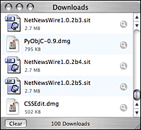
Note the Clear button, which supports click-through. If you position the Downloads window at the bottom of your screen, especially in the bottom left corner, it is easy to inadvertently click on this button while trying only to bring the window to the front. If you’re unfortunate enough to do so, however, you’ll have just cleared the very list you wanted to look at. (And it’s not undoable.)
With a policy where click-through is on by default, developers have the responsibility of identifying every control where click-through might be dangerous. E.g. Apple Mail, which supports click-through in its toolbar, but disables it for the Delete button, for obvious reasons. (This is yet another hole in the “click-through is more consistent” fallacy, since it likely isn’t obvious at all to a typical user why Mail’s Compose and Reply buttons support click-through, but the Delete button does not.)
But where to draw the line for “dangerous”? What about the merely annoying? An inadvertent click on the Back button in Safari probably doesn’t qualify as dangerous, but it can be frustrating. What about a button that causes an offline computer to connect to the Internet?
Better is a default policy where click-through is off by default, and enabled only for exceptions where there is little or no downside when click-through isn’t intended. Thus, in most cases, buttons are not good candidates for click-through. But draggable objects, like file and folder icons in the Finder (and similar apps, such as FTP programs), are.
| Previous: | More iTunes Minutiae |
| Next: | Much Ado About Click-Through |