
By John Gruber

WorkOS MCP: Manage your auth platform from any AI agent.
Deal With It
Friday, 23 March 2007
Last week I linked to Tantek Çelik’s “Three Hypotheses of Human Interface Design”, which I described as an “excellent analysis … regarding what makes software feel easier and more fun to use.”
Some of the feedback I got from DF readers on Çelik’s essay was negative, but the complaints were mostly about the way it was written, couched in a sort of academic-ese (e.g.: “The inverse geometric relationship results from the compounding of two asserted inverse linear relationships”).
But don’t let those dashes of formality turn you off; I’m convinced that Çelik’s premises are insightful and very important. Çelik writes:
More specifically, all other things being equal, the cognitive load required to complete an action or task in a human computer interface is directly (probably linearly) proportional to the number of clicks and keystrokes required to complete that action or task. Cognitive load can be roughly defined as “how mentally easy/hard it feels to do something”.
Example: instant messaging someone vs. emailing them. To instant message (IM) someone, you merely:
- switch to your IM client
- double click their name
- type your message
- press return
Four steps. Only three if you were already “in” your IM client. Not counting typing the message itself of course which is the “content” you wanted to communicate anyway brings it down to only two steps. Thus only two gestures of user interface overhead. To email someone, you have to:
- switch to your email client
- choose “New/Compose Message” from the interface
- type the recipient’s name (autocomplete in most email programs typically helps to reduce this to 3-4 keystrokes)
- type tab or return to go to the next field (typically another to or cc field)
- type tab or return again to go to the subject field
- think up a subject (or ideally skip it)
- type a subject (or ideally skip it)
- type tab or return again to go to the message body field
- type in your message
- click send
Ideally, assuming no subject (which is atypical), and only typing 3 letters to autocomplete the recipients name, this comes to a total of TEN steps, more than 3× as much interface overhead as using instant messaging. I assert that this is why sending email feels so much more heavyweight than instant messaging someone.
This example hit home for me, because I’ve caught myself doing this many times — sending something via AIM that deserved to be sent via email. However, I suggest measuring things differently than Çelik does. For one thing, once you’re already typing, additional keystrokes within the same text field don’t matter much.
Çelik’s technique is to count the actions, or, if you will, the verbs. But I suspect it’s the nouns that add the most to the cognitive load. For example, hitting the Tab key to switch to a new field doesn’t add to the load. It’s the field itself that counts.
I would enumerate Çelik’s examples like this. Sending an IM:
- Double-click name in buddy list.
- Type message in chat window text field.
Sending an email:
- Create a new message window.
- Type name in the To field.
- Skip the CC field.
- Type subject in the Subject field.
- Type message.
- Send the message.
My counting methodology can be reduced to the form “Deal with some specific user interface element”. For IM:
- Deal with the buddy list.
- Deal with the text field in the new chat window.
For email:
- Deal with creating a new message window.
- Deal with the To field.
- Deal with the CC field.
- Deal with the Subject field.
- Deal with the message content text box.
- Deal with sending the message and closing the message window.
I don’t count sending the IM as a step because it doesn’t feel like you have to deal with anything. You just whack the Return key after typing your message. Eventually, yes, you will have to deal with the chat window (or tab) you’ve created, but you don’t have to deal with it before you send the message. (And in fact, in most cases, your expectation is that you’ll soon get a response in that window.) Whereas with an email message, you must click a Send button or invoke a command-key sequence, either of which feels like a separate item to deal with.
Any rule of thumb is inherently inexact. Not all of these steps are equally weighted. Step #3 in sending an email — skipping past the CC field — carries far less cognitive load than entering a message subject. But it does carry some load, even if you’re just hitting Tab to skip it. Imagine if there were five CC fields to skip in every message window. Or 100. It’s a little tiny thing, but it is not nothing. The same goes for the Subject field in a reply — you don’t have to think of and type a new subject, but you still have to deal with skipping past the field on your way to the message body.
This technique serves as a perfect explanation for why I despise entering events in iCal:
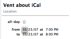
My typical usage:
- Double-click on the date of the event in month view.
- Type the event name.
- Tab past Location.
- Tab past “all-day” checkbox.
- Tab past Month.
- Tab past Day.
- Tab past Year.
- Enter the hour.
- Enter the minutes.
- Swap the AM/PM.
Some of these steps are variable. If you use the mouse instead of the keyboard, you don’t have to “Tab past” fields, but you do have to click on very small targets. And if the event starts on an even hour and the AM/PM field is already correct, you can stop at #8.
Compare and contrast to the event entry UI for the calendar feature in 37signals’s Backpack:
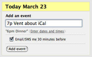
My typical usage:
- Double-click on the date of the event in month view.
- Type the time and name of the event.
You don’t have to deal with the Add Event button because you can just hit the Return key when you’re finished entering the time and name of the event, much like sending an IM.
This is not about “easy” vs. “hard”, which are clumsy, imprecise words for describing a user interface. Easy what? Easy to learn? Easy to understand? Easy to remember how to use? Easy meaning “simple”?
There’s nothing complex or confusing about iCal’s event entry UI. And with specific fields for each item of data, it is more obvious than Backpack’s — but only for a first-time user, which is the wrong case to optimize for. But to me iCal’s date entry UI is clearly worse, much worse, and the reason why can be expressed by the fact that it forces you to deal with about 10 user interface elements, versus just 2 for Backpack.
If you only count mouse clicks and key presses, however, you might arrive at a similar count for each UI. To enter an event named “Breakfast” starting at 9:30 am in iCal, it requires 21 keystrokes and a double-click:
- Double-click on date.
- Type “Breakfast”, Tab 6 times, “9”, Tab, “30”, Tab, “a”.
In Backpack, it requires 16 keystrokes and a double-click:
- Double-click on date.
- Type “9:30a Breakfast”, Return.
Compared this way, by simply counting keystrokes and mouse clicks, it doesn’t look like much of a difference at all, which is terribly misleading. I’m annoyed every single time I enter a date in iCal; I actually enjoy entering them in Backpack. It’s as palpable as the difference between going uphill and downhill.
Counting the user interface elements you have to deal with produces a comparison that reflects the actual appeal of the two designs.