
By John Gruber

Paper — The connected canvas for teams shipping with agents
The Unsatisfying State of Twitter Web Clients for the iPhone
Thursday, 17 April 2008
Twitter and the iPhone seem, at a glance, a perfect match: bite-sized micro-content paired with the world’s best mobile web reader. But here’s the thing: there’s not yet a single good iPhone Twitter client.
The main things I want in a Twitter interface on my iPhone, roughly in order:
- A readable, attractive list of tweets, with the ability to page back to previous tweets so I can catch up if I haven’t looked at Twitter in a while.
- A good text input field for posting, including a live character count and responsive typing speed.
- The ability to mark tweets as favorites.
- An easy way to create @username replies.
- A way to view a list of replies directed at me.
There’s not a single available Twitter client for the iPhone that offers all of the above. And the single biggest problem is out of the hands of third-party developers: paging. The API only returns the 20 most recent tweets, and the optional parameter to request previous pages (20 tweets at a time) has been marked “Temporarily Disabled” for over six months. This means when you use a third-party Twitter client, you see the 20 most recent tweets in your stream, and that’s it. It’s a deal-breaking limitation for third-party clients, because when you read your stream via the Twitter.com web site, paging works just fine.
It’s unclear what the rationale behind this API limitation is — I can find no public explanation for it from anyone at Twitter. If it’s to prevent API clients from overwhelming Twitter’s servers by paging back through the entire history of users’ timelines (say, for the purpose of building a database for a Twitter search engine), this could be solved by allowing paging, but limiting the results to the most recent N pages, where N is a relatively low number like 10. That would suffice for common case of someone wanting to catch up on the last few dozen tweets from the people they follow.
This limitation isn’t just a problem for Twitter web clients. Unless Twitter re-opens this ability in the API, it’ll impose a serious limitation on the coming-soon-to-the-iTunes-App-Store native iPhone application Twitter clients as well. Given that third-party iPhone applications won’t run in the background, each time you launch such a client you’ll see the 20 most recent tweets and no more.
Twitter.com
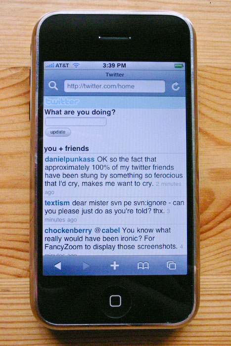
You don’t need a “client” to use Twitter, of course. You can just use the regular Twitter.com web site, which renders fine in Mobile Safari. It’s not, however, optimized for display on the iPhone. At its default size, it’s far too small to be readable:

You can use the double-tap trick to zoom in on the content column, but you sort of have to double-tap at just the right spot near the top to get the entire column (including icons) sized perfectly.
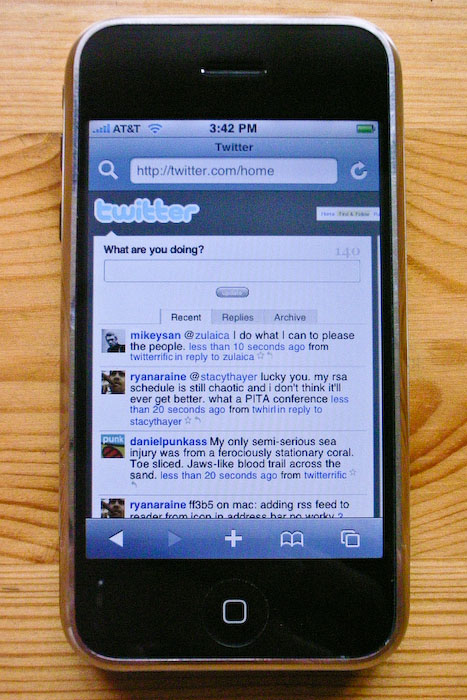
Once you’re zoomed in it’s a pretty good iPhone Twitter display: it looks pretty good, includes user icons, and displays 20 tweets per page. It also includes “Newer” and “Older” buttons at the bottom of the list for paging.
At the end of each tweet are two buttons: a star for marking favorites and an arrow for creating an @username reply. However, at just 18 × 18 px, these buttons are far too small to be usable on an iPhone’s touch screen. Apple, in the iPhone Human Interface Guidelines for Web Applications, recommends that controls have a tappable area at least 44 px high.1 (For example, the back/forward/etc. toolbar at the bottom of the screen in Mobile Safari is 44 pixels high.) In terms of area, an 18 × 18 px button is just 16 percent the size of a 44 × 44 px button. But what really kills the usability of these buttons in Mobile Safari is that you’re typically viewing them scaled down. Twitter.com’s tweet list, not including the user icons, is 470 px wide; the iPhone screen in portrait mode is just 320 px wide. When zoomed to the width pictured above, these buttons are just 10 or 11 px wide. You’ve got to zoom significantly to use these buttons on the iPhone.
For posting, the Twitter.com interface is a disaster on the iPhone. It works, but the size is all wrong. When you tap in the field to begin writing, Mobile Safari zooms the view to a width that cuts off half the field. If you zoom back out to a scale where the entire field is visible, the text is ludicrously small.
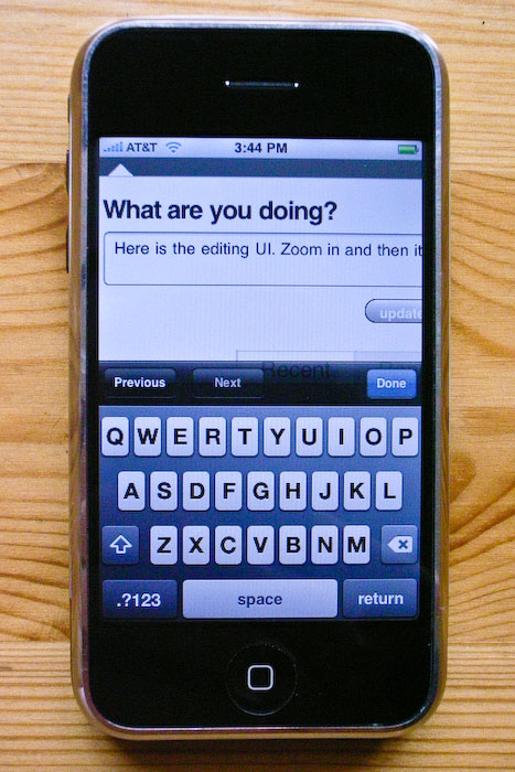
Worse, typing in the field is dreadfully slow. The JavaScript Twitter.com uses to display the live character count works just fine in a desktop browser, but it’s way too slow for the iPhone. Worse, you can’t even see the character count while typing because it’s off the screen if you’re zoomed in close enough to make the text in the field legible.
In short, Twitter.com is a perfect example of a web page that renders and works correctly in Mobile Safari, but which provides a user experience far inferior to what could be done with an iPhone-optimized web site. It seems weird that sites like Facebook and Amazon, which do so much more than Twitter, have iPhone-optimized interfaces, but Twitter does not.
m.Twitter.com
Twitter also provides a “mobile web” interface — a web interface for phones with rudimentary browsers. It used to be that to access this interface, you used a different URL: m.twitter.com. That was good.
A few weeks ago they changed this, however, and Twitter is now using user-agent sniffing to automatically serve the mobile web interface to Mobile Safari, even when you go to the regular twitter.com domain. This is bad.
You can change which version you’re getting in the footer at the bottom of the page. (Even if you don’t have an iPhone or iPod Touch, you can try out the mobile interface by using Safari’s Develop menu to set your user agent to Mobile Safari.) This setting is remembered with a cookie, but it doesn’t take long for the cookie to be forgotten. With the old scheme, where the standard and mobile web interfaces were specified by different URLs, you could (and I did) bookmark both separately, for use in different situations.
The key appeal of Twitter’s mobile web interface is that it is very fast to load. One obvious reason is that doesn’t display user icons. Another is that the entire page is almost self-contained — the CSS is inline, it doesn’t use any JavaScript, and the only image is the small Twitter logo. It also only loads 10 tweets at a time.
There’s no need for zooming, and typographically the display is spot-on — perfect use of Helvetica for the iPhone. (Unless you rotate the screen to landscape: if you do, the font blows up to giant size and stays there even if you rotate back to portrait.) There’s no way to mark favorites or create @username replies.
The editing interface for the mobile version stinks. Most obviously, the field is way too small: it’s just one line high and doesn’t even extend to the full width of the iPhone screen. Typing performance is good, but that’s because it doesn’t use JavaScript at all, which means it doesn’t provide a character count. It does stop you from typing any additional characters once you hit the 140 mark, though. (It’s just a text field with the maxlength attribute set to 140.)
A notable omission from the mobile interface is a way to view your @yourname replies. In the standard web interface you just tap the Replies tab, and all the third-party Twitter web clients support this as well.
The 10-tweet display is a bit limiting, but like the standard Twitter web interface, the mobile interface supports paging. Better to have just 10 tweets at a time but with paging than 20 tweets at a time and no paging (as with third-party clients). EDGE network performance ranges from “kind of slow” to “really damn slow”; when tending toward the latter, the difference in loading Twitter’s mobile interface and standard interface is dramatic. That’s why it stinks that it’s set with cookie rather than the URL: if you’re currently set to use the standard interface (because, say, you were on Wi-Fi) but now wish to use the mobile interface (because you’re now on EDGE), you have to wait for the entire standard web interface to load, scroll to the bottom, zoom in, and click “Mobile”. With the old way, (a) they were bookmarkable, and (b) you could keep them open in two separate tabs at the same time — making it easy to use the standard Twitter interface most of the time, while switching to the mobile web interface with just two quick taps for use on EDGE.
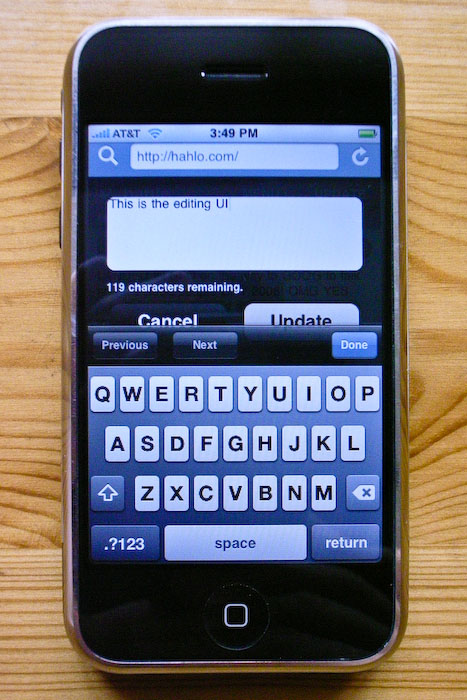
Hahlo
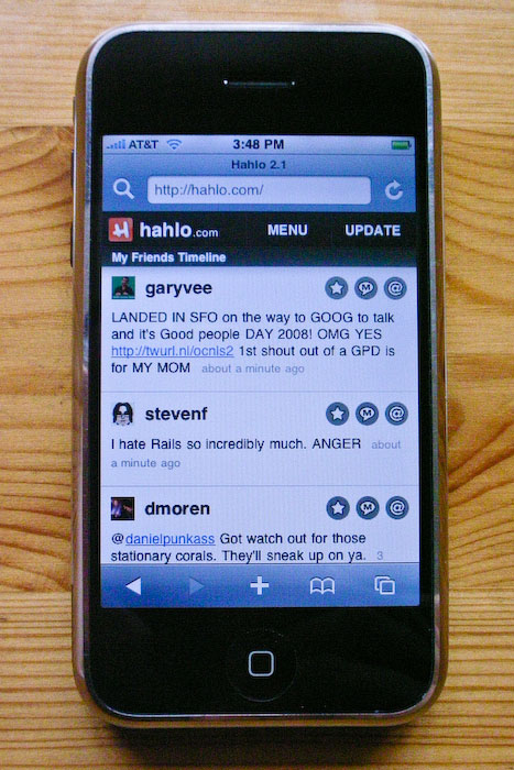
Dean Robinson’s Hahlo is my favorite third-party Twitter web client. If it weren’t for the no-paging limitation in the Twitter API, I’d use it as my primary iPhone interface to Twitter.
My biggest complaint about Hahlo itself is that its initial screen is a list of menu items, not a list of tweets. Perhaps this seems like a ticky-tacky thing to complain about, but the main thing you want to see when loading Twitter are the tweets. Waiting for the page with the menu to load before you then wait for the page with the tweets to load is annoying. (There’s a workaround for this, though, which I’ll get to in a moment.) Plus, the menu commands are a bit oddly named:

“My Timeline” is a list of your own tweets. Twitter’s own parlance for this is “Archive”. Hahlo’s second menu item, “My Friends Timeline”, is what you want: a list of the 20 most recent tweets from the people you follow. But because Hahlo is entirely Ajax-driven, the URL doesn’t change from http://hahlo.com/, which means you can’t bookmark the tweets page you see after tapping “My Friends Timeline” on the main menu. However, you can get a bookmarkable list of tweets from Hahlo by loading this URL: http://hahlo.com/friends_timeline. Most users will never realize this is possible, because there doesn’t seem to be a way to navigate to that URL from within the Hahlo UI.
Once you do see Hahlo’s tweet list, it looks nice. Good size, good spacing, good use of Helvetica. It includes user icons and has reasonably-sized buttons for marking tweets as favorites and for creating replies and direct messages to the author of a tweet.
Editing is where Hahlo is a Viking. Typing speed is acceptable — not great, but good enough — and the best of any Twitter web client with a live character count. In most other iPhone clients with a live character count, typing feels dreadfully sluggish. Hahlo’s character count is mostly accurate — which means it’s best-of-breed for iPhone Twitter web clients.2
iTweet
Colby Palmer’s iTweet is very much comparable to Hahlo. The most notable difference is the reversed light-on-dark color scheme. (I like it.) Like Hahlo, it offers a very nice tweet display, replete with nicely-sized per-tweet buttons for marking favorites and creating replies.
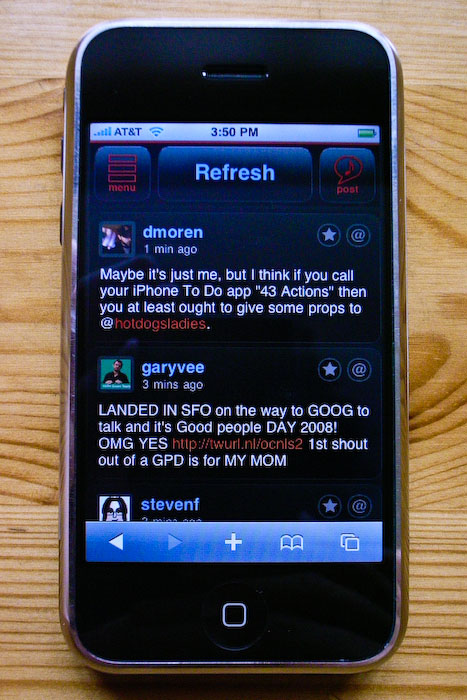
iTweet’s UI is more sensibly laid-out and named than Hahlo’s. At the top of the tweet list are three buttons: Menu, Refresh, and Post. (Hahlo uses the word Update instead of Post, which is ambiguous: Update could just as easily be used to mean Refresh, in the sense of “Update this list of tweets.” You shouldn’t have to press a button to figure out what it does.)
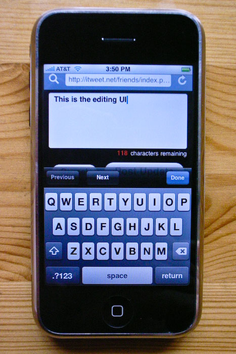
iTweet’s editing field looks good. Appearance-wise, it’s my favorite of any client — the text is eminently readable, slightly bigger and bold. iTweet also provides a live character count, but unlike with Hahlo’s, iTweet’s JavaScript hooks result in terribly sluggish typing speed. It doesn’t even come close to keeping up with my two-thumb typing speed, which is rather slow to start with. It doesn’t lose keystrokes, but the UI feedback for each keystroke is delayed by a fraction of a second, completely ruining the feedback that makes the iPhone’s on-screen keyboard tolerable.
PocketTweets
Justin Williams and Bobby Andersen’s PocketTweets uses more gradients than any other iPhone Twitter client. The icons look good, as one might expected from Mr. Andersen, but the text is too small throughout the entire UI.
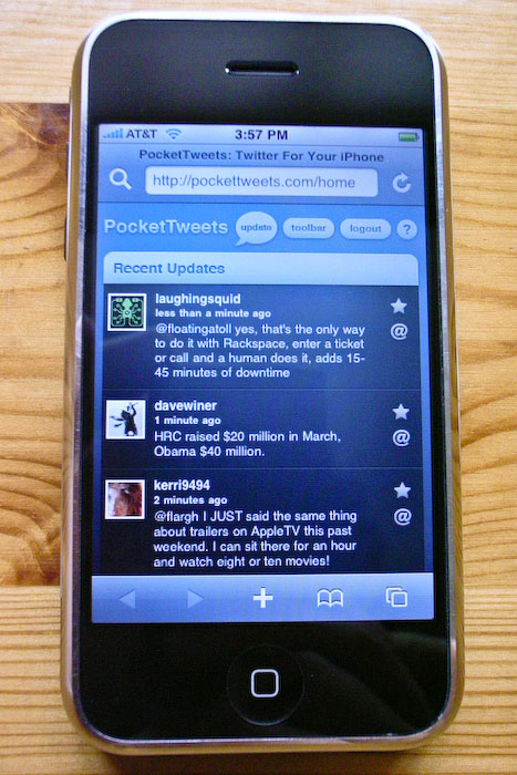
PocketTweets correctly defaults to showing you a list of tweets rather than a menu, and like iTweet, offers buttons for marking favorites and replying. However, once you mark a tweet as a favorite, PocketTweets doesn’t seem to allow you to unmark it. Also, the vertical Favorite/Reply button layout is worse than the horizontal layout in Hahlo and iTweet — I find myself inadvertently invoking Reply when I mean to tap Favorite. Another annoyance is that PocketTweets doesn’t create links from @username instances in the text of a tweet. In other clients you can tap on @username to display a list of that user’s tweets — useful for picking up the context of a reply.
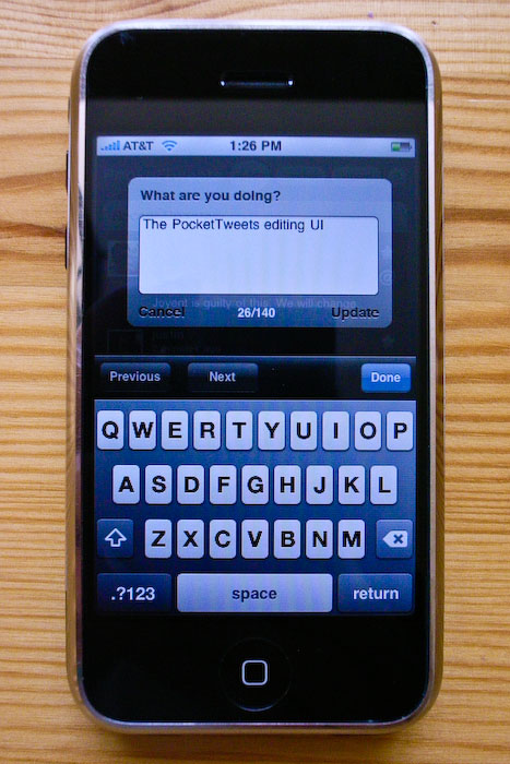
PocketTweets’s editing UI is also too small; it feels unnecessarily cramped. Typing speed is acceptable (on par with Hahlo), and it provides a character count. Unlike Hahlo and iTweet, PocketTweets doesn’t enforce the 140-character limit in the field. With Hahlo and iTweet, once you hit the 140-character mark, you can’t enter additional characters in the field. PocketTweets lets you run long, trusting you to notice the greater-than-140 character count. I like this design — it allows you to finish your sentence and then go back and edit the message to get under the limit. Sort of like writing an article with a word count — you wouldn’t want your word processor to stop accepting input once you’ve reached the limit.
One last, truly minor niggle: the name “PocketTweets” is too long to fit as a web clip name on the iPhone home screen. It gets truncated as “Pocke…eets”. PocketTweets pre-dates the iPhone web clip feature, but it goes to show that iPhone app names need to be short and sweet.
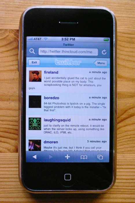
Thincloud
Last and least is Thincloud, from New Leaders. New Leaders seem to have recently renamed Thincloud to the rather scammy-sounding “Twitter for iPhone”. They use Twitter’s logo and name in such a way that, unless you read the light-gray small print in the footer on their web site — which (the small print) is not displayed when viewing the web site on an actual iPhone — creates the impression that you’re looking at some sort of official Twitter iPhone interface.
For reading, Thincloud’s font is too small, the text clumsily wraps back underneath the user icon on long-ish tweets (see the word “guys” in the first tweet in the photo below), and there’s no way to mark a tweet as a favorite or automate a reply. For posting, there’s no live character count or enforced limit — Thincloud will let you blow past the 140-character mark with nary a warning, and you won’t notice until you see your truncated tweet in the list. (On the other hand, it’s the JavaScript for the character counting that seems to slow the other clients down; typing speed in Thincloud’s editing field is the fastest of the bunch.)
[Update: I was wrong. Thincloud does have a live character count — I just never noticed because, inexplicably, it’s positioned off-screen above the text editing field. Scroll down after you start editing to see it.]
SMS
Twitter was conceived from the outset as a service for mobile phone users, even those with ridiculous old-timey pre-2007 phones without web browsers, using SMS. Twitter’s 140-character limit on status updates is a result of the 160-character limit of SMS. For reading tweets, Twitter might work OK via SMS if you only follow a very small handful of relatively quiet friends. But if you follow even just a few dozen people, I can’t even imagine how annoying it would be to have an SMS alert jingle your phone every time someone updates.
To post status updates via SMS, you associate your mobile phone number with your Twitter profile (on your Twitter.com account settings page), and then send messages to the short code 40404. Typing speed is excellent in the iPhone SMS app, but, of course, you don’t get a character count. One technical advantage to posting tweets via SMS is that it works well even with sketchy signal strength or when Twitter’s web servers are under duress. Via SMS, I was able to post live updates from the hall in Moscone West during the Macworld Expo keynote in January. (Given that Twitter’s web servers were mostly down during the keynote, however, it’s questionable whether anyone was able to read them until afterward.)
So
If ever there was a web app that could be — should be — better on the iPhone than on a desktop browser, Twitter is it. But it isn’t.
Twitter.com is the best site for reading tweets, even though it’s not iPhone-optimized at all, simply because it allows for paging. But it’s the worst site for posting. Hahlo, PocketTweets, and Thincloud are the best for posting, but because the Twitter API doesn’t allow for paging, no third-party client is good for reading.
The result is completely unsatisfying. Using one Twitter client for reading and another for posting is like getting your sandwich at Burger King and your fries from McDonald’s — convenience is the whole point.
-
In landscape mode, Mobile Safari’s toolbar shrinks to 32 pixels high — a reasonable compromise for an orientation where vertical screen space is at a premium. ↩︎
-
In every character counting feature I’ve tested on the iPhone, the count gets thrown off when you delete characters. Something seems broken regarding JavaScript keystroke event hooks in MobileSafari, at least with the Delete key. ↩︎
| Previous: | The Invisible Bit |
| Next: | Stopped Clock |