
By John Gruber

WorkOS Pipes: More context makes for smarter products.
iPhone-Likeness
Monday, 3 November 2008
Anyone involved in Mac software development is familiar with arguments over whether a particular app is “Mac-like”. In the early days of the Mac — the first decade or so — the entire Mac community was largely in agreement about just what this meant. To be un-Mac-like was to be ignorant of the fundamental concepts and norms of the Mac OS. It was something you could spot in an instant — software designed by engineers who just did not get it.
In the last decade, however, accusations of “un-Mac-likeness” have largely degenerated into meaningless hand-waving. You still occasionally see UI mistakes that are genuinely un-Mac-like — like, say, outright Windows-isms such as ordering dialog box buttons OK/Cancel rather than Cancel/OK — but in most cases, when someone complains “that’s not Mac-like”, what they really mean is “I don’t like that.”1
The overriding factor, I think, is that the overall scope of the Mac platform (and Windows, too, for that matter) has grown so large that it supports a wide variety of UI design philosophies and styles. iPhoto and Aperture have very different styles, both visually and functionally, but yet they’re both photo management apps made by Apple.
There are still fundamental norms and conventions which all Mac software should adhere to, but there no longer exists a single, simple, overall design style or philosophy that defines Mac-likeness.
The iPhone, on the other hand, is very much where the Mac was in the 1980s. It is new, innovative, and ambitiously stretches the bounds of what current hardware can support. Like the Mac, the iPhone has established UI conventions that aren’t just different, but contrary to the conventions of what has preceded it. Apple has sketched out a remarkably clear picture of what it means for an app to be “iPhone-like”.
And, just as many third-party Mac developers in the ’80s struggled to design Mac-like software because they couldn’t shake preconceptions forged in the “everything is just text” pre-Mac era, many third-party iPhone developers aren’t wholly getting the iPhone-like part. In many cases, I think, it’s because they can’t shake preconceptions forged designing Mac software.
I’ll put forth one central, overriding guideline for iPhone UI design:
Figure out the absolute least you need to do to implement the idea, do just that, and then polish the hell out of the experience.
I further suggest the following, more specific, guidelines:
- Each screen should display one thing at a time. That “thing” may be a list, but it should just be a list.
- Minimize the number of on-screen elements.
- Make UI elements large enough to be easy to tap; place them far enough apart that there is little risk of tapping the wrong target by mistake.
- Eschew preferences as much as possible, and assume that nearly all users will use the default settings.
- As you show more detail, conceptually you move from left to right — but it’s best to minimize how deep you can get while drilling down to the right.
These guidelines describe nearly every iPhone app designed by Apple, and apply to the ones I like most from the App Store.
Notes on Notes
As a case study, consider the iPhone’s built-in Notes app. This app is an excellent example of what it means to be iPhone-like.2
There are only two screens in Notes. First, a list of all Notes. A row in the list shows the note’s title and the date on which it was last modified. The list is always and only sorted chronologically, most recent first. There are only two things you can do at this screen: open an existing note by tapping it, or create a new note by tapping the “+” button that is always visible at the top of the list. There are no folders. There are no other sorting options.

When you create or edit a note, the toolbar at the top offers two buttons: “Notes”, which points back to the left and takes you to the list of notes, and “Done”, which ends the editing mode by putting the keyboard away and using the full screen to display the contents of the current note. There is no explicit “Save” button — changes are always saved automatically. There is no “Cancel” button when creating a new note; just hit “Done” or “Notes” before typing anything and no new note will be created.
There is no separate title field. The first line of text in the note is used as the title. Change the first line of the note, and you change the name of the note.
After opening an existing note, there is no “Edit” button — to switch to editing mode, simply tap the content area of the note itself and the keyboard will appear, with the insertion point at the position where you tapped in the note.
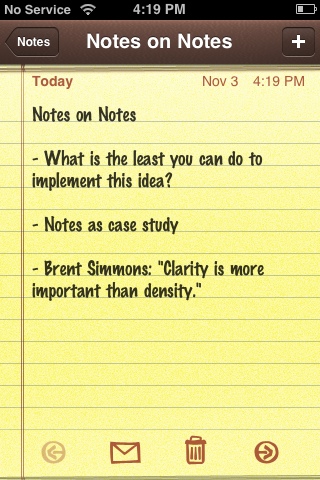
In an interview with Kyle Baxter in July, Brent Simmons said this regarding his design for the iPhone version of NetNewsWire: “Clarity is more valuable than density.” The iPhone’s Notes app is clear and sparse — or, perhaps better put, clear because it is sparse.
The only metadata displayed on the note screen is the modification date. The toolbar at the bottom of the note has just four buttons:
- A left arrow to move to the previous note.
- An envelope to send the note as an email message (without leaving the Notes app).
- A trash can to delete the note (with a two-button Delete Note/Cancel confirmation panel).
- A right arrow to move to the next note.
The left/right buttons aren’t necessary functionally, but they are necessary in order to avoid annoyance. Without them, to scan through multiple notes, you’d need to do a “back to the list, tap the next note, back to the list, tap the next note” dance.
This is the entirety of the Notes app. I’ve looked at several note-editing apps available in the App Store, and most of them seem to have been designed without any recognition of just how clever and well-designed Apple’s Notes app is. Notes exposes its core functionality clearly and obviously, launches very quickly, requires very few taps to use, and uses just two simple levels of hierarchy (the flat list of notes, and the notes themselves). After more than 16 months using the Notes app, I’ve found that having the list sorted chronologically is exactly what I want nearly all the time.
That’s not to say Notes, as it stands today (which is to say, as it stood when the original iPhone debuted, since it hasn’t changed since then) cannot be improved.
The biggest missing feature, clearly, is syncing. Email is currently the only way to export notes from Notes, and there is no way at all to import. There practically begs to be some way to transfer snippets of text from your computer to the Notes app on your iPhone, but there is none. This is a major feature, and, currently, the biggest opportunity for third-party note apps.
A search feature would be nice. I imagine something along the lines of the search field Apple added to the Contacts list in iPhone OS 2.0, sitting at the top of the list of notes; type a search string and the list of notes would be filtered to display only those which match.
Notes doesn’t rotate. It should, for the benefit for those who prefer typing on the horizontal keyboard.
And that’s pretty much it for my Notes wish list — a pretty short list.
| Previous: | Regarding Opera Mini and the App Store |
| Next: | A Fantastic Monument |