
By John Gruber

WorkOS MCP: Manage your auth platform from any AI agent.
Google Maps for iPhone
Thursday, 13 December 2012
Announcement here. It’s replete with vector maps tiles and turn-by-turn navigation. This iOS 6 mapping saga has been a source of tremendous controversy, but here we are three months after iOS 6 was released and iPhone users now have a better Google Maps experience than they did when Google was providing the back-end data for the built-in Maps app. It all worked out.
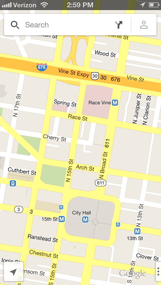
A few thoughts on the design. The icon looks good, and is based on the Android Google Maps app icon. But the UI of the app itself is very different from the Android app: iOS Google Maps; Android Google Maps. I prefer the iOS design — it’s less cluttered. Perhaps it’s also less featureful, but this new iOS app seems to have all the features I’d want to use. The UI aesthetic is along the lines of Google’s other recent iOS apps (their just plain “Google” search app, and the newly redesigned Gmail app). This aesthetic is quite distinct from the standard iOS look, but it’s unique to Google’s iOS apps, not a port of Android’s look and feel. In fact, if anything, Google’s iOS apps look and feel more Google-y, brand-wise, than Android does. Android’s look and feel match its name: sterile, robotic. Google’s brand has always been very friendly, colorful, humane. Their iOS apps have that same feeling. (Which gets back to my long-standing belief that Android feels like an independent subsidiary of Google, not an integrated part of the company.)
The look is very clean: matte-finished in contrast to Apple’s glossiness; flatter, but not entirely flat.
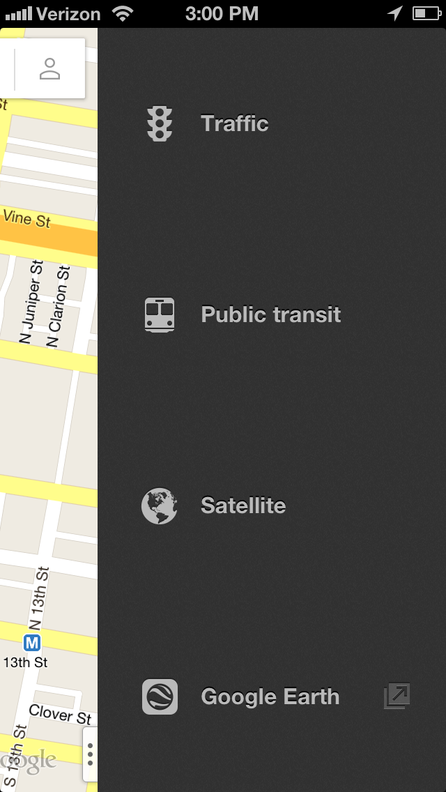
But certain navigational (no mapping pun intended) aspects of Google Maps feel a tad off to me. You tap or drag a little sideways “…” button in the lower right corner to access optional mapping layers (traffic, public transit, satellite imagery) in a sort of drawer that slides from the right. That vertical “…” button is an Android-ism, and feels out of place on iOS. It’s taking the place of Apple Maps’s bottom-right page curl. The items in Google Maps’s drawer, though, don’t look like overlay toggles. To me they look like items in a source list that are going to take me to entirely new places. And in fact, the bottom one, “Google Earth”, does — it launches the Google Earth app if it’s installed, and takes you to the App Store app if it isn’t. This is a quibble though; once you figure out how the overlay drawer works you won’t forget it.
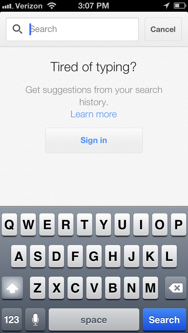
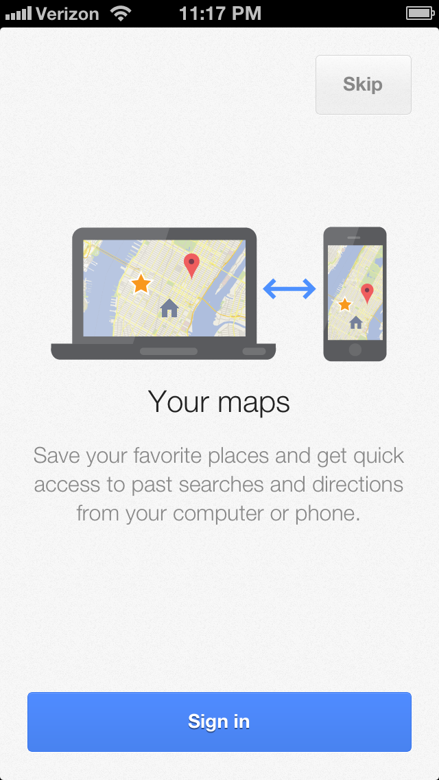
The app very much wants you to sign in with a Google account. There’s a full screen prompt to sign in upon first run. I declined, and the app is fully functional without signing in. But there’s a prominent prompt to sign in every time I search, and one of the very few buttons on the main screen’s delightfully minimal interface is for your Google account profile. Fewer people will use Google Maps now that it’s an App Store download instead of the back-end for the built-in Maps app, but those who do will be far more likely to engage with the Google ecosystem. (Read: Google will be able to collect more, and more identifying, location and search information.)
Mapping data aside, I consider Apple’s new Maps the better-designed app, but this new Google Maps is very good.
A Few Updates, a Few Hours Later:
“It all worked out”: My “It all worked out” observation was in no way an attempt to argue that this was Apple’s plan all along. In fact, quite the opposite. What makes it remarkable is that it’s all worked out despite clearly not being Apple’s plan. Apple’s plan was for their own mapping service to be, if not as good as Google’s, at least good enough that it didn’t make us miss Google’s map data. I think Apple — where by “Apple”, I mean the company’s collective executive leadership — is seething regarding the way this has played out. Everything from Apple Maps being the butt of jokes to the accolades and joy that have accompanied the release of the new Google Maps iOS app. Seething.
Google has lost something valuable, too: its place as the default mapping data provider for iOS. What’s interesting is that this is a case where it’s us, the users, who’ve won. We’ve got two apps with turn-by-turn-navigation and vector map tiles where before we had none. Ideally, yes, Apple Maps would have best-of-breed data and search, but the situation was even further from ideal prior to iOS 6.
“Data aside”: Regarding my original concluding sentence, Nick Bergus tweets:
Wouldn’t @gruber jump all over a review of a mapping app that concluded the judgement with the line “mapping data aside...”?
Fair point. My intent there was to avoid opening a rather enormous can of worms. The entire piece was focused specifically on the interface design of the app, not the quality of the mapping data and search results. No argument that the quality of the mapping data and search results are foremost in the experience of actually using a maps app. But that’s all well-trod ground. We know what Google Maps data is like, what their search results are like. This new iOS app introduces nothing new in that regard.
Further complicating a discussion of mapping data/search results quality is that I personally have found Apple Maps’s data and search quality to be just fine: fast, accurate, attractive. Obviously, many people disagree. Complicating this point even further: I don’t use maps frequently. I go weeks at a time without venturing more than a few blocks from home, and when I do travel, it’s generally to places I’m already familiar with. So while I really have personally found iOS 6 Maps to be a nice update over the old Google Maps-backed iOS Maps, I don’t feel it’s a point I should hammer upon because, as someone who seldom uses Maps, I have no sense of whether I’m right that Apple’s Maps is actually pretty good and getting an unfair bad shake in the public’s perception, or, if I simply don’t use it enough to see just how bad it really is. I feel confident critiquing the design of the apps themselves; I feel unqualified to judge the quality of their service.
Privacy, Signing In, and Contacts: One thing I missed initially is that, if you’re not signed in to a Google account, your search history is not saved. And, dare I say bizarrely, Google Maps does not use your iPhone contacts data for search. It only uses your Google account contact data, which means if you’re not signed in to a Google account you can’t search for addresses in your contact data, and even if you are signed in, you can only search by contact data if you give Google your contacts data. An iOS app that doesn’t use iOS contacts data is just wrong. Me, personally, I don’t sync contact data with Google, and I don’t trust Google with my location data. Google’s decisions here reinforce the notion that they seek to collect and cross-index anything and everything about you.
Update: It ends up Google Maps for iOS doesn’t even use your Google contacts, even if you’re signed in. It just plain doesn’t search contact data. Even on Android, apparently.
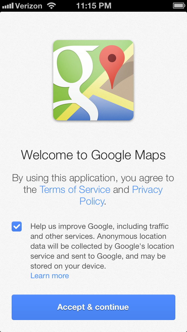
Second, with the anonymous location and traffic data collection, Google does make this optional in the first run experience with a checkbox. But it’s an unusually small checkbox, not just visually but also in terms of tap target size. And checkboxes of any size are wrong on iOS; iOS uses On/Off toggles (which provide bigger tap targets). To change the setting later, you have to tap:
The profile icon on the main screen → the gear menu on the Profile screen → “About terms & privacy” on the Settings screen → “Terms & privacy” → “Location data collection”.
Five layers of hierarchy qualifies as “hidden”. (Although once you get to that page, it is a standard iOS On/Off toggle.)
On the second screen of the first-run experience, where they want you to sign in with your Google account, there’s no indication that this is not required — that pressing the (faint, low-contrast gray) “Skip” button will allow you to use the app without signing in. This is designed to imply, without saying so, that you have to sign in to use the app.
Horizontal Ellipsis: August Joki found this Unicode glyph, “Presentation Form For Vertical Horizontal Ellipsis” for Google’s Android-inspired menu icon: ︙
| Previous: | Why ‘The Daily’ Failed |
| Next: | A Big Misunderstanding |