
By John Gruber

WorkOS Pipes: More context makes for smarter products.
Conjecture Regarding Larger iPhone Displays
Friday, 22 August 2014
Throughout the entire rumor cycle for this year’s new iPhones, we’ve been inundated with reports of two new screen sizes, 4.7 and 5.5 inches. But while the physical sizes of these displays leaked early and often, the exact pixel dimensions have not.
At this point, there’s too much smoke around the “two new iPhones, one at 4.7 inches and the other 5.5 inches” narrative for there not to be a fire. I think that’s what Apple is planning to announce next month — not because anyone “familiar with the plans” has told me so, but simply because so many parts have leaked corroborating these two sizes.
I’ve spent much of the last month trying to figure out the pixel counts for these displays, and it’s actually quite tricky. When Apple changed the iPhone display previously, they did so in obvious ways. With the iPhone 4’s retina display, Apple kept the physical size exactly the same (3.5 inches1) and exactly doubled the pixels-per-inch resolution (from 163 to 326). When the iPhone 5 increased the size to 4 inches and the aspect ratio (switching from 3:2 to 16:9), they simply added pixels vertically. Same pixels-per-inch resolution, same width (640 pixels), new height (1136 pixels instead of 960).
There is no similar “easy” way to do either a 4.7 or 5.5 iPhone display.
But after giving it much thought, and a lot of tinkering in a spreadsheet, here is what I think Apple is going to do:
- 4.7-inch display: 1334 × 750, 326 PPI @2×
- 5.5-inch display: 2208 × 1242, 461 PPI @3×
@2× means the same “double” retina resolution that we’ve seen on all iOS devices with retina displays to date, where each virtual point in the user interface is represented by two physical pixels on the display in each dimension, horizontal and vertical. @3× means a new “triple” retina resolution, where each user interface point is represented by three display pixels. A single @2× point is a 2x2 square of 4 pixels; an @3× point is a 3x3 square of 9 pixels.
I could be wrong on either or both of these conjectured new iPhones. I derived these figures on my own, and I’ll explain my thought process below. No one who is truly “familiar with the situation” has told me a damn thing about either device. I have heard second- and third-hand stories, though, that lead me to think I’m right.
How I Derived These Figures
First, I’m assuming both the 4.7 and 5.5 inch rumors are true. Second, I’m assuming a 16:9 aspect ratio for both displays.2 Given these assumptions and the Pythagorean Theorem, it’s easy to create a spreadsheet model that gives you the pixels-per-inch resolution for a given pixel count.
For example, consider the 4.7-inch display. That’s the diagonal measured in inches. Given the height and width in pixels, we can solve for the diagonal in pixels (a2 + b2 = c2). Starting with values of 1334 and 750 for a and b, we get roughly 1530.4 pixels diagonally solving for c. Divide 1530.4 by 4.7 inches, and you get 326 pixels/inch — exactly the same pixel density as all previous iPhone retina displays (and the retina iPad Mini).
When I’ve written about this sort of diagonal pixel division in the past, I’ve gotten complaints that there’s no such thing as “diagonal pixels” or fractional pixels. But for our purposes, that doesn’t matter. Effectively we’re treating “pixel” as a unit of measure — the length of an actual pixel on the display. If you don’t believe me, we can use the Pythagorean Theorem the other way, to compute the length of the sides in inches given the diagonal in inches and the aspect ratio. A 16:9 display with a diagonal measuring 4.7 inches has a height of 4.1 inches and width of 2.3. 1334/4.1 and 750/2.3 both work out to roughly 326 pixels per inch. Trust the math.
Keeping the same 326 pixels-per-inch density would fit with the patterns Apple has established. They keep reusing the same pixel densities across iOS devices. In the past, I’ve speculated that this might be a matter of economy of scale — that they just cut different size displays from the same (large) sheets of LCDs. I no longer think that’s the reason. For one thing, they stick to these same pixel densities even across devices that use entirely different displays. The iPhone 5, retina iPod Touch, and retina iPad Mini all use 326 PPI displays, but all three use different LCD display technology.
I think the explanation has more to do with the physical size of user interface elements and touch accessibility. It’s about points. User interfaces in iOS aren’t specified in display pixels, they’re specified in virtual points. On non-retina devices, points and pixels were one and the same. But as stated earlier, on @2× retina devices, each (virtual) point represents two (physical) pixels on the display in each dimension.
Apple has always recommended tappable targets of at least 44 points. From the iOS HIG:
Make it easy for people to interact with content and controls by giving each interactive element ample spacing. Give tappable controls a hit target of about 44 × 44 points.
This recommendation is based not on aesthetics — how the controls look — but on the size of human fingertips. That’s the real constraint. 44 points isn’t a magic number; it’s a by-product of the size of the pixels on the original 2007 iPhone display (pre-retina, one point equaled one pixel). On every iPhone to date, from the original through the 5S and 5C, there has been a single consistent point resolution: 163 points per inch. That means a 44 × 44 point UI element has remained exactly the same physical size (as measured in inches or millimeters).
The original iPad introduced a second point resolution: 132 points per inch. This has remained consistent on the large (9.7 inch) iPads. The iPad Mini (both original and retina) uses the iPhone’s 163 points-per-inch resolution. Apple’s recommended target sizes did not change for the 9.7-inch iPad: they simply made the recommended tap targets physically larger. 44 points on an iPhone or iPad Mini is roughly 0.27 inches (6.9 mm). 44 points on a 9.7-inch iPad is 0.33 inches (8.4 mm). Everything is bigger by a factor of about 1.24.
Making UI elements (and text) bigger on the iPad works, both in terms of touch and visual accessibility. Making UI elements smaller, however, would not work, either physically (touch sizes) or visually (legibility). Any changes that Apple makes to iOS displays, in terms of physical dimensions or pixel resolution, necessitate extra work for app developers and designers to fully support. They’ve gone from @1× to @2×, and eventually (I think next month) they will go to @3×. They’ve introduced three different aspect ratios: 3:2 (now deprecated), 16:9 (all recent iPhones), and 4:3 (all iPads). They’ve used two different sizes of the same aspect ratio (iPad and iPad Mini).
But what they have never done, and I believe never will do, is redefine the virtual point to something other than 1/44th the recommended minimum tap target size for every device.
Apple has already started encouraging iOS developers to begin using adaptive layout techniques. See session 216 from WWDC 2014: Building Adaptive Apps with UIKit. What’s telling when you watch that session and read the documentation is that developers should clearly anticipate new aspect ratios (whether for new displays, or for a still-hypothetical but rumored split-screen multitasking feature on future iPads) and physical sizes, but nowhere is there any suggestion that the role of the point as the UI unit of measure is changing.
This is important when speculating about new iOS device displays. Take the physical pixels-per-inch of the display, divide by the retina factor (@1×, @2×, @3×, etc.), and you get the points-per-inch for that proposed display. If that result is higher than 163 points-per-inch, then a 44-point UI element would be undesirably small as a touch target for human fingertips. What we want are display resolutions that provide more total points but the same or fewer points-per-inch.
Now, in theory, Apple could go ahead and do this anyway, and on such a device developers would have to use an entirely different recommended size, in points, for UI elements. But effectively that would require double the design work. The adaptive techniques and APIs that Apple is recommending (again, see WWDC 2014 Session 216) are intended to enable apps to be designed just once and flexibly adapt to different displays.
It’s also important to consider the two possible (and not necessarily conflicting) reasons why larger displays are desirable:
- To show more content on the display at once.
- To make the content on the display physically larger.
#1 is about showing more content on screen (e.g. more text per page in an e-book). #2 is about making the content bigger (e.g. larger text in an e-book). #1 is about increasing the number of points, not (only) the number of pixels. #2 requires larger points (fewer points per inch).
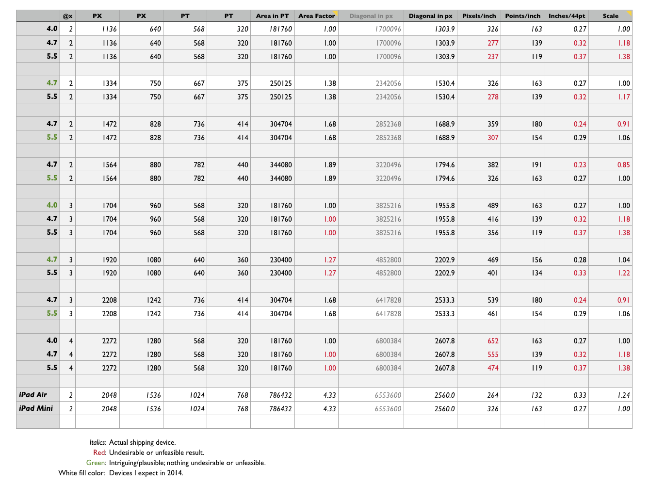
Using the Above Assumptions and Concepts to Consider Hypothetical iPhone Display Resolutions, Starting With 1136 × 640
As a baseline, let’s consider the existing iPhone 5 / 5C / 5S display:
| Size | Retina | Pixels | Points | px/inch | pt/inch |
|---|---|---|---|---|---|
| 4.0 | @2× | 1136x640 | 568x320 | 326 | 163 |
The easiest thing Apple could do to create 4.7 and 5.5 inch displays would be to use the current 1136 × 640 pixel resolution, but this leads to several undesirable results, even though developers would have to do nothing new to support it. Such a 4.7-inch display would have a resolution of only 277 pixels per inch, and a 5.5-inch display would come in at only 237 pixels per inch. Neither display would show any additional content compared to the iPhone 5, and though everything would be physically bigger, the lower pixel-per-inch resolution would make everything look jaggier, especially on the 5.5-inch model. That’s not going to happen. New iPhone displays need to look as good as or better than the existing ones.
1704 × 960: Only Works Well for 4.0-inch Displays
Now, let’s consider an oft-cited prospective new iPhone resolution, 1704 × 960, about which 9to5Mac’s Mark Gurman reported in May:
Fast forward to 2014, and Apple is preparing to make another significant screen adjustment to the iPhone. Instead of retaining the current resolution, sources familiar with the testing of at least one next-generation iPhone model say that Apple plans to scale the next iPhone display with a pixel-tripling (3X) mode. [...]
568 tripled is 1704 and 320 tripled is 960, and sources indicate that Apple is testing a 1704 × 960 resolution display for the iPhone 6. Tripling the iPhone 5’s base resolution would mean that the iPhone 6’s screen will retain the same 16:9 aspect ratio as the iPhone 5, iPhone 5s, and iPhone 5c.
Simply tripling the base point size would make things relatively easy for developers — it’d be akin to the 2010 introduction of the first retina device, the iPhone 4. Developers would just need to add @3× graphic assets.3 The layout of the app, as specified in points, would remain unchanged.
I think Gurman was right that Apple was testing an @3× mode. I’m almost certain he was wrong that they ever tested 1704 × 960, unless they considered a new iPhone with a 4.0-inch display. That’s the only size at which 1704 × 960 makes any sense. Why? Because as measured in points, an @3× 1704 × 960 display would show no additional content compared to the iPhone 5. It’d still be 568 × 320 points. (One could comfortably reduce their Dynamic Type system-wide font size preference on such a display, but it wouldn’t increase the amount of content displayed by default. Dynamic Type alone is not a good enough solution to showing more content — the only good solution is increasing the number of points, not just the number of pixels.)
A 4.7-inch 1704 × 960 display would require a 416 pixels-per-inch display, and would have a scaling factor of 1.18 compared to all previous iPhones. It would display the same content, but everything would be 1.18 times larger. A 5.5-inch 1704 × 960 display would require a 356 pixels-per-inch display, and would display content at a comically large 1.38 scaling factor. (For comparison’s sake, the iPad Air has a scaling factor of 1.24 compared to the iPad Mini.)
The one thing that’s magic about 1704 × 960 is that it’s the one resolution that would keep the iPhone akin to the iPad — multiple physical sizes and retina factors, but with one universal dimension in terms of points. You know how iPad apps have the exact same 1024 × 768 layout on all iPads, just with different physical and retina scales? That’s what 1704 × 960 (with @3× retina scale) would do for the iPhone. I think the iPhone is fundamentally different from the iPad in this regard, however.
(As I said above, 1704 × 960 would work perfectly for a new 4.0-inch iPhone with @3× retina scaling. Layout and UI element sizes would remain unchanged from the iPhone 5 series, but everything would look 1.5 times sharper with a 489 pixels-per-inch display. By all accounts, however, there is no such device in the works. Apple seems to be leaving the 4.0-inch size behind.)
1334 × 750: The 4.7-inch Sweet Spot
| Size | Retina | Pixels | Points | Area Factor | px/inch | pt/inch | Scale Factor |
|---|---|---|---|---|---|---|---|
| 4.7 | @2× | 1334x750 | 667x375 | 1.38× | 326 | 163 | 1.0× |
| 5.5 | @2× | 1334x750 | 667x375 | 1.38× | 278 | 139 | 1.17× |
At 4.7 inches, 1334 × 750 works perfectly as a new iPhone display, addressing problem #1, showing more content. With point dimensions of 667 × 375, this display would show 1.38 times more points than the iPhone 5. At 326 pixels-per-inch, everything on screen would remain exactly the same physical size. There would just be 38 percent more room for content.
This resolution is feasible for a 5.5-inch display, but doesn’t work well enough in my opinion, for the reasons italicized in the above table. 278 pixels-per-inch is unacceptably low — again, new iPhone displays need to look as good as or better than the previous models, and 278 pixels-per-inch is too low. Apple does this with the iPad Air and Mini (two sizes, same pixel count), but the iPad Air gets away with its sub-300 pixels-per-inch display because you tend to hold it further away from your eyes than you do a phone.
If Apple were to use this display resolution for both the 4.7- and 5.5-inch phones, the relationship between the two devices would only be a matter of scale. Everything on the 5.5-inch iPhone would appear 1.17 times larger than on the 4.7-inch one, but they would each show the same amount of content. I don’t think that’s a good enough reason to produce two new larger iPhone display sizes.
1472 × 828: Too Small for 4.7, Too Crude for 5.5
Gurman this week reported on a configuration file in the latest iOS 8 beta SDK, suggesting a display size — measured in points, not pixels — of 736 × 414. That, indeed, was interesting — but not so much at @2×, as Gurman posited.
| Size | Retina | Pixels | Points | Area Factor | px/inch | pt/inch | Scale Factor |
|---|---|---|---|---|---|---|---|
| 4.7 | @2× | 1472x828 | 736x414 | 1.68× | 359 | 180 | 0.91× |
| 5.5 | @2× | 1472x828 | 736x414 | 1.68× | 307 | 154 | 1.06× |
This resolution is a non-starter for a 4.7-inch phone on the basis of scaling. With 180 points per inch, UI elements and text would be rendered almost 10 percent smaller than on an iPhone 5. With a scaling factor of 0.91, I don’t think it would appear comically small, but no one expects or wants things to appear smaller on a 4.7-inch phone than they do on a 4.0-inch phone. Not going to happen.
At 5.5 inches, however, this resolution works. The only hiccup is that the display would be “only” 307 pixels-per-inch. That meets Apple’s original 2010 definition of “retina display” as 300+ PPI, but just barely. Sticking with @2× retina scale would be less work for UI designers, and such a display would cost less and be less graphically taxing than what I’m about to propose, but a new iPhone with a lower resolution (in terms of pixels-per-inch) display is a bitter pill to ask people to swallow. Again, I think the display on a new top-tier iPhone must be as good or better than the previous model in every way. 307 pixels-per-inch doesn’t quite cut it, I think. (If I’m wrong about anything in this piece, however, this might be it — that 307 pixels-per-inch number is the only thing I see wrong about a 5.5-inch 1472x828 display.)
2208 × 1242: The 5.5-inch ‘Holy Shit’ Sweet Spot
Take the same 736 × 414 point display size, and apply a retina scaling factor of @3× instead of @2×, and you get a very intriguing 5.5-inch iPhone:
| Size | Retina | Pixels | Points | Area Factor | px/inch | pt/inch | Scale Factor |
|---|---|---|---|---|---|---|---|
| 4.7 | @3× | 2208x1242 | 736x414 | 1.68× | 539 | 180 | 0.91× |
| 5.5 | @3× | 2208x1242 | 736x414 | 1.68× | 461 | 154 | 1.06× |
Nothing changes compared to 1472 × 828 but one thing: pixels-per-inch resolution. The 4.7-inch size is still out because the scaling factor would render everything almost 10 percent smaller.
Everything works at these dimensions for a 5.5-inch display. With an increase in area of 68 percent and a scaling factor of 1.06, this display would address both reasons why someone might want a very large iPhone: it would show a lot more content, and it would render everything on screen, point-for-point, a little bit bigger. And at 461 pixels-per-inch, everything would be amazingly sharp. At that point it would be difficult for most of us to perceive individual pixels from any viewing distance, not just from typical practical viewing distance. This would be so sweet, I’d wager Apple comes up with a new marketing name for it: super-retina or something.4
The only issue is whether it’s technically feasible for Apple: (a) to obtain sufficient supply of 461 PPI displays at a reasonable cost, and (b) to produce a GPU capable of pushing that many pixels. (b) Might not be a problem at all, considering that last year’s A7 SoC is already capable of driving the 2048 × 1536 retina iPad displays without breaking a sweat. As for (a), rumors abound that @3× is a real thing, and if that’s true, I think it’s for the 5.5-inch phone. In terms of the total number of pixels, the technical jump from the iPhone 5 series to this display would be quite comparable to that from the 3GS to the iPhone 4. With the 3GS to the 4, the number of pixels exactly quadrupled. Going from the 1136 × 640 iPhone 5 display to a new 2208 × 1242 display would increase the total number of pixels by a factor of about 3.8. After four years of @2× retina scale, I think it’s plausible that Apple could pull this off — especially since they pulled off the @1× to @2× jump after only three years.
The technical and manufacturing difficulties involved in such a leap could well explain the pervasive rumors that the new 5.5-inch trails the 4.7-inch model in terms of production. It also fits with pervasive rumors that it will cost at least $100 more.
Other Resolutions
1564 × 880 is feasible for a 5.5-inch phone. That’s what you get if you maintain the 326 pixels-per-inch density and @2× scale. This would increase area — the number of points displayed on screen — by a whopping 89 percent. But it wouldn’t increase the size of what you see at all. I think the sweet spot for a 5.5-inch phone would allow you to see more content and make what you see at least a little bit bigger. So that’s why I’d bet against 1564 × 880. (1564 × 880 would be implausible for the 4.7-inch phone: it would render UI elements and text 15 percent smaller than all previous iPhones.)
1920 × 1080 is a standard resolution for “high definition”, but the numbers only work for 4.7 inches at @3× retina scale:
| Size | Retina | Pixels | Points | Area Factor | px/inch | pt/inch | Scale Factor |
|---|---|---|---|---|---|---|---|
| 4.7 | @2× | 1334x750 | 667x375 | 1.38× | 326 | 163 | 1.0× |
| 4.7 | @3× | 1920x1080 | 640x360 | 1.27× | 469 | 156 | 1.04× |
| 5.5 | @3× | 1920x1080 | 640x360 | 1.27× | 401 | 134 | 1.22× |
None of those numbers jumps out at me as terrible (although the 1.22 scaling factor at 5.5 inches comes close), but none of them are particularly compelling either. At 4.7 inches, 1920 × 1080 would give you 27 percent more content (in points), and would increase the scale of points by 4 percent. Both of those are plausible, and a reasonable balance between showing more content and bigger content. But it seems like a worse tradeoff balance for 4.7 inches than my perceived sweet spot of 1334 × 750. I’ve repeated those numbers in the chart above for comparison. I think for the 4.7-inch phone, you want to focus on more content, not bigger content, and 1334 × 750 is a better — and cheaper, and more power efficient — option for that.
At 1920 × 1080, a 5.5-inch iPhone would skew too heavily toward showing bigger content than more content. People who really want bigger text would be served just as well, I think, with a 2208 × 1242 @3× display and changing the Dynamic Type font size. At 1920 × 1080, everyone would get very large type by default. Even worse, a 1920 × 1080 5.5-inch phone at @3× would have fewer points than a 1334 × 750 4.7-inch iPhone at @2× (640 × 360 vs. 667 × 375, respectively). I don’t think it’s feasible for the physically larger phone to show less on-screen content. This is why it’s essential to consider points, not just pixels.
Lastly, I considered 2272 × 1280 at @4× retina scale. Jumping from @2× to @4× would make things much easier for iOS UI designers (see footnote 3 below), but Apple’s top priority isn’t making life easier for UI designers. 2272 × 1280 is exactly double the current 1136 × 640 iPhone 5 display. The problem with that is that it doesn’t change the screen size in terms of points at all. You’d see exactly the same amount of content, only bigger (on the 4.7-inch phone) or much bigger (on the 5.5). Everything would look incredibly sharp as well, but I think showing more content is an essential aspect of the demand for large-screen phones.
Conclusions
The three main factors to consider for a new iPhone display size:
- Content area: showing more points on screen.
- Scaling factor: the number of points per inch.
- Sharpness/quality: the number of pixels per inch.
A 4.7-inch iPhone at 1334 × 750 pixels would change only one of those: content area. The points-per-inch and pixels-per-inch would remain unchanged from the iPhone 5 series, but the display would expand from 568 × 320 points to 667 × 375, an increase of 38 percent. This is such an Apple-like thing to do — keeping the exact same 326 pixels-per-inch density and simply putting more pixels in both dimensions to make a larger display — that I’m surprised I can only find one mention of it: an April report from KGI Securities analyst Ming Chi-Kuo. (In that same note, Chi-Kuo pegged the 5.5-inch iPhone at 1920 × 1080, which, for the reasons outlined above, I very much doubt.)
A 5.5-inch iPhone at 2208 × 1242 pixels (and @3× retina scaling) would improve all three factors:
- Content area: with 736 × 414 points, viewable content area would increase by 68 percent over the iPhone 5 (and 21 percent over my conjectured 1334 × 750 4.7-inch phone).
- At 154 points per inch, points would be 6 percent bigger than on all other iPhones to date. Just a little bigger, not a lot bigger, which is probably just what the doctor ordered.
- At 461 pixels per inch, everything would be rendered incredibly sharply.
So, those are my guesses.5
-
Remember back in 2007, when Apple was seemingly concerned that the 3.5-inch iPhone was too big? How times change. ↩︎
-
To be precise, when I say “16:9”, I mean “close enough to 16:9 for practical purposes”. 2208 × 1242 is in fact precisely 16:9: divide the height by the width and you get 1.777. 1334 × 750, however, is not precisely 16:9: divide and you get 1.7786. That doesn’t matter. It’s more than close enough to 16:9 for practical purposes. Note too that the existing iPhone 5 series 1136 × 640 display isn’t precisely 16:9 either. 1136 × 639 would be precisely 16:9, but an odd number of pixels in one dimension would be stupid. ↩︎
-
Moving to @3× from @2× is actually quite a bit trickier than moving from @1× to @2× was, because the math is no longer tidy. When you double, everything remains an even number. @3× leads to odd numbers. For example, what do you do with a 3-pixel wide stroke from your @2× interface? You can’t render it at 4.5 pixels, so you have choose between rendering it at 4 or 5 pixels, making it slightly thinner or thicker. Or you could anti-alias it to approximate a 4.5-pixel stroke width, in which case you sacrifice sharpness and precision. We’re talking about hundredths of an inch, but trust me, iOS designers care about this. @3× is going to be a bit of a pain in the ass for pixel-obsessive designers. ↩︎
-
This in turn will drive the Android die-hards nutty, on the grounds that there have been Android handsets with 450+ PPI displays since last year, but Apple will play it on stage and in TV commercials as though they’re breaking new ground. ↩︎
-
For those curious, here’s the spreadsheet I used to work this out: Numbers file, and screenshot. ↩︎
| Previous: | Two Memos |
| Next: | Security Trade-Offs |