
By John Gruber

Day One — The journal you actually keep. Start with a chat, end with a journal entry. ⭐ 4.8 (400k)
Design as Branding
Tuesday, 20 September 2016
Farhad Manjoo, in his State of the Art column for The New York Times, published shortly after Apple’s September 7 event, “What’s Really Missing From the New iPhone: Cutting-Edge Design”:
The absence of a jack is far from the worst shortcoming in Apple’s latest product launch. Instead, it’s a symptom of a deeper issue with the new iPhones, part of a problem that afflicts much of the company’s product lineup: Apple’s aesthetics have grown stale.
The column is accompanied by an illustration of a fellow holding an Apple logo in his hand, yawning out of boredom.
In my own take on Apple’s event, I wrote:
There is a large contingent of pundits who apparently would be more excited about a new iPhone that looked entirely different but had the exact same components as the iPhone 6S than they are by the actual iPhones 7, which are shaped like the 6S but have amazing new components. I don’t get that mindset at all. It’s like being a car pundit and judging the new Porsche 911 with a “meh” because it looks like the previous 911, and never even considering what it’s like to actually drive the new car.
Manjoo’s headline says “design”.1 In his column, he says “aesthetics”. Aesthetics is only one aspect of design. I’m sure Manjoo knows that, and I know Times columnists don’t write their headlines, their editors do. But the headline is still his responsibility.
Steve Jobs, in a 2003 Rob Walker profile of the iPod for The New York Times Magazine:
“Most people make the mistake of thinking design is what it looks like,” says Steve Jobs, Apple’s CEO. “People think it’s this veneer — that the designers are handed this box and told, ‘Make it look good!’ That’s not what we think design is. It’s not just what it looks like and feels like. Design is how it works.”
I’ve cited this quote frequently over the years, and for good reason. It’s a concise statement that provides deep insight into Apple’s company culture. It is true, it is meaningful, and it exemplifies what separates Apple from most other companies. At most other companies, design is what it looks like and feels like, not how it works.
But even if we just want to talk aesthetics, just what the iPhone 7 looks like, I really don’t see how Manjoo could write “Apple’s aesthetics have grown stale” after looking at this:
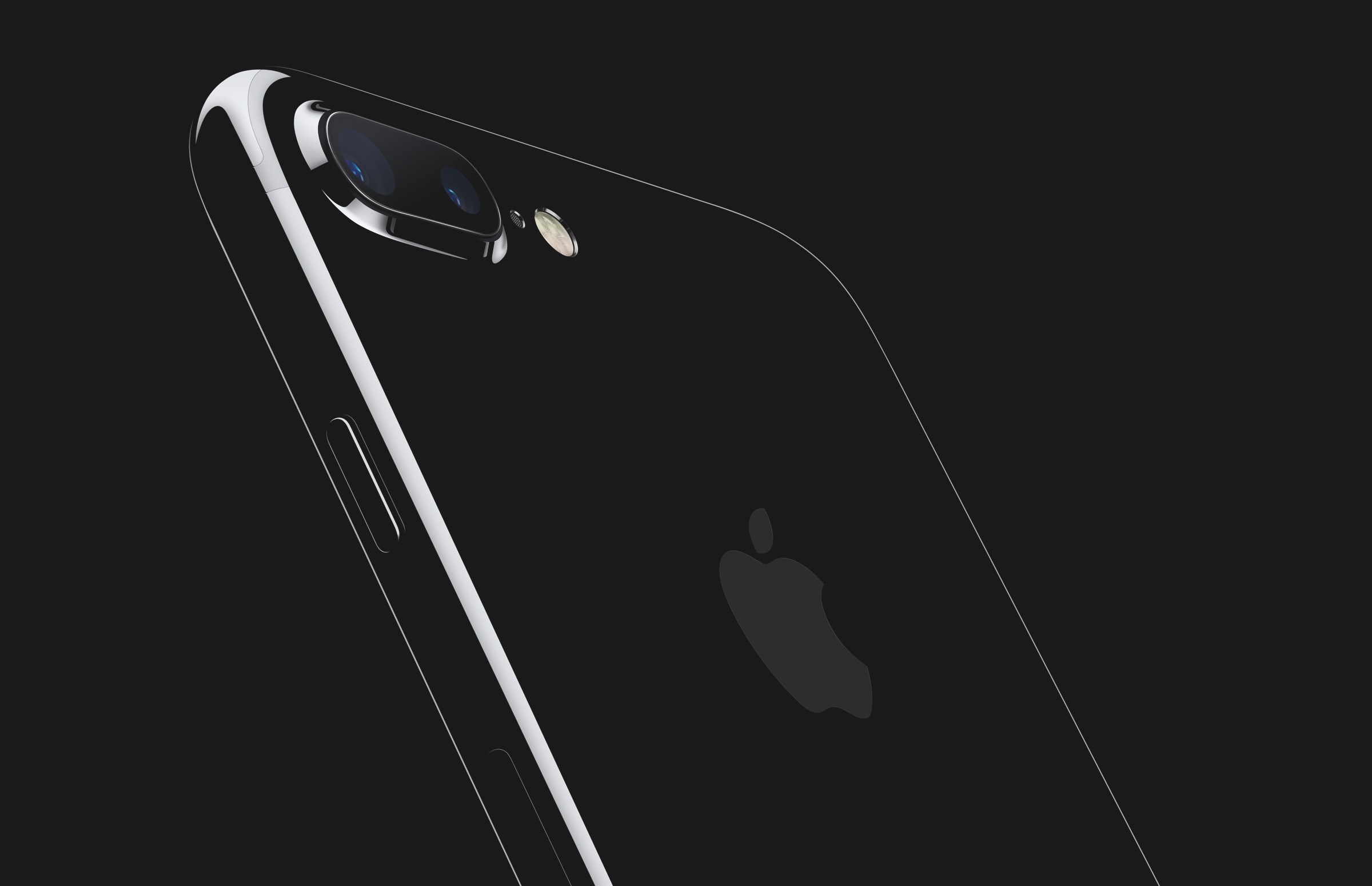
That’s stale? Which product from Apple, ever, looked like that? Which phone from any other company looks like that? I feel bad for a technology enthusiast who isn’t excited by that photograph.
Here’s the genius of the black and (especially) jet black iPhones 7. In a very seductive way, they look like something new and desirable. And at the same time, they are instantly recognizable as iPhones. That is what Manjoo and similar-minded I’m-bored-with-Apple’s-designs pundits don’t get. With a highly successful product and brand, new versions need to strike a balance between familiarity, the foundations of the brand, and hot newness. The bored-with-Apple crowd just wants the hot newness.
You need to recognize a Porsche 911 as a 911. An iPhone needs to look like an iPhone. The design needs to evolve, not transform. The thing to keep in mind is that the iPhone itself, what it looks like in your hand, is the embodiment of the iPhone brand. There is nothing printed on the front face of an iPhone because there doesn’t need to be. The Apple logo is the company’s logo. The iPhone’s logo is the iPhone itself.
It is notable that the iPhone 7 breaks an eight-generation-long pattern of Apple putting out a distinctive new industrial design every other year. I think there are two factors at play. First, whatever design is coming next wasn’t ready yet. Second, after five major form factors (original, 3G, 4, 5, 6), the iPhone has gotten ever closer to its idealized form. Iconic brands don’t zig-zag. They move forward with seemingly inexorable momentum. Their evolutions often feel inevitable, not surprising. Weak brands move like ping-pong balls; strong brands move like bowling balls. A new Rolex needs to look like a Rolex. A Leica needs to look like a Leica. A new Coca-Cola bottle needs to look like a Coca-Cola bottle.
The better the iPhone gets, the longer it’s going to stretch between major new form factor designs. Ben Bajarin, writing at Recode, is on the same page as me:
The key here is that we can expect new colors, materials, or variations to deliver some dramatic new finishes each year. Yet, they remain grounded in high-end or luxury coatings, the way high-end cars strategically span certain colors and materials. The idea that during each buying cycle consumers may be confronted with new types of innovative colors and materials is an interesting idea. Again, it reminds me quite a bit of how car manufacturers use color innovation and new types of materials (carbon fiber, mesh or other types of metals) to add design flair to their cars each year.
Similarly, sports car designs are iconic. You know a Porsche 911 when you see one, no matter what year it was made. I feel similarly about Apple sticking with certain design language, and thus establishing it as iconic. Iconic car designs have slight variations year to year, but never dramatic departures from the iconic look. I feel that Apple is on a similar design path.
Back to Manjoo:
Apple has squandered its once-commanding lead in hardware and software design. Though the new iPhones include several new features, including water resistance and upgraded cameras, they look pretty much the same as the old ones. The new Apple Watch does too. And as competitors have borrowed and even begun to surpass Apple’s best designs, what was iconic about the company’s phones, computers, tablets and other products has come to seem generic.
This is a subjective assessment, and it’s one that Apple rebuts. The company says it does not change its designs just for the sake of change; the current iPhone design, which debuted in 2014, has sold hundreds of millions of units, so why mess with success?
What Manjoo is implicitly advocating here is change for the sake of change. Apple executives have emphasized this point for years: their designs change only when they believe they’ve come up with something better, not merely something different. They’re not going to change because their competitors copy the designs.
Here is a 1968 Rolex Submariner. Here is what the current incarnation looks like. It is one of the most ripped-off designs in watch history and Rolex does not care. (Or perhaps better put: they care, insofar as I’m sure they’d rather not be ripped off in the first place, but they’re not going to let imitators budge them from their own familiar design language.)
From Manjoo’s conclusion:
And while Apple has slowed its design cadence, its rivals have sped up. Last year Samsung remade its lineup of Galaxy smartphones in a new glass-and-metal design that looked practically identical to the iPhone. Then it went further. Over the course of a few months, Samsung put out several design refinements, culminating in the Note 7, a big phone that has been universally praised by critics. With its curved sides and edge-to-edge display, the Note 7 pulls off a neat trick: Though it is physically smaller than Apple’s big phone, it actually has a larger screen. So thanks to clever design, you get more from a smaller thing — exactly the sort of advance we once looked to Apple for.
An important caveat: Samsung’s software is still bloated, and its reputation for overall build quality took a hit when it announced last week that it would recall and replace the Note 7 because of a battery defect that caused spontaneous explosions. To the extent that making a device that doesn’t explode suggests design expertise, Apple is still ahead of Samsung.
The Note 7’s larger display in a smaller form factor is, unquestionably, a design win. But I would call the fact that it’s been recalled (and banned from use on all flights) for exploding batteries more than just a “caveat”. And Manjoo’s claim that “Samsung’s software is still bloated” comes just a few paragraphs after he wrote, “Apple has squandered its once-commanding lead in hardware and software design.” Which is it?
I believe Manjoo is arguing honestly. One of the many advantages of his perch at The New York Times is that he doesn’t need to chase clicks with disingenuous arguments. I also think he represents a large contingent of tech-minded Apple critics. They really are bored by the iPhone 7 design. I just think there has never been a bigger chasm between the desires of these critics and the desires of the hundreds of millions of current and would-be iPhone users. What the critics find boring and stale, the masses find familiar and iconic.
-
Looking at the URL slug for the column, you can see that the original headline used the word “dazzle” in place of “design”. Both words are facile in light of the iPhone 7, but again, I realize that the headline was as likely written by a Times editor as by Manjoo. ↩︎