
By John Gruber

WorkOS MCP: Manage your auth platform from any AI agent.
Brushed Metal and the HIG
Saturday, 16 October 2004
I’ve noticed that there are two entirely different arguments in the Aqua-vs.-Brushed-Metal debate.
The more common, superficial argument is about personal preference. Some prefer the way metal windows look, others hate it, and that’s the argument. You say to-MAY-toe, I say to-MAH-toe.
But the deeper argument against the brushed metal (a.k.a. textured) theme is simply one of consistency. A large part of the Mac’s historical usability advantage is that Mac applications all look and feel the same. Not exactly the same, of course, but certainly within the bounds of a single “theme”. Most consistent would be a single theme; acceptably consistent would be a second theme used only under certain well-defined criteria.
Brushed-metal aficionados often point out that what they like about metal windows isn’t how they look, per se, but rather how they behave, in that you can drag metal windows by clicking in any unused space in the window (as opposed to regular windows, which can only be moved by clicking in the window title bar). But this behavioral difference makes things even less consistent — if it’s a good usability idea, all windows should work like this; otherwise, none should.
Apple’s Human Interface Guidelines ostensibly lay out the rules for when the brushed metal theme is appropriate:
Windows have two distinct looks in Mac OS X. There is the standard default look of windows, as shown in the examples so far. There is also a brushed metal look available, shown in Figure 8-11. You can use a brushed metal window if your application:
Provides an interface for a digital peripheral, such as a camera, or an interface for managing data shared with digital peripherals — iPhoto or iSync, for example
Strives to re-create a familiar physical device — Calculator or DVD Player, for example
Provides a source list to navigate information — for example, iTunes or the Finder
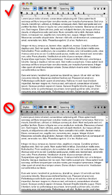
Don’t use the brushed metal look indiscriminately. Although it works well for some types of applications, some applications appear too heavy when using this look. For example, it works well for the iSync application window (see Figure 8-11), but it does not work very well for the TextEdit document window (see Figure 8-12).
Here’s Figure 8-12:
The big problem, obviously, is that Apple has simply ignored the HIG. The HIG states, “Don’t use the brushed metal look indiscriminately”, but indiscriminate is precisely the word to describe Apple’s use of it.
Another problem, however, is that the HIG itself contributes to the conflation of the two arguments — visual appeal vs. consistency. The HIG should be emphasizing the need for consistency, but with its discussion of certain apps appearing “too heavy when using this look”, it validates the notion that developers should just pick the theme that they think looks better.
The release of Safari was a watershed; it’s an app which fits none of the HIG’s criteria for when brushed metal is appropriate. You could perhaps put forth a contorted argument that the “source list” in Safari’s bookmarks view qualifies it, but that’s a real stretch. It’s quite obvious that the one and only reason Safari uses brushed metal is that someone at Apple thinks it looks better that way. (Who the “someone” is doesn’t really matter to me, but most people think it’s Steve Jobs.)
What’s interesting about the above figure from the HIG is that the hypothetical brushed metal TextEdit document window — which is presented as an example of when not to use brushed metal — is pretty much exactly what Safari windows look like.
I dredge this up for two reasons:
The HIG ought to be revised to accurately describe Apple’s de facto policy on the use of the brushed metal theme: that there are suggestions for when to use it, but that it’s ultimately capricious and subject to the whims of the developer. Ideally, the brushed metal theme either wouldn’t exist or would only be used by Apple when certain well-defined criteria — such as those in the current HIG — are met. But that’s not so, and is unlikely to change.
The HIG is only credible if it accurately reflects Apple’s actual policy. If the policy isn’t going to change, then the HIG should.
To those of you who think this state of affairs is just fine, that there’s no problem with Mac OS X providing two disparate themes for developers to choose between based on whim, I ask this: If two themes are OK, why not three or four?
| Previous: | PayPal Outage |
| Next: | Today’s Theme: Themes |