
By John Gruber
-Dark.png)
Mux — Video API
for developers.
Build better video.
Today’s Theme: Themes
Tuesday, 19 October 2004
At the end of Saturday’s “Brushed Metal and the HIG”, I asked:
To those of you who think this state of affairs is just fine, that there’s no problem with Mac OS X providing two disparate themes for developers to choose between based on whim, I ask this: If two themes are OK, why not three or four?
This was sort of a trick question, because arguably, there already are three Mac OS X themes from Apple, and perhaps a fourth on the way in 10.4. (Let’s not even mention the ridiculous woodgrain-and-ebony custom theme used in GarageBand.)
The ‘Pro’ Theme
For lack of an official name, let’s call the third theme Pro, since it’s the look and feel used by Apple in its “Pro” line of media production software: Final Cut, Motion, DVD Studio Pro, and Logic. (Shake seems to use something slightly different, but perhaps that’s because it’s still a recent Apple acquisition.)
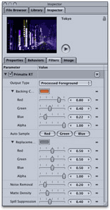
The Pro theme is a sort of graphite-gray sibling to Aqua. Here’s the inspector window from Motion:
And here’s a close-up of DVD Studio Pro:
In some ways, the Pro theme is even more different from the normal Aqua appearance than is brushed metal. Brushed metal is primarily just a look-and-feel for window frames; the controls themselves in a metal window aren’t any different. The Pro theme, however, consists of an entire alternate set of control widgets: lists, buttons, sliders, pop-ups, etc.
Motion even goes so far as to offer yet another set of controls for use in special palette windows which are called “dashboards” (which term is likely to cause confusion when 10.4 ships, with its Dashboard desktop widgetry feature). It’s a Darth-Vaderish sort of thing:
For what it’s worth, I think the Pro theme looks very nice — the overall effect is much more graceful and understated than the brighter, somewhat childish look of both normal Aqua and brushed metal windows. But what that’s worth is very little — as I framed the issue in the last post, my point in bringing all this up is not to argue about which themes look good and which don’t.
The point is consistency. Not usability, not how easy something is to learn, but consistency for its own sake. Nor is it aesthetics. Whether one theme is better-looking than the other is a matter of taste; whether the interface is being used consistently across applications is not. Apple’s apparent desire to assert its Pro line of software as being special by using a custom suite-wide theme comes directly at the expense of system-wide consistency.
Consistency does not imply monotony. There’s plenty of room for creative UI design within the context of the default Aqua theme. Plus, brushed metal and Aqua could conceivable coexist consistently if Apple itself were willing to limit its use of brushed metal to apps that fit specific criteria defined in the HIG. But this Pro theme is even worse, consistency-wise. How would you even begin to codify appropriate use of the Pro theme in the HIG? If your application is a professional production tool, and your company headquarters are at 1 Infinite Loop, Cupertino CA, you may use the Pro theme to provide a special appearance for your application.
This isn’t about using a few custom controls. Obviously, advanced media production and design apps need to offers users the ability to perform tasks that aren’t suited to the standard UI controls provided by the system. Adobe and Macromedia certainly have a number of custom controls in their suites of software. The difference, however, is that Adobe and Macromedia design their custom controls to blend in with the regular look and feel of the system, and when they can use standard controls, they do. Apple’s Pro theme is replacement of the default theme, not a supplement to it.
Unlike brushed metal, the Pro theme is not available to third-party developers. This might help establish a brand for the company’s suite of high-end production software — but at the expense of the brand of the company’s entire platform. Is it not reasonable to conclude that Apple deems Mac OS X’s default appearance not good enough for its own use?
How long until third-party developers start implementing the Pro look and feel on their own? That’s what happened with brushed metal, before Apple officially supported its use in third-party software. Or imagine the chaos if other major developers follow Apple’s lead and start shipping software using their own unique themes?
Tiger’s New Theme
Apple’s fourth theme is something slated to arrive with 10.4. It’s not a secret: you can see it in the screenshots Apple has posted for Spotlight and the updated version of System Prefs. Unlike brushed metal or the Pro theme, however, this new look is so subtle you may not even notice it.
It’s mostly like Aqua, but with certain touches borrowed from brushed metal; particularly the way that window title bars and the toolbar area underneath are combined as a single expanse. And, mercifully, it’s free of pinstripes. In the same way that brushed metal matches the look of PowerBook and PowerMac hardware, this new theme is perhaps intended to evoke the look of iBook and iMac hardware. Here’s a portion of the main System Prefs window from Apple’s preview of 10.4:
But while it may not be a secret, I haven’t seen any official word from Apple about this new look, such as what to call it, or whether it’ll be officially supported for use by third-party developers. I’ve heard from several developers who referred to it as the “unified title bar and toolbar appearance”, which doesn’t exactly roll off the tongue, but it’s certainly an apt description.
I’m not sure what to make of this new theme. My hope is that it’s an attempt by Apple to rectify the current inconsistent mess — that it’s more of an expansion of the standard Aqua theme rather than something altogether new, intended for use instead of brushed metal in situations where, for whatever reasons, the default Aqua appearance is deemed undesirable. And that it will be used consistently for well-defined reasons. (Here’s to hoping that it’s not merely coincidence that the Back/Forward buttons as seen in the above screenshot from System Prefs very much resemble the Back/Forward buttons in Safari.)
My fear, of course, is that it’s just a third window frame, and that the only factor determining when it will be used is whether it looks cool.
Consistency in and of itself has been a fundamental pillar of the Mac user experience from 1984 onward. But with Apple no longer leading the way, it’s fading. “At least it’s still more consistent than Windows” is not high praise.