
By John Gruber

WorkOS MCP: Manage your auth platform from any AI agent.
iPhone Fonts
Friday, 20 July 2007
[Update July 2012: Michael Critz’s iOS Fonts website is a much more up-to-date and comprehensive resource than the below article.]
One regard in which the iPhone’s OS X is clearly just a shallow subset of Mac OS X is in the set of fonts that come installed with the system. Apple made some curious and disappointing decisions here.
It’s true that in most of the apps on the iPhone there aren’t any font choices — everything, both the application UI elements and your data, is rendered, beautifully, in Helvetica.1
But then there’s MobileSafari, which renders whatever font is specified by a page’s CSS style sheet. MobileSafari is limited, however, by the fonts installed on the iPhone.2 Here’s the list:
- American Typewriter
- American Typewriter Condensed
- Arial
- Arial Rounded MT Bold
- Courier New
- Georgia
- Helvetica
- Marker Felt
- Times New Roman
- Trebuchet MS
- Verdana
- Zapfino
Most of these fonts are available in bold and italics; American Typewriter (both regular and condensed), however, has no italics on the iPhone.
To compare this selection to the fonts that are bundled with Mac OS X, I’ve created a web page specifying all of the standard (Latin alphabet) Mac OS X fonts, with a key indicating which are installed on the iPhone:
Table: Fonts From Mac OS X Included With iPhone
I’ve also created a PDF version of the same table, which shows how each of these fonts should render.
The first thing to note about the list of fonts included with the iPhone is that it’s short: a mere 11 typeface families. This is somewhat understandable — every megabyte matters with the iPhone’s relatively limited storage and RAM. Fonts aren’t that big, though; most families weigh in at well under 1 MB. And with a minimum of 4 GB of storage and 128 MB of RAM, the iPhone is roughly equivalent in terms of storage and memory to a Mac OS 8 or 9 system from a decade ago — and those Macs shipped with a much richer selection of fonts.
But worse than that the list is so short is that some of the fonts Apple did include are so ugly.
Courier vs. Courier New
Courier New is a wretched variant of Courier; anemic and spindly. You don’t have to be a type nerd to notice the difference. Here’s how both fonts render at 12 points on Mac OS X 10.4:
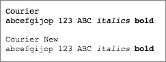
Mac OS X includes both fonts; iPhone, inexplicably, only includes Courier New. If a web page specifies Courier, MobileSafari will substitute Courier New. If Apple’s only going to include one, it ought to be Courier, not Courier New (and MobileSafari should do the substitution the other way around).
Courier New is the only fixed-width font on the iPhone, which means all fixed-width text looks like complete ass.
Helvetica vs. Arial
Helvetica is perhaps the most popular typeface in the world, and is widely acclaimed as one of the best. Arial is a tawdry, inferior knock-off of Helvetica, but which, to the detriment of the world, Microsoft chose to license for Windows simply because it was cheaper. Because Arial is a default Windows font and Helvetica is not, it is ubiquitous. Mark Simonson’s “The Scourge of Arial” is an excellent resource on both Arial’s history and its typographic deficiencies; his accompanying sidebar is an excellent primer on the specific differences between Arial and Helvetica.
Unlike Courier/Courier New, the differences between Helvetica and Arial are, at least to those who aren’t type nerds, subtle. On Mac OS X, non-system fonts can be disabled, so those of us who are offended by Arial can simply turn it off. Most web pages that specify Arial also specify Helvetica as an alternative, so turning Arial off on Mac OS X actually improves the typography of most web pages that specify it.3 No such luck on iPhone, however, where fonts can neither be added nor disabled.
But so if resource constraints are such that Apple sees reason to severely limit the number of fonts installed on the iPhone, why include both Arial and Helvetica? Why not just include Helvetica, and for any web page that specifies Arial, substitute Helvetica? The overwhelming majority of people would never notice, and those who would notice would be delighted.
Other Fonts
Mac OS X ships with a remarkable number of outstanding fonts. My three favorites — in addition to Helvetica — are Futura, Gill Sans, and Hoefler Text. Futura and Gill Sans are two of the finest sans serif typefaces ever designed, and Hoefler Text is a terrific serif text face. A designer stranded on a desert island with nothing but these three fonts could continue to produce a remarkable range of work.
Among the fonts that are included on the iPhone are some obvious standards: Georgia, Times New Roman, and Verdana. Good choices, all.
But Trebuchet? Utter garbage. To include Trebuchet but not Gill Sans or Futura is like choosing Mario Mendoza for the baseball Hall of Fame and omitting both Mickey Mantle and Willie Mays.
My feelings on Marker Felt are well known. American Typewriter is a fine typeface, but somewhat gimmicky (and the absence of italics is, I hope, a mistake). And Zapfino, while serving as a remarkable example of OS X’s advanced typographic features (automatic ligatures, automatic substitution of alternative glyphs), is rather limited in terms of its usefulness — and its advanced typographic features aren’t taken advantage of by WebKit anyway.
Untapped Potential
It isn’t just that Apple has left some great Mac OS X typefaces off the iPhone, but that they would look so good if they were there. The iPhone’s high-resolution 160 pixels-per-inch display combined with OS X’s advanced anti-aliasing produces gorgeous on-screen typography. For the iPhone-less, here’s a photo of my iPhone displaying the aforelinked PDF of the standard Mac OS X fonts.4
Type looks noticeably better on my iPhone than it does on my Mac’s Cinema Display. With smaller, denser pixels, anti-aliasing looks less fuzzy and more like printed type.
It’s a shame this wonderful display is being held back by such a poor selection of installed fonts. Here’s to hoping for some TrueType love in future iPhone software updates.
-
Notes, which uses Marker Felt instead of Helvetica, is a notable exception, but you, the user, still don’t get any choice in the matter — when you use the Notes app, you get Marker Felt or nothing. ↩︎
-
The iPhone itself offers no listing of its installed fonts, but you can determine the list simply by looking at this table using an iPhone and observing which fonts are rendered in the specified typeface. Further, the iPhone Dev Wiki has a listing of the entire iPhone file system, and the included fonts (in /System/Library/Fonts/ and /Library/Fonts/) confirm this list. ↩︎
-
Alas, most CSS style sheets that specify both Arial and Helvetica list Arial first, which means that if both fonts are available, Arial will be used. One reason for this is that while Helvetica is not bundled with Windows, it’s still fairly common, and on many Windows systems it renders horribly in web browsers because it isn’t one of Microsoft’s own specially-hinted-for-the-screen TrueType fonts. Even discerning type nerds would admit that Arial doesn’t look that much worse than Helvetica on Mac OS X, while on Windows, Arial looks far better. ↩︎
-
Looking at the full-size version of this photograph, I believe the iPhone is using sub-pixel anti-aliasing — there’s a red shift on the right side of black lines, and a blue shift on the left. In the parlance of Mac OS X’s Appearance panel in System Prefs, I believe iPhone is using “Medium — best for Flat Panel” rendering. ↩︎
| Previous: | Simple Inbox Archiving Script for Apple Mail |
| Next: | iSuppli |