
By John Gruber

Paper — The connected canvas for teams shipping with agents
The New Twitter (R.I.P. Tweetie)
Thursday, 8 December 2011
Twitter today unveiled a new UI, debuting first in updated versions of its official iPhone, Android, and web clients. Coming soon: an updated version of their iPad app. (No mention of the Mac app — a sign of the times.)
This is more than an update. It’s a serious rethinking of the entire concept of Twitter. The old official Twitter app for the iPhone started life as Tweetie, a third-party app by the talented Loren Brichter. Twitter bought Tweetie and hired Brichter back in April 2010. Until today’s update, Twitter’s iPhone app was very much just a rebranded and updated version of Tweetie.
Not any more.1
Let me state up front that I was a big fan of Tweetie right from the get-go, when it debuted in November 2008. Tweetie was remarkably innovative. It was one of the first Twitter clients that supported loading additional (older) tweets when you reached the end of a list. It’s hard to imagine a Twitter client without that feature today. Brichter invented the pull-to-refresh gesture that’s now used by dozens of iOS apps.2
But more than anything, what I liked about Tweetie was its simplicity and clarity of purpose. If anything, Tweetie offered a better, more clearly-defined presentation of Twitter than even the Twitter.com website itself. Tweetie presented three main things:
- The main timeline, showing the tweets of those people you follow.
- Replies/mentions, showing tweets where you are mentioned or addressed.
- Direct messages, showing private messages in IM-style threaded views.
That’s what Tweetie presented you with, and that, to me, is what Twitter is all about. The app fit my mental model of the service. Three things: what I subscribe to, people mentioning me, and direct messages.
That’s not how everyone views Twitter. Maybe not even most people, I don’t know. There are other excellent Twitter clients that take a different view of the service. As of today, Twitter’s own client does too.
There are four main tabs in the new Twitter apps for iPhone, Android, and the mobile web app:
“Home”, showing the tweets of the people you follow. So far so good. This is just a new and perhaps better name for the main timeline. The birdhouse icon is delightful, just right.
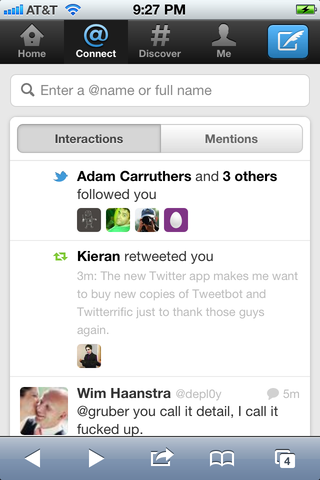
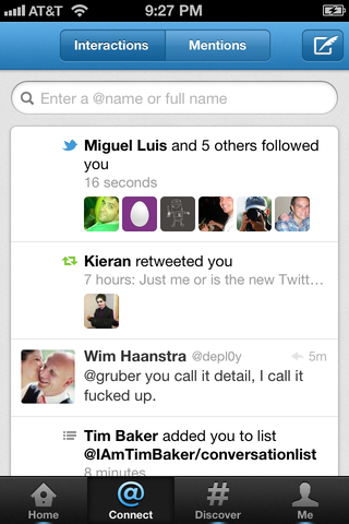
“Connect”, which leads to a second tab bar: “Interactions” and “Mentions”. So what was previously just mentions is now two things: mentions and interactions. Interactions are your mentions plus events like when people start following you, or favorite or retweet one of your tweets. This is not terrible, per se, but it adds complexity. A tab view within a tab view is often a bad sign — a second level of hierarchy makes things at least twice as complex. Interactions and Mentions aren’t two different things — the Interactions view includes your mentions. It’s more like Mentions Plus Other Events vs. Mentions Only. Instead of two different views, this should simply be an On/Off setting: “Show interactions with mentions”, with a small-print description of the sort of events that will be included.
And the Mentions tab is slightly worse on the iPhone app than on the mobile web app. Here’s a screenshot of the Connect view on the mobile web app; here’s the same view from the iPhone app. At least in the mobile version (and I presume, the Android version, which also puts the main tab bar at the top) the hierarchy is clear: “Interactions/Mentions” is obviously a sub-view of the main tab bar. But in the iPhone version, there’s no visual indication as to which tab bar is a sub-view of the other.
Why is this section called “Connect” anyway? What is getting connected here? That it was (apparently) hard to come up with a name for the parent tab of the Interactions/Mentions view is another sign that this was not an improvement over the simplicity and obviousness of the old just plain Mentions tab.
“Discover”. Uh-oh. Gone are direct messages as a standalone top-level tab. Replacing them is Discover, with a “#” as the icon. What is this? I see, in order, “Stories” I don’t care about, “Trends” I don’t care about, and suggestions for people to follow. I have no interest in anything in this tab other than, perhaps, the suggestions for people to follow, but that certainly isn’t a feature that deserves one of only four top-level tabs in the app. As we move from left to right in these tabs, we see the former clarity and simplicity of Tweetie devolve into complication and conceptual mushiness.
Presumably, this Discover tab is the successor to the late and unlamented dickbar — where sponsors will be able to pay Twitter to promote products and services.
“Me”. Oh boy. Stashed into this tab are your profile, your direct messages, your Twitter Lists, and the interface for switching to other Twitter accounts. This tab is the conceptual carpet under which Twitter swept everything that didn’t fit under “Home”, “Connect”, or “Discover”.
This new treatment of multiple accounts deserves attention. In Tweetie, there was a left-to-right column-view hierarchical layout, a design pattern used throughout iOS. Consider Mail, left-to-right: list of accounts, list of mailboxes in an account, list of messages in a mailbox, an individual message. If you only have one email account, Mail is smart enough to omit the list of the accounts from the hierarchy.
Tweetie followed this same pattern. Left-most, a list of the Twitter accounts you’d set up within the app. To the right, a list of tweets for an account. If you only configured one account — common for most Twitter users, surely — Tweetie omitted the list of accounts. But if you did configure multiple accounts, the interface for switching was spatial: go back to the left, using a button at the top left corner of the screen.
Now, to switch accounts in the new Twitter app, you go to the rightmost tab at the bottom — bottom right instead of top left, which in and of itself I find disorienting. Then scroll down to “Switch accounts”, which, when tapped, flips the screen — the animation you get in widget apps like Weather or Stocks when you tap the “i” button to configure them. The concept here is that the “front” face of the app is where you use a Twitter account, and the “back” face is a list of accounts you can switch to. That’s not completely broken conceptually, but it seems unnatural on iOS.
If you frequently use direct messages and/or multiple accounts, I don’t see how you can view this new Twitter app as anything but a step back. There are gestural shortcuts for accessing these things: swipe left on the Me tab bar button to jump to the account switcher (the direction of the gesture corresponds to the direction of the flip as the screen spins to show you the “back”), swipe up on the Me button to jump to direct messages (this too, corresponds to the direction of the animation — the direct message view comes up from the bottom of the screen). But it’s wrong to need to know gestural shortcuts to access frequently-used features. Gestural shortcuts are like keyboard shortcuts — a nice convenience for power users, but not something that you should need to know merely to feel efficient within the app.3
The grab-bag nature of the Me tab isn’t wholly out of place on the iPhone. It’s a common design for apps with a tab bar at the bottom, but which offer more features than the iPhone has room for tabs. The standard design is to put a “More” tab at the bottom right, with a “...” icon, which shows a list of less-frequently used items. And there should be an edit button that allows you to drag-and-drop items to decide which ones are stashed away in More and which get the permanent spots on the toolbar itself. See the Music app (née iPod) for a canonical example.
The problem here isn’t necessarily that they’ve stashed direct messages within the Me tab and given a new feature, Discover, its former spot on the tab bar. It’s that you can’t change it back, if, say, you frequently use direct messages and never use Discover.
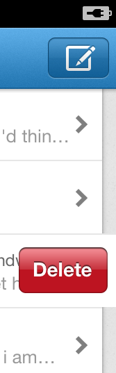
There are all sorts of little fit-and-finish problems. Swipe to delete a DM conversation and the red Delete button draws with a clipping error over the background gutter. Swipe to delete an individual direct message and it’s even worse. Go to Me → Settings → Advanced, then click the back button to go back to Settings. The “Done” button in the top left corner jitters around nervously before settling into place.
Tweetie was an iPhone app. It was an attempt to do Twitter as best as it could be done on the iPhone (and iPad for that matter). It wasn’t for everyone. There were (and are) other ways to do Twitter in an iPhone-optimized way.
But this, today’s new Twitter, is something else. It’s an attempt at a best way to do Twitter that is as consistent as possible across multiple platforms, ranging from the iPhone to Android to the mobile and desktop web. I don’t want an iPhone app that’s constrained by the restrictions of a mobile web app. The whole reason I prefer native apps is that I like experiences that far exceed what can be done in a web app. This is a native app that looks and feels like it was designed and polished according to the norms of web apps, not other native iPhone apps.
So, bottom line, I don’t care for the new Twitter app much at all. But I switched to Tweetbot on my iPhone months ago. And I stopped using the Twitter website for much of anything years ago. Native Twitter clients, all the way. So I’m not angry, or even aggrieved. I am, though, a little sad — and more than a little worried.
Sad, because Tweetie was truly a great app, and today’s Twitter is no Tweetie. I wouldn’t hesitate to hold Tweetie up as one of the best iPhone apps ever made, period. It was every bit as polished and clever — if not more so — than Apple’s own apps. No app is perfect, no app will please everyone, but Tweetie came damn close.
Worried, because the flip side of the disintegrating quality of Twitter’s official client software is their growing ambivalence toward third-party clients. Everything’s going to be just fine so long as great apps like Tweetbot, Tweetlogix, Twitterrific, Echofon and so forth are able to serve as unhindered Twitter clients. The question is how long that will be.
What also worries me is that these changes suggest not only a difference in opinion regarding how a Twitter client should work, but also regarding just what the point is of Twitter as a service. The Twitter service I signed up for is one where people tweet 140-character posts, you follow those people whose tweets you tend to enjoy, and that’s it. The Twitter service this new UI presents is about a whole lot more — mass-market spoonfed “trending topics” and sponsored content. It’s trying to make Twitter work for people who don’t see the appeal of what Twitter was supposed to be. It all makes sense if you think of the label under the “#” tab as reading “Dickbar” instead of “Discover”.
Twitter 4.0 for iPhone lacks the surprise, delight, and attention to detail of a deserving successor to Tweetie, offering instead a least common denominator experience that no one deserves.
-
Worth noting: Loren Brichter’s last day working at Twitter was last month. ↩︎
-
Who do we bribe at Apple to get pull-to-refresh into Mail? ↩︎
-
Speaking of gestures, the new Twitter app has gotten rid of one of the best gestural shortcuts I’ve ever seen. In Tweetie, Brichter had a gestural shortcut that allowed you jump back to the root of a deeply nested series of screens. Let’s say you were in your main timeline, and you tapped on a tweet. Now you’re one screen to the right, on a tweet detail. Then, within that tweet, you tap a @username. One more screen to the right, on that user’s profile page. Then you decide to view a list of that user’s previous tweets — another screen to the right. And then you tap on a URL within one of those tweets to read a linked web page. One more screen to the right. Now, at this point, if you want to go all the way back to your main timeline, you’d need to tap a series of back buttons in the top left corner. Back back back back back back back (with apologies to Chris Berman). Brichter’s shortcut allowed you to swipe on any of those back buttons to jump all the way back to the beginning. So you could go as many levels deep as you wanted and you’d be just one swipe away from going all the way back.
That shortcut is gone now. ↩︎
| Previous: | Rootkit, Eh? |
| Next: | Merry |