
By John Gruber

WorkOS MCP: Manage your auth platform from any AI agent.
Special
Wednesday, 29 January 2014
Amidst all the well-deserved accolades celebrating the 30th anniversary of the original Macintosh, what has struck me is how very Apple that product — and the team that made it — was.
For one thing, they sweated the details. The greatest testimony to their genius is just how much of that original design is recognizable in today’s Mac OS X 10.9. A Mac user from 1984 could sit down in front of an iMac or MacBook today and recognize it as a successor to that original machine. That’s simply amazing.
Even more amazing is that some things haven’t changed at all. File, Edit, and View menus to start the Finder menu bar — the same today as in System 1 in 1984.
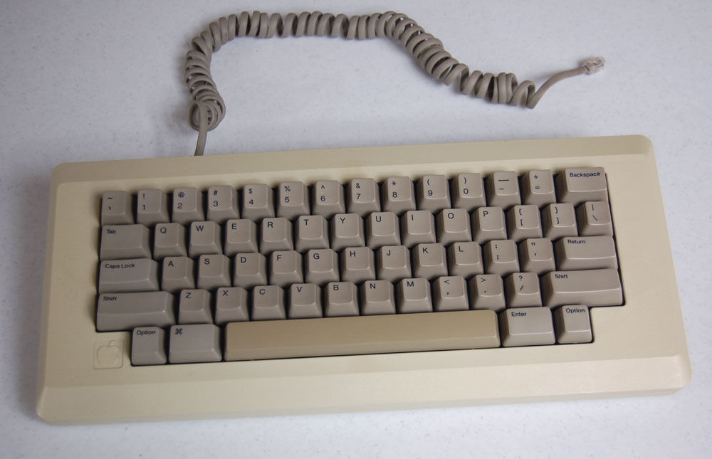
Now consider keyboard shortcuts. The basic idea behind keyboard shortcuts on the Mac was and remains that you hold down the Command key, then press a letter key. And the letter keys should, ideally, correspond mnemonically to the menu command they represent — and for common operations, the shortcuts should be standard system-wide, across all applications.1 So: ⌘S for Save, ⌘P for Print, ⌘Q for Quit. But then what about Select All? ⌘S was already taken, so: ⌘A, emphasizing the All rather than the Select. ⌘D for Duplicate, ⌘B/I/U for Bold/Italic/Underline, respectively. And so forth.
Which brings us to the Edit menu, and its first four items: Undo, Cut, Copy, Paste. All four items posed problems for choosing a standard keyboard shortcut. ⌘U could not be used for both Underline and Undo; likewise for ⌘C for Cut and Copy. And ⌘P could not be used for Paste because it was already used by Print.
So instead, the Mac’s designers looked at the keyboard itself, and considered the importance of these four commands and how frequently they’d be used (along with how frequently they’d be used in tandem). They assigned the commands to the four letters above the Command key. (And I do mean the Command key, as originally there was only one, to the left of the space bar.)
So Copy was awarded the mnemonic ⌘C, and Cut the sort-of-mnemonic ⌘X, but Undo and Paste were assigned the semantically meaningless but ergonomically convenient shortcuts ⌘Z and ⌘V. Not only was the idea of Undo a novel invention, the Mac team found a shortcut to invoke it that was as easy to type as possible. And what is the most common thing to do after copying? Pasting. So what could be a better shortcut for Paste, ergonomically, than the key right next to the one for Copy? You remember these shortcuts not by letter, but by physical position.
Even these four commands’ order in the Edit menu corresponded to their shortcuts’ order on the keyboard: Undo, Cut, Copy, Paste — Z, X, C, V. Simply brilliant. Every one of these design decisions has persisted through today.
The second aspect of the original Mac that stands out today as Apple-like is putting just enough whimsy into the experience. Most famously, the smiling Mac you saw as the system booted. Had anyone prior even considered a smiling computer? But fundamental to the genius of the smiling Mac is that it didn’t come across as silly or corny. Friendly and fun: yes. Goofy: no. Getting that right required that most Apple-y of talents: taste.2
Which brings me to one of my favorite details in the original Mac, one which persisted through Mac OS 9: the Finder’s Special menu. The File menu was for commands pertaining to files. Edit for editing. View for view options. All commands neatly organized into three simple, obvious menus.
But there were a few commands left over: Clean Up, Empty Trash, Erase Disk, and Set Startup. (Clean Up tidied the icons in the current view, and eventually moved to the View menu, where it remains today. Set Startup allowed you to change the startup disk, and was replaced by the Startup Disk control panel in 1988’s System 6.) But so what to call this menu? “Miscellaneous” is the obvious choice, semantically, but that’s long and a little ugly, aesthetically. (Andy Hertzfeld has a screenshot on his wonderful Folklore website of a 1981 demo app made by Bud Tribble with a “Misc” menu — an abbreviation which solved the length problem but would have felt sloppily casual in shipping software.) “Other” is the only… other straightforward word I can think of for this menu, and it would have felt somehow off-putting.
“Special” was a stroke of genius. Two of its four items were dangerous (and Empty Trash, originally, didn’t prompt for confirmation), and “Special” seems like as friendly a way as possible to cue the user to be a little careful in this menu. But more than serving as an apt categorization of the menu items it contained, “Special” served a higher purpose — an apt description of the Macintosh in its entirety.
File Edit View Special
When I see those four words, they evoke not a thought but a feeling. Poetry, in the form of a menu bar.
-
It’s hard to remember this, but prior to the Mac, there was no consistency between disparate applications. The way you saved files in program A was nothing like how you saved files in program B. It’s impossible to overstate how enlightened and revolutionary the Mac’s emphasis on system-wide consistency was. ↩︎
-
Think about the jiggle animation of apps on the iOS homescreen; that’s the modern-day Apple’s sense of whimsy at work. The radical visual overhaul of iOS 7, I think, was largely driven by a sense that iOS 6, with its skeuomorphic textures, had veered too far over the line, past merely fun and into the territory of silly. But there’s a strong case to be made that the course correction was too far in the opposite direction, and as a result, iOS 7 is perhaps the least whimsical — least fun — system that Apple has produced since 1984. More than any specific critiques regarding icons or button shapes and borders, it’s the depletion of whimsy in general that sits at the heart of the mixed reaction that greeted iOS 7. ↩︎