<?xml version="1.0" encoding="utf-8"?>
<feed xmlns="http://www.w3.org/2005/Atom">
<title>Daring Fireball (Articles)</title>
<subtitle>Mac and web curmudgeonry/nerdery. By John Gruber.</subtitle>
<link rel="alternate" type="text/html" href="http://daringfireball.net/" />
<link rel="self" type="application/atom+xml" href="http://daringfireball.net/feeds/articles" />
<id>http://daringfireball.net/feeds/articles</id>

<updated>2026-09-09T01:12:24Z</updated><rights>Copyright © 2026, John Gruber</rights><entry>
    <title>The iPhone Air and iPhone 17 Pro</title>
    <link rel="alternate" type="text/html" href="https://daringfireball.net/2026/09/the_iphone_air_and_iphone_17_pro" />
	<link rel="shorturl" href="http://df4.us/xjn" />
	<id>tag:daringfireball.net,2026://1.43475</id>
	<published>2026-09-09T00:55:53Z</published>
	<updated>2026-09-09T01:12:24Z</updated>
	<author>
		<name>John Gruber</name>
		<uri>http://daringfireball.net/</uri>
	</author>
	<summary type="text">One year later and it feels like both the iPhone 17 Pro and iPhone Air could be announced tomorrow, not a year ago, and would seem fresh and exciting.</summary>
	<content type="html" xml:base="https://daringfireball.net/" xml:lang="en"><![CDATA[
<p>Last year, an unplanned personal hiatus coincided with the time when I should have been reviewing the then-new iPhones 17 and iPhone Air. <a href="https://daringfireball.net/2025/09/personal_note">In my brief note</a> explaining my absence, I wrote:</p>

<blockquote>
  <p>I look forward to getting back to writing very soon. I can feel
it: I will be back soon. I’m itching to go. I mean, jiminy, it’s
new iPhones week. But it’ll be a few more days before I get those
reviews out.</p>
</blockquote>

<p>354 days is arguably more than a few, but given that I missed the window for reviewing them when they were new, I thought it might be interesting to consider the iPhone 17 Pro and iPhone Air on the cusp of their being obviated by the next generation of iPhones.</p>

<h2>The iPhone Air</h2>

<p>The iPhone Air is the <em>nicest</em> phone Apple has ever made, and probably the nicest device Apple has ever made, period. It’s just so goddamn nice. Over the years, Apple has gone back and forth with its treatment of the metal side rails on iPhone hardware: some years polished like jewelry, other years, matte like a tool. The iPhone Air is polished, and the effect is luxe. (And it stands in contrast to the matte iPhones 17 Pro.)</p>

<p>The whole point of the device is that it is absurdly thin. A year later, it still feels remarkably thin and light in hand — and, even better, thin and light <em>in pocket</em>. It is delightful to hold and carry. The screen is terrific. The buttons are perfect: they stick out just enough and have just the right clickiness.</p>

<p>The big concern most people have regarding the Air is battery life. I used my Air review unit extensively and battery life was never once a problem. Yes, battery life is shorter than with other iPhone models, but it’s more than long enough. When you know you might need to top it off, you just do it here and there throughout the day. I not only never once ran out of battery by the end of the day with the Air, I never once came all that close. It’s fine.<sup id="fnr1-2026-09-08"><a href="#fn1-2026-09-08">1</a></sup> I mean, if you’re the sort of person who struggles to get through the day battery-life-wise with a regular (thicker) iPhone, the iPhone Air obviously isn’t for you. But that’s <em>really</em> obvious.</p>

<p><em>My</em> biggest concern going into it was the camera system. The iPhone Air has only a single rear-facing camera, with non-interpolated 1× and 2× zoom factors.<sup id="fnr2-2026-09-08"><a href="#fn2-2026-09-08">2</a></sup> In practice, yes, sometimes while carrying the Air I regretted not having either the ultra wide 0.5× lens or telephoto lens, both of which I’m accustomed to having at my disposal. But ultimately I didn’t miss either of those lenses enough that I regretted having the Air in my pocket that day. And conversely, there’s something mentally freeing about having just one lens. There’s no question which lens you should use. <a href="https://www.mpb.com/en-us/content/tips-and-techniques/zooming-with-your-feet-or-how-i-learned-to-understand-focal-length-distance-and-perspective">Zoom with your feet</a>.</p>

<p>And the one lens the iPhone Air has is excellent. It’s not quite as good as the main 1×/2× lens on the Pro models, but it’s much closer to the Pro models in image quality than it is to the single-lens iPhone 17e. (But even the 17e <a href="https://daringfireball.net/2026/03/the_iphone_17e">is a damn good camera for a phone</a>.) One thing you miss by not having a 0.5× ultra wide lens is a true macro mode. But because it uses a slightly smaller sensor, the camera on the iPhone Air has a closer minimum focus distance than the iPhone 17 Pro’s main camera (15 cm vs. 20 cm — those 5 cm often make a big difference). I like the iPhone Air camera so much that it didn’t factor all that much into my decision whether to buy one to use as my personal iPhone for the last year. It’s that good.</p>

<p>But I did not buy one to use as my personal iPhone for the last year. I bought an iPhone 17 Pro. The reason is size.</p>

<p>The iPhone 17 Pro comes in two sizes: regular and Max. I find the Max sizes too big — unpleasant to hold, unpleasant to pocket. The iPhone Air comes in only one size — a sort of one-size-fits-all midway point between the regular iPhone models and Max models.</p>

<p><table class="table-BD81DA9A-8BB8-41EE-A176-9F781C68AAFB" width=425>
<style>
.table-BD81DA9A-8BB8-41EE-A176-9F781C68AAFB th:nth-child(1) { text-align: left }
.table-BD81DA9A-8BB8-41EE-A176-9F781C68AAFB td:nth-child(1) { text-align: left }
.table-BD81DA9A-8BB8-41EE-A176-9F781C68AAFB th:nth-child(2) { text-align: center }
.table-BD81DA9A-8BB8-41EE-A176-9F781C68AAFB td:nth-child(2) { text-align: center }
.table-BD81DA9A-8BB8-41EE-A176-9F781C68AAFB th:nth-child(3) { text-align: center }
.table-BD81DA9A-8BB8-41EE-A176-9F781C68AAFB td:nth-child(3) { text-align: center }
.table-BD81DA9A-8BB8-41EE-A176-9F781C68AAFB th:nth-child(4) { text-align: center }
.table-BD81DA9A-8BB8-41EE-A176-9F781C68AAFB td:nth-child(4) { text-align: center }
.table-BD81DA9A-8BB8-41EE-A176-9F781C68AAFB th:nth-child(5) { text-align: center }
.table-BD81DA9A-8BB8-41EE-A176-9F781C68AAFB td:nth-child(5) { text-align: center }
</style>
<thead>
<th></th><th>Width</th><th>Height</th><th>Thickness</th><th>Weight</th>
</thead>
<tbody>
<tr>
<td>iPhone 17 Pro Max</td><td>78mm</td><td>163mm</td><td>8.75mm</td><td>233g</td>
</tr>
<tr>
<td>iPhone Air</td><td>75mm</td><td>156mm</td><td>5.64mm</td><td>165g</td>
</tr>
<tr>
<td>iPhone 17 Pro</td><td>72mm</td><td>150mm</td><td>8.75mm</td><td>206g</td>
</tr>
</tbody>
</table></p>

<p>Width- and height-wise, the Air is pretty much halfway between the Pro and Pro Max. For me, in practice, the factor that really matters is width — and I find the Air too wide. Just holding the phones as objects to admire, the dramatic thinness and lighter weight make the iPhone Air the nicest, by far. But holding them to actually <em>use</em>, I find the Air feels too wide. Specifically, too wide to use with one hand, gripping it with my palm and fingers and swiping and tapping with my thumb. If I had my druthers, the <em>regular</em>-sized iPhones would be slightly smaller, footprint-wise. The regular iPhone 17 Pro is pretty much as wide as can be for me to use it one-handed. The Air is too wide for that — it’s a two-handed device for me. And that was the dealbreaker.<sup id="fnr3-2026-09-08"><a href="#fn3-2026-09-08">3</a></sup> I use my iPhone one-handed frequently, often while walking around the city carrying a bag or beverage in my other hand.</p>

<p>If the iPhone Air came in two sizes, regular and Max, corresponding to the widths and heights of the two Pro sizes, I would have bought the regular-sized Air model and, I’m convinced, been delighted with it for the past year. But the iPhone Air only comes in one size, and that size is too wide for my taste, and in practical use, that factor overrides everything I love about the Air.</p>

<p>If you use your iPhone two-handed almost exclusively — perhaps because you find even the regular-sized models too wide to use one-handed — there’s a good chance you’d be happier with the Air than whatever model you’re currently carrying. It’s so goddamn nice.</p>

<h2>The iPhone 17 Pro</h2>

<p>The iPhone 17 Pro is the <em>best</em> phone Apple has ever made, and perhaps the best device Apple has ever made, period.</p>

<p>After two years of titanium side rails and full-glass backs 
(the 15/16 Pro generations), the 17 Pro went back to aluminum, and the metal is now more of an entire frame for the device than just a side rail. There remains a matte glass panel on the back, but only for the bottom three-quarters or so, underneath the camera plateau. (Inductive MagSafe/Qi charging doesn’t work through metal.) The camera plateau is now aluminum, and, most noticeably, extends across the full width of the device, even though the three camera lenses (0.5×, 1×/2×, 4×/8×) remain in a triangle arrangement in the corner.</p>

<p>This new full-width plateau is a winning design. I think it looks good, but more importantly, feels great. It looks more balanced and feels more balanced too. It still wobbles when placed on a table, but it wobbles less. The camera capabilities, to me, are <em>the</em> defining aspect of the Pro models. It thus feels correct for them to be so physically prominent on the devices.</p>

<p>The iPhone 17 Pro was offered in three colors: cosmic orange, deep blue, and silver. All three colors are excellent, and each of them tempted me to some extent. I’m not sure why silver didn’t get an adjective — it’s a very nice colorway. But cosmic orange is the eyecatcher. For <em>years</em>, Apple has been releasing non-pro iPhones in fun colors, and Pro iPhones only in no-fun (or at best low-fun) colors. It really seemed like a mystery why Apple never released an iPhone Pro model in a vibrant fun color. Now that they finally did it, it seems like even more of a mystery why it took them so long — anecdotally, cosmic orange has been an <em>incredibly</em> popular choice. I see orange iPhone 17 Pros in use every day, often in clear cases to show off the color.</p>

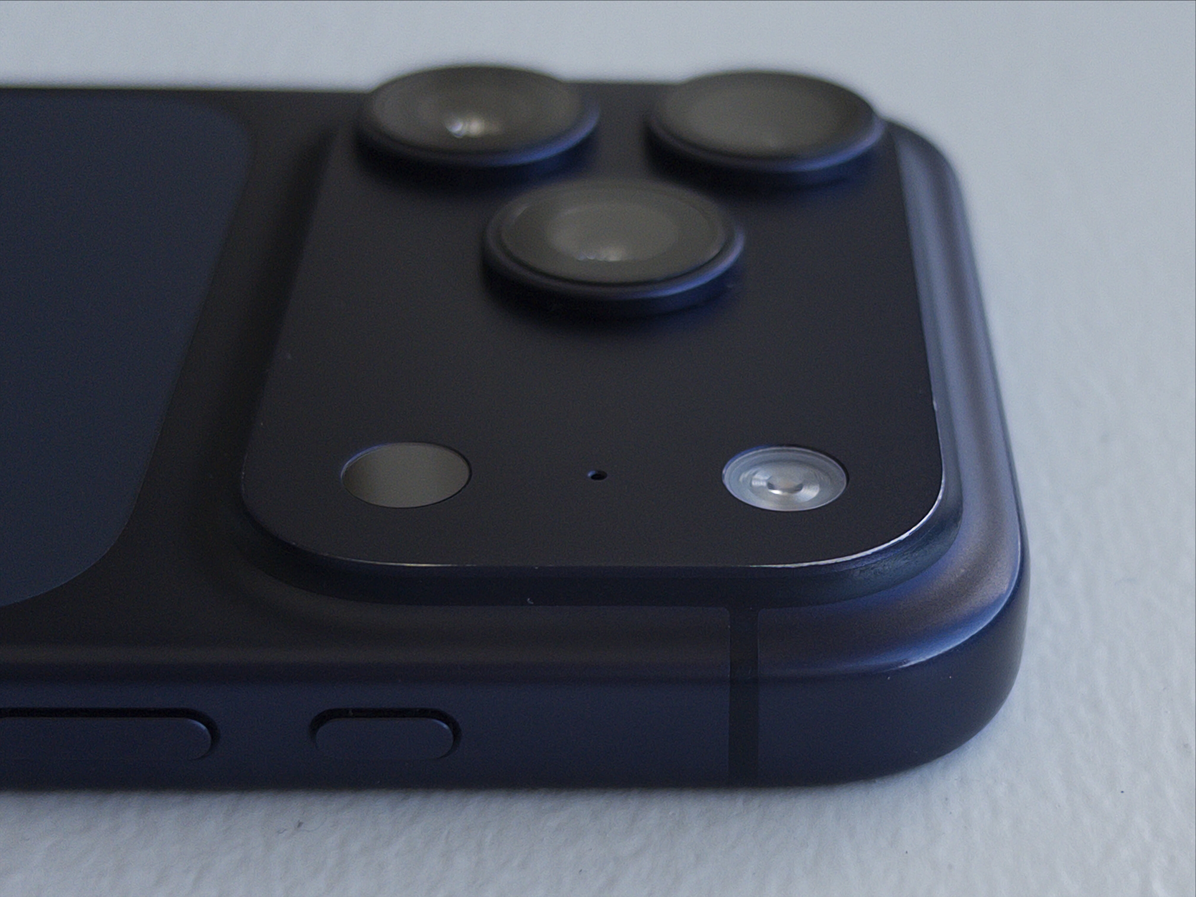
<p>My personal rule has been to always buy black, or the nearest to black offered. Deep blue isn’t all that near to black, but it was the nearest, so that’s what I bought. I wouldn’t call it fun but I liked it when I bought it and I’m not tired of it now, nearly a year later. It’s a serious blue. After 10+ months of near-daily use, the anodization is beginning to wear away at the top corner of my iPhone’s camera plateau, where there’s a bit of a sharp corner. I find this to be a charming patina, not a flaw, and looking at that wear increases my affection for this little guy.</p>

<p><a href="https://daringfireball.net/misc/2026/09/iphone-17-pro-deep-blue-one-year.jpeg" class="noborder">
  <img
    src = "https://daringfireball.net/misc/2026/09/iphone-17-pro-deep-blue-one-year.jpeg"
    alt = "My deep blue iPhone 17 Pro, showing the worn anodization at the corner of the camera plateau."
    width = 525
  /></a></p>

<p>(<em>Photo taken with the iPhone Air, using <a href="https://halide.cam/">Halide Mark III</a>.</em>)</p>

<p>I’ve shot (and kept) 5,365 photos and 97 videos with the iPhone 17 Pro. (Perhaps I should shoot more videos.) The iPhone camera has long been the best camera in the sense of “<em>The best camera is the one you have with you</em>.” With each successive year, they come closer and closer to being the best camera I’ve ever owned, period. It’s really quite remarkable how good a camera it is.</p>

<p>Battery life has been excellent. I charge to 100 percent every night while I sleep, and never worry about it during the day. Very seldom is the battery under 25 percent by the end of the day. According to the statistics in Settings → Battery → Battery Health, maximum battery capacity remains at 96 percent after 230 cycles. That seems pretty good.</p>

<p>Durability has been terrific as well. <a href="https://daringfireball.net/linked/2026/08/13/ceramic-shield-2-is-the-real-deal">I mentioned a month ago</a> that Apple’s “Ceramic Shield 2” process seems to be the real deal. Even under close inspection, there’s seemingly not a single micro abrasion on the front glass. I used a <a href="https://nomadgoods.com/products/magnetic-leather-back-rustic-brown-horween-iphone-17-pro">Nomad leather back</a> during the very coldest weeks of the east coast winter, but otherwise have never used a case. Despite near-daily use for 10-ish months, it’s in near-mint condition. I’ve also found that it’s about as grippy as one could hope in most weather conditions, the frigid cold being the one exception.</p>

<p>Dust and fuzz accumulates in the USB-C port — just like every phone with a USB port. I clean it out every few months. Some sort of crud also accumulates in the very thin, easily overlooked slit for the speaker at the top of the display. That requires something like a pin or needle to clean. I don’t know what that crud is and I don’t want to know. I also don’t know what Apple could do about this crud accumulation, but I need to reach deep to find anything at all to complain about regarding this iPhone. I look forward to a future hermetically sealed iPhone which has no crevices in which to accumulate crud.</p>

<p>One year later and it feels like both the iPhone 17 Pro and iPhone Air could be announced tomorrow, not a year ago, and would seem fresh and exciting.</p>

<div class="footnotes">
<hr />
<ol>
<li id="fn1-2026-09-08">
<p>Apple also created a battery pack exclusively for the Air: the <a href="https://www.apple.com/shop/product/mgpg4am/a/iphone-air-magsafe-battery">$100</a> <a href="https://support.apple.com/en-us/125312">iPhone Air MagSafe Battery</a>. Like Apple’s late great Lightning <a href="https://support.apple.com/en-us/111857">MagSafe Battery Pack</a>, the Air MagSafe Battery is a much better product than any third-party battery pack I’ve ever tried, and I’ve tried an embarrassing number of them. It sticks better magnetically, and there’s software integration with iOS that shows the battery pack’s remaining power when you first connect it, and in the Battery widget. iOS also seems smarter about when to draw power from it, making it last longer. It’s a no-brainer recommendation for anyone who buys an iPhone Air. You won’t need it most days, but on the days when you need it, it’s perfect. </p>

<p>My only gripe about the iPhone Air MagSafe Battery remains the same <a href="https://daringfireball.net/linked/2025/09/09/moren-awe-dropping-details">from the day it was announced last year</a>: it has “Air” in the name because it’s designed exclusively for the iPhone Air. Apple’s old Lightning MagSafe Battery Pack was designed to fit <em>any</em> iPhone. (In fact, it debuted in 2020 alongside <a href="https://daringfireball.net/2020/11/the_iphone_12_mini_and_iphone_12_pro_max">the iPhone 12 Mini</a>, an iPhone that actually needed help getting through the day on a single charge.) The old Lightning battery pack remains so good that I continue to use mine (I own two) instead of the numerous third-party ones I’ve blown money on in the intervening years. The old Lightning ones don’t pack much of a punch, juice-wise — particularly because they’re now several years old — but no matter how much I use my iPhone, it’s always enough to extend me through the day. (The key is not to start using it until your iPhone drops under 30 percent — it takes less energy to recharge a mostly depleted battery.) I continue using them because they stick to the back of the iPhone so strongly, and, once attached, are so comfortable. It’s the last Lightning device I actively use, but unless Apple comes out with a proper USB-C replacement that works on iPhones other than the Air, I don’t foresee retiring mine until they’re completely shot.&nbsp;<a href="#fnr1-2026-09-08"  class="footnoteBackLink"  title="Jump back to footnote 1 in the text.">&#x21A9;&#xFE0E;</a></p>
</li>

<li id="fn2-2026-09-08">
<p>The front-facing camera on the iPhone Air is <a href="https://www.macrumors.com/how-to/iphone-17-use-center-stage-front-camera/">the new (for 2025) Center Stage camera</a>. It’s exactly the same front-facing camera as the iPhone 17 Pro and non-pro models, and uses a square sensor with a wider field of view.&nbsp;<a href="#fnr2-2026-09-08"  class="footnoteBackLink"  title="Jump back to footnote 2 in the text.">&#x21A9;&#xFE0E;︎</a></p>
</li>

<li id="fn3-2026-09-08">
<p>This, of course, makes me wonder about the one-handed usability of the passport-sized foldable iPhone that Apple is expected to unveil tomorrow.&nbsp;<a href="#fnr3-2026-09-08"  class="footnoteBackLink"  title="Jump back to footnote 3 in the text.">&#x21A9;&#xFE0E;︎</a></p>
</li>

</ol>
</div>

    ]]></content>
  </entry><entry>
    <title>SuperDuper 4</title>
    <link rel="alternate" type="text/html" href="https://daringfireball.net/2026/09/superduper_4" />
	<link rel="shorturl" href="http://df4.us/xjl" />
	<id>tag:daringfireball.net,2026://1.43473</id>
	<published>2026-09-08T14:55:20Z</published>
	<updated>2026-09-08T14:55:22Z</updated>
	<author>
		<name>John Gruber</name>
		<uri>http://daringfireball.net/</uri>
	</author>
	<summary type="text">SuperDuper feels like impossibly good software.</summary>
	<content type="html" xml:base="https://daringfireball.net/" xml:lang="en"><![CDATA[
<p>I have mentioned and recommended <a href="https://www.shirt-pocket.com/superduper4.php">Shirt Pocket’s Mac backup app SuperDuper</a> quite <a href="https://daringfireball.net/search/super+duper">a few times</a> over the years, and for good reason: it performs very important functions very well. Version 4, which shipped just over a month ago, is an extraordinary update to an extraordinary app.</p>

<p>Visually, the interface is all new. That took some getting used to, but not much. It didn’t take long for me to see how the new UI is better in every way. The style of presentation is new and modern, but the core idea remains the same: the interface of SuperDuper is self-explanatory. It explains what, exactly, is going to happen. It remains a marvel of clarity, especially when you consider the complexity of what it does.</p>

<p>Functionally, SuperDuper 4 is also much improved. SuperDuper has never been slow, but now some copy operations are over 2× faster. Scheduling options are more powerful. You don’t need to worry about the details to use SuperDuper, but the details are there for your inspection.</p>

<p>Shirt Pocket’s Dave Nanian designed it, implemented it, and <a href="https://www.shirt-pocket.com/guide.php">thoroughly documented</a> it. I don’t know how that’s possible. SuperDuper feels like impossibly good software. Read his post <a href="https://www.shirt-pocket.com/blog/supererduperer">announcing version 4</a> to start, then catch up on <a href="https://www.shirt-pocket.com/blog/">the rest of the blog</a> to get a feeling for how much work he’s put into SuperDuper 4. Just extraordinary.</p>

<p>In the 22 years since SuperDuper first shipped, Shirt Pocket has never charged for updates and never raised the price. (This too seems impossible, at least for a company that remains in business.) Version 4 costs $44 — an astonishing value — and discounts are available for anyone who bought version 3 after July 2020. Sans license, free of charge, SuperDuper 4 still allows you to make bootable backups.</p>

<p>I recommend SuperDuper 4 wholeheartedly.</p>

<p><strong>See also:</strong> <a href="https://sixcolors.com/post/2026/08/review-superduper-4-gets-a-stem-to-stern-revamp-but-is-just-as-seaworthy-as-ever/">Dan Moren at Six Colors</a> and <a href="https://mjtsai.com/blog/2026/08/13/superduper-4/">Michael Tsai</a>.</p>

    ]]></content>
  </entry><entry>
	
	<link rel="alternate" type="text/html" href="https://glyphsapp.com/" />
	<link rel="shorturl" href="http://df4.us/xjk" />
	<link rel="related" type="text/html" href="https://daringfireball.net/feeds/sponsors/2026/09/glyphs_4" />
	<id>tag:daringfireball.net,2026:/feeds/sponsors//11.43472</id>
	<author><name>Daring Fireball Department of Commerce</name></author>
	<published>2026-09-07T22:16:26Z</published>
	<updated>2026-09-07T22:16:27Z</updated>
	<content type="html" xml:base="https://daringfireball.net/feeds/sponsors/" xml:lang="en"><![CDATA[
<p>Glyphs 4 is here: a Mac-native app for creating fonts, lettering, icons, and pictograms. Draw with flexible strokes and efficiently reuse shapes across huge glyph sets, explore variable vector designs with complex higher-order interpolation. Build and manage massive font families and icon sets with ease, export all modern font formats, SVG, PNG and PDF. Hundreds of refinements and native Tahoe support make designing, testing and shipping your vectors smoother than ever. Glyphs 4: Create. Love the process.</p>

<p><a href="https://glyphsapp.com/">Discover Glyphs 4</a>, and use code <strong>FIREBALL</strong> to save $30 if you purchase in the next month.</p>

<div>
<a  title="Permanent link to ‘Glyphs 4’"  href="https://daringfireball.net/feeds/sponsors/2026/09/glyphs_4">&nbsp;★&nbsp;</a>
</div>

	]]></content>
	<title>[Sponsor] Glyphs 4</title></entry><entry>
    <title>And It’s True That I Stole Your Lighter, and It’s Also True That I Lost the Map</title>
    <link rel="alternate" type="text/html" href="https://daringfireball.net/2026/09/its_true_that_i_stole_your_lighter" />
	<link rel="shorturl" href="http://df4.us/xjf" />
	<id>tag:daringfireball.net,2026://1.43467</id>
	<published>2026-09-07T16:31:55Z</published>
	<updated>2026-09-07T21:00:20Z</updated>
	<author>
		<name>John Gruber</name>
		<uri>http://daringfireball.net/</uri>
	</author>
	<summary type="text">What we want is a system where geographic names are determined democratically, by voting. And that is the system we in fact have.</summary>
	<content type="html" xml:base="https://daringfireball.net/" xml:lang="en"><![CDATA[
<p>Last week <a href="https://blog.google/products-and-platforms/products/maps/gnis-lake-ontario-lake-america-name-change/">both Google</a> <a href="https://www.macrumors.com/2026/09/01/apple-maps-lake-america/">and Apple</a> updated their maps to accommodate Trump changing the United States Geological Survey’s recognized name for Lake Ontario to “Lake America”. Just as with Trump’s fiat renaming of the Gulf of Mexico back in the first days of his 2.0 administration, Google and Apple are showing the same names to the same people, by region. Here are the names you now see for Lake Ontario, based on what region your device is set to:</p>

<ul>
<li>United States: “Lake America”</li>
<li>Canada: “Lake Ontario”</li>
<li>Everywhere else in the world: “Lake Ontario (Lake America)”</li>
</ul>

<p>This is exactly the same as <a href="https://daringfireball.net/2025/02/golfo_del_gringo_loco">their joint solution to the Gulf of Mexico renaming</a> — the U.S. sees “Gulf of America”, Mexico sees “Gulf of Mexico”, and the rest of the world sees “Gulf of Mexico (Gulf of America)”.</p>

<p>Here is the solution I strongly believe Google and Apple <em>should</em> follow:</p>

<ul>
<li>United States: “Lake America (Lake Ontario)” and “Gulf of America (Gulf of Mexico)”</li>
<li>Everywhere else in the world: “Lake Ontario” and “Gulf of Mexico”</li>
</ul>

<p>There is no reason to show these new Trump-dictated names anywhere outside the U.S., even putting them in parentheses. There is no reason to show only the actual traditional names exclusively for users in Canada (for Lake Ontario) and Mexico (for the Gulf). Treating Canada and Mexico as special cases only makes sense if they’re part of some sort of dispute over the names. They’re not. The names of these two bodies of water are not contentious. There is no long-simmering debate about them, like there is with <a href="https://en.wikipedia.org/wiki/Denali–Mount_McKinley_naming_dispute">Denali/Mount McKinley in Alaska</a>. The one and only country on the planet with a crackpot kook-ridden government that claims these bodies of water have new names is the United States; the only country that should see the new names is the United States.<sup id="fnr1-2026-09-07-maps"><a href="#fn1-2026-09-07-maps">1</a></sup></p>

<p>So, I disagree with how Google and Apple have chosen to handle these re-namings. But it <em>is</em> correct that users in the United States do see the new names.</p>

<p><a href="https://ihnatko.com/she-made-harry-eat/">Here’s Andy Ihnatko, at his eponymous website</a>:</p>

<blockquote>
  <p>We all have every right to be upset. Google’s receiving plenty of
flak over this move (as is Apple; Apple Maps now shows “Lake
America,” reportedly after <a href="https://apnews.com/article/apple-lake-ontario-america-trump-93232341c99a10d35338d3f1afd54171?ref=ihnatko.com">being pressured directly by
Trump</a>). I dislike Google’s and Apple’s choices, but I can’t
personally fault them.</p>

<p>That said, Trump’s move is clearly meant to antagonize Canada
during a volatile period in our relations. He’s throwing gasoline
on a tariff fight that’s already creating uncertainty and
suffering among vulnerable businesses and consumers on both sides
of what was once an impeccably peaceful border. Google and Apple
didn’t need to move so damned <em>quickly</em>. I wish they’d deferred
the name change long enough for things to cool down a little.
Doing so would have avoided creating the perception of handing one
side a swift, validating victory.</p>
</blockquote>

<p>I doubt a cooling-off period would help. Wounds don’t feel better when they’re reopened after healing. It’s best to get it over with. Applying the change to Google and Apple Maps while the <a href="https://www.usgs.gov/tools/geographic-names-information-system-gnis">GNIS</a> database ink is still wet at least serves to remind <em>who</em> made this change and why. And whose change it rightfully is to make.</p>

<p>This is a bitter pill for some to swallow. What a lot of people want is for Google and Apple to just ignore the U.S. government’s official new names. E.g., to pick just one high-profile pundit, here’s Kara Swisher <a href="https://www.threads.com/@karaswisher/post/Dcq_BjdEQyF">regarding Google</a> (“quislings”) <a href="https://www.threads.com/@karaswisher/post/DcwocY9kio6">and Apple</a> (“craven”, “pathetic”). But I suspect, quite strongly, that the people who profess to be the most angry at Apple and Google for going along with this change are the same people who would argue most strongly that Goliath tech companies and mega-billionaires wield too much anti-democratic power and influence.</p>

<p>It’s not coherent to argue that Google and Apple should decide which names to put on their maps only when <em>you</em> want them to ignore the names from the official government database. Neither Google nor Apple are going to sell their maps apps, but it’s not outlandish to think that in some alternative universe, one or more of the leading maps app might be owned by, say, Elon Musk or Larry Ellison. Would the people who want Apple and Google to ignore the official names from the GNIS support the same stance if the two leading maps apps were owned by SpaceX and Oracle instead? Obviously they would not.</p>

<p>What we want is a system where geographic names are determined democratically, by voting. And that is the system we in fact have. Trump won. The Department of the Interior has the power to change these names. If you’re angry that their official names in the United States are now Lake America and Gulf of America, stay angry that Trump won the 2024 election. Stay angry that our president continues to debase his office and embarrass our nation. Directing your anger at Google and Apple for reflecting that change is shooting the messengers.</p>

<p>But this is why I find it embarrassing that both Google and Apple are foisting these absurd names on the rest of the world, even if only between parentheses. These names are nonsense, and they are Americans’ nonsense to deal with.</p>

<p>China is another country with ridiculous geographic dogma. China demands that Taiwan, which is an independent free nation, be <a href="https://www.rfa.org/english/news/afcl/fact-check-apple-maps-taiwan-03072024174451.html">falsely labelled as a province of China</a>. Apple Maps reflects that policy — <em>within China</em>. It doesn’t label Taiwan as “(Province of China)” on maps outside China. Bullshit inside parentheses is still bullshit. Less seriously but more preposterously, the Chinese government also insists that the obscure Diaoyu Islands, subject of a long-running territorial dispute with Japan, <a href="https://daringfireball.net/2025/02/golfo_del_gringo_loco#:~:text=China%E2%80%99s%20State%20Bureau%20of%20Surveying%20and%20Mapping">be drawn larger than they actually are on maps</a>. Apple Maps dutifully renders those inflated false island sizes to users in China. It doesn’t show them to users anywhere else in the world — not even as dotted outlines. Chinese users see Chinese government dogmatic nonsense; no one else does.</p>

<p>So too it should be for U.S. government dogmatic nonsense. Spreading the nonsense to the rest of the world only makes it more embarrassing.</p>

<p>Neither Google nor Apple claim to be cartographic editorial authorities. I do not think we should want them to be. Other non-governmental institutions do claim to be independent authorities. <a href="https://en.wikipedia.org/wiki/Associated_Press_v._Budowich">The Associated Press has stuck to their guns</a> even in the face of losing its White House press pool seat over their refusal to adopt the “Gulf of America” name. And then there’s Wikipedia, whose reputation, integrity, popularity, and independence <a href="https://gizmodo.com/is-elon-musks-grokipedia-dead-no-longer-updates-articles-2000795280">haunt</a> the right wing. <a href="https://www.politico.com/news/2026/09/02/tech-lake-ontario-01062631">From Politico, last week</a>:</p>

<blockquote>
  <p>Other platforms will soon follow, a senior administration official
told Politico on Tuesday. “We got Lake America changed on Google
Maps, and many other maps are changing in a couple days. And
Wikipedia is going to change as well,” said the official, who was
granted anonymity to speak frankly.</p>

<p>As of Wednesday, Wikipedia was still using the original names of
both the Gulf of Mexico and Lake Ontario, while noting that Trump
had signed orders to rename them.</p>
</blockquote>

<p>Regarding this, <a href="https://bsky.app/profile/molly.wiki/post/3murrlnufd22w">Molly White noted</a>:</p>

<blockquote>
  <p>A Wikipedia editor put it well: “You almost want to pat them on
the head and say ‘Yes, of course it will’ in the same way you’d
tell a small child that Santa Claus will be delivering their
presents.”</p>
</blockquote>

<div class="footnotes">
<hr />
<ol>
<li id="fn1-2026-09-07-maps">
<p>And, I feel strongly, the traditional names should remain visible, in parentheses, even for users in the U.S. for a period of, say, five years. What is someone who doesn’t follow current events — god bless them — to think if they go looking for Lake Ontario on Google Maps or Apple Maps and don’t see it?&nbsp;<a href="#fnr1-2026-09-07-maps"  class="footnoteBackLink"  title="Jump back to footnote 1 in the text.">&#x21A9;&#xFE0E;</a></p>
</li>
</ol>
</div>

    ]]></content>
  </entry><entry>
    <title>Writing With Unnatural Constraints</title>
    <link rel="alternate" type="text/html" href="https://daringfireball.net/2026/09/writing_with_unnatural_constraints" />
	<link rel="shorturl" href="http://df4.us/xj1" />
	<id>tag:daringfireball.net,2026://1.43453</id>
	<published>2026-09-04T18:07:18Z</published>
	<updated>2026-09-06T00:20:11Z</updated>
	<author>
		<name>John Gruber</name>
		<uri>http://daringfireball.net/</uri>
	</author>
	<summary type="text">It’s sophistry to argue that one can write within a constraint without the constraint affecting the quality of the writing.</summary>
	<content type="html" xml:base="https://daringfireball.net/" xml:lang="en"><![CDATA[
<p>Marcin Wichary, <a href="https://unsung.aresluna.org/i-just-chose-words-carefully/">writing at Unsung</a>, regarding <a href="https://gamefaqs.gamespot.com/snes/588741-super-metroid/faqs/10114">a rather subtly astonishing FAQ for the game Super Metroid</a>, written in the late 1990s by “rs1n”. It’s over 17,000 words long, and the whole thing is full-justified when viewed with a monospaced font, using no trickery with extra spaces or hyphenation to achieve the layout:</p>

<blockquote>
  <p>The author lightly covers in the FAQ at the bottom:</p>

<blockquote>
  <p>What program did you use to justify the text?</p>

<p>None. I just chose words carefully so that everything lined up on
the right hand side. Everything was done with an ASCII editor.</p>
</blockquote>

<p>I’m sharing this mostly as a curiosity; some rewrites for physical
books are par for the course to avoid widows and orphans, but you
don’t see them as much in onscreen writing.</p>
</blockquote>

<p>The FAQ reads pretty well, but to my ear, there’s something obviously off about it. The justification gimmick is very fun and the fact that the prose reads as well as it does is quite the feather in rs1n’s cap. He tried something very difficult and pulled it off with aplomb. And I’m sure many people have read the FAQ without even noticing the accomplishment, or considering just how difficult it is to write with such an unyielding constraint. There were many FAQs and other documents from the plain-text era that were full-justified, using extra spaces between words and paragraphs and occasional hyphenation to achieve the effect. rs1n’s FAQ achieves the effect with no trickery, and the result looks so natural that it doesn’t call attention to itself. It just looks nice.</p>

<p>But it doesn’t <em>read</em> entirely naturally. It’s stilted, as though written by someone for whom English is their second language. Which, for all I know, is true for rs1n, but I doubt it — I think the ESL-like stiltedness is just the result of making word choices to fit the line length, not simply for meaning and tone.</p>

<p>The line-length constraint brings to mind <a href="https://en.wikipedia.org/wiki/Lipogram">lipograms</a>, “writing paragraphs or longer works in which a particular letter or group of letters is avoided”. Ernest Vincent Wright published an entire novel in 1939, <em><a href="https://en.wikipedia.org/wiki/Gadsby_(novel)">Gadsby</a></em>, without using the letter <em>e</em>. The Wikipedia page for lipograms lists more examples. That’s a hell of a trick, but there’s a reason why <em>Gadsby</em> is almost unheard-of, and Fitzgerald’s <em>The Great Gatsby</em> remains famous. <em>Gadsby</em> is <a href="https://www.gutenberg.org/ebooks/47342">miserable to read</a>. Wright was obviously a fine writer. <em>Gadsby</em>’s “Introduction” is written without the no-<em>e</em>’s constraint — and largely about the no-<em>e</em>’s constraint — and it reads just fine. But the text of the novel is a goddamn laborious slog. I couldn’t get through more than two paragraphs before deciding that my point was proven. It’s a fun challenge to compose lipograms but it’s no way to actually write. The gimmick necessarily becomes the highest priority of your word choices, not clarity or meaning.</p>

<p>So too, goes my thinking, regarding the “watermarking” of AI-generated text through word choices alone. Fitting words into the watermarking pattern surely results in prose <em>far</em> less stilted than omitting the letter <em>e</em>, and surely also less stilted than rs1n’s hard-wrapped-at-75-characters-per-line Super Metroid FAQ, but it’s necessarily stilted to some degree. It’s sophistry to argue that one can write within a constraint without the constraint affecting the quality of the writing.</p>

<h2>Bonus Quibble</h2>

<p>Wichary opens his post with the following:</p>

<blockquote>
  <p>I don’t think anyone particularly enjoys typesetting in monospace.</p>
</blockquote>

<p>I disagree! I think typesetting in monospace is fun — or at least <em>satisfying</em>. I think it’s part of the appeal of Markdown that you can make a document look <em>just right</em>. <a href="https://daringfireball.net/2026/09/writing_with_unnatural_constraints.text">What you see reading Markdown</a> is what I saw writing it. And just look at the fun people still have printing “large type” banners <a href="https://www.figlet.org/">using ASCII punctuation characters</a> or <a href="https://www.macstories.net/news/notesctl-a-club-macstories-preview-of-federicos-advanced-apple-notes-cli-tool/">fancier box-drawing Unicode glyphs</a>. When you format something in plain text, you know exactly how it’s going to look everywhere.</p>

    ]]></content>
  </entry><entry>
	
	<link rel="alternate" type="text/html" href="https://workos.com/blog/delegated-access-for-ai-agents?utm_source=daringfireball&amp;utm_medium=newsletter&amp;utm_campaign=q32026" />
	<link rel="shorturl" href="http://df4.us/xit" />
	<link rel="related" type="text/html" href="https://daringfireball.net/feeds/sponsors/2026/09/workos_how_to_give_an_agent_a" />
	<id>tag:daringfireball.net,2026:/feeds/sponsors//11.43445</id>
	<author><name>Daring Fireball Department of Commerce</name></author>
	<published>2026-09-01T07:59:07Z</published>
	<updated>2026-09-01T07:59:07Z</updated>
	<content type="html" xml:base="https://daringfireball.net/feeds/sponsors/" xml:lang="en"><![CDATA[
<p>Give an agent an access token and it spreads: into the context window, into tool call logs, into notes it keeps between steps. Each copy works from anywhere, long after the fact.</p>

<p><a href="https://workos.com/docs/pipes/relay?utm_source=daringfireball&amp;utm_medium=newsletter&amp;utm_campaign=q32026&amp;utm_content=docs">Relay</a> keeps the credential at WorkOS. Your agent names the user, WorkOS attaches that token, refreshes it, and releases it only to allowlisted hosts. A hijacked agent session is a live process you can kill.</p>

<p><a href="https://workos.com/blog/delegated-access-for-ai-agents?utm_source=daringfireball&amp;utm_medium=newsletter&amp;utm_campaign=q32026">Learn how it works →</a></p>

<div>
<a  title="Permanent link to ‘WorkOS: How to Give an Agent a Task Instead of a Token’"  href="https://daringfireball.net/feeds/sponsors/2026/09/workos_how_to_give_an_agent_a">&nbsp;★&nbsp;</a>
</div>

	]]></content>
	<title>[Sponsor] WorkOS: How to Give an Agent a Task Instead of a Token</title></entry><entry>
    <title>Thoughts and Observations on Apple’s First Immersive MLB Broadcast, a Yankees 1-0 Win Over the Red Sox</title>
    <link rel="alternate" type="text/html" href="https://daringfireball.net/2026/08/thoughts_and_observations_apple_immersive_mlb_broadcast" />
	<link rel="shorturl" href="http://df4.us/xir" />
	<id>tag:daringfireball.net,2026://1.43443</id>
	<published>2026-08-29T17:53:34Z</published>
	<updated>2026-08-29T17:53:42Z</updated>
	<author>
		<name>John Gruber</name>
		<uri>http://daringfireball.net/</uri>
	</author>
	<summary type="text">It felt like something new and different. Something at least as different from watching on TV as watching on TV is different from merely listening on radio. It’s profound.</summary>
	<content type="html" xml:base="https://daringfireball.net/" xml:lang="en"><![CDATA[
<p>Jason Snell, writing at Six Colors, <a href="https://sixcolors.com/post/2026/08/apple-takes-first-immersive-baseball-swings-from-the-on-deck-circle/">has an exemplary review of the experience</a>:</p>

<blockquote>
  <p>I didn’t mind the reduced pace of the NBA broadcast, which toggled
between cameras under each basket, but Stratechery’s Ben Thompson
<a href="https://stratechery.com/2026/apple-you-still-dont-understand-the-vision-pro/">felt strongly</a> that the best option would’ve been a single
camera at mid-court, to completely eliminate the disorienting cuts
and replicate being at the game in person.</p>

<p>Apple’s approach with baseball, at least based on Friday’s game,
seems to lean toward Thompson’s preferred approach — and it does
benefit from it. Each half inning was shown from a single camera
on the dugout rail next to the on-deck circle, giving a great view
of pitcher and hitter and the infield, as well as the goings on
right in front of the dugout in foul territory. The camera
switched between innings, so you were always viewing from the
perspective of the at-bat team’s dugout.</p>

<p>Making it all work better was Apple’s addition of a “virtual
jumbotron” floating in the sky, a scoreboard with graphics and a
video feed of the standard 16:9 telecast on Apple TV. It was easy
to look up and catch a replay or even get a better view of
something happening in the far-off outfield, without getting in
the way of my view of the game itself.</p>
</blockquote>

<p>I concur with Snell’s review. The camera placement was terrific. You watched each team bat from the perspective of its own dugout. Perfect. A few other thoughts:</p>

<ul>
<li><p>The whole thing was legit <em>exciting</em>. Vision Pro continues to get a bad rap because Apple hasn’t sold many of them, and isn’t going to sell many of them until they come out with new models that are cheaper and lighter and less fussy. But there’s no denying that these immersive experiences are fucking cool. And an immersive <em>live</em> experience adds something else. It’s ineffable. Hard to say <em>why</em>, but feeling like you’re at another place watching something happen <em>live</em> is magic. Just a few years ago it would have required literal magic. It wasn’t possible. Now it is.</p></li>
<li><p>The immersive audio was terrific. It really sounded like being at Yankee Stadium, and truly added to the you-are-there feel of the experience. It seems corny to say this, but I really had the urge to stand during the national anthem, and it felt slightly wrong not to take the “hat” off my head (where the “hat” was the Vision Pro). It’s exciting to feel 43,000 fans roar <em>around</em> you. Baseball is a slow game but when the crowd roars, it erupts. That never comes across on regular TV broadcasts. It did here.</p></li>
<li><p>Like Snell though, I felt Apple’s commentators were too chatty. I’d love an option to toggle the commentary on and off, to just experience the natural audio of the ballpark.<sup id="fnr1-2026-08-29"><a href="#fn1-2026-08-29">1</a></sup> </p></li>
<li><p>The only thing missing was aroma. Cement, grass, dirt, sweat, beer, peanuts, hot dogs with the works. Ballparks smell like fun. (Even Fenway.) But the you-are-there experience was so visceral I swear I could <em>almost</em> smell it. It’s like my brain was filling in the missing sensation. It didn’t feel like watching a 3D TV broadcast. It didn’t feel like a better version of TV broadcasting. It felt like something new and different. Something at least as different from watching on TV as watching on TV is different from merely listening on radio. It’s profound. TVs are small — laptops, tablets, and phones are even smaller. Yankee Stadium is huge. Watching this game immersively felt huge. Awesome, in the literal sense.</p></li>
<li><p>I love how you could look around and see how filthy everything really is in baseball: the on-deck mats, the interior of the dugouts, the tiny bits of schmutz on the warning track. It’s a lot of dirt and quite a bit of spit. <a href="https://rotowear.com/products/thats-baseball-suzyn-mens-t-shirt">That’s baseball, Suzyn</a>.</p></li>
<li><p>There’s a resolution and/or depth of field limitation with the cameras, exacerbated by the fact that Vision Pro’s displays are, compared to reality, low resolution. They’re the highest-resolution VR displays on the market but I still couldn’t see the ball once it left the infield. When balls were hit to the outfield you just kind of had to judge what was happening by what the infielders and baserunners were doing. Ben Rice hit a double in the first inning and I thought the Sox outfielder caught it and I was confused why Rice was running to second base. Turns out the outfielder stopped running because Rice hit the ball over his head and he was waiting to play the carom off the left field wall. I was happy to be wrong. A few years from now, with better cameras and better Vision headset displays, these problems will be solved. But in the meantime, the outfield is fuzzy.</p></li>
<li><p>The best part about the immersive perspective compared to a traditional broadcast is watching how complex infield play really is. It’s fun to quickly look around the whole infield right before the pitch. You really see how much more stressful it is for the pitcher once there’s a runner on base — let alone more than one. It’s what I love about going to the ballpark — so much more complexity and intricacy is revealed — and watching this immersive broadcast enables the same thing. You can see the whole game, at all times, not just the pitcher, catcher, and batter.</p></li>
<li><p>The virtual “jumbotron” is a fine idea but I wish you could move it a bit higher, and it would be even better if you could configure it with the stats <em>you</em> want to see. But positioning it higher is my big request.</p></li>
<li><p>I have to admit I hadn’t used my Vision Pro in quite a few weeks before last night’s game. One thing that really struck me, almost certainly because baseball is a long game, is how heavy it is. My chin wants to droop and my face wants to look down when I’m wearing it. It’s the weight more than the isolation that makes it tiresome for anything other than short-form content, for me at least.</p></li>
</ul>

<p>The whole thing was a great success. I’m writing these notes on Saturday afternoon while watching the old flat broadcast of game 2 of this 4-game series, and it feels ... well, boring. And small. Bodes well for the future of sports.</p>

<div class="footnotes">
<hr />
<ol>
<li id="fn1-2026-08-29">
<p>Even better would be an option to swap in the local radio broadcasts, like bringing a portable radio to the ballpark. Go skeuomorphic with the UI and make it look like an old handheld <a href="https://www.amazon.com/Sony-ICF-P27-Portable-Radio-Speaker/dp/B09QBZSYTS/?tag=df-amzn-20">Sony</a> or <a href="https://www.amazon.com/Panasonic-RF-P50d-Pocket-Silver-RF-P50D/dp/B0756S4BM7/?tag=df-amzn-20">Panasonic</a> transistor radio, and make the toggle “click” on and off. Go skeuomorphic with the audio too — make it sound like it’s coming out of a little speaker or a little earpiece and have the tuner play static as you switch between home/away (and English/Spanish) stations. That’d be so fun. And the regular old flat Friday Night Baseball telecast <a href="https://www.apple.com/newsroom/2026/08/apple-mlb-announce-september-friday-night-baseball-schedule/#:~:text=local%20radio%20broadcasts">already supports</a> swapping in local radio broadcasts — they’ve already got the rights. Bring that to these immersive games!&nbsp;<a href="#fnr1-2026-08-29"  class="footnoteBackLink"  title="Jump back to footnote 1 in the text.">&#x21A9;&#xFE0E;</a></p>
</li>
</ol>
</div>

    ]]></content>
  </entry><entry>
    <title>Memory and Storage Configurations and Pricing for the New Mac Minis (M6/M5 Pro) and Mac Studios (M5 Max/M5 Ultra)</title>
    <link rel="alternate" type="text/html" href="https://daringfireball.net/2026/08/configurations_and_pricing_for_new_mac_minis_and_mac_studios" />
	<link rel="shorturl" href="http://df4.us/xi5" />
	<id>tag:daringfireball.net,2026://1.43421</id>
	<published>2026-08-25T14:38:01Z</published>
	<updated>2026-08-25T21:57:10Z</updated>
	<author>
		<name>John Gruber</name>
		<uri>http://daringfireball.net/</uri>
	</author>
	<summary type="text">Here’s my attempt to put all of the RAM/SSD configurations into condensed tables, so you can see which storage and memory options are available for each chip, and how much they cost.</summary>
	<content type="html" xml:base="https://daringfireball.net/" xml:lang="en"><![CDATA[
<p>Apple today announced an all new lineup of Mac Mini (M6 and M5 Pro) and Mac Studio (M5 Max and M5 Ultra) desktops. The Apple Newsroom announcements for <a href="https://www.apple.com/newsroom/2026/08/apple-unveils-a-more-powerful-mac-mini-featuring-the-all-new-m6-and-m5-pro/">Mac Mini</a> and <a href="https://www.apple.com/newsroom/2026/08/apple-introduces-new-mac-studio-with-m5-max-and-m5-ultra/">Mac Studio</a> only note base model prices. Here’s my attempt to put all of the RAM/SSD configurations into condensed tables, so you can see which storage and memory options are available for each chip, and how much they cost.</p>

<h2>Mac Mini M6</h2>

<pre><code>12-core CPU, 12-core GPU: $900
  RAM:
       16 GB      $0
       24 GB    $200
       32 GB    $400
  SSD:
      256 GB      $0
      512 GB    $200
        1 TB    $500
        2 TB   $1000
</code></pre>

<h2>Mac Mini M5 Pro</h2>

<pre><code>15-core CPU, 16-core GPU: $1,700
18-core CPU, 20-core GPU: $1,900
  RAM:
       24 GB       $0
       48 GB     $600
       64 GB    $1000
  SSD:
      512 GB       $0
        1 TB     $300
        2 TB     $800
        4 TB    $1800
        8 TB    $3800
</code></pre>

<h2>Mac Studio M5 Max</h2>

<pre><code>18-core CPU, 32-core GPU: $2,500
  RAM:
       36 GB       $0
18-core CPU, 40-core GPU: $3,100
  RAM:
       48 GB       $0
       64 GB     $400
      128 GB    $2000
  SSD:
      512 GB       $0
        1 TB     $300
        2 TB     $800
        4 TB    $1800
        8 TB    $3800
</code></pre>

<h2>Mac Studio M5 Ultra</h2>

<pre><code>30-core CPU, 64-core GPU: $5,500
36-core CPU, 80-core GPU: $6,800
  RAM:
       96 GB       $0
      256 GB    $4000
      512 GB   “Coming late October”
  SSD:
        1 TB       $0
        2 TB     $500
        4 TB    $1500
        8 TB    $3500
       16 TB    $7500
</code></pre>

<h2>Notes</h2>

<ul>
<li><p>Ethernet: Across all Mac Mini models, upgrading from 2.5 gigabit to 10 gigabit is $100. On Mac Studio, 10 gigabit is standard on all models.</p></li>
<li><p>If you configure an M6 Mac Mini with 2 TB of storage, the SSD upgrade ($1,000) costs more than the entire base model computer ($900). So too with the 4 TB SSD upgrade for the M5 Pro Mini ($1,800 upgrade for a $1,700 computer).</p></li>
<li><p>Both Mac Mini and Mac Studio are available in a wide array of cool color choices, including silver.</p></li>
<li><p>It kind of stinks that there are no RAM options for the M5 Ultra Studio between the 96 GB base and the $4,000 256 GB upgrade. There “should be” a 128 GB tier, but if you squint <a href="https://mastodon.social/@ajfrompgh/117156994437443045">you can see why</a> they did it this way.</p></li>
<li><p>The best currently-available-to-order Mac Studio (36/80 cores, 256 GB RAM, 16 TB SSD) costs $18,300. But if you’re OK with the base 30/64-core chip and just 8 TB storage, you can cut the price to a smooth $13,000.</p></li>
<li><p>“Coming late October” = “Bend over”.</p></li>
</ul>

    ]]></content>
  </entry></feed><!-- THE END -->