
By John Gruber

WorkOS MCP: Manage your auth platform from any AI agent.
What to Do About Those Menu Item Icons in MacOS 26 Tahoe
Tuesday, 24 March 2026
Steven Troughton-Smith, over the weekend:
Here’s one for the icons-in-menus haters on macOS Tahoe:
defaults write -g NSMenuEnableActionImages -bool NOIt even preserves the couple of instances you do want icons, like for window zoom/resize.
You do not need to restart or log out after applying this setting, but you will need to quit and relaunch any apps that are currently running for it to take effect.
If this worked to hide all of these cursed little turds smeared across the menu bar items of Apple’s system apps in Tahoe, this hidden preference would be a proverbial pitcher of ice water in hell. As it stands, alas, it’s more like half a glass of tepid water. Still quite welcome when you’re thirsty in hell, though.
The problem is that while some of Apple’s system apps obey this setting across the board, others obey it only scattershot, and others still ignore it completely. Apple’s AppKit apps — real Mac apps — are the most likely to obey it. In the Finder, Notes, Photos, Preview, and TextEdit, it pretty much kills all menu item icons, leaving behind only a few mostly useful ones. (Among the random inconsistencies: Preview still shows an icon for the File → Print command — a stupid printer icon, natch — but none of the other apps listed above show an icon for the Print command.)
Mail and Calendar are more scattershot. Calendar hides most menu item icons, but keeps a few in the File menu. Mail is more like half-and-half, with no apparent rhyme or reason to which menu items still show icons. In the Mailbox menu, nearly all items have their icons removed; in the Messages menu, most keep their icons even with this setting set to hide them.
Safari is a heartbreak. It’s one of my favorite, most-used apps, and generally, one of Apple’s best exemplars of what makes a great Mac app a great Mac app. But with this setting enabled, only a handful of seemingly random menu items have their icons hidden. For example, here is the File menu in Safari v26.3.1, before and after applying this setting:
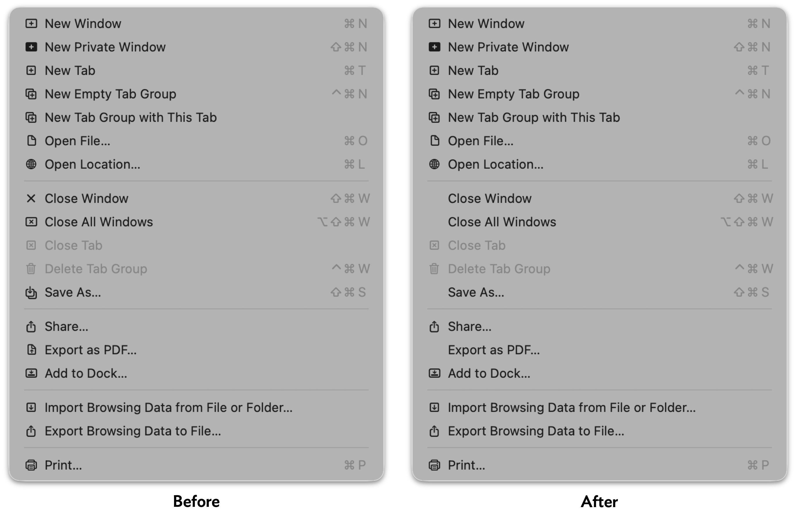
So, after applying a setting that should hide almost all menu item icons, 15 out of 18 menu items still have icons in Safari’s File menu — with no rhyme or reason to the 3 that are omitted. Safari’s other menus are similarly noncompliant. Like I said, heartbreaking.
(All is not lost in Safari, however — the setting does remove the icons from Safari’s contextual menu.)
Apple’s non-AppKit (Catalyst/UIKit/SwiftUI) Mac apps are mostly lost causes on this front. Messages, Maps, and Journal keep all their icons, except for the Window menu. The iPhone Mirroring app hides the icons from its Edit and Window menus, but keeps all of them in the View menu.
So it’s a mixed bag. But even a mixed bag is better than seeing all of these insipid ugly distracting icons. Apple should fix these apps so they all fully support this global preference (that’s what the -g switch in Troughton-Smith’s command-line incantation means), and should expose this setting as a proper, visible toggle in the System Settings app. And of course, in MacOS 27, Apple should remove most of these icons from these apps, leaving behind only the handful that add actual clarity to their menu items. There’s an outcome just waiting to be had where the MacOS menu bar is better than it used to be, not worse, by carefully adding icons only next to commands where the icons add clarity.
My favorite example: commands to rotate images, like the Tools → Rotate Left and Rotate Right commands in Preview, and Image → Rotate Clockwise and Rotate Counterclockwise in Photos.1 The rule of thumb should be that menu items should have icons if the icon alone could provide enough of a clue to replace the command name. That’s very much true for these Rotate commands, and the icons help reduce the cognitive load of thinking about which way is clockwise.
And but so what about third-party Mac apps? I think the best solution is for third-party apps to ignore Apple’s lead, and omit menu item icons on apps that have been updated for the new appearance on MacOS 26 Tahoe. That’s what Brent Simmons has done with NetNewsWire 7, using code he published as open source. Rogue Amoeba Software has adopted the same technique to improve their suite of apps when running on Tahoe, and published this blog post, illustrated with before and after screenshots, to explain their thinking.
No one is arguing that icons never improve the clarity of menu items. But for the most part, menu commands should be read. If a few special menu items are improved by including icons, include just those. They’ll stand out, further improving clarity. Part of the problem with Apple’s “almost every menu item has an icon” approach with their own apps on Mac OS 26 Tahoe is that — as copiously documented by Nikita Prokopov and Jim Nielsen — the overall effect is to add visual clutter, reducing clarity. But a side effect of that clutter is that it reduces the effectiveness of the menu items for which icons are actually useful (again, like Rotate commands, or the items in the Window → Move & Resize submenu). If every menu item has an icon, the presence of an icon is never special. If only special menu items have icons, the presence of an icon is always special.2
-
It should go without saying that these commands in Preview and Photos should use the same terms. Either both should use Rotate Left/Right, or both should use Rotate Clockwise/Counterclockwise. I personally prefer Clockwise/Counterclockwise, but the inconsistency is what grates. In the heyday of consistency in Apple’s first-party Mac software, Apple’s apps were, effectively, a living HIG. If you were adding a Rotate command to your own application, and you were unsure whether to call it “Rotate Right” or “Rotate Clockwise”, you could just check what Apple did, in its own apps, and feel certain that you were doing the right thing, using the correct terms. ↩︎
-
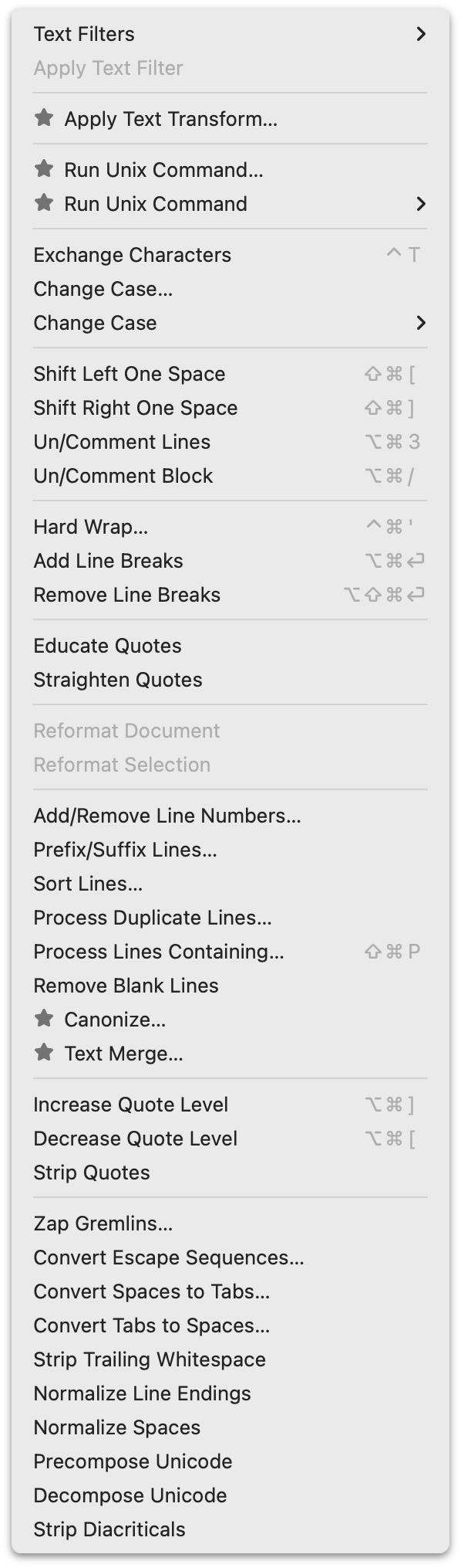
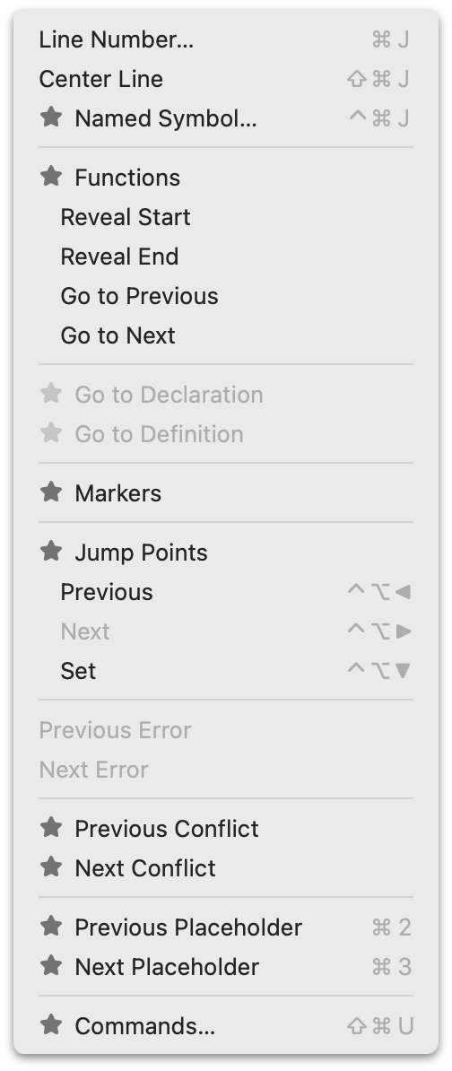
BBEdit offers a great example. BBEdit can be used, free of charge, in perpetuity with a limited (but robust!) subset of its full feature set. Its full feature set is unlocked with a one-time purchase for each major release version. But the full feature set is available as a 30-day trial — which trial period is reset each time a major new version is released. During that trial period, menu commands that are paid features are available to use, but marked with a “★” icon. (A very fine choice of icon, if you ask me.) Here, for example, are screenshots of BBEdit’s Text and Go menus while in trial mode. When the trial period ends, those commands are disabled, but remain visible in the menus, still marked with those star icons. Thus, during the free trial period, users can see which commands they’re using that they’ll need to pay for when the trial ends, and after the trial ends, they can see which features are locked. (After you purchase a license, those star icons just go away.) ↩︎︎