
By John Gruber
Day One — The journal you actually keep. Start with a chat, end with a journal entry. ⭐ 4.8 (400k)
Anti-Aliasing
Saturday, 8 March 2003
One thing that Safari has gotten wrong ever since it debuted is that it applies anti-aliasing to all typefaces, including small monospaced fonts such as 9- and 10-point Monaco.
Yes, yes, the Mac OS X zeitgeist is such that anti-aliasing is everywhere. But small-point monospaced fonts are the exception to the rule, for good reason. Monospaced typefaces are an anachronism, a throw-back to the typewriter era. They are, for most purposes, ugly; their metrics contradict the basic precepts of proper typesetting. With regular (non-monospaced) fonts, small punctuation marks such as commas and apostrophes fit snugly next to adjacent alphabetic characters; punctuation is intended to be subtle. But with a monospaced font, every character consumes the same amount of horizontal space on the line; it’s downright silly that an apostrophe should consume the same space as an m.
But monospaced typefaces serve one great purpose in the modern age: they are ideal for displaying markup and programming language source code. In normal prose it is not so great an error to, say, mistake a parenthesis for a curly brace; but in source code, such a mistake is generally catastrophic. Precisely accurate punctuation is of fundamental importance in most major programming languages. Monospaced typefaces are helpful in this regard: the extra horizontal space given to punctuation characters gives them extra visual emphasis. (Monospaced fonts are further useful for source code because they make it easier to horizontally align indented lines; but this is unrelated to the issue of anti-aliasing.)
When you read normal prose, your brain doesn’t recognize individual characters — it recognizes entire words. Anti-aliasing, in my opinion, makes individual characters more difficult to recognize; but it doesn’t hurt your ability to recognize complete words. The overall effect is that anti-aliasing preserves more of the general flavor and emotion of a typeface, the full effect of which is only available in high resolution (600 DPI or greater) output. The real Helvetica is what you see on the printed page. Even the best modern display offers significantly lower resolution than the printed page; anti-aliasing is the best compromise for capturing the spirit of a typeface on-screen.
But this is why anti-aliasing is less appropriate for displaying source code: individual characters carry much more importance in source code than in prose. The ability to discern individual characters is more important than creating on-screen characters that more accurately reflect the style of high-resolution output. Thus, the precisely-accurate non-anti-aliased versions of small monospaced fonts should be preferred for on-screen display, despite the fact that the anti-aliased versions more closely resemble the laser-printed versions.
9-point Monaco is the last surviving masterpiece of the original Macintosh’s painstakingly hand-tuned set of pixel-perfect bitmap fonts, and deservedly so. Sure, it’s been tweaked in recent years (for example, to distinguish the lowercase L from the digit one, the zero from the capital O, and to enlarge certain punctuation characters, like the period, which originally was just a single pixel), but today’s Monaco 9 would look very familiar to a circa-1986 Mac programmer. Mac OS X introduced a newly refined 10-point counterpart, which feels much larger than the ostensible one-point difference from Monaco 9 would imply. Monaco 10 is also eminently readable, perhaps quite a bit more so than Monaco 9 on today’s high-resolution displays, and yet is very true to Monaco 9’s spirit.
Here they are, as they were meant to be, in bitmapped pixel-perfect glory:
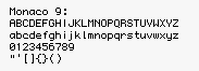
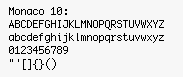
(I’m quite fond of several of the letterforms in Monaco 10 which are different from their Monaco 9 counterparts. In particular: the pointy capital A, the extended tail on the capital Q, the more distinct W’s (both upper and lowercase), the descender of the lowercase y, and the more defined lowercase r. The only letterform in Monaco 10 which I dislike is the capital J, with its preposterously exaggerated hat.)
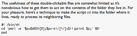
Neither Monaco 9 nor 10 was meant to be anti-aliased. All Mac OS X web browsers (Cocoa or not) follow this dictum — except for Safari. Compare the following screenshots of a recent post on Jonathan Rentzsch’s weblog. Camino does the right thing; Safari does not.
Camino (version 0.7):
Safari (version hypothetical):
Note that Rentzsch’s snippet of Perl uses both single quotes (') and backticks (`). Although you can see the difference between these quotes in Safari’s anti-aliased text, the difference is more discernable in Camino. Worse, the Safari version makes the dollar signs ($) look like capital S’s, and the tilde (~) looks suspiciously like a dash. And, in this critic’s humble opinion, the anti-aliased version of Monaco just isn’t an attractive typeface; it looks smudged, not smooth.
What’s so puzzling about Safari’s behavior is that Cocoa applications, by default, do not apply anti-aliasing to Monaco 9 or 10. Try it in TextEdit or Project Builder, if you don’t believe me. Hopefully, Safari’s behavior is simply a bug, and not a deliberate design decision.
The Geneva Convention
A curious postscript: Camino also avoids anti-aliasing 9-point Geneva, even though Geneva is most assuredly not a monospaced typeface. Here are screenshots of Dan Benjamin’s Hivelogic, which uses Geneva 9 for its navigation menu, as seen in Camino and Safari:
Camino:
![]()
Safari:
![]()
This is interesting, because Geneva 9 looks much better in Camino, without anti-aliasing. This is true of many of the older Mac fonts, which were originally designed as bitmapped screen fonts — when anti-aliased, as in Safari, they end up looking too thin and wispy. I’m not sure how Camino is smart enough to do this, but it’s very clever indeed.
| Previous: | Aliasing |
| Next: | SmartyPants 1.2.1 |