
By John Gruber

WorkOS MCP: Manage your auth platform from any AI agent.
Ads in Software Are Like Stickers on Laptops
Monday, 27 July 2026
Regarding my recent pieces regarding Apple’s shitty ads in the App Store and Apple News (and, perhaps soon, Apple Maps), a friend sent me this pithy take:
The ads Apple is happy to inflict on us in its apps are the equivalent of the stickers it would never allow on its physical products.
Bullseye.
That’s what those stickers on PCs are: they’re ads. Intel pays for the “Intel Inside” stickers that booger up PC laptop palm rests. Longtime readers will recall that back in August 2007, Apple held a Town Hall event to introduce new iMacs and some iLife and iWork software updates. In a post-event Q&A (imagine that), Bob Keefe of Cox Newspapers asked “Can you say why you all are not participating in the Intel Inside program, putting the stickers on your new or previous Macs?” This question was so absurd from the perspective of those who covered Apple closely that it prompted outright laughter. Jason Snell wrote a great column arguing that it was actually a good question.
Here’s the whole exchange (via Dan Moren, then at MacUser). Give it a listen, it’s only 100 seconds or so:
Keefe asks, Steve Jobs answers, Phil Schiller answers, and then Jobs closes it. Jobs broke the ice in his initial answer, with “What can I say? We like our own stickers better.” I was in the room, and that line killed. Jobs at his best. But you can tell that Jobs wasn’t really sure how to answer at first. He didn’t want to throw any shade at Intel, Apple’s partner, but he knew there was a key point to make here about Apple.
The whole thing is funny because at a fundamental level we all just know in our bones that Apple never even considered putting “Intel Inside” stickers on Macs. But why? For eons, mankind knew that when you drop something, it will fall to the ground. But why? Gravity is worth asking about. Worth figuring out. I think that’s the point of Snell’s 2007 column arguing that people (like me) were wrong to mock Keefe for asking.
It’s when Jobs comes back to the question, after Schiller, that we get the real answer:
You know, we put ourselves in the customers’ shoes and we say, what do we want stuck on our product when we take it out of the box? And the answer is, nothing.
That’s the answer. Apple still treats its hardware with that level of respect. With reverence. iPhones don’t even say “iPhone” on the hardware. No model or serial numbers. No small print. Just an Apple logo on the back.
Putting themselves in customers’ shoes today, how many ads do Apple’s executives want stuck in the results when they search for an app in the App Store? We know the honest answer. But the answer evidenced by the actual App Store is “Two really big ones, including one in the first spot.” ★
Monday, 27 July 2026
- WorkOS MCP ★
-
My thanks to WorkOS for sponsoring last week at DF to promote their MCP server. Debugging SSO, managing users, adjusting auth policies, configuring branding: every configuration task has lived behind a UI that only a human can drive.
The WorkOS MCP server gives agents the same access as your dashboard login. Hundreds of operations, discoverable at runtime. Connect in one command via OAuth, with scoped tokens instead of a master API key. Pass a screenshot of your marketing site and ask your agent to match the login page. If a human had to do it before, an agent can do it now. Connect your agent today.
Saturday, 25 July 2026
- ‘AI Mania Is Eviscerating Global Decision-Making’ ★
-
Fascinating essay by Nikhil Suresh:
On a trip overseas, I had the privilege of a meeting with one of the Fortune 500 executives mentioned at the beginning of the post, who will remain anonymous so that they are not executed by firing squad by their board. As we were chatting, it became clear that they were very switched-on and technically competent, and they also happened to be at a company that had committed to the usual battery of exorbitant claims about their recent innovations — we’ve 100×’d our productivity, AI is the future of everything, I am but a vessel for OpenAI to make love to my wife. You know, normal things. But since I had them there without any microphones around, I asked why this was being repeated without opposition. Was it just sales fluff?
The answer was a lot more interesting. It was partially ridiculous sales material being delivered to an easily excitable audience, but this was not the dominant factor constraining honesty. Executives at their customers were saying absurd things about achieving 100× productivity, and this meant that if any executive at the vendor said that these gains were not plausible, it would undermine the credibility of the customer’s executive, be perceived as an attack (or heresy), and possibly result in an enterprise contract cancellation. And getting enterprise contracts cancelled because you wanted to opine on something that doesn’t really matter to your organisation’s mission is a great way to get fired.
The whole essay is very much worth reading, and might make you feel saner for harboring your own doubts regarding just how much has been changed in the world by generative AI. The gist of his argument is that the entire corporate world — not merely the computer/tech/industry — is caught up in an AI mania that brooks no dissent. It’s a religious fervor and heretics are excommunicated. But the dissenters, who feel they must remain silent, are largely correct.
One way I’ve been thinking about AI mania is this: Computers have profoundly changed the world. There can be no dispute about that. Computers continue to improve in capability as networking effects grow and especially as Moore’s Law makes them faster and more capable at a pace unlike any other previous technical revolution. But most people are incapable of understanding how computers really work, and thus personally aren’t able to do much with them. Computers, for most people, are communication tools, not creative tools. Generative AI changes that. People with no computer aptitude are able to create things or discover things via ChatGPT and Claude that were simply beyond their ken heretofore. Per Clarke’s third law, “Any sufficiently advanced technology is indistinguishable from magic”. Generative AI feels a bit magical to all of us, even those of us with mid-to-high levels of understanding how computers work and how to make them work. But it feels like the first time ever that computers have been tools for their own creation for a lot of rather dimwitted but confident corporate manager/executive types. This moment feels like the Big Bang to them. The religiosity of this is such that there is no way to convince them that AI, as it stands today, is impressive and useful and innovative, yes, but several orders of magnitude less so than they’re imagining that it is. No way to convince them, that is, until the bubble bursts.
- EU Fines Google $1 Billion for DMA Competition Violations, Including Making Search Results More Useful ★
-
The European Commission on Thursday:
The Commission found that Google gives preferential treatment to its own services, including shopping, hotels, transport and sports results, over those of third parties in Google Search, thereby breaching its obligations under the DMA.
Google displays its own services more prominently in search results, including at the top of the search results page or by using enhanced visuals and filters, while similar third-party services do not have the same prominence.
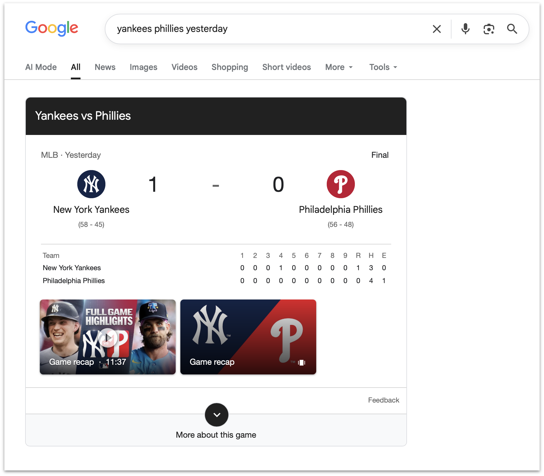
So if you search for the score of a sporting event, it’s illegal in the EU for Google to show you the score, like this search I just tried. What the EC is saying is that because Google Search is so popular, it’s no longer allowed to improve. It is impossible to imagine how this benefits EU citizens.
What generates more for the EU, fines against US tech companies, or tax income from EU tech companies? Here’s a viral post on Twitter/X that claims it’s now fines against US tech companies. The amounts certainly seem to be in the same ballpark.
- Court Grants SerpApi’s Motion to Dismiss Google Lawsuit ★
-
Julien Khaleghy, CEO of SerpApi:
The U.S. District Court for the Northern District of California granted our motion to dismiss Google’s lawsuit, marking a win not just for SerpApi, but for all who depend on an open internet. We’re pleased that the court rejected Google’s attempts to expand the DMCA to assert control over access to public pages. The internet’s founding principle — open access to usable information — is essential to driving innovation and ensuring everyone benefits from the promise of data. SerpApi will continue supporting developers, AI companies, researchers, and businesses that rely on access to public search information.
Yours truly, back in March, when SerpApi filed the motion to dismiss:
I’ve come around on SerpApi in the last few months. My initial take was that it surely must be illegal for a company to scrape Google’s search results and offer access to that data as an API. But I’ve come around to the argument that what SerpApi is doing to obtain Google search results is, well, exactly how Google scrapes the rest of the entire web to build its search index. It’s all just scraping publicly accessible web pages.
This December piece by Mike Masnick at Techdirt is what began to change my mind.
Even Google seems to understand the logical bind they’re in here, regarding scraping.
- Apple Maps to Power Navigation Experience for Ford’s New EVs ★
-
Apple Newsroom:
Apple and Ford today announced that Apple Maps will be integrated directly into Ford’s upcoming Universal Electric Vehicle (UEV) Platform through Apple’s new MapKit for Automotive SDK. Coming to Ford’s UEV Platform in 2027, this integration will deliver a beautiful and easy-to-use navigation experience powered by Apple Maps directly to the vehicle’s displays. Road-level Maps information will also enable Ford’s Latitude AI team to build a seamless hands-free driving experience.
See also: Techmeme’s roundup of commentary.
- Measles Cases Hit New Record in U.S., as Stupid-Americans Reject Vaccines ★
-
Teddy Rosenbluth, reporting for The New York Times:
On Friday, the Centers for Disease Control and Prevention announced that there have been 2,318 confirmed cases of measles so far this year. The case count toppled the record set last year, when measles infected more than 2,200 Americans and killed two unvaccinated children. More measles cases have been reported in the United States in the last two years than in all the years from 2000 through 2024 combined.
Reversing course on measles would require a nationwide push to improve vaccination rates, a prospect that experts said seemed unlikely under the leadership of Health Secretary Robert F. Kennedy Jr. He has halted funding for vaccine hesitancy research, downplayed the risks of measles and spearheaded a hunt for evidence that vaccines are unsafe.
Nilay Patel, endorsing Kamala Harris for president in 2024: “A Vote for Donald Trump Is a Vote for School Shootings and Measles”. (He missed “quagmire war with Iran”.)
“tarltontarlton” on Reddit last year: “Stupid-Americans are the New Irish-Americans, Trump is Their JFK”. I continue to think about this post frequently.
Isaac Asimov, in a column for Newsweek in 1980:
There is a cult of ignorance in the United States, and there has always been. The strain of anti-intellectualism has been a constant thread winding its way through our political and cultural life, nurtured by the false notion that democracy means that “my ignorance is just as good as your knowledge”.
I continue to think about this frequently as well.
- bIRC — A New Native IRC Client for Mac ★
-
For a long time the best native Mac IRC client was Textual, but although Textual still works, it’s been sunset by the author. Not to fear, however. Fredrik Blank just launched bIRC:
Creating an IRC client in 2026 is not something that will pay the bills : ) It would be just for the joy of programming. But the amount of work involved always made me throw the thought aside.
But one night when I had nothing better to do, I started implementing the good old spec in Swift (RFC 2812). And then I got motivated to continue, adding IRCv3 extensions and UI. Been working on it on and off on it since the end of 2025. Now I feel pretty satisfied with the result. Say hi to bIRC — an IRCv3 client for Mac.
I was never a big IRC user, personally, and haven’t used IRC in years. But I installed bIRC just because it looks so good, and took it for a brief test drive. It’s nice. And it is very Mac-assed in a modern way. It’s got a detailed documentation page too. There are (alas) many great apps that lack good documentation, but there are very few apps with good documentation that aren’t great apps. bIRC is free to download and use from the App Store, and there’s a suite of additional fun/pro features you can unlock for a one-time $13 purchase. I bought the pro upgrade despite seldom using IRC just to celebrate a killer new Mac app.
Regarding Ad Blockers and Daring Fireball
Friday, 24 July 2026
Following up on the previous item today, re: content blockers and ad-blocking, I ran into a weird situation a few weeks ago with my column “John Ternus Should Reverse Apple’s Slide Down the Advertising Slippery Slope”. That article contains this sentence, in Markdown:
And -- at this writing, still "coming soon" -- Apple is
launching [ads on Apple Maps][🗺️].

[🗺️]: https://ads.apple.com/maps
The problem is that anyone reading that article in NetNewsWire saw it rendered like this, with the words “ads on Apple Maps”1 omitted:
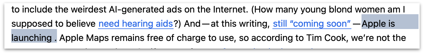
It looks like I forgot to finish writing that sentence. NetNewsWire simply omits the hyperlinked words. After a few readers reported this, I immediately suspected the problem was the “ads.apple.com” domain. I’ve never linked to that domain before, and many ad blockers just block any domain that starts with a domain prefix like ads.*.
And that’s exactly what the problem is. I had no idea that NetNewsWire filtered any content whatsoever (and I sort of think it shouldn’t), but DF reader Antonio Germano searched through NetNewsWire’s open-source code and found it in the core.css file, line 49:
38  /*Block ads and junk*/
39
40  iframe[src*="feedads" ],
41  iframe[src*="doubleclick"],
42  iframe[src*="plusone.google"] {
43      display: none !important;
44  }
45
46  a[href*=".ads."],
47  a[href*="feedads" ],
48  a[href*="doubleclick"],
49  a[href*="//ads."],
The culprit identified, I dutifully pinged my friend Brent Simmons to report the problem. But then I had to decide what to do about it. I have no idea which feed readers are being used to read Daring Fireball’s feeds, but NetNewsWire is surely one of the most popular, and probably the most popular. It’s the feed reader I use personally. I can’t change the contents of NetNewsWire’s core.css file, so I can’t keep NetNewsWire from stripping out words that link to Apple’s ads.apple.com domain. What I could do is not link to ads.apple.com, like, say by changing my link from ads.apple.com/maps to a shorten-and-redirect URL like bit.ly/4wmXFSE that points back to Apple’s original URL.
But I didn’t do that. I don’t like playing whack-a-mole to work around bugs in other software. I have enough trouble fixing my own mistakes. I also don’t like the idea of showing everyone a “Click it and find out where it actually goes” mystery URL from Bitly rather than the direct URL. It’s a general principle thing, and also a much better policy for links that are meant to last for decades.
What I really don’t like about NetNewsWire’s ad-blocking here is that it just omits the linked text. It doesn’t remove the link but leave the words; it removes the words that are hyperlinked to the blocked domain. I’ve run into this with other content blocking extensions. For example, the Banish extension for Safari, which I recommended back in 2022. At some point a year or two ago, Banish started blocking links to Apple’s App Store domain, and it did so by removing the words that link to the App Store. That’s crazy. I linked to the App Store in my own post recommending Banish, which means if you have Banish installed and read that post, you won’t see the headline of the post (nor be able to follow the link). I think there are other content blockers that do the same thing with text that links to the App Store.2
So what do I do about that? Do I stop linking to the App Store? That’s dumb. Do I create custom URL redirects for every single link I make to the App Store? That’s work I don’t need or want to do, and adds a layer of abstraction that confuses everyone who isn’t using a content blocker with such a stupid rule. So I just ignore it. But that means an untold number of readers, who are using such content blockers, are just missing words in my articles whenever I link to the App Store. Well, so be it. Ideally, content blockers “just work” — blocking only things you want blocked, never things you don’t want blocked. Nothing is perfect however. What’s pernicious about blockers that remove the actual words that link to certain domains is that that’s not expected behavior. From the reader’s perspective, it really just looks like an editing error on the part of the website, not a content blocker with an overzealous pattern-matching rule.
Ultimately, though, when you install a content blocker extension, you take responsibility for any overzealousness in what they block.
Let me use this opportunity to make a small personal request. The display ads on Daring Fireball are unobtrusive and limited to one per page. They are also entirely private, and always have been. There not only are no cookies or JavaScript that attempt to track you, but the ads themselves are served from the daringfireball.net domain. I turn down advertisers who request to serve images (or “tracking pixels”, which are just invisible images) from their domains. (Such requests are infrequent, thankfully.) I don’t display the ads in between paragraphs mid-article, a common practice that to me is disrespectful both to the writer and reader. In short, I try to keep the ads on Daring Fireball not merely unobjectionable, but something that actually adds to the site. I actually like the ads in certain high-quality print magazines, like The New Yorker. My goal for the ads on DF is for them to be like that.
In short, I hope they’re the sort of ads readers don’t want to block. I’m pleased to say that most of the ad-blocking content blocking extensions I’ve personally tried do not block ads on Daring Fireball by default. In other cases, they do, but it’s easy to adjust the per-domain settings to allow them. In the previous post, I recommended uBlock Origin Lite (free, a bit complex) and Magic Lasso (paid, much simpler). Magic Lasso does not block ads on DF by default. I don’t remember what uBlock Origin does by default, but it’s trivial to change it to allow them.
If you use an ad blocker and it currently blocks the ads on DF, I humbly ask you to consider taking a moment to tweak the settings to permit them. (If you are using a blocker that strips the ads from DF by default, you can do me an additional favor and shoot me a short email telling me which one. I’m curious.) If you are the developer of an ad blocker, I ask you to consider allowlisting Daring Fireball by default.
If you are a reader and you really do want to block DF’s ads, please, go right ahead. I find that an odd mindset, but it’s your web browser and your call. No hard feelings. (Please further note that I have no JavaScript code that attempts to detect whether you’re blocking DF’s ads in order to nag you.) ★
-
I omitted the Markdown creating a link on the words “still ‘coming soon’” for clarity, to emphasize only the problematic link in my original prose. (Also, it’s fun to use emoji as named link definitions, like in this example.) ↩︎︎
-
I of course reported this to the developer of Banish, twice, but he never responded. I, err, banished Banish from my own devices, and upon finishing this article, I’m going to update my 2022 recommendation of Banish to un-recommend it. ↩︎
Friday, 24 July 2026
- Coiner of ‘Enshittification’ Endorses ‘Dickover’ ★
-
Speaking of dickovers, here’s Cory Doctorow, writing this week at Pluralistic:
Seizing the means of computation isn’t theft, it’s bargaining. Commercial surveillance companies will tell you that by spying on you, they are simply engaged in a marketplace exchange in which you swap your privacy for access to online services. But they are running a very curious sort of market: it’s a “market” where as soon as you stop to browse someone’s wares, the stallholder gets to reach into your pocket and clean out your wallet. In “markets,” prices are announced and bargained over, not set unilaterally and extracted from anyone unwise enough to cross the threshold.
Adblocking, dickover blocking and other customizations are a way for you to bargain back, to answer the opening bid of “How about you give me all of your data forever and let me do anything I want with it?” with “How about ‘nah?’”
Doctorow’s specific advice is to switch to Firefox for your browser and Linux as your desktop OS. You’re probably not going to do either of those things. But the spirit of his advice is that you should avail yourself of bookmarklets and browser extensions that fight back against shitty ads and dickovers. There are some great options for Safari. StopTheMadness Pro is great for creating custom rules to permanently block specific page elements. uBlock Origin Lite is a free-of-charge content blocker that is incredibly effective, and very configurable (but complicated). Magic Lasso is a paid content blocker — $30/year — which includes synced blocking on iOS, MacOS, and even Apple TV. Magic Lasso offers a much more approachable configuration interface, and includes a “just turn it on” easy-to-use private VPN feature that allows for blocking ads in all apps, including Apple News.
Bargaining back is exactly what using content blockers is. There’s no reason to feel guilty about it.
(Magic Lasso has previously been a DF sponsor, but not since May 2021. I’m recommending Magic Lasso here only as a happy paying user.)
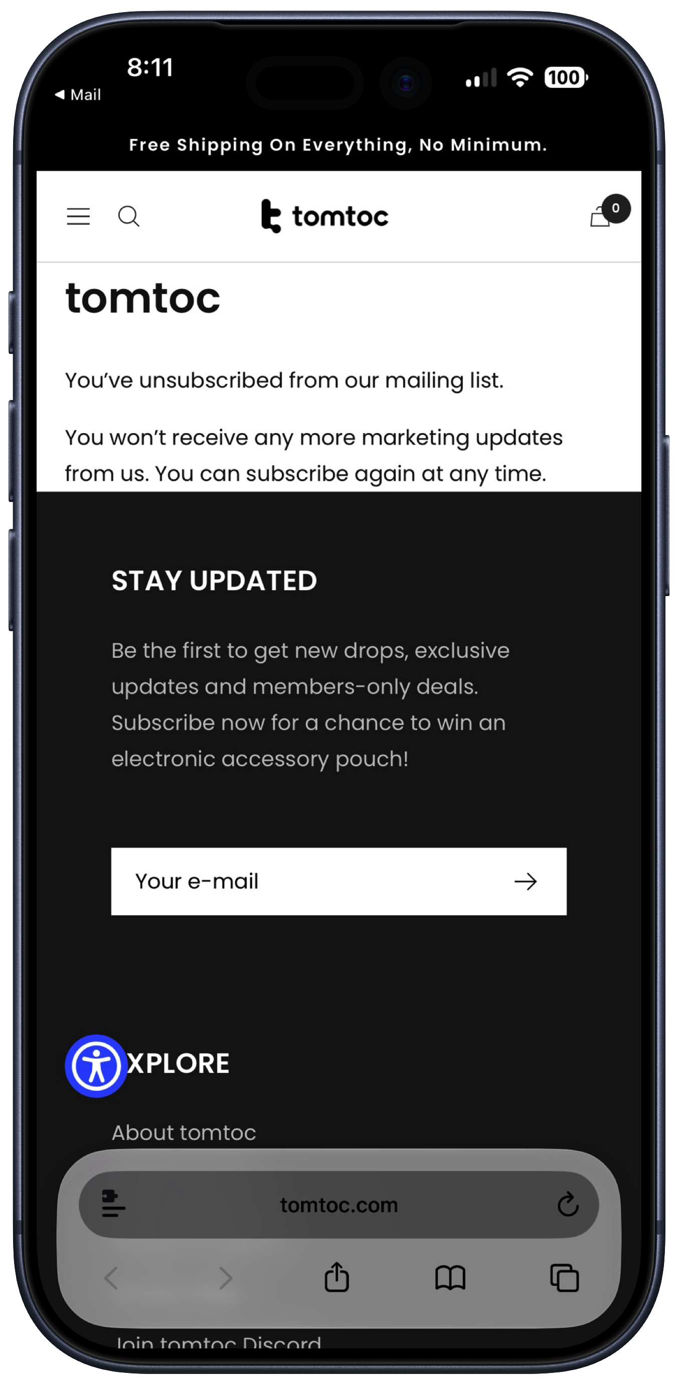
- Dickover of the Week: Tomtoc ★
-
Here’s a real gem that a reader sent me. Tomtoc is a maker of laptop bags and sleeves. Visit their homepage and, of course, you’ll get a dickover asking you to join their mailing list “for exclusive updates and get a chance to win a free tech pouch every month.” But here’s the gem. If you do subscribe, and you decide later to unsubscribe, you get this:
- Sixers Sign LeBron James ★
-
The betting odds for the Sixers to win the NBA championship went from 20-1 to 10-1. Here’s James on Twitter/X, explaining his decision:
This is my last decision. I’m not going for money. I’m not going for family. What am I really playing for at this point?
I still want to sacrifice. I still want to work. I still want to grind. I still want to compete, to win and to have a chance at the feeling of winning another championship.
I believe I can help make the Philadelphia 76ers a championship team and I am so excited to energize a new fan base and start this incredible journey one last time.
James signed for the league minimum for a veteran: two years at just $4 million per year. He’s going to love playing here.
- The Talk Show: ‘A Scam Held Together With Patriotism and Golden Paint’ ★
-
Quinn Nelson returns to the show to discuss OpenAI’s ChatGPT/Codex “native” app migration fiasco, Siri AI in Apple’s OS 27 betas, MacOS 27 Golden Gate, and the hottest new cell phone of the year, the Trump T1.
Sponsored by:
- Notion: Try the powerful, all-in-one Notion AI today.
- Factor: Healthy eating, made easy. Get 50% off your first box, plus free daily greens, with code talkshow50off.
- Squarespace: Save 10% off your first purchase of a website or domain using code TALKSHOW.
Thursday, 23 July 2026
- Bond Movie Filming Locations Map ★
-
“From a Bond fan to Bond fans worldwide.” Nice work.
The Ads on Apple News Continue to Suck, but at Least There Are a Lot of Them
Thursday, 23 July 2026
Kirk McElhearn, back in February:
I use Apple News to keep up on topics that I don’t find in sources I pay for (The Guardian and The New York Times). But there’s no way I’m going to pay the exorbitant price Apple wants for Apple News+ — £13 — because, while you get more publications, you still get ads.
And those ads have gotten worse recently. Many if not most of them look like and probably are scams. Here are a few examples from Apple News today.
One of the ads he examined was, supposedly, from a small company going out of business because the proprietor — supposedly a straight-out-of-Central-Casting kind old woman — was retiring after 26 years. McElhearn looked up the domain name and it had only just been created last year, and was registered from a company in China.
Two years ago this very week, I wrote about Apple striking a deal with Taboola to sell ads for Apple News. In that post, I quoted Eric Seufert (of Mobile Dev Memo) posting on Threads:
Regarding Taboola’s partnership with Apple: I’ve seen people claim that this is somehow hypocritical from a privacy perspective, assuming that Taboola’s somewhat obnoxious, clickbait-style ads must invasively target user profiles and browsing histories.
They don’t. They are targeted entirely contextually. That’s the point.
Want brash, garish advertising plastered all over the web? Reject ads personalization. Want relevant, informed advertising? Embrace ads personalization.
Now quoting from myself in that same article:
If you told me that the ads in Apple News have been sold by Taboola for the last few years, I’d have said, “Oh, that makes sense.” Because the ads in Apple News — at least the ones I see — already look like chumbox Taboola ads. Even worse, they’re incredibly repetitious. [...]
So while I don’t think it’s good news that Apple is partnering with Taboola, I don’t expect it to make any discernible difference in the ad quality or frequency. Maybe it will improve the variety?
Privacy is not the issue with Apple’s Taboola partnership, or Apple advertising in general. The issues are quality and user experience. I was correct that the partnership has made no discernible difference in ad quality or frequency. And it hasn’t made any improvement to variety either. Here’s a collection of ads I continue to see in Apple News — often with the same ad appearing 3–4 times in the same article, as I scroll. (I posted the same image in my recent article “John Ternus Should Reverse Apple’s Slide Down the Advertising Slippery Slope”, if you’re thinking it looks familiar.)
The ads I see in Apple News are not relevant or informed. And, to be clear, I have “Personalized Ads” turned on in Settings → Privacy & Security → Apple Advertising (which makes me wonder if turning that off might actually make the ads even worse). The ads shown in the App Store never seem contextually relevant to me. So I have no faith that the ads that Apple is supposedly on the cusp of serving in Apple Maps are going to be good.
Back in March I wrote:
I’m not going to prejudge the actual experience, and you shouldn’t either. I also do not begrudge Apple for wanting to monetize Maps. But if the addition of ads does make the Apple Maps experience worse, why won’t Apple let us buy our way out of seeing them? Netflix doesn’t force us to watch their ads. YouTube Premium is arguably the best bang-for-the-buck in the entire world of content subscriptions. Why should Apple One subscribers still see these ads in Apple Maps?
This to me is proof that Apple leadership is suffering from cognitive dissonance over their slide into advertising. They’re conflating cause and effect. The Apple brand stands for high-quality superior user experiences because the devices and software Apple makes traditionally deliver high-quality superior user experiences. The work Apple ships is what makes the brand what it is. But now they’re stricken with the mindset that it’s the Apple brand that makes something a high-quality superior experience. If it comes from Apple it must be great — that sort of thinking. The ads in Apple News and the App Store can’t be detrimental to the user experiences and at times even embarrassingly crude or downright scammy because Apple doesn’t ship things that are detrimental to the user experience or embarrassingly crude — and certainly never with even a whiff of scamminess.
My theory is that’s why Apple isn’t allowing users to buy our way out of the ads. When streaming services like Netflix let you pay more money for ad-free tiers, it’s an explicit acknowledgement that the experience with ads is worse. Apple doesn’t offer ad-free tiers for the App Store or (soon) Apple Maps1 because, I think, they can’t bring themselves to admit that by adding ads to these services they have made them worse. If you refuse to admit that the ads make these services worse, you also can’t admit that there’s a reason to offer an ad-free experience. So the thinking is something like “Apple always focuses on the user experience, and never deliberately makes the user experience worse. Therefore, if an Apple service shows ads, those ads are high quality and don’t detract from the quality of the product or the experience of using it. Therefore, there’s no reason to offer users a paid ad-free tier, because there’s no reason to want to avoid Apple’s ads.”
It’s a textbook case of Upton Sinclair’s famous adage: “It is difficult to get a man to understand something, when his salary depends upon his not understanding it.” The obvious truth is that Apple’s ads just plain suck. They are not good at advertising-based services. And it shouldn’t be surprising that they’re not good at advertising-based services, because the incentives for advertising-based services are in direct opposition to the incentives for everything Apple actually is good at. To wit: offering superior products worth paying a premium price for.
One can argue that an ad-free Apple Maps experience ought to be included with the price of the devices Apple sells (which, of course, has been true until now). It’s even easier to argue that the App Store ought to be ad-free for everyone, based on its exclusive role in software distribution and the 15–30 percent commission Apple takes on every transaction. But if Apple simply made the App Store and Apple Maps ad-free for users paying for iCloud+ or Apple One, I’d stop complaining. That would make it clear: the full Apple experience requires not just an Apple device, but an Apple subscription. But the way things stand now, that ad-free experience isn’t even available. ★
-
Apple News is different because the inclusion of ads is controlled by the publishers, not by Apple. If you read Daring Fireball on Apple News, for example, you don’t see their crummy chumbox ads, because I don’t participate in that system. Most of the cringe-inducing ads I see in Apple News are seemingly sold through Apple Ads, though, so I’m not arguing that Apple isn’t ultimately responsible for the Apple News reading experience. I’m saying they can’t just flip a switch and offer a paid-subscription no-ads Apple News experience without the agreement of every single participating publisher. The App Store and Apple Maps, however, are services under Apple’s complete control. Every ad shown in those apps is Apple’s choice to show. ↩︎
Thursday, 23 July 2026
- John Dvorak on Computer Chronicles in 1987 to Discuss the Then-New IBM PS/2 ★
-
Dvorak is best known for all the takes he was jacktastically wrong about, but what gave his schtick staying power is that he was technically savvy. His take here on the PS/2 was actually spot-on: that it was technically impressive in many ways, especially the way it was assembled without any cables, but that it was doomed in the market against ugly mess-of-cables commodity PCs.
“Computer Chronicles” was the real show from the 1980s that Adam Lisagor so lovingly and spectacularly spoofed with “Computer Show” a decade ago.
- John Dvorak Drops Dead at 80 ★
-
William Gallagher, AppleInsider:
Legendary technology columnist, pundit, author and podcast host John C. Dvorak has died, age 80. He is survived by his wife Mimi Dvorak.
Today Dvorak is best known for co-hosting the “No Agenda” podcast with Adam Curry, where he would critique mainstream news media. His death was first announced by the podcast on X, although note that Dvorak’s age is mistakenly given as 74.
From the No Agenda News newsletter yesterday:
For a man who spent decades famously predicting the catastrophic demise of almost every major technological innovation, it is with the heaviest of hearts we must announce that John’s own hardware finally gave out on Monday morning, July 20th, 2026, at the age of 80. He went peacefully, albeit suddenly, with Mimi at his side, critiquing the acting and story line of NCIS.
His death truly seems quite sudden — the most recent episode of No Agenda dropped on Sunday, the day before he died.
- Flighty New Connection Assistant Feature ★
-
Chance Miller, 9to5Mac:
Flighty’s new Connection Assistant feature includes step-by-step information for your specific connection. This includes things like terminal changes, security checkpoints, passport control, and more. Connection Assistant also gives you estimates of how long each step of making a connection usually takes.
“The new Connection Assistant combines Flighty’s best-in-class flight tracking data with airport-specific procedures and statistical modeling of millions of prior flights, and then turns it all into guidance for your exact trip,” the Flighty team explained in a press release today.
I don’t know what the equivalent term to “Mac-assed” should be for iPhone apps, but whatever it is, Flighty epitomizes it. Incredibly useful for what it does, exemplary for how it looks and feels and is visually organized. It is as iOS-assed as an app can be.
European Commission: ‘Guidance to Google for AI Interoperability on Android & Sharing of Google Search’
Tuesday, 21 July 2026
The European Commission, last week:
Today, the European Commission has issued two sets of binding specification measures to Google under the Digital Markets Act.
The aim of the first specification measures is to ensure that competitors’ Artificial Intelligence (AI) services can compete with Google’s own AI services, such as Gemini, by having equal access to features on Google’s Android devices.
The aim of the second specification measures is to rebalance the playing field by giving third-party search engines access to search data that only Google Search can collect at scale.
They provide separate “Q&A” overviews of the guidance for Android AI interoperability and web search sharing, and the full guidance documents are PDFs (Case DMA.100220 for Android AI, Case DMA.100209 for web search). I suggest reading the two Q&A overviews, unless you’re having trouble falling asleep at night, in which case you’ll love the full PDF decisions.
Both decisions are interesting. With search, Google is required to share with competitors — search engines and AI chatbots alike — a massive amount of user data from Google Search user interactions. What terms people search for, what they click on in results, what languages and devices they use. It’s all ostensibly anonymized but that’s tricky when it comes to search terms. A lot of the terms people type into web search fields are to some degree personally identifying. The EC seems to be saying it’s Google’s problem to filter out things like passwords and usernames and omit them from the shared datasets. Google can charge money for this access, but only under “fair, reasonable, and non-discriminatory (FRAND)” prices, based on a Commission-defined methodology.
More interesting to me, however, is the guidance pertaining to on-device AI on Android devices. What the EC is dictating to Google is just breathtaking in scope. The EC is demanding that Google create APIs that allow third-party AI assistants to do everything Google Gemini does now, including:
- Control hardware buttons (to invoke the assistant).
- Capture anything on screen, from any app.
- Seemingly unfettered access to microphones and cameras and other sensors on the device.
- Unfettered background operation. Third-party AI assistants must be permitted to execute in the background whenever they want, for as long as they want.
- Execute their own audio models on the digital signal processor, so they can listen at all times for their own custom “Hey Dingus” wake phrases/hot words.
- Google must allow concurrent access to always-on hot word detection. So if you have Claude and ChatGPT and Grok and Meta AI installed, all of them — in addition to Gemini — must be permitted to have always-on audio detection concurrently. Google is permitted to do some vetting here, but this seems like madness.
- Third-party models get access to Google’s on-device local models.
Also, in my reading, the EC is demanding that Google make available to third-party AI assistants all information in Google’s own apps (Gmail, Google Calendar, Google Docs, Google Maps, etc.) that Gemini has access to. There is no opt-out for Google regarding data from their own apps. Nor, I think, does this guidance allow third-party apps from other developers to only support specific system-level AI models. Like, let’s say you’re Slack, and you use the APIs to make the content from within Slack available to Gemini on the device. These guidelines don’t permit Google to allow Slack to say that they trust Gemini but only Gemini. If a third-party app like Slack supports making its data available to any system-level AI provider, it must make its data available to every system-level AI provider.
There’s a lot more. Basically, though, the EC is demanding that third-party AI assistants be enabled to become part of the system software, not just apps. I’m sure some people think this is a great idea. It’s the user’s device, they should be allowed to make ChatGPT or Claude or Meta AI part of their OS if they want. It’s up to them. Put users in control.
This is how PCs have traditionally worked, but many normal people’s PCs are a mess of third-party software running in the background. That includes the Mac. If you ask a normal person “What third-party software runs in the background on your Mac or PC?” they would have no idea. It’s all just magic to them. If Google supports this guidance, it could turn Android phones in the EU into PCs. Honestly, some of the stuff the EC is requiring is lower-level than what MacOS and Windows allow third-party software to do.
What the EC’s “guidance” describes in this document is an entirely different operating system than the Android that Google has designed. The European Commission obviously thinks it is their place to design operating systems. Maybe you do too. Google obviously disagrees, and so does Apple. And so should most people who have any idea how these devices work. This is a recipe for disaster, if Google were to enact it and third-party AI assistants took advantage of it.
That second “if” is a big one. One possible scenario that I consider quite likely is that Google could spend years of engineering time and human resources building out APIs to enable all of this, in the safest and most private ways possible, and no major AI assistant adopts it. That’s the way it’s turned out with a whole slew of DMA compliance for Apple and Google. Apple built an entire complex set of APIs to enable third-party web browser rendering engines, exclusively for compliance with the DMA, and there exist no third-party web browser rendering engines for iOS. Not one. Because while the EU is a big market, it’s not big enough to justify building a custom web browser just for the EU alone.
Ways I can see this playing out, in order of likelihood (most likely first):
(A) Google enacts all of this and no major AI assistants support it because it’s only for Android, only in the EU. And it’s not like ChatGPT and Claude are seeing a lack of usage as things stand now. In this scenario Google just wastes massive time and engineering talent building APIs that never get used, and Android users in the EU get hassled with additional annoying choice and permission screens just to use the Gemini features that are built into Android.
(B) Google enacts all of this and major AI assistants do support it. Unintended results include massive privacy violations where third-party assistants exfiltrate on-device data to the cloud, Meta uses on-device third-party data for the targeting of ads, and users who take advantage of these third-party assistants see significant battery life drain as third-party assistants run without limits in the background and run expensive inference locally to save on their own server costs.
(C) Google enacts all of this, major AI assistants do support it, and there are no privacy scandals, nor any issues with battery life, because each of the companies that makes these assistants develops them with respect for user privacy and for device resources like CPU and memory consumption.
(D) Google pulls system-integrated Gemini from Android in the EU, or severely restricts its capabilities. Rather than elevate third-party assistants from apps to system software, demote Gemini to the privileges of a mere app and leave Android users in the EU without a system-integrated AI assistant.
Under all scenarios, future feature updates to system-level AI in Android will appear late or never in the EU. No future new features can debut in the EU at the same time as the rest of the world because for DMA compliance, Google will need to add support for third-party assistants to do the same things. And they’re not going to hold new features for the rest of the world waiting for that.
I’m not even sure (D) is permitted under this Commission guidance, given that Google started shipping Gemini on Android last year. The entire guidance document is written under the presumption that Google will comply by building the APIs that the guidance demands, not by achieving parity by removing Gemini system integration features. It would be awkward and unpopular for Google to ship updates to Android that remove core AI features, but that might be more palatable than the alternative.1 Note that with iOS, to my recollection, Apple hasn’t pulled any existing features from the EU. They’ve only withheld or delayed new features. Google’s on-device Gemini horse is already out of the barn.
Lastly, although this guidance document pertains to Android, not iOS, I see no reason to think the European Commission wouldn’t demand all or most of the same things from Apple. They haven’t given Apple any guidance yet, because it’s European Commission policy to give guidance only after a DMA-designator gatekeeper ships something that is then ruled non-compliant. But it’s hard to imagine Apple accepting most of these terms. Unfettered background processing and access to the microphone, cameras, and sensors? Third-party audio models running on the hardware DSP listening for wake words? Granting third-party assistants unsupervised access to all user data from apps published using App Intents?
Apple unfortunately hasn’t shared any technical details describing its proposal for a “Trusted System Agent” that it shared with the EC last year. But whatever Apple’s vision for the Trusted System Agent is, I don’t see how the EC would deem it compliant with the DMA if they want from Apple anything close to what they are now demanding from Google. There are no checks and balances or oversight that Google is permitted to apply to third-party assistants in this guidance. If Gemini can do something, third-party agents must be able to as well. Because Gemini gets to run in the background as much as Google sees fit, third-party assistants must be permitted to run in the background as much as they see fit. And if those third-party assistant developers — OpenAI, Anthropic, xAI, and Meta — have different opinions than Google on how much CPU usage is appropriate in the background, how much RAM and storage is appropriate to consume, or how respectfully to treat users’ on-device data, well that’s just tough noogies. If the user OK’s it, then it’s OK.
A month ago, after WWDC, when this guidance pertaining to Android AI was rumored to be forthcoming, I wrote:
Google is learning the lesson Apple learned the hard way with all the existing features of iOS that were deemed noncompliant with the DMA when it went into effect. The “ship it first and ask forgiveness / hope it’s deemed compliant” strategy is not a good one in the EU.
I genuinely wonder what the European Commission thinks the purpose of Android is. Google created Android for the benefit of its own services. Google was worried about Microsoft, not Apple, at the time, but they wanted to ensure their own services were available on a major mobile platform. I’m really not seeing how it’s more attractive to Google to comply with this guidance than to just pull system-level Gemini in the EU. Either they waste a small fortune building APIs no one will use, or, they spend that small fortune buildings APIs for the benefit of their biggest competitors. I get it that that’s the intended price to pay for being a designated DMA gatekeeper. But what’s the motivation for Google to do this rather than just walk away from system-integrated AI on Android in the EU? It certainly doesn’t look like the competing platform, iOS, is going to offer it in the EU anytime soon either. ★
-
If you are handed a mandate that everyone must be able to run at the same speed, and you can’t figure out how to make slow people faster, you can comply by forcing the fast to wear weighted boots. This is where utopian egalitarian initiatives often lead. ↩︎
Monday, 20 July 2026
- ‘Who’s Afraid of Chinese Models?’ ★
-
Ben Thompson, on the hype regarding Kimi K3, at Stratechery:
This is a point that bears repeating: because U.S. open weight model makers must follow the frontier labs’ terms of service, they (1) are worse than Chinese alternatives and (2) end up distilling the distillation, just with a detour through Chinese labs. Wouldn’t it be better if western open weight model makers could go to the source?
To that end, here’s an even more interesting question around distillation: why exactly is it bad? After all, what are large language models but the distillation of all of the knowledge on the open Internet, scraped by the frontier labs and distilled into the models that are themselves being distilled? Who is exactly being wronged here?
In fact, this paradox is the solution. I believe that open weight models are good for innovation (and, per the above, I think that labs on the frontier will be fine), but it’s a problem to be dependent on China. The U.S. should pass a law that (1) makes explicit that collecting data for training models is fair use, and (2) bars terms of service that forbid distillation, for U.S. companies at a minimum. Stopping distillation — which is literally just querying the API — is nearly impossible; the U.S. should go the other way and lean into a new copyright policy that both indemnifies the labs and also guarantees that what they learned fuels further innovation for everyone else.
To be clear — and Thompson emphasizes this point too — the leading Chinese models like K3 aren’t good only because of distillation. They’re not entirely rip-offs. But distillation is clearly an essential part of the formula they’re using to keep releasing models that are 6–9 months behind the U.S. frontier state of the art. So the Chinese treat all models as “open”, regardless of the terms of service. But anyone in the U.S. or other western countries that respect copyright — or contracted terms of service — who wants to distill a good model has to wait for the Chinese to release their models, like K3.
And that second paragraph I quote above distills (sorry) exactly why I want to bring out the world’s smallest violin to play a sad song for OpenAI and Anthropic regarding their objections to their frontier models being distilled against their terms of service.
Sunday, 19 July 2026
- Paper ★
-
My thanks to Paper for sponsoring last week at DF. Paper is a new professional design tool where every layer is real HTML and CSS. Your design is already code, which means fewer handoffs, translations, and layers of abstraction between what you design and what you actually ship.
Paper works both ways: code to design, and design to code. Connect any AI agent through MCP and the agent can read and edit your designs. Or use Paper Snapshot to capture your live site as editable layers and make new iterations. Agents handle the tedious work so you can focus on your craft and the decisions that matter.
Try Paper at paper.design (great domain name), and check out the documentation and FAQ for more info.
- 9to5Mac Uncovers Dozens of Disguised Gambling Apps on the App Store in Brazil ★
-
9to5Mac:
Brazilian users browsing the App Store rankings in categories such as Navigation, Travel, and Weather have noticed a growing number of poorly made games appearing among the top results, many of them featuring AI-generated illustrations of animals as their app icons.
As it turns out, these are so-called jacket apps, which are just a front for hidden betting and gambling apps. A 9to5Mac investigation has uncovered more than 60 apps that behave exactly as depicted in their App Store screenshots when accessed from virtually anywhere in the world, except Brazil.
When opened from a Brazilian IP address, the same apps instead reveal online betting platforms, as shown in the example below, which is currently the top app in the Weather category.
Obviously the main problem is that these apps disguise themselves Trojan Horse-style, and slip through App Store review undetected. I don’t think it’s reasonable to think App Store review could catch every attempt at this sort of thing though — if the horses are disguised well-enough, some of them are going to slip through. That’s actually fine.
But the first example 9to5Mac cites isn’t well disguised at all. What sense does it make that “PotatoPlot Puzzle” — a game featuring a rabbit potato farmer — is a weather app? How is that not a red flag right there?
Also, this app rose to become not just popular, but the number one weather app in Brazil, a nation with over 200 million citizens. In my yearslong argument that Apple should commission an internal bunco squad dedicated to hunting down scammers in the App Store, I always mention that the point of such a squad shouldn’t be to make the App Store 100 percent scammer-free — which I believe is an impossible goal that would set the team up for failure. The point should be only to make the App Store free of successful scams. Focus on the most popular apps and the most lucrative apps. There’s simply no feasible excuse for PotatoPlot Puzzle to have become the most popular “weather app” in Brazil.
Update: Apple issued a statement to 9to5Mac:
The company thanked 9to5Mac for its investigation and added that, prior to our reporting, it had already investigated and taken action against 25 similar apps, while also terminating the developer accounts associated with them.
Mornings in Cupertino Have the Aroma of Napalm Once Again
Saturday, 18 July 2026
‘It Seems You Have a Different Policy’
Ben Thompson, in a subscriber-only Stratechery update Tuesday:
I got a fun email from former Apple executive, Nest founder, and one-time Stratechery Interview subject Tony Fadell in response to yesterday’s Update about Apple suing OpenAI (published with permission):
Good article as always… This is Apple’s typical tactic to scare Apple employees — either former or current. I heard this lawsuit was driven by the Apple board.
Steve threatened to file a lawsuit against Nest for poaching 80-100 Apple employees. He called me, screamed for a while with lots of accusations. Then I said, “Steve, it’s Apple’s job to retain its talent, not mine.” He stopped his rant and then we went on to talk about our families and vacation plans. We kept hiring…
This sounds about right — and in terms of the Steve Jobs angle, John Gruber made a compelling case on Dithering that this lawsuit may very well have been driven by John Ternus channeling his inner Jobs.
Fadell, of course, is correct that it’s Apple’s job to retain its talent. Recent reporting from Mark Gurman suggests that John Ternus is keenly aware of this, at least as it pertains to Apple’s industrial design team, which has been ground zero for the Apple-to-OpenAI recruitment pipeline. (And the Dithering episode Thompson references is the one we made free-to-listen this week.)
Playing hardball when it comes to poaching is deeply embedded in Apple’s DNA. Steve Jobs hated Apple employees getting poached. In 2005 he sent this email to Adobe CEO Bruce Chizen:
From: Steve Jobs
To: Bruce Chizen
Date: Thursday, May 26, 2005 9:36 AM
Subject: RecruitingBruce,
Adobe is recruiting from Apple. They have hired one person already and are calling lots more. I have a standing policy with our recruiters that we don’t recruit from Adobe. It seems you have a different policy. One of us must change our policy. Please let me know who.
Steve
After one back-and-forth exchange with Jobs, Chizen agreed Adobe would change its policy.
A more contentious example came in August 2007, when Jobs sent an email to Palm CEO Ed Colligan that read:
From: Steve Jobs
To: Ed Colligan
Date: Sunday, August 26, 2007 11:42 am
Subject: Fwd: Your proposalEd,
This is not satisfactory to Apple. It is not just a matter of our employees deciding they want to join Palm. They are being actively recruited using knowledge supplied by Jon Rubenstein [sic] and Fred Anderson, with Jon personally participating in the recruiting process. We must do whatever we can to stop this. I’m sure you realize the asymmetry in the financial resources of our respective companies when you say: “We will both just end up paying a lot of lawyers a lot of money.”
Just for the record, when Siemens sold their handset business to BenQ they didn’t sell them their essential patents but rather just gave them a license. The patents they did sell to BenQ are not that great. We looked at them ourselves when they were for sale. I guess you guys felt differently and bought them. We are not concerned about them at all. My advice is to take a look at our patent portfolio before you make a final decision here.
Steve
That’s a good email. Information dense. My favorite part isn’t the “I’m sure you realize the asymmetry in the financial resources of our respective companies”, although that’s good. It’s the “I guess you guys felt differently and bought them.” Stone cold.
Some backstory on the players:
Colligan, of course, is Mr. “PC guys are not going to just figure this out. They’re not going to just walk in.” He was a business guy who thought product guys didn’t matter in an industry that was about to be taken over by product guys. Sort of like Steve Ballmer, without the charisma, at a much smaller company.
Jon Rubinstein1 was a hardware engineering executive at Apple, overseeing Mac hardware during the comeback years after Steve Jobs returned, then switching to oversee the newly-created iPod division in 2004. (Mac hardware then went under the supervision of a then-little-known operations executive referred to in the announcement as “Timothy Cook”.) Rubinstein left Apple in early 2006, citing exhaustion.2 His departure was announced six months earlier, alongside the promotion of Cook to COO. By 2007 Rubinstein was involved with Palm, by way of Elevation Partners, an investment firm that took a 25 percent stake in Palm. He became CEO of Palm in 2009, tried to turn it around, and then wasted a few years as an executive at HP after HP bought Palm’s carcass thinking it was still alive.
Fred Anderson was Apple’s CFO from March 1996 (almost a year before the NeXT reunification) to June 2004 — the nail-biting, at-times-near-bankruptcy turnaround years. Anderson took the fall, perhaps unfairly, for the stock options backdating scandal under Steve Jobs and, after leaving Apple, paid a $3.5 million fine in a settlement with the SEC. Needless to say, in the summer of 2007, there was bad blood between Anderson and Apple. Anderson, post-Apple, was a co-founder of Elevation Partners and had recruited Rubinstein to join.
Some bad blood. Some former high-level Apple executives putting a team of ex-Apple engineers and designers together to take on the iPhone. History doesn’t repeat, but it often rhymes.
If in addition to thinking that this sounds familiar, you also think these emails sound illegal, you may recall that in 2015, Apple (along with Google, Adobe, Intel, and other companies) paid a collective $415 million penalty to settle a class-action anti-poaching lawsuit. That they settled doesn’t mean they regret playing hardball. Rules are only followed by those who fear the penalties.
Jobs liked to fight, and wasn’t afraid to let his temper show. Tim Cook has a fierce temper and steel nerves, but he arguably only once, ever, showed it in public. I do not think he relishes a fight. He’s a diplomat, not a general. I suspect there’s no undiscovered tranche of Jobs-style stone-cold threatening emails from Cook to competing CEOs.
Steve Jobs’s oft-cited parting advice to Tim Cook was “Don’t ask what I would do. Just do the right thing.” Cook has largely lived by that mantra. But maybe — maybe — by taking that advice to heart, he has at times deliberately steered the company in ways Jobs would not have, just for the sake of steering it in a different way. I think maybe John Ternus is more of a “Hey, what would Steve have done here?” kind of guy.
On the one hand, this lawsuit is a bad look for Apple. It could be perceived that Apple does not think their employees are free to leave and compete against them. On the other hand, Apple could use a booster shot of Steve Jobs’s “us against the world” attitude. It might be wrong to start a war, but it’s never wrong to finish one after being attacked.
What would Steve Jobs do with this OpenAI situation? He’d go to war.3
‘This Is Not Satisfactory to Apple’
The early history of the Macintosh GUI went something like this: When the Macintosh debuted in 1984 it didn’t hit like Apple had hoped it would. (That’s when Steve Jobs was run out of the company.) But by the late 1980s it had caught on, especially in markets like design and desktop publishing. It was the only GUI game in town — command-line DOS PCs were popular, but Windows 1.0 was almost too primitive to believe and Windows 2 wasn’t much better. Apple was certain that the WIMP GUI was the future of computing, and because the Macintosh was the only credible GUI then on the market, Apple owned the future of computing. They were correct about one of those things. Because then came Windows 3, which still sucked — still was ugly, still was terribly designed, still severely limited compared to the Mac in its UI grace and vocabulary of actions — but, it didn’t suck as much. It wasn’t good but it was good enough for the corporate IT market, and the corporate IT market drove the industry at the time.
In the early 1990s John Sculley filed and pushed the infamous “look and feel” lawsuit against Microsoft. One year out from the launch of Windows 95 — which at least looked pretty good4 — Apple’s response was to try to argue in court that they owned the copyright and patent rights to the very concepts of the GUI and the desktop metaphor. The court handed Apple its ass. Apple soon found itself 90 days away from bankruptcy and in desperate need of a new modern operating system, which they themselves had proven incapable of creating. Windows 95 launched with such anticipation that customers lined up overnight outside retail stores to buy it the morning it launched.
That lawsuit was the low point in the entirety of Apple’s history. It was incoherent and, worse, pathetic. Incoherent because Apple was simultaneously arguing in marketing that the Mac remained vastly superior to Windows (“C:\ONGRTLNS.W95”), while arguing in court that Windows was a feature-for-feature clone. It couldn’t be both. I would argue that the former was true — the Mac remained superior in many ways — but actions speak louder than words and Apple’s action was to sue Microsoft and lose. It was pathetic because you know who loses? Losers.
The correct response to the competitive threat of Windows wasn’t to futilely attempt to argue that Windows should not be allowed to exist. It was to make the Macintosh so much better than it already was — to inject so much new innovative insane greatness — that customers would line up overnight to buy Mac software (and watch Apple keynotes). What Microsoft had in 1995 that Apple could not muster was vast customer enthusiasm. That cannot be bought. It cannot be faked. It can only be earned. And you sure as shit cannot stop it with a lawsuit.
Earning that sort of consumer enthusiasm — in spades — is exactly how Steve Jobs pulled Apple out of its nosedive. It took the better part of a decade.
When Apple announced this new lawsuit last week against OpenAI, I wondered, at first, whether it had a whiff of that 1994 look-and-feel loser desperation. Is it Apple’s position that the only way to stop its talent exodus to OpenAI is in court? Upon consideration, I think not. First, it’s not incoherent. There’s no conflict between what Apple is saying about its products or itself as a company that is at odds with this lawsuit. They’re just saying, “Fuck you, you goddamn traitors. You want to fuck with us? We’ll fuck with you.” When you poke a bear — 400 times — you better be ready for the bear to eventually react.
Further, while Apple can only have one CEO at a time, and that CEO remains Tim Cook until September 1, there’s no way that John Ternus doesn’t fully approve of this lawsuit. Cook has gone out of his way to leave Ternus with a clean plate. It would be insane to file this suit six weeks ahead of Ternus taking the helm if Ternus is anything short of fully on board.
I’m not saying it’s a good look for Apple. I’m certainly passing no judgment on the merits of the case, which OpenAI hasn’t yet responded to legally. But it is a very different and much more emotional reaction than we’ve seen under Tim Cook. Those anti-poaching emails Steve Jobs sent to Adobe, Palm, and Google weren’t good looks for Apple either. But that doesn’t mean they were bad for Apple. A bad look can be a good thing. Passion is powerful, and in and of itself, inspiring. This is a passion-fueled lawsuit. I saw some commentators speculate that, already hemorrhaging cash on a daily basis, OpenAI will surely spew some of that in the direction of Cupertino and just settle it. But Apple doesn’t need cash. This is a lawsuit that I believe OpenAI cannot settle, because there is no settlement Apple would accept short of a dissolution of their entire hardware division.
Apple claims in their complaint that the trade-secret chicanery they’ve already documented “is the tip of the iceberg”. If Apple is wrong, and OpenAI has recruited above the board and hired 400 former Apple employees fair and square (or even just mostly fair and mostly square), they have nothing to fear, and John Ternus will look like a petty little jealous bitch, and a feckless one at that. If Apple is right, however, all bets are off. I said earlier that rules are only followed by those who fear the penalties. But some never consider the penalties in the first place because they believe the rules don’t apply to them. Sometimes they find out otherwise.
I’m not saying OpenAI cannot win. I’m saying they can’t get Apple to settle — at least not until Apple is satisfied the whole iceberg has been revealed through discovery. Until then, John Ternus’s offer to Sam Altman is nothing — not even the fee for the gaming license, which he would like Altman to put up. ★
-
Jobs might be forgiven for misspelling Rubinstein’s surname in his email to Colligan. Everyone called him “Ruby”. Perhaps akin to misspelling Greg Joswiak’s name as “Jozwiak” because everyone just calls him “Joz”. ↩︎
-
I think it’s more likely that Rubinstein wore out his welcome at Apple. Here, I turn to Walter Isaacson’s Steve Jobs, which has some remarkable reporting on the situation. Quoting from Chapter 35, “Round One” (which chapter title refers to Jobs’s first bout with the cancer that eventually did him in), pp. 459–460 in the print edition:
In the fall of 2005, after returning from his medical leave, Jobs tapped Cook to become Apple’s chief operating officer. They were flying together to Japan. Jobs didn’t really ask Cook; he simply turned to him and said, “I’ve decided to make you COO.”
Around that time, Jobs’s old friends Jon Rubinstein and Avie Tevanian, the hardware and software lieutenants who had been recruited during the 1997 restoration, decided to leave. In Tevanian’s case, he had made a lot of money and was ready to quit working. “Avie is a brilliant guy and a nice guy, much more grounded than Ruby and doesn’t carry the big ego,” said Jobs. “It was a huge loss for us when Avie left. He’s a one-of-a-kind person — a genius.”
Rubinstein’s case was a little more contentious. He was upset by Cook’s ascendency and frazzled after working for nine years under Jobs. Their shouting matches became more frequent. There was also a substantive issue: Rubinstein was repeatedly clashing with Jony Ive, who used to work for him and now reported directly to Jobs. Ive was always pushing the envelope with designs that dazzled but were difficult to engineer. It was Rubinstein’s job to get the hardware built in a practical way, so he often balked. He was by nature cautious. “In the end, Ruby’s from HP,” said Jobs. “And he never delved deep, he wasn’t aggressive.”
There was, for example, the case of the screws that held the handles on the Power Mac G4. Ive decided that they should have a certain polish and shape. But Rubinstein thought that would be “astronomically” costly and delay the project for weeks, so he vetoed the idea. His job was to deliver products, which meant making trade-offs. Ive viewed that approach as inimical to innovation, so he would go both above him to Jobs and also around him to the midlevel engineers. “Ruby would say, ‘You can’t do this, it will delay,’ and I would say, ‘I think we can,” Ive recalled. “And I would know, because I had worked behind his back with the product teams.” In this and other cases, Jobs came down on Ive’s side.
At times Ive and Rubinstein got into arguments that almost led to blows. Finally Ive told Jobs, “It’s him or me.” Jobs chose Ive. By that point Rubinstein was ready to leave.
There’s a strong whiff of “You can’t fire me, I’m retiring” in the air when someone claims they were ready to leave after Jony Ive issued a “him or me” ultimatum. That’s like saying you’re ready to leave the pub after the bartender rings the bell for last call.
I’d end this footnote here, but the very next passage is too apt to omit:
He and his wife had bought property in Mexico, and he wanted time off to build a home there. He eventually went to work for Palm, which was trying to match Apple’s iPhone. Jobs was so furious that Palm was hiring some of his former employees that he complained to Bono, who was a cofounder of a private equity group, led by the former Apple CFO Fred Anderson, that had bought a controlling stake in Palm. Bono sent Jobs a note back saying, “You should chill out about this. This is like the Beatles ringing up because Herman and the Hermits have taken one of their road crew.” Jobs later admitted that he had overreacted. “The fact that they completely failed salves that wound,” he said.
-
One can argue that this whole situation never would have happened if Steve Jobs were still alive, because if he were, Jony Ive, Tang Tan, Evans Hankey, et al. would still be at Apple, and there would be no io. But that’s like saying maybe if someone in the 1910s had given Hitler more encouragement as a painter, none of this would have happened either. I enjoy fictional alternative histories as much as the next guy, but I’m more interested in the question of how Jobs would respond, right now, to the actual current situation. ↩︎︎
-
A small irony is that the look-and-feel of Windows 95 borrowed much more from NeXTStep than it did from System 7. The look and layout of windows themselves; the use of gray, not white, as the default background color for the UI chrome; the chiseled 3D look — it’s almost inarguable that the Windows 95 look was ripped off from NeXT. Microsoft even copied from NeXT the window-close button going in the top right, not top left, and marking it with an “×” glyph, which the Mac never did. ↩︎︎
Saturday, 18 July 2026
- Apple Sends Letters to Dozens of Former Employees Now at OpenAI ★
-
Michael Acton, reporting for the Financial Times from San Francisco:
About 40 former employees now working at OpenAI have been sent letters directing them to preserve documents and communications and demanding meetings with Apple’s lawyers, according to multiple people familiar with the matter. Apple and OpenAI declined to comment.
The decision to hit employees with personal legal letters highlights Apple’s aggressive tactics after it last week launched a blockbuster lawsuit accusing OpenAI and two employees of stealing secret hardware plans.
Friday, 17 July 2026
- Apple Books and Amazon Are Lousy With AI-Generated Books Ripping Off Legitimate Authors ★
-
Joanna Stern at New Things, last month:
Last month, just days after my book went on sale, AI knockoffs of the ebook version flooded Apple Books. There was Joanna Stern On I Am Not A Robot by Sophie Mercer. I AM NOT A ROBOT by Finn Tech. I AM NOT A ROBOT by Joana Stern — with one “n.” (Watch our latest video showing all these titles and more.)
In total, I found ten AI-generated ebooks clearly riding on mine, with AI-generated covers mimicking the style of my real one — the same blue, yellow and red color palette. Most were priced at $9.99, but some have gone as high as $20.99. [...]
After I contacted Apple about my own book’s clones back in May, the knockoffs quickly disappeared. [...] But now, a month after that first Apple cleanup, the problem is back. At the start of this week, there were at least three other I AM NOT A ROBOT counterfeits on Apple Books. (They seem to have since been removed.)
And I’m not alone. Lena Dunham’s Famesick has multiple lookalikes on the platform. Haley Sacks’s Future Rich Person has copycats that even use AI generated images of women on the cover that resemble the real author.
Kashmir Hill at The New York Times today (gift link):
Recently, I received a strange text from a new acquaintance. “You have your own biography???” it read. “How did you neglect to tell me this?”
This was news to me. I went to Amazon to investigate. There it was. A biography of Kashmir Hill — title: “The Biography of Kashmir Hill” — had been released nearly a year earlier, in August 2025. My life story had a mottled brown cover and a publisher I’d never heard of before. It had no reviews until I wrote one, asking, as the subject of this work, if I could please speak to the author. The hardcover cost $26.99, which seemed a bit steep, but my editor splurged on a copy and I was forced to read it.
My biography is 90 pages long and should be shorter. It combines facts about me that are widely available on the internet, such as where I grew up, with generic insights that could be true of anyone, like a horoscope spread over dozens of pages. “You cannot understand Kashmir Hill without understanding her contradictions,” my biographer wrote, along with an excruciatingly long description of my elaborate coffee-making ritual. (Fact check: My husband does it.)
It’s not just an e-book problem. Printing services are so cheap nowadays that some of these mooks (like one “author” Hill spoke to) are commissioning print editions for hundreds of these slopfests.
- Google Runs Out of Appeals, Must Pay Record $4.7 Billion EU Antitrust Fine ★
-
Arjun Kharpal, reporting for CNBC, back on July 2:
Europe’s top court on Thursday upheld Google’s fine of around 4.1 billion euros ($4.67 billion) over alleged anti-competitive practices.
In 2018, the European Commission slapped Google with the record-breaking penalty on the grounds that it abused Android’s mobile dominance to give unfair advantage to its own apps via pre-installation deals with smartphone makers.
Google has been appealing the ruling through the EU court system. But the European Court of Justice (ECJ), Europe’s top court, dismissed Google’s appeal. Google has no further right to appeal.
Google last year booked $132 billion in profit; this fine is about 3 percent of that. But in 2018, when the fine was initially assessed, Google booked “just” $31 billion in profit — this fine, if they’d paid it then, would have been about 15 percent of their annual profit. (And they booked only $13B, $19B, $16B, and $14B in profit going back from 2017 to 2014.)
There’s never a reason not to string the appeal process out, but it’s especially true when your profits are growing at an exceptional rate. By growing their profits around 5×, they’ve reduced the relative sting of this fine by 5×.
And that’s ignoring the effects of inflation — which over the last eight year have been significant.
- Roblox Set to Introduce AI Game-Building Feature, Including on iOS ★
-
Roblox executives Nick Tornow and Vlad Loktev, on the Roblox blog:
Twenty years ago, Roblox launched with a simple idea: “You make the game.” At the time, that was a radical proposition — most games were made by studios and professionals, and the idea that anyone could be a creator was far from obvious. But we believed it. And the millions of creators who built on Roblox proved it. As we look to a future where any one of Roblox’s 132 million daily active users could come up with the next hit game, we’re taking that original idea further than we ever have. Over the coming months, we’ll share a series of announcements that will give every creator a clear runway to go further and fulfill the promise of “You make the game” for more people than ever before.
Today, we’re announcing Build, a new mobile-first creation tab within the Roblox app, and a new suite of AI-powered tools within Studio for creators of every level. On July 28, we’ll begin testing these new agentic tools. With Build and Studio, creators can delegate the parts of development that don’t require their full attention.
This sounds really cool and fun. But you know what else was really cool and fun? AI coding apps that ran on iOS, like Bitrig, Replit, and Vibecode — all of which Apple put the kibosh on back in the winter. You of course are free to use any tool you want to build apps for iOS on a desktop computer, but Apple decided to disallowing building iOS apps on iOS.
But it’s OK for Roblox to allow AI-assisted game generation on iOS ... because Roblox is already so big and popular? How can Apple justify allowing Roblox to do this while disallowing anyone else?
- Apple Raises Prices for Apple Music and Apple One Subscriptions ★
-
Chance Miller, 9to5Mac:
Here are the new monthly prices for Apple Music and Apple One as of today:
Apple Music:
- Individual: $11.99 (up from $10.99)
- Family: $19.99 (up from $16.99)
- Student: $6.99 (up from $5.99)
Apple One:
- Individual: $19.95 (unchanged)
- Family: $27.95 (up from $25.95)
- Premier: $39.95 (up from $37.95)
- OpenAI’s Product Shake-Up Put the Complexifiers in Charge ★
-
Wired, back on May 15:
OpenAI says it’s folding ChatGPT, its AI coding agent Codex, and its developer-facing API into one core product team. The company says that Codex is increasingly powering its consumer and enterprise offerings, which are gaining the ability to perform digital tasks autonomously on behalf of users.
Other OpenAI leaders are also taking on larger roles at the company as part of the changes. OpenAI’s head of Codex, Thibault Sottiaux, has been tapped to lead the company’s core product and platform teams. Sottiaux was a key leader in building Codex into one of the company’s fastest-growing products of all time. He’s also one of the leaders overseeing development of OpenAI’s forthcoming “super app,” which aims to combine Codex, ChatGPT, and the company’s Atlas web browser into a unified desktop application.
I’ll give them credit for sticking with a plan for two whole months to get this out the door. But the problem is they went the wrong way. Instead of putting the eggheads from Codex in charge of ChatGPT, they should have put the product-minded people from ChatGPT in charge of Codex. Codex, I’m finally learning, is sprawling and confusing. It needs a strong dose of focus, clarity, and coherence — attributes that ChatGPT exhibited in spades. Instead, by putting the Codex dorks in charge, they’ve injected ChatGPT with confusion, incoherence, and sprawl.
Claude, the app OpenAI’s leadership is obsessed with copying now, is so goddamn confusing that it has Extensions, Plugins, Capabilities, Skills, and Connectors — and they’re all different things. You’ve let your own AI overuse turn your brain to mush if you think that makes sense, but even more so if you think that’s the model to copy.
I’ve been waiting for a while now for someone to explain all of this clearly and succinctly, worried that maybe it was my job to figure it out and do the clear succinct explaining. All of this dogshit from OpenAI and Anthropic presents itself as though it can be explained clearly and succinctly. But it’s just a veneer of coherence. It’s all just been thrown together in an AI blender and poured out as mush.
- MG Siegler: ‘OpenAI Makes ChatGPT ChatGPT Again’ ★
-
MG Siegler, writing at Spyglass:
In that light, we can see the dilemma. But there were also probably about a dozen better ways to do this roll-out — as highlighted by how fast they’re fixing these things — and they just missed the mark. While they undoubtedly knew there would be some backlash, they probably didn’t realize there would be this much. Again. All that points to perhaps a disturbing trend where OpenAI doesn’t really understand their user base. Which you almost can understand given how they clearly stumbled into ChatGPT in the first place. Still, here they are with those billion users. A problem that all of their competitors would love to have. But still a problem if you want to fundamentally change what you are as a product.
But those are bigger, existential issues. All I wanted was chat back in the ChatGPT app. Front and center. And I got it. It’s not perfect. It’s still bloated. But at least it’s usable again now and not a confusing mess of ideas out of the box.
MG is pretty scathing, but I still think he’s taking it too easy on OpenAI for what a colossal fuck-up this remains. There was nothing wrong with the way things were, with two apps — the simple ChatGPT and the complex Codex. (Well, the Codex Mac app being an Electron turd was wrong, but that complaint seems quaint at this point.)
Adding “ChatGPT” as a tab to Codex is fine. Renaming Codex to “ChatGPT” is stupid. They have not made ChatGPT “ChatGPT” again.
There is nothing — not one single tiny feature — in the new ChatGPT app that makes me want to use it instead of ChatGPT Classic. And there is so much in ChatGPT Classic that works better or just isn’t available in the new ChatGPT. You can’t even just delete a chat in the new app — you have to “archive” it first, then fish around to find the archive and delete it there.
I don’t think the problem is that OpenAI “doesn’t really understand their user base”. I think it’s that decisions are now being made by AI research eggheads who don’t understand their own products. They think this makes sense. So of course they don’t understand their user base — who uses the ChatGPT product — either. I mean what sense does it make that the ChatGPT app for iOS and Android is still the old ChatGPT, which on the Mac is now “ChatGPT Classic”, but there’s a totally different app that is an entire order of magnitude more complicated on the Mac now named “ChatGPT”?
The only good solution is to pretend this last week didn’t happen and go back to calling ChatGPT “ChatGPT” and Codex “Codex”. If they want to give one of them a new name, don’t call ChatGPT “ChatGPT Classic” — instead rename Codex “ChatGPT Codex”. There, done. All problems solved.
The Codex app is clearly capable of amazing things. But the reason that there are a billion users of ChatGPT but only a few million users of Codex — by OpenAI’s own accounting — is because ChatGPT is simple and focused and based on a single coherent concept: chat. The frustration of the eggheads now running product at OpenAI is obvious: how come these hundreds of millions of morons using ChatGPT aren’t running Codex instead? Somehow they thought they could fix this by giving Codex the ChatGPT name. This is like if Apple had gotten rid of the Messages app on the Mac and replaced it with Xcode, which they renamed to “Messages”. Now they’ve put an “iMessage” tab in the Xcode sidebar and re-released the Messages app everyone knew and loved as “Messages Classic”.
OpenAI separated itself from its competition — especially Anthropic — by being good at product. Now their product decisions are being made by people who don’t understand why Apple makes both iMovie and Final Cut Pro, or GarageBand and Logic Pro.
- OpenAI Starts Cleaning Up the Utter Mess It Made of ChatGPT ★
-
Thibault “Tibo” Sottiaux, the OpenAI engineering lead who’s taking the most public credit for this and thus probably deserves the most blame, on Twitter/X:
Evening! We’ve gotten lots of great feedback on the new ChatGPT desktop app (which we didn’t get totally quite right on the first try), and as a result, we’ve made some changes.
1/ ChatGPT conversation history and projects are now visible in the sidebar. Also, your Chat and Work history now sync across web, mobile, and desktop. Local tasks still stay on your computer.
How in the world did they ship this without sync?
2/ You can now easily switch between Chat and Work modes inside ChatGPT on desktop, which is now also consistent with how it shows on web and mobile.
Bringing back “chat” to ChatGPT is literally the least they needed to do. Hiding chat in an obscure corner of the interface from an app named “ChatGPT” would be like removing text editing from TextEdit.
The updates OpenAI shipped yesterday address some of the abject incoherence of the initial rollout of the “new” ChatGPT, but it’s still dogshit. The new app remains a 1.5 GB Electron monstrosity (and if it’s not technically Electron that’s because they’ve created another bloated layer of abstraction around Electron — Sottiaux oversees the only engineering group in the world that looked at Electron and thought it was too slim and close to the metal).
Here’s the software update dialog I saw today in the old version of ChatGPT, which is now named ChatGPT Classic:
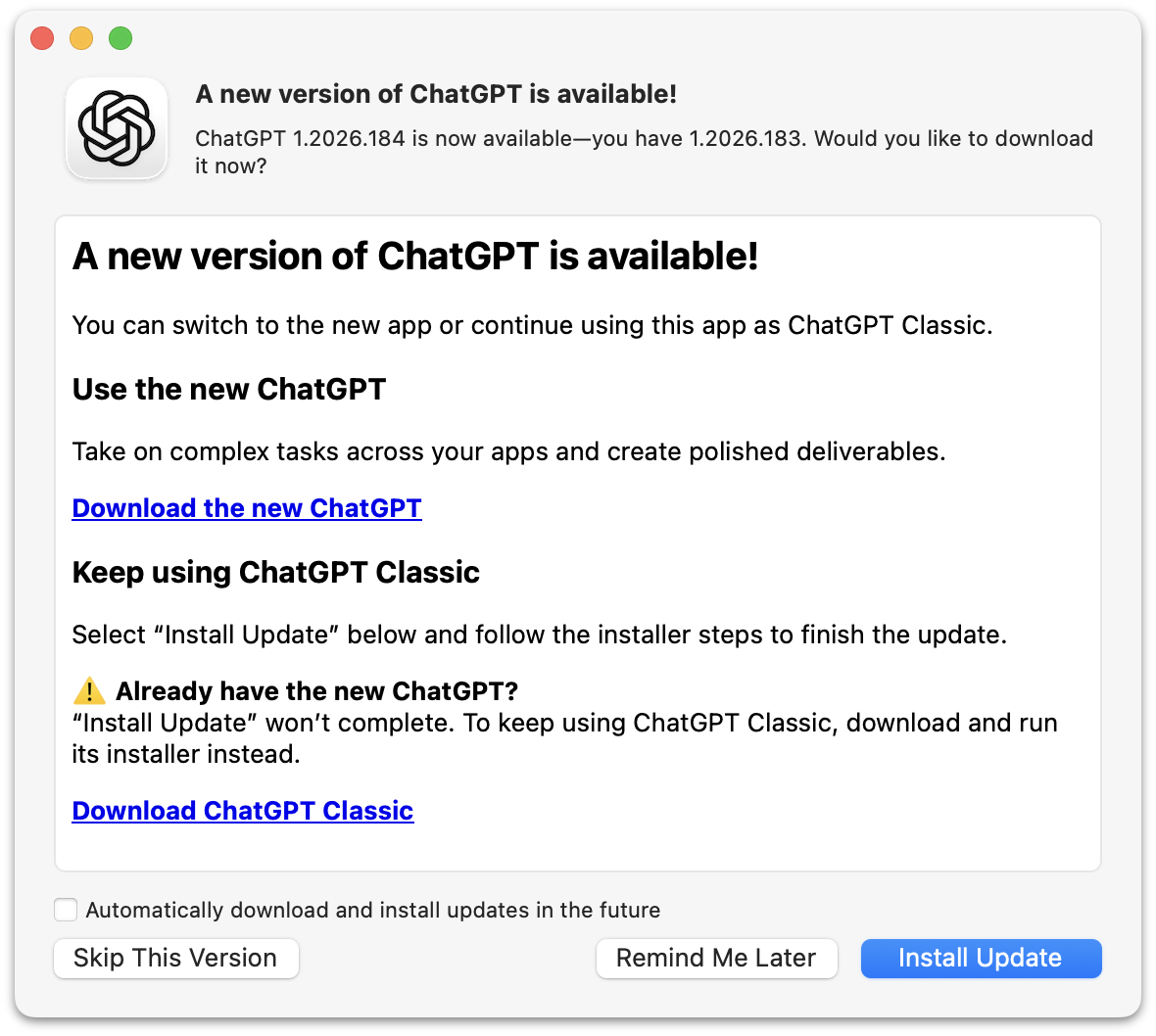
What they’re trying to say here is that if you’ve ever installed the new ChatGPT the “Install Update” button in this dialog will do nothing. It will take some time to do nothing, but ultimately do nothing. Except quit ChatGPT.
If you’ve never installed the new ChatGPT, this dialog box will update the old ChatGPT to the latest version, which is now renamed “ChatGPT Classic”. If you have tried the new ChatGPT, you need to install ChatGPT Classic manually, even though you’re seeing this update dialog box in a slightly older version of the app you want to keep using. But at least they now offer a supported way to install ChatGPT Classic.
This whole thing makes the “New Coke”/”Coke Classic” fiasco from the 1980s look like a well-thought-out change.
- Linus Torvalds: ‘AI Is a Tool, Just Like Other Tools We Use. And It’s Clearly a Useful One.’ ★
-
Linus Torvalds:
I realize that some people really dislike AI, but this is an area where I’m willing to absolutely put my foot down as the top-level maintainer.
Linux is not one of those anti-AI projects, and if somebody has issues with that, they can do the open-source thing and fork it.
Or just walk away.
AI is a tool, just like other tools we use. And it’s clearly a useful one.
It may not have been that “clearly” even just a year ago, but it’s no longer in question today.
There are other questions around AI (like what the economy of it will actually look like in the end), but “is it useful” is no longer one of those questions. Anybody who doubts that clearly hasn’t actually used it.
- BBEdit 16 ★
-
Speaking of BBEdit, version 16 dropped just before WWDC, and adds a slew of nifty improvements, headlined by vastly expanded support for Shortcuts. You can also search for text in images, use the W3C HTML syntax checker, and of all things, use vi keyboard emulation. There’s a lot more, of course — and as always the changes, improvements, and additions are copiously documented in the release notes.
New licenses are $60, upgrades from v15 cost $30, and upgrades from older versions are $40. In the Mac App Store it’s a $5/month or $50/year subscription.
See also: Jason Snell at Six Colors and Adam Engst at TidBITs.
- ArtfulType: Markdown Writing App for the 68K Macintosh ★
-
Sean Malseed — “Action Retro” on YouTube — created a Markdown editor for the original Macintosh. Source code on GitHub; intro video on YouTube. It’s written in C, not Pascal, and uses the modern Retro68 GCC-derived compiler.
I absolutely love that this exists. I don’t like the actual app at all. I guess “full screen” mode is the point of some “distraction free” editors, but I for one would never look twice at a Mac app that didn’t use windows. Full-screen mode just wasn’t a thing back then, except for games. ArtfulType is not a Mac-assed 1984 Mac app.
If I wanted to write in Markdown on a classic Mac, I’d use BBEdit, which was the app I originally created Markdown for use in. And one of two apps I primarily still use it in. But BBEdit won’t run on an original 128 KB Macintosh, because Rich Siegel didn’t create it until 1989, and the earliest public version was BBEdit 2 in 1992. BBEdit 2.1.3 does run in System 5 on Infinite Mac, but crashes if launched on System 3. I 100 percent see the appeal of using a 1980s retro Mac, but I don’t see the appeal of using one that can’t run System 6.
- Happy iCal Day ★
-
Joanna Stern explains why this emoji is correct today: 📅. (This one too: 📆)
- Google and Epic Give Up Fighting — Third-Party Android App Stores Are Coming Next Week ★
-
Sean Hollister, reporting for The Verge (gift link):
Here’s Google’s full statement on withdrawing its proposed modifications to Judge Donato’s permanent injunction, via Google spokesperson Dan Jackson:
We’ve agreed with Epic to withdraw our motion to modify the US Court’s injunction rather than prolonging this process which creates uncertainty for the ecosystem. This allows us to focus on executing our recently announced global business model evolution to deliver greater app store choice, lower prices, and more opportunities for developers and users. We remain committed to maintaining Android’s industry-leading security and fostering a competitive ecosystem where every app store and developer has the freedom to compete. In parallel, we continue to comply with the US Court’s injunction.
Google had previously announced that it would launch its sideloaded Registered App Store program in the rest of the world, beginning with the new version of Android later this year. That means there may be two different tracks for Android: stores-within-a-store in the United States and Registered App Stores everywhere else.
Google is already informing US app developers that their apps and game listings will automatically be provided to third-party app stores starting July 22nd, unless they opt out, and it’s launched a specific page for its Play Catalog Access Program for third-party app stores to enroll.
I presume that this new agreement between Google and Epic includes ripping up the “no criticism of Play Store” gag order that the highly principled Tim Sweeney had agreed to in exchange for $800 million back in March?
Anyway, it will be interesting to see what developers do. My guess is that all the big app developers will opt out of this. Games, though, maybe not?
Thursday, 16 July 2026
- European Commission Adds Exemptions for Watches and Earbuds to Portable Battery Removal Rules ★
-
The European Commission:
The European Commission adopted a delegated act today (14 July) introducing new rules that exempt additional products from EU requirements on the removability and replaceability of portable batteries.
Under the EU’s Batteries Regulation, portable batteries in products sold in the EU must generally be removable and replaceable by consumers. This helps extend products’ lifetime by allowing battery replacements and supports recycling by making it easier to collect used batteries. [...]
The Commission is now adding six new product categories to the existing list of exemptions. This includes wearable devices such as smartwatches and fitness trackers, electric toys, and products within the scope of the ATEX Directive (equipment used in explosive atmospheres such as explosion-proof motors, sensors, pumps or forklift trucks).
See, exemptions aren’t hard, especially to stupid regulations.
- Quiche Browser Now Defaults to No-AI Web Search Results ★
-
Quiche Industries (Greg de J.):
Starting today, Quiche Browser disables AI overviews in search results by default, out of the box.
Compare how much space and time they waste. I love the web too much to let that nonsense bury links to real websites made by humans.
This is my modest contribution to the fight against the dead internet theory. Why no other browser does that is beyond me.
To elaborate a bit:
• It simply opens search results in the AI-free versions of Google, DuckDuckGo, Bing, and Brave, whenever they’re selected as the default search engine. • No content blocker involved. Search results are served as-is. • AI features can be turned back on in Settings → Search.
I wrote about Quiche Browser a few months ago, praising it for, amongst numerous other features and aspects, its built-in JavaScript toggle. This is another killer feature. Traditional no-AI web search is a splendid default. Making it an option to enable if that’s what you want is the right way to do this.
- Dithering: ‘Apple Sues OpenAI’ ★
-

Tuesday’s episode of Dithering was a good one, especially for the DF audience, so we’ve moved it outside the paywall and made it free-to-listen on the web. (We don’t (yet?) have an RSS feed that you can put in your podcast player for these occasional free episodes, alas.) I have a slightly different take on Apple’s lawsuit against OpenAI than I’ve seen expressed elsewhere.
If you don’t subscribe to Dithering, you probably should. Two episodes per week, 15 minutes per episode. Not a minute less, not a minute more. $7/month or $70/year — or, get it included with the Stratechery Plus bundle.
- OpenAI Takes a Second Crack at a Response to Apple’s Trade Secret Theft Lawsuit ★
-
OpenAI, in a statement to Bloomberg this week:
“While we take these allegations seriously, we’re not aware of any evidence that this complaint has merit. We believe in fair competition and allowing people the freedom to work wherever they choose, and we’re focused on building innovative technology that empowers people everywhere.”
“We’re not aware of any evidence that this complaint has merit” is very different from, say, “This complaint has no merit.” Again, a curious response.
- Lawyer for Apple Mixed Up Two OpenAI Employees’ Names, Sent One Email to the Wrong Guy, Back in February ★
-
David Ingram, reporting for NBC News (which recently added a paywall without gift links, alas):
Apple alleged in a lawsuit last week that OpenAI “never responded” to its concerns this year about what Apple believed was trade secret theft. But emails reviewed by NBC News show that’s not the full story: OpenAI did respond in February to Apple’s initial outreach. The communications became bogged down and, according to OpenAI, abruptly stopped after an outside attorney representing Apple mixed up the names and email addresses of two OpenAI employees who had the last names Wang and Chang.
The emails show that Gabriel Gross, a lawyer for Apple with the law firm Weil, Gotshal & Manges, intended to email an OpenAI employee with the last name Wang but instead emailed a different employee with the last name Chang and confused their interactions. Gross apologized a day later for his mistake, but the interaction appeared to upset OpenAI’s general counsel, who asked Apple to remove the outside counsel from the matter. Apple declined. [...]
By the next morning, a Tuesday, Gross had realized his error and wrote a third email to Chang. He said he had intended to send the second email to the former Apple employee who had gone to work at OpenAI.
“After we had emailed Mr. Wang yesterday about retaining Apple information, he promptly called me and offered to cooperate with Apple in resolving any issues. I then intended to email him again, but accidentally replied to my email chain with you instead. I apologize for the confusion that likely caused,” Gross wrote.
Based on that email, Chang believed the issue had been resolved and didn’t respond, according to Pusateri, the OpenAI spokesperson.
It’s slightly embarrassing to conflate two rhyming surnames and mistakenly send an email intended for one person to the other, but I don’t see how this is a big deal. And I definitely don’t see how it refutes Apple’s claim that OpenAI didn’t respond to Apple’s February letter laying out their initial accusations. The back and forth seems to have gone like this, paraphrasing:
Apple lawyer: Here’s a letter and three exhibits where we lay out our claims of trade secret malfeasance at OpenAI.
Apple lawyer, to the wrong person: Thanks for the phone call.
OpenAI lawyer, who had not yet responded: WTF? I never called this guy.
Apple lawyer: Sorry, that second email wasn’t for you, I made a mistake.
And then at that point, we’re to believe that the OpenAI lawyer presumed the entire matter was settled? That makes no sense. If this is OpenAI’s defense they’re in bigger trouble than I thought. And why did NBC News think this was exculpatory in any way?
- Louie Mantia: ‘The Shape of Apps’ ★
-
Louie Mantia, with a thoughtful essay on app icon design and the squircle-jail controversy on the Parakeet blog:
It’s worth noting that some of the platform’s best icons look worse, while some of the platform’s worst icons look better.
Ultimately this is what I object to with the squircle mandate. It favors the bottom of the heap by restricting the top. It makes bad icons mediocre but pushes great icons toward mediocrity too. That’s not The Macintosh Way.
Masking all of these app icons to a squircle, and even applying Liquid Glass effects to them, aims to solve this problem. And this follows the same principle of iOS 7, which is to make it easier for all apps to fit in on the platform, especially apps built by designers and developers who aren’t familiar with how to make an icon that looks great next to first-party icons.
Just so I’m clear about my preference, I would love if Apple provided a way for designers to poke outside that squircle boundary. Some of my favorite app icons did that. But also some of my least-favorite app icons ignored this shape entirely, when it was used for every system icon in the last five years. Whenever those apps showed up in my Dock, it was like a stain on my shirt I couldn’t get out.
Despite the genuine loss associated with the squircle restriction, there’s more than one way to design with it.
What a wonderful piece, and of course, it’s replete with example icons. It’s a compelling defense of the direction Apple has taken Mac app icon design.
- OpenAI Releases Codex Micro, a Stupid $230 Hardware Keypad ★
-
Remember back in March when then-co-CEO Fidji Simo announced to the company that “We cannot miss this moment because we are distracted by side quests”? And then weeks later they spent “low hundreds of millions” to purchase the TBPN YouTube show? In their continuing effort to focus on core product, they’re now selling a $230 hardware keypad ostensibly for working with Codex, which is no longer an app but just a tab in their craptacular super app.
No way, that’s crazy. I’ve just been using the keyboard and trackpad that came on my laptop for free like a stupid idiot.
Wednesday, 15 July 2026
- Gurman on OpenAI’s Upcoming Hardware Product: ‘Movable, Screenless Speaker Built as AI Companion’ ★
-
Mark Gurman, reporting for Bloomberg:
OpenAI believes the product’s defining feature will be its personality and ability to connect on a humanlike level with users. The speaker incorporates mechanical elements that can move on their own, creating a sense that it is alive and not just an object responding to commands. The machine also will draw on personal information such as emails to better understand its owner.
The goal is for the device to feel like a companion and become a physical manifestation of OpenAI’s ChatGPT. Still, the exact plans could change as the company works through the development and legal process. [...]
Another central difference is that the device includes a rechargeable battery, allowing it to be carried from room to room throughout the day. A user could bring it into the laundry room while doing chores, move it into the kitchen for cooking assistance, and later place it in a living room or bedroom to have it play music. It can also remain plugged into a single room if the customer chooses.
This description doesn’t sound compelling at all to me. If it’s able to move at all, then it ought to be autonomous. Star Wars-style droids are, in my opinion, the end game here. That’s ambitious though. I don’t think either AI or robotics are there yet. But if it can’t move itself, it needs to be wearable, not luggable.
No one wants a companion they need to lug around.
- Eric Seufert: ‘Did Apple Just Signal a Third-Party Expansion of Apple Ads?’ ★
-
Eric Seufert, Mobile Dev Memo:
The new language could simply accommodate the availability of Apple-owned services on the web and through third-party devices and operating systems; the Apple TV app, for instance, is available on smart TVs, streaming devices, and game consoles. But the addition of “other properties” is conspicuously broad and appears to give Apple the contractual latitude to distribute ads beyond its own services entirely. This would allow for a material expansion of the company’s advertising surface area.
Further, if Apple does indeed plan to expand Apple Ads to third-party surfaces, it would explain why the company did not reveal an update to its AdAttributionKit (AAK, formerly SKAdNetwork, or SKAN) attribution framework at this year’s WWDC.
That would be one way to go.