
By John Gruber

WorkOS MCP: Manage your auth platform from any AI agent.
Interface Details: iTunes vs. Safari
Thursday, 1 May 2003
iTunes 4 gets a bunch of little interface details right, details that Safari gets wrong.
For one thing, even though iTunes uses custom controls for the playback buttons, it’s smart enough to offer two sets, one for each of the two system-wide color schemes in Aqua, blue and graphite. Safari, on the other hand, only offers controls that match the blue theme, which look out of place when you’re using graphite:


Sure, it’s just cosmetic. But isn’t cosmetic appeal the entire point of offering two color schemes?
Click-Through
More practically, iTunes smartly dims its entire toolbar when the player window is not frontmost — the buttons are grayed out, and the Search field is disabled. This makes it very obvious at a glance that iTunes is not in the front. Contrast this with Safari, which leaves its toolbar enabled when its windows are in the background. Depending how you have your windows arranged on screen, it’s easy to get fooled into thinking Safari is frontmost when it isn’t — a background Safari window is nearly indistinguishable from a foregound one.
iTunes’s distinct foreground and background states:


Safari, in the foreground and background:


This is not just a cosmetic detail, however. Safari supports click-through for most interface elements. This means that even when a Safari window isn’t in the front (including when Safari isn’t the current application), you can click on its toolbar buttons. iTunes does not support click-through, so you can click anywhere in a background iTunes window and the click will simply bring the window to the front. (Except of course for the window titlebar buttons — close, minimize, zoom — which now support click-through system-wide in Mac OS X, which is an entirely other story.)
Safari’s support for click-through is a terrible idea. You might think otherwise, especially if you come from a non-Mac background, but trust me on this. The argument for click-through is that it’s somehow a time-saving shortcut — I see the button in the background window, why not just let me click the mouse once to invoke it? But how much time does an extra mouse-click to activate a window before clicking a button cost you? A fraction of a second, almost nothing.
So click-through doesn’t really save you any time at all — but it can cost you plenty. What happens is that you click in a background window trying just to bring it forward, but inadvertently your click invokes a button. Say you click on the Back button — the web page you wanted to see is replaced by the previous one. Now you have to (1) realize what the fuck just happened; (2) click the Forward button to go back to where you wanted to be. Other buttons can waste even more of you time, like the Refresh button.
One of the biggest benefits of the larger displays on modern computers is that you can arrange your windows such that you can see several at once, and switch between them using the mouse. In effect, the entire visible area of a background window becomes a large button you can use to bring that window forward. Fitt’s Law at work once again.
Click-through ruins this. Instead of being able to click anywhere in a window to bring it forward, you need to carefully check to make sure you’re not clicking on a button or other click-through enabled control.
That’s not to say click-through is never appropriate. For example, iTunes does support click-through when the main window is in the minimized “remote control” state, and this is appropriate given the purpose of the minimized window. If you position the minimized window such that it remains visible while other applications are active, it’s useful and intuitive to allow for quick access to the player controls.
Fast Window Resizing on Slow Machines
If you have an older Mac, one of the most annoying aspects of Mac OS X is live window resizing — when you resize a window, the window redraws as you drag instead of simply showing an outline of the new window size (as on Mac OS 9). Live window resizing is sort of slow even on brand new Macs, but it’s so slow on old Macs as to be almost unusable.
iTunes solves this nicely. On fast machines, it uses live resizing. On slow machines, it uses old-fashioned outline resizing. I’m not quite sure what the cutoff is, but a good guess would be whether your Mac is capable of using Quartz Extreme. I’d love to see this added to a future version of Safari (not to mention every other application on Mac OS X, for that matter).
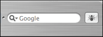
Search Box Label
When Safari first debuted one of the first things I complained about was its goofy placement of text field labels inside the text fields themselves. E.g. the “Google” label inside the Google search text field:
iTunes does this correctly, using actual labels for labeling:

Yes, it takes a couple of extra pixels of vertical screen real estate, but “saving space” is not a valid excuse to completely ignore standard control behavior. Not to mention that adding a few pixels to Safari’s toolbar wouldn’t hurt — its buttons are really rather small.
| Previous: | Observations Regarding iTunes 4 |
| Next: | Et Tu iTunes? |