
By John Gruber

Simplify integrations with WorkOS Pipes.
Panther Text Rendering
Monday, 10 November 2003
If you want an overview of everything new in Panther, the best resource I’ve seen, by far, is Mark Pilgrim’s “What’s new in Panther” — 11 pages, 100 screenshots, and pretty much a point-by-point overview of everything new. If you’ve upgraded to Panther and aren’t sure if you’ve checked out everything there is to check out, use Mark’s guide. (He even had it ready to go on Panther’s release day.)
That’s the overview. Now, let’s take the underview — one change, examined in minute detail.
Panther introduces significant changes to Mac OS X’s text services, providing new formatting doodads, ranging from the mostly-useless-but-flashy (e.g. text shadows and outlined letterforms) to the genuinely useful (e.g. true typographic small caps and better ligature support). For more details, see this article at Code Poetry.
(Of course, while these new formatting features are neat, I can’t say the same for the standard UI to access them, the Font Panel. It’s way too crowded, it tends to get in your way because it’s a floating palette, and the useful features (like genuine small caps) are hidden, while the useless (shadows) are prominent. But you don’t have to like the UI to appreciate the text formatting features.)
But what I find even more impressive is even further under the hood: on-screen text rendering in Panther is significantly improved. This has nothing to do with shadows or ligatures or new fonts. I’m just talking about the way text is rendered on screen. Specifically, the rendering of anti-aliased outline fonts at small point sizes, where by “small”, I mean the range of sizes typical for reading.
This topic — on-screen rendering of outline fonts at small sizes — encompasses all sorts of highly subjective observations. Meaning that many reasonable people have very different opinions about what looks better/more legible/more readable/more comfortable/etc. Very different. But before going any further into those areas of subjectivity, we should acknowledge the fundamental, inarguable, non-subjective foundation for the whole shebang:
Computer displays are a terrible medium for typography.
Interpolation on Why Computer Displays Suck for Reading
Now, the only other popular medium for reading is paper. And, compared to paper, your screen is horrible. Just dreadful. The problem is simply one of resolution. The on-screen atom is the pixel, and even the very best displays today offer very low pixel-per-inch resolution. Give or take, most displays today offer somewhere between 90-100 dots per inch. (Pixels are just on-screen dots.)
Most books and magazines are printed at at least 1200 DPI, sometimes more. Low-end cut-rate laser printer offer at least 600 DPI. Even cheap USB inkjet printers offer significantly higher resolution than the very best computer displays. Text from a $70 inkjet is much more legible than text displayed on a $2000 Apple Cinema Display.
In the early days of desktop publishing, affordable laser printers offered only 300 DPI, and most people with any sense agreed that at text sizes, type looked rather crummy at that resolution. Letterforms looked slightly smudged, and text just felt brittle. Today’s computer displays offer nowhere close to 300 DPI resolution.
Let’s be generous and assume that we’ll soon have displays that offer 150 DPI resolution. On such a display, a one-inch square would contain 150 × 150 = 22,500 dots. Compare this to an old 300 DPI laser printer, from which a one-inch square would contain 300 × 300 = 90,000 dots. The point being that because resolution is two-dimensional, “twice” the resolution means four times the dots. And, as stated earlier, 300 DPI isn’t even really that good for text sizes. 600 DPI output delivers 360,000 dots in a one-inch square, 16 times more than a 150 DPI screen. And 150 DPI screens aren’t here yet.
So why do we put up with on-screen reading if the quality of the type is so poor? Because it’s so damn convenient, of course. (Similar thinking leads us to drive everywhere we go, despite the fact that serious automobile accidents are frighteningly common.) The idea of, say, printing all your email along with everything you wish to read on the web is, well, a bit silly. Not to mention costly and wasteful.
So, in a nutshell, this is the fundamental truth of screen reading: the type looks terrible, but the content is extraordinarily convenient.
Interpolation on Digital Fonts
On paper, type consists of minuscule dots of ink or toner. But you can’t really see the dots, even if you hold the paper right up close to your eyes (ink spreads, and modern laser printer resolution is too fine). On screen, however, individual pixels are fairly easily discerned, and if you get close enough, you can even see the space between pixels.
The most obvious technique for designing fonts for screen use is to create the letterforms out of pixels. For example, in a “9 point” screen font, each character is designed to fit in a 9-pixel-high grid, a “10 point” font in a 10-pixel-high grid, and so forth. (The grid might actually be two or three pixels higher than the point size, to account for descending strokes in letters like y or g, but you get the idea.)
Such fonts are called by several names: screen fonts, bitmapped fonts, pixel fonts, etc. I’ll call them pixel fonts, because that’s the most apt description — every character at every size was designed pixel-by-pixel.
In traditional typography, type designers have the luxury of working with curves. To form, say, an S out of metal or wood, the designer could carve/mold continuous curves. Whereas with a pixel font, the designer is forced to work only with square pixels. It’s exactly like designing letterforms by filling in squares on a piece of graph paper. At small point sizes, the grid for any single character contains very few squares.
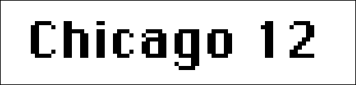
The original Macintosh shipped with an assortment of wonderful pixel fonts designed by Susan Kare. Most famously, the original system font, Chicago, which came in only one size — 12. Chicago 12 is simply sublime. Given the limitations of a small monochrome display, I think it’s pretty close to as good as a pixel font can get. Designers at Apple apparently agree — Chicago 12 is also the system font for the iPod. Here it is at normal size:
![]()
And magnified 6×:
It might at first strike you as relatively simple to design multiple sizes of the same pixel font, but it’s not. It’s devilishly tricky. Take for example 9- and 10-point Geneva, another old Macintosh stalwart. Life size:
![]()
Magnified 6×:
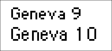
Going from 9 to 10, you get one extra row of vertical pixels. But because you only get one extra row, and because you can’t split pixels, it’s impossible to carry the same internal character proportions. Look at the differences between Geneva’s e’s and a’s at the two sizes — these are very different letterforms.
Because each different size of the font is designed separately, pixel-by-pixel, a pixel font only looks good at the sizes for which it was designed. A robust family of pixel fonts might come in sizes of 9, 10, 12, 14, 18, 24, 36, 48, and 72. Some fonts only came in a handful of sizes. Chicago, as previously stated, only came in size 12.
Outline fonts, on the other hand, are what most people think of when they think of fonts. Outline fonts are designed not as pixels, but as continuous curves and lines. Outline fonts come in numerous formats — PostScript, TrueType, OpenType — but they work the same way. Most importantly, they are scalable. Outline fonts can be used to generate characters at any point size, or even fractional point sizes.
Pixel fonts tend to look better on-screen than they do printed. This is because their low resolution precisely matches the low resolution of the display, but falls woefully short of the maximum resolution of the printer. Outline fonts tend to look better on paper than they do on-screen, because they scale to take advantage of the printer’s high resolution.
Interpolation on Techniques for On-Screen Font Rendering
To make pixel fonts look good on screen, the onus is on the type designer. When rendering a pixel font, the computer has very little work to do — it simply takes the pixel-by-pixel shapes for each character and renders them pixel-by-pixel on screen. A pixel font drawn at its natural size is effectively pre-rendered.
Making outline fonts look good on screen, however, puts the onus on the computer. Outline fonts are almost always designed with high-resolution output devices in mind. No matter what the output device — screen or paper — outline fonts need to be rasterized before they’re displayed. That just means that the scalable vector-graphic letterforms are turned into grids of dots. With high resolution printers, the rasterized characters are composed of many, many dots, even at tiny sizes. Four-point laser printed type might not be comfortable for extended reading, but it’s certainly legible.
But for on-screen display of an outline font, there just aren’t enough dots to do the letterforms justice. Shoe-horning a high-resolution letterform into a very low-resolution display is impossible. Or, rather, it’s impossible to do it in such a way that some of the details of the letterforms aren’t lost.
The obvious strategy — assuming we’re talking about black text on a white background — is to use the outline font letterforms to determine which pixels to turn black, and which to leave white. In other words, black text = black pixels.
There is a different strategy for rendering outline fonts to the screen: anti-aliasing, a.k.a. text smoothing. In short, anti-aliasing uses gradient shades to render type on screen. For example, to draw black type on a white background, an anti-aliasing rendering engine would generate not just black pixels and white pixels, but also gray pixels.
Which pixels to turn which shades of gray, however, is quite a tricky problem. There are dozens of algorithms for anti-aliasing text, and some methods are clearly superior to others. The system-wide anti-aliasing offered by Mac OS 9, for example, is very poor. In other cases, it’s a matter of subjectivity. Photoshop 7 offers four different anti-aliasing algorithms. They’re all pretty good, but the results sometimes differ quite a bit, especially for small type.
Without anti-aliasing, outline fonts rendered at small sizes on screen tend to look like a bad fax, due to the aforementioned shoe-horning issues. Therefore, outline font designers — especially the designers of typefaces intended for use at small sizes — sometimes make an extra effort to include corresponding pixel fonts, or else they hint their typefaces. Hinting is quite a complicated endeavor, but the layman’s definition will suit us just fine here: a hinted outline font provides hints to the computer as to how best display characters on a low-resolution screen.
If an outline font is hinted well enough, the on-screen results look like a pixel font. That’s because the art of hinting requires the same painstaking pixel-by-pixel attention to detail on the part of the typeface designer. When an outline font isn’t hinted well (or at all), the results at small sizes are horrendous.
Take, for example, two of the fonts included with Mac OS X: Helvetica and Helvetica Neue. Helvetica is an old Mac OS standby; it is therefore no surprise that it is hinted very well at small sizes. Helvetica Neue, on the other hand, does not appear to be hinted at all.
Now, these are two extremely similar typefaces. Helvetica Neue is simply a redrawing of Helvetica (for more information, see here). With anti-aliasing, they are practically indistinguishable:
![]()
However, turn anti-aliasing off — by raising the threshold in the “Appearance” (née “General”) System Prefs panel — and the difference is, dare I say, startling:
![]()
Helvetica looks just like it did in the old days. Helvetica Neue looks like poop.
The latest advance in anti-aliasing is called sub-pixel rendering, and is only desirable for LCD displays. Sub-pixel rendering is based on the idea that each pixel on an LCD display is comprised of three sub-pixels: red, green, and blue. The trick with sub-pixel rendering is that instead of using shades of gray pixels to smooth black text on a white background, it instead uses shades of red, green, and blue.
This sounds crazy, I know. I didn’t believe it at first, either, but it works. It’s an effective illusion, rendering text that looks like it was generated at a higher resolution than your display actually supports. Microsoft’s recent versions of Windows use this technique, under the name ClearType. Their web site contains a lot of useful information on the subject.
Mac OS X supports sub-pixel rendering as well. In the “Appearance” panel in System Prefs (in Panther; it’s the “General” panel in Jaguar), you can choose from the following anti-aliasing methods: Standard, Light, Medium, Strong. Light, Medium, and Strong all use sub-pixel rendering, which is why Medium is labeled “best for Flat Panel”. Standard is a traditional anti-aliasing technique (e.g. using only shades of gray to render black text), and thus is labeled “best for CRT”.
How the Preceding Interpolations Apply to Text Rendering on Mac OS X 10.3
This is where things get interesting and, well, controversial.
The controversy stems from the fact that many people simply don’t like anti-aliased text, period, regardless of the algorithm or technique used to achieve it. Many other people adore anti-aliased text. Those who dislike anti-aliased text tend to describe it as fuzzy or blurry. Those who like it tend to think anti-aliased text just plain looks better: that it’s smoother and more accurately conveys the style and feeling — the je ne sais quoi — of a typeface.
There do exist people with no strong feelings on the matter, but for those who do feel strongly, there is no middle ground. The problem is that both camps are right. Anti-aliased text is fuzzy and blurry. But it’s also true that it is smoother. Anti-aliasing is an illusion — the illusion of higher resolution than is actually available. Unfortunately, the illusion doesn’t work well for everyone.
Non-anti-aliased text is dorky but sharp. Anti-aliased text is elegant but fuzzy. You can’t win, because truly winning would require on-screen text that is both elegant and sharp, and that requires higher-resolution displays than those we have today.
In the meantime, we need to make the best of the relatively low resolution displays that we’ve got. The old way of “making the best” was to use painstakingly hand-generated pixel fonts. That’s what the old Mac OS did. The new way of “making the best” is for the operating system to offer fast, high-quality, system-wide anti-aliasing. This is what Mac OS X does.
You might disagree with Apple’s decision. Admittedly, I did. But this is no longer worth arguing about. That train has left the station. Most text on Mac OS X is going to be anti-aliased. What is worth hoping for is that Mac OS X’s anti-aliasing routines continue to improve.
And that, dear reader, is exactly what’s happened in Panther.
It’s worth noting that most people who notice such things as the quality of on-screen text rendering tend to be in the pro-anti-aliasing camp. From Mac OS X 10.0 onward, many of these people have proclaimed loudly and passionately that on-screen text in Mac OS X is beautiful. And rightly so — by the standards of anti-aliasing, text on Mac OS X has always looked good.
So, since Mac OS X on-screen text rendering was already very good, it’s no surprise that the improvements in Panther are rather subtle. It’s quite probably that most Panther users haven’t even noticed.
Here, for example, is 12-point Hoefler Text (an outstanding text face provided free with Mac OS X), rendered in TextEdit on both Jaguar and Panther, in both Medium (best for LCDs) and Standard (best for CRTs):
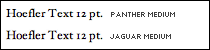
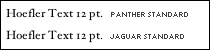
I told you the improvements were subtle. At 6× magnification, however, the improvements on Panther are obvious:

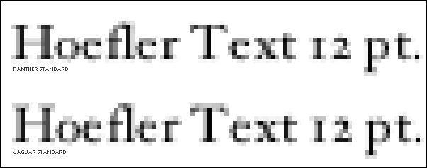
In the Panther samples, there is much less vertical fuzziness. In particular, note the tops of the “H”, “T”, and “1” — under Panther, the tops of the letterforms are much sharper. Also note the “o” — under Jaguar, it almost looks like two small adjacent parentheses; under Panther the “o” is more clearly a complete circle.
You might be tempted to wonder whether it matters, given that you can barely perceive the difference without magnification. Well, consider a pair of shoes which are a half-size too small. Perhaps you will not perceive the difference in the morning when you first put them on, but you will by the end of the day, when your feet hurt.
Panther’s improved anti-aliasing epitomizes the best of Apple. The smallest details matter. Perfection is worth striving for. Great is OK, but insanely great is better.
| Previous: | SmartyPants 1.4.1 |
| Next: | BBEdit 7.1 |