By John Gruber

Manage GRC Faster with Drata’s Agentic Trust Management Platform
iPhone-Optimized Google Search Results
Monday, 17 November 2008
On the desktop version of Safari, when you use the built-in Google search field, you get pretty much the same results page as when you go to google.com and enter your query the old-fashioned way. The toolbar search field is just a more convenient way to get the same results.
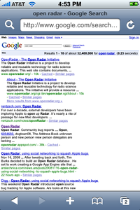
But that’s not the case on the iPhone. On the iPhone, when you use the toolbar search field (the one you get by tapping the magnifying glass button next to the location field), you get Google search results that look pretty much exactly like Google’s default web presentation, shrunk down to fit on the iPhone screen:
In this initial state, the results are effectively illegible. But if you start your search by loading the google.com home page, you get a results presentation that is specifically optimized for MobileSafari:
The text is perfectly sized, and the entire page layout is optimized for the iPhone display.
Admittedly, the un-optimized presentation you get via the toolbar button isn’t a big deal, because you can double-tap on the results column to zoom in:
But even then it’s still not as nice as the version you get through the web site interface. I don’t understand why, if Google has an iPhone-optimized search results mode, this mode isn’t used for queries initiated via the iPhone’s built-in Google search field.
It’s not clear to me whether Apple should change MobileSafari to send a different query string to Google to trigger these iPhone-optimized results, or whether Google should just handle it on their end, the same way they already serve an iPhone-optimized version of their home page to iPhone users.1
Update 1: Looks like Google engineers Steve Kanefsky and Rob Stacey wrote about this last week for the Google Mobile Blog:
Over time, we intend to make the newly formatted results pages available through other search entry points on the iPhone, on additional devices, and in more language and country combinations.
Update 2: I neglected to mention that if you change your default MobileSafari search engine from Google to Yahoo, the search results from Yahoo are iPhone optimized:
Right idea, but I don’t care for Yahoo’s presentation. Each result is too big — you can only see the first two without scrolling, whereas with Google’s iPhone display you can see four.
-
In addition to sizing and positioning the form fields on the Google home page in a way that’s optimized for the iPhone, there’s also a very nice as-you-type menu of suggested search terms. Google, company-wide, has made some of the best iPhone-optimized web sites I’ve seen. ↩︎


