
By John Gruber

Paper — The connected canvas for teams shipping with agents
Observations, Complaints, Quibbles, and Suggestions Regarding the Safari 4 Public Beta Released One Week Ago, Roughly in Order of Importance
Wednesday, 4 March 2009
Performance
The Safari 4 public beta is faster than Safari 3 and every other browser available for the Mac. (CNet’s Crave backs up Apple’s claim that Safari 4 is the fastest browser available for Windows as well.) One thing to keep in mind — and I’ll return to this distinction again — is that Safari, the browser application, and WebKit, the open source HTML/CSS/JavaScript rendering engine, are separate things. There are several web browsers that use WebKit, but not all WebKit-based browsers exhibit identical performance. Safari itself seems to be responsible for eking out some measure of the new performance gains — but, for the obvious reason that the rendering engine is responsible for the majority of the CPU-intensive work, WebKit is the source for most of the improvements.
From its inception over 6 years ago, the WebKit team has adhered to an interesting policy regarding performance:
The way to make a program faster is to never let it get slower.
We have a zero-tolerance policy for performance regressions. If a patch lands that regresses performance according to our benchmarks, then the person responsible must either back the patch out of the tree or drop everything immediately and fix the regression.
Common excuses people give when they regress performance are, “But the new way is cleaner!” or “The new way is more correct.” We don’t care. No performance regressions are allowed, regardless of the reason. There is no justification for regressing performance. None.
This may sound like common sense, but anyone who’s ever worked on large software products will tell you that many teams, if not most, do not adhere to such a policy. The most common excuse is one that the WebKit policy doesn’t list: “We’ll fix the performance issues later.” The truth is that sometimes, later never comes.
Safari started life in 2003 as a fast browser, at least by the then-low standards of Mac OS X web browsing, and it has gotten nothing but faster since. I fully expect other high-quality browsers like Firefox and Chrome to leapfrog ahead as they reach future milestones. What really matters isn’t whether Safari is the fastest web browser in the world, but simply that its performance, in actual use, is state-of-the-art. Prior to Safari, this just wasn’t true for any Mac web browser. The difference Safari and WebKit have wrought to web browsing (and HTML web view rendering system-wide) simply cannot be overstated.
And so in a nut, the latest version of WebKit deserves nothing but accolades; but Safari 4? Well, we have some issues.
Progress
Even more so than the new style of tabs, Safari’s new progress indicator is the change I’m having the most trouble adjusting to. Every previous release of Safari, starting with the initial 1.0 public beta, displayed page load progress with a horizontal meter in the location field:

Now, in the Safari 4 public beta, page load progress is indicated only by a subtle spinner at the far right of the location field:

Most of what I wrote in my review of the original Safari 1.0 public beta in 2003 stands up remarkably well. But I was very wrong about the progress meter. I wrote:
Progress Bar Behind Location Field
Hideous. It looks like partially-selected text. Please scrap it.
But I quickly grew accustomed to it, and soon grew to miss it when using other browsers. It was, I soon decided, a damn clever way to show progress in a way that was prominent while the page was actually loading, and without taking up any additional space on the screen after loading was complete.
For sites that load quickly — and some sites do load nearly instantly in Safari 4, with a good network connection — it doesn’t make much difference. But not all web sites load quickly, and not all network connections are good.
It’s not just that the new spinner is subtle, but that it is indeterminate — a simple spinner only indicates “not done yet”, with no indication as to how far along it is at the moment. This has nothing to do with WebKit’s rendering performance, just simple bandwidth and latency. A typical multi-megabyte PDF file might take a minute or more to load from a busy server or on a slow network, but the only feedback you get in the new Safari 4 is a small indeterminate spinner. Almost done? Not even close? You have no idea until the download is complete. It’s hard to see this as anything but a loss.
So: Why? Safari’s designers aren’t talking, so we’re left to speculate. Estimating the progress of a page load is not an exact science — a determinate progress bar is at best an estimate. But Safari’s progress indicator seemed very accurate to me. At least it felt accurate, and that’s the entire point. Perhaps the idea is that Apple sees the modern browser as more than just a simple HTML document viewer — that it’s an entire software environment and runtime. But I still can’t see this as anything but a regression in the experience. A determinate progress meter has the psychological effect of making a wait seem shorter. That’s why the iWork suite shows a progress meter when you open documents. Yes, what you really want is for the web page to be finished loading, but in the mean time, it’s nice to know it’s a third of the way — no, now half, now two-thirds — done.
The new progress spinner doesn’t make Safari slower, but it does make it feel slower. This time I really mean it: Please scrap it.
The Tabs
Safari’s new tab layout, placing the tabs directly in the window title bar, is a radical change. There’s no use addressing the specific details — good and bad — of this new arrangement, without first trying to figure out why Apple did this. Again, the designers are behind Apple’s wall of silence, so we’re left to speculate.
Rule out the notion that Safari’s designers undertook this change lightly. This is a major change to an important feature that many users feel strongly about. My guess is that this is an attempt to bring tabbed browsing to the masses. The biggest and most important change is that the interface for the tabs is now far more prominent. In fact, previously, the entire interface for tabbed browsing was not visible in Safari by default — in a window with just one tab, Safari’s default settings were such that the tab bar was not shown.
In Safari 4, there’s a prominent and unique “+” button that is always visible in the top right corner of every window, where the standard tic-tac button for toggling the display of the toolbar usually resides.1 Because the interface to create new tabs is now obvious, I can only assume that the point of this redesign is to encourage more people to use, or at least try, tabbed browsing.
But the problems with this new tab layout are significant.
Conceptually, the basic idea is sound. Browser tabs are, effectively, a collection of separate browser windows grouped together in a single parent window. Safari’s new tab layout makes this a tab is like a sub-window metaphor more explicit. The anchor, the conceptual root, of a standard Mac OS window is the title bar, and in Safari 4, the tabs aren’t just in the title bar, they are the title bar.
The placement atop all other window content is, yes, following the lead of Google Chrome. But Safari takes it one step further, and, I think, also one step too far. Chrome’s tabs are still contained within a window title bar — they are obviously things contained within a window, rather than in Safari, where they’re more like multiple windows snapped together. Aesthetic comments aside (although by the standards of Windows software, I personally think Chrome looks good), the relationship between Chrome’s tabs and their parent window are more thoroughly thought-out than Safari 4’s.
Safari 4’s tabs bring to mind the tab-style window title bars of the old BeOS. In Be’s system, title bars were only as wide as the name of the window, rather than stretching across the entire width of the window itself — reminiscent of the tabs on real-world folders. (Apple played with such an idea in 1980 while developing the graphical user interface for the Lisa and Mac.) Be’s windows could not be snapped together to create a single window containing multiple tabbed windows, but by holding down the Shift key, you could slide the title bar horizontally across the top of any window, the point of which was to allow you to manually arrange windows in a tabbed style. This movie demonstrates how it worked:2
Safari 4’s tabs are visually similar to the Be concept, except they are snapped together. But, conceptually and visually, Safari’s current implementation is a bit muddled. Tabs are their own thing, but when snapped together, the window as a whole is its own thing as well. But there’s now very little chrome (in the lowercase c sense) devoted to the window as whole — pretty much just the triumvirate of buttons for closing / minimizing / zooming the window. Visually there’s no border between these buttons and the first (left-most) tab:

Damien Molokai, in an overall defense of Safari’s new tabs, suggests simply adding a left border to the first tab and leaving some room to the right of the window controls, leaving a clear area intended for dragging the window itself:

Molokai’s mockup is visually cleaner, but doesn’t go far enough to fix the conceptual mushiness. Sean Sperte suggests a more Chrome-like layout, leaving a border atop the window belonging to the parent window itself:

That’s not perfect, but it’s clearly better than the actual tab bar design in the Safari 4 public beta. Consider: with the previous tab design, if you wanted to move a window you dragged the window, and if you wanted to move a tab you dragged the tab. Now in Safari 4, if you want to move the window you drag a tab, and if you want to move a tab you drag the small grippy strip at the far right edge of a tab. This is more abstract, indirect, and worse. Chrome’s tab design suffers none of these problems.
Yes, it saves 20 pixels of space to consolidate the title bar and tab bar into the same area. But design is always about trade-offs. Whitespace can serve a purpose. Take for example the margins in a book, which aid in readability and usability (by giving you a place to put your thumbs without obscuring the text). Safari 4’s tabs-in-the-title-bar arrangement is like a book with text set right to the very edge of the paper — it saves space at the expense of something useful.
There’s also something unpleasant about the width of the tabs in Safari 4. In most other tabbed document UIs, including Safari’s old one, tabs don’t change their width or position dynamically until they need to shrink in order to fit an additional tab in the window — in a typical window, generally after the fifth or sixth tab. In Safari 4, the entire tab bar (which is to say most of the window title bar) is divided equally between all tabs. The old way, tabs only move and shrink a little, and only when you have many tabs in the window. The new way, tabs move and shrink a lot until you reach the point where there are many tabs in the window, making it harder to keep track of where a particular tab is. Consider a window with five tabs: the title of the second tab is on the left side of the title bar. Now close the third, fourth, and fifth tabs, leaving just the first two. The name of the second tab has moved all the way over to the right side of the title bar. When you do the same exercise in Safari 3 the second tab never moves.
My guess is that space consolidation, combined with the desire to encourage tab use by typical users, is what drove this design. Most users only use what they see. They never saw tabs because there was no visual tab interface until after a second tab had been added to a window. And the tab bar was hidden when there was just one tab open because it looks like a lot of wasted space to have an entire tab bar containing just one tab, and if the tab bar isn’t shown by default in a new window, there’s no good place to put an obvious “+” button for creating new tabs, which button is necessary so that typical users see how to create new tabs. Hence the decision to combine the tab bar with the window title bar: always visible, no wasted space.
But I think Safari’s designers over-thought the problem. It would have been better simply to turn on the “Always show tab bar” setting by default, add the new tab “+” button to the now-visible-by-default tab bar, and let users who are annoyed by the “wasted space” turn it off in Safari’s preferences. That’s pretty much how Panic’s Coda handles document tabs (except that Coda has no option to hide the tab bar, 20 pixels of space be damned):
Tab Click-Through
Click-through problems with Safari 4’s new tabs abound. You get it when you don’t want it: accidentally activating — or worse, closing — a tab when you simply wanted to bring a window forward. And you don’t get it when you do want it: for dragging a tab out of a background window and into another window. As a general rule you’re less likely to want click-through for clicking but more likely to want it for dragging — in Safari 4 you get the worst of both.
Consider the common scenario where you want to drag a file from a Finder window in the background into your current frontmost window (regardless what app you’re currently in). You can just click-and-drag on the file in the background Finder window and drag it — the background Finder window does not activate when you click in it to start a drag.
With the Safari 4 public beta, that doesn’t work. Say you have a frontmost Safari window wherein you are collecting several related tabs. You see a tab in a background window that you want to move to the front one. But as soon as you click on the grippy strip to commence dragging the tab from the background window, that tab’s entire window is brought forward, and, if the two windows overlapped significantly, now obscures the previously frontmost window such that you can no longer see the intended destination of the drag. When you drag something out of a background window, the window should not pop forward.
When you click (not drag) in the title bar area to bring a background Safari window forward, in addition to the window activating, whichever tab you clicked on activates as well. So the more tabs you have open in a window, the smaller the region is within the title bar where you can click to activate the window without changing that window’s current tab. In every other app in Mac OS X, you can click anywhere on a window title bar to bring that window forward without changing the context of the window. But, if you click and drag on a background tab in a background window in Safari 4, the window activates but the tab does not.
Even worse, click-through is in effect for the close buttons on background tabs in background windows, even though these close buttons are only visible when the mouse is hovering over them. Twice in the past week I’ve accidentally closed a tab when trying to activate a background Safari window.
My guess is that Apple chose to make background tabs’ close buttons and grippy strips only visible when the mouse is hovering over a tab to reduce the appearance of clutter. But hiding the controls doesn’t eliminate the actual clutter — a Safari 4 title bar containing five or six tabs is littered with dangerous spots on which to click or drag. Because of click-through, you must now be careful about where and how you click in the title bar of a background Safari window; that’s not the case for any other app on the Mac.
Tab Colors
One of the best things Apple introduced in Leopard was a consistent, single style for regular windows, with increased contrast between the frontmost window (dark) and background windows (light). Safari 4 uses the wrong colors both for active and inactive windows.
The following table compares the top left corner of active (foreground) and inactive (background) windows in Safari 3 and 4 on Mac OS X 10.5.6. Safari 3 uses the system-standard colors for both states. Safari 4 is shown both with the leftmost tab active and inactive.3
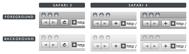
The toolbar/title bar in a standard, frontmost Leopard window is a gray gradient that goes from 77% brightness at the top to 59% at the bottom; for background windows, the standard gradient goes from 91–81%. (100% would be pure white, 0% pure black.) Safari 4 displays four different title bar states, for active and inactive tabs in both foreground and background windows. In none of these four states does Safari 4 use the standard gradient colors.
| Safari 3 | Safari 4 Active Tab |
Safari 4 Inactive Tab |
|
|---|---|---|---|
| Foreground | 77–59 | 88–69 | 73–61 |
| Background | 91–81 | 95–86 | 83–77 |
In the above table, colors are expressed as a range of two grayscale percentages, the first from the top of the window, the second from the bottom of the gradient.
The usability advantage to Leopard’s consistent system-wide window colors is that it is easy to pick out the current frontmost window at a glance, regardless of the contents of the window, by glancing at the title/toolbar areas at the top of your screen. All background windows are very light; the frontmost window is dark, so to find the active window just look for the dark one.
Safari 4’s non-standard colors ruin this simplicity, particularly in two cases:
- A foreground window containing a single tab.
- A background window containing several tabs, and where the rightmost tab is the active one.
The problem with #1 is that in an active Safari 4 window with just one tab, the color is nearly as bright as that of a standard background window, especially at the very top of the window — there should be a 14 percent difference in brightness but the difference is only 3 percent. The problem with #2 is that inactive tabs in a background Safari 4 window are nearly as dark as the active tab in the frontmost Safari 4 window — there’s only a 6 percent difference in brightness at the top of the window. In both cases there simply isn’t enough contrast. A significant Leopard usability improvement has been ignored for no benefit whatsoever.
Other Things That Are Wrong With Safari 4’s Tabs
Add to the aforementioned problems:
In order to fit more text in each tab, Apple is drawing Safari 4 tab titles in a different font size and weight (11px Lucida Grande Bold) than the title bar text in every other window in the entire system (13px Lucida Grande Regular). This makes the title bar area look particularly strange when a window contains just one tab.
Prior to Safari 4, you could Command-click the title of a window to get a pop-up menu showing a hierarchical path listing for the current URL. This feature is now gone. I can’t say it was that big of a deal, but it seems to me Apple could bring it back when you Command-click on a tab title.
The triangular grippy strip that indicates the draggable region of a tab is a poor choice. It looks almost exactly like the standard drag-to-resize indicator in the bottom right corner of a window, but serves a completely different purpose. Things that look similar should behave similarly; things that behave differently should look different.
In Safari 3 (and prior), you could drag a URL from any app and drop it into the empty space at the right side of the tab bar to create a new tab in that window displaying the contents of the dropped URL. It is very tricky to do this in the Safari 4 public beta. The obvious destination for such a drop is the “+” button in the top right corner, but that doesn’t work unless you hit just the right sliver — maybe 4 or 5 pixels horizontally between the “+” button and the rightmost tab. (You can drop a URL on Safari’s Dock icon to open it in a new tab, but only if you change Safari’s preference setting regarding how to “Open links from applications”.) The entire “+” button acts as a drop target for URLs in the Windows version of Safari 4, so I can only assume this is a bug in the Mac version.
The Good News: Tab Dragging No Longer Modal
In April last year, I documented Safari 3’s two different modes for moving tabs with drag-and-drop, which I called inter-window (moving a tab from one window to another) and intra-window (rearranging the order of tabs within one window). The mode was determined by the direction in which you initially began moving a tab. The problem was that once you entered a mode, you couldn’t switch to the other without stopping and starting over.
Good news: Safari 4 no longer locks you into a dragging mode. Regardless which direction you start dragging, you can change directions and drag the tab wherever you want. Even better news: the locked-in dragging modes are also gone in Safari 4 even when you diddle the defaults preferences to revert to the old-style tabs underneath the toolbar.
Cinematic Experience
The first time you launch it, Safari 4 opens a browser window that displays a logo and animation, replete with sound, reminiscent of the startup screen for Apple TV. I find it oddly captivating. It’s an example of the “cinematic experience” that Apple has been pushing for at recent WWDCs — the idea being that the production value and feel of Mac software should be of similar caliber to that of popular TV shows and movies. What’s interesting about this splash screen technically is that it isn’t a QuickTime or Flash movie. It’s implemented entirely using HTML 5 and JavaScript.
The new Top Sites feature — the most prominent feature on Apple’s “What’s new in Safari” page — is another example. From a practical standpoint it’s a neat idea, and pretty much identical to the “new tab page” feature Google introduced in Chrome — a visual matrix of your most-visited web sites, created and updated automatically based on your browsing history. But where Chrome’s presentation is a flat rectangle of thumbnails, Safari’s is a three-dimensional fan against a black background, complete with a glossy reflective foreground. Safari uses RSS to check for updated content on the pages in your Top Sites list; when there’s a change, it marks the page with a peeled-down corner and a star. It’s nice.
One thing that’s not at all obvious, however, is how you can customize the top sites list. When you enter the edit mode, you can drag to rearrange, pin a site to a specific spot in the grid, and delete a site from the list. But when you delete a site, it’s replaced by another site chosen automatically based on your history. You can customize the listing, though — when in edit mode, just drag-and-drop a URL from another Safari window to the spot where you want it in the Top Sites grid. (Nerdier tip: the list of top sites is stored in a plist file at ~/Library/Safari/TopSites.plist; you can edit it by hand when Safari isn’t running.)
The other visual-effects-powered feature is the addition of Cover Flow for your browsing history. I seldom use Cover Flow mode in iTunes and never in the Finder, but for web page history, it strikes me as downright useful — perfect for finding a page when you don’t remember the name or URL, but you do remember what it looked like.
Improved Location Field and Google Search Auto-Completion
Both the location field (a.k.a. address field) and Google search field feature much improved auto-completion.
The biggest improvement to the location field auto-completion is that it feels way faster. Previously, if I typed fast enough, I could hit return intending to engage the default suggested completion, but in fact hit return before the completion menu had even appeared, in which case Safari would take whatever few characters I’d typed and tack “.com” at the end, loading the wrong web site. The completion menu now seems to appear instantaneously. It also looks better, with a clear separation between page titles and URLs, and separate sections for matches from your history and bookmarks. In Safari 3, the completion menu only showed URLs (no titles), and there was no separation between matches from your bookmarks and history. My only gripe is that it currently shows the history section above the bookmarks section — I’d prefer it the other way around.
The Google search field now populates the suggestion menu as you type with results from Google’s Suggest feature. For me at least, the suggestions are remarkably, almost spookily, good. Note, though, that it doesn’t offer suggested results, but rather offers suggested terms to search for. If you choose a suggestion from the menu, you still go to a Google search results listing, not immediately to a destination page. That’s OK with me, but it’s not going to satisfy those of you who prefer input manager hacks like Inquisitor.
Minor Observations
The “Save as Web Application” feature in previous Safari 4 betas (which were available only to ADC developers) is gone. It was a command in the File menu that let you turn any web page into a site-specific browser — like Fluid, but built into Safari. No idea what happened to it.
I enjoy Mobile Me’s automatic bookmark syncing between my Mac and iPhone versions of Safari. But I’d like to see history syncing, too. Imagine having location field auto-completion on your Mac work for sites which you visited using your iPhone.
Zoom is now page zoom, not just text zoom — when you zoom in or out, the entire page, including layout and graphics, scales. But there’s an option in the View menu, off by default, to do text zoom only.
SnapBack is now only available for search results — the orange SnapBack button in the location field and manual “Mark Page for SnapBack” features from Safari 3 are gone. The only remaining SnapBack feature is the “Search Results SnapBack” command in the History menu. I never used it, and I don’t know anyone who does, so I suspect this was a good feature to cut. I’m sure some people used it, but if you never remove lesser-used features, you can’t add new features without letting the overall complexity blow up.
-
Yes, yes, there are command-line
defaultspreferences you can diddle to revert the tabs (and the progress bar) to the old style, but those may not be here for long, and they certainly won’t help the millions of users who have never even heard of Terminal, let alone launched it. ↩︎ -
My thanks to Chris Liscio for the movie. ↩︎
-
These screenshots also demonstrate how in Safari 3 the toolbar buttons are vertically centered between the close/minimize/zoom buttons and the bottom of the toolbar. In Safari 4 they are not, which I find visually unpleasing. ↩︎
| Previous: | Lost in the Shuffle |
| Next: | Obsession Times Voice |