By John Gruber

Rec League:
Share what you’re into
and find your people.
Halide
Tuesday, 30 May 2017
It takes some real grit to create a new iPhone camera app in 2017. To say that “camera apps” constitute a crowded category in the App Store is an understatement, and every camera app is competing against the system’s built-in Camera app, which (a) is very good, and (b) has built-in advantages — like being accessible from the lock screen by swiping right — that third-party apps can’t match.
Halide — a brand-new iPhone camera app designed by Sebastiaan de With and developed by Ben Sandofsky — rises to the challenge.
The first question Halide needs to answer is why should anyone even consider it instead of the system’s Camera app. The answer is that the Camera app has a wide range of responsibilities: separate modes for time-lapse, slow-motion video, regular video, regular photos, square photos, and panoramic photos. Camera also has to be usable by all iPhone users. Camera has a few semi-advanced features for still photography, like auto-exposure and auto-focus lock, but for the most part it only functions as a point-and-shoot camera, because it needs to be understood by the most casual of casual users.
Halide only does still photography. No video, no panoramic photos, no time-lapse. That frees precious on-screen real estate for advanced still photography features — the sort of things photographers expect from “real” cameras:
- A fast live-updating histogram.
- An easily-toggled, easily-used manual focus mode.
- Manual ISO and white balance controls.
- RAW support.
- Perhaps best of all, at least in my opinion, Halide has a focus peak feature: this highlights, in real time, which parts of the image have the sharpest contrast.
So if you’re a camera enthusiast, Halide easily passes the bar for features that justify the price (a mere $2.99 for now, but going up to $4.99 in a week). But as I mentioned before, there are dozens, maybe hundreds, of camera apps in the App Store, and none of Halide’s features are unique to it.
What sets Halide apart is design.
How the features are arranged. How they are accessed. How they are indicated visually. With traditional camera hardware, good reviews spend a lot of words talking about not just what the camera does, but what it is like to use. Camera reviewers often obsess over the placement and feel of all the buttons and dials. Halide brings that sort of obsessive attention to the placement and feel of its controls. This sort of maniacal attention to the smallest of details deserves to be celebrated.
Here’s how de With and Sandofksy put it in their announcement:
Smartphone cameras have improved massively over the years, but the shooting experience hasn’t. The built-in camera app is a little too simple, while advanced apps feel like an airplane cockpit. We needed an elegant app for deliberate and thoughtful photography, so we built Halide. [...]
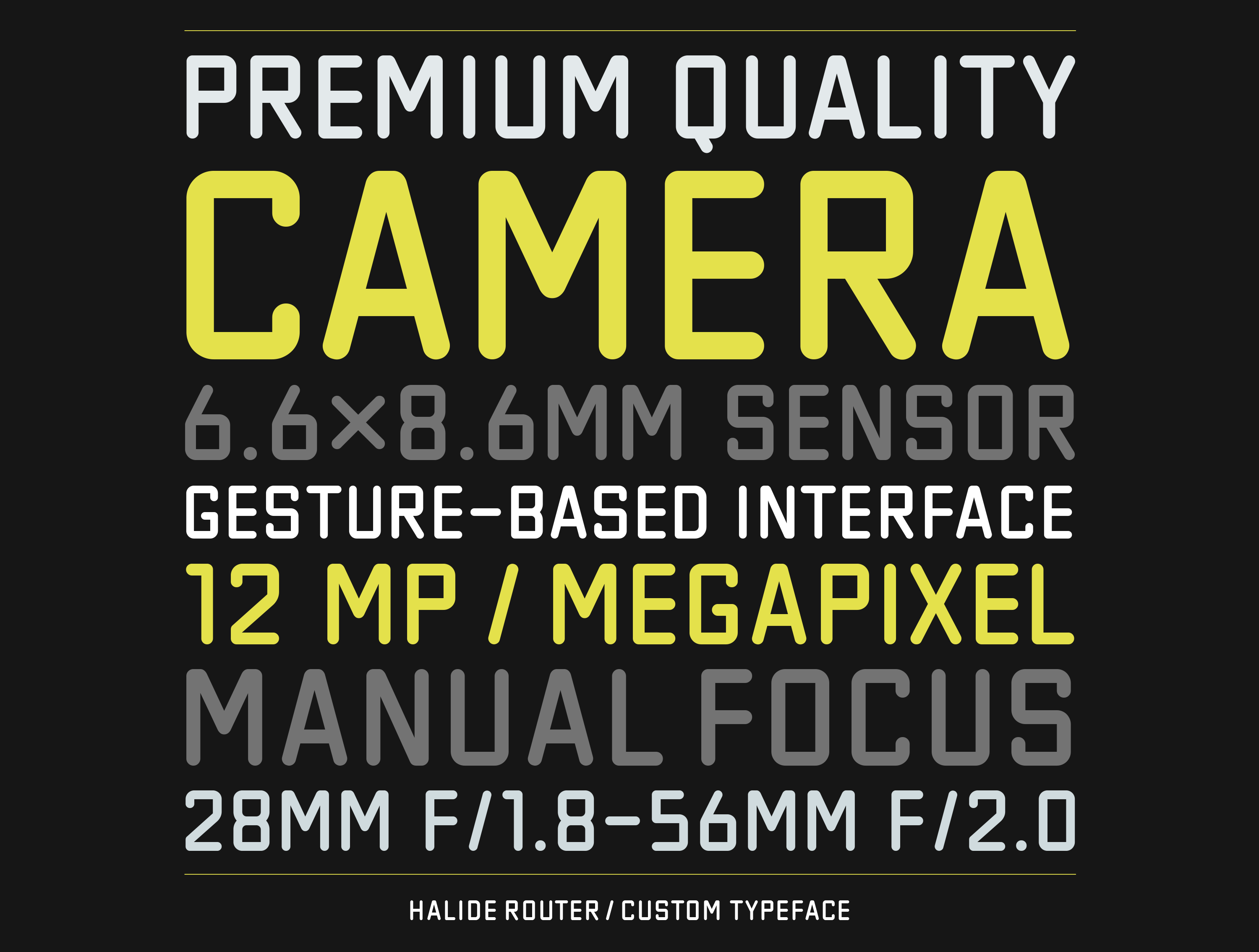
Lots of little details are scattered around the app, like a full fledged retro styled user manual and a custom typeface for the UI called Halide Router, developed by Jelmar Geertsma.
This was a labor of love. It’s an effort by two friends who love photography and found there wasn’t a tool out there that met our needs. We wanted a premium camera for our phone.
I love the page-turning in the user manual, and I love the textured shutter button. There’s a way to do modern UI design while keeping some whimsy, texture, and depth — and Halide is a wonderful example of how to do it right.
The custom Halide Router typeface is what puts the whole thing over the top in my book. For chrissake just look at it:
Clearly inspired by the lens inscriptions on kit from Leica and Zeiss, it just exudes camera-ness. The fact that Sandofsky and de With went so far as to commission a custom typeface is probably all you need to hear about Halide. Some of you will hear that and think “That’s insane, why would anyone waste so much time and effort on a custom typeface just for a few UI controls?”
The rest of you are like me, and will think, “That’s insane, I need to check this out immediately.”


