
By John Gruber

Paper — The connected canvas for teams shipping with agents
Medium and the Scourge of Persistent Sharing Dickbars
Monday, 19 June 2017
Medium seems to continue to grow in popularity as a publishing platform, and as it does, I’m growing more and more frustrated by their on-screen “engagement” turds. Every Medium site displays an on-screen “sharing” bar that covers the actual content I want to read. This is particularly annoying on the phone, where screen real estate is most precious. Now on iOS they’ve added an “Open in App” button that literally makes the last 1-2 lines of content on screen unreadable. To me these things are as distracting as having someone wave their hand in front of my face while I try to read.
Here’s an annotated screenshot (and threaded rant) I posted to Twitter while trying to read Steven Sinofksy’s WWDC 2017 trip report on my iPad Pro review unit last week.
Safari already has a built-in Sharing button. It has all the options for sharing I need. And as I scroll the page, it disappears so that I can see as much text on screen as possible. Safari is designed to be reader-friendly, as it should be. But it’s trivial to get that Sharing button back when I want it – just tap the bottom of the screen and there it is. Easy.
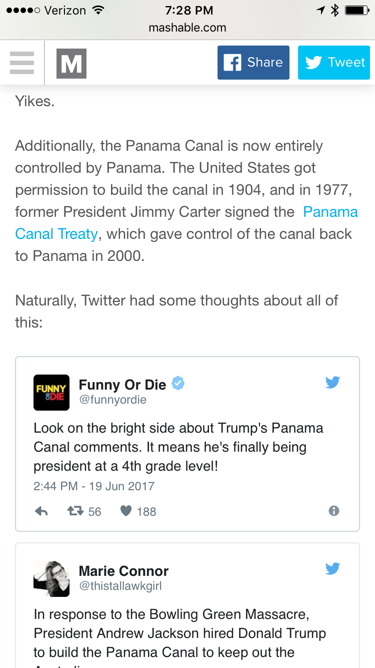
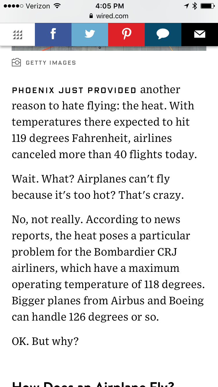
This is now a very common design pattern for mobile web layouts. Medium is far from alone. It’s getting hard to find a news site that doesn’t put a persistent sharing dickbar down there.
More examples:
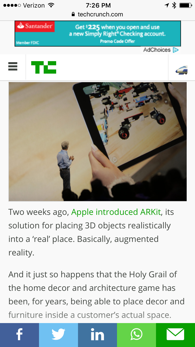
TechCrunch’s waste of space deserves special mention, for having a persistent navbar at the top and a persistent ad, in addition to their sharing dickbar.
I’m sure “engagement” does register higher with these sharing dickbars, but I suspect a big part of that is because of accidental taps. And even so, what is more important, readability or “engagement”? Medium wants to be about readability but that’s hard to square with this dickbar, and especially hard to square with the “Open in App” button floating above it.
iOS also has a standard way to prompt users to install the app version of a website — Smart App Banners. And it’s user-dismissible.
For any piece over a page long, I read Medium pieces with Safari’s Reader Mode. Medium is supposed to be a reader-optimized layout by default. It should be one of the sites where you’re never even tempted to switch to Reader Mode.
I’m frustrated by this design pattern everywhere I see it. But I’m especially disappointed by Medium’s adoption of it. I don’t expect better from most websites. I do expect better from Medium.
A website should not fight the browser. Let the browser provide the chrome, and simply provide the content. Web developers know this is right — these dickbars are being rammed down their throats by SEO experts. The SEO folks are the same dopes who came up with the genius strategy of requiring 5-10 megabytes of privacy-intrusive CPU-intensive JavaScript on every page load that slows down websites. Now they come to their teams and say, “Our pages are too slow — we gotta move to AMP so our pages load fast.”
I don’t expect to break through to the SEO shitheads running the asylums at most of these publications, but Medium is supposed to be good. When people click a URL and see that it’s a Medium site, their reaction should be “Oh, good, a Medium site — this will be nice to read.” Right now it’s gotten to the point where when people realize an article is on Medium, they think, “Oh, crap, it’s on Medium.”