
By John Gruber

WorkOS MCP: Manage your auth platform from any AI agent.
Pentagram’s ‘Range of Possibilities’ for Slack
Wednesday, 16 January 2019
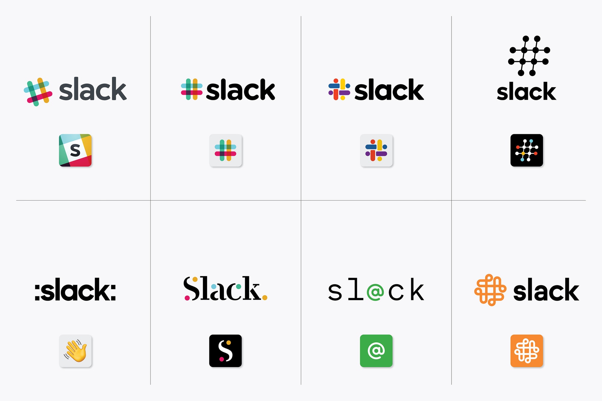
Coincident with the announcement of Slack’s new branding, Pentagram posted some of the work they did for Slack. For example, this image showing seven takes on a new identity (alongside the old one). What they’re showing is shockingly bad work. I can’t believe Pentagram would present some of this to a client, and it’s even harder to believe they would show it publicly.
Exhibit A:
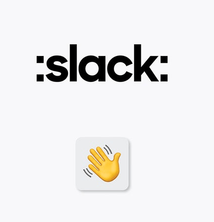
Slack uses colons like that for entering text shortcuts for Slack’s emoji-like “reaction” stickers. E.g., type :wave: and it’ll be replaced by a hand-waving sticker. No one who doesn’t use Slack would know that; many people who do use Slack don’t know that, because they have visual ways for choosing stickers; and even for people who do know what those colons represent, why in the world would anyone think they belong in the logo? And the actual waving hand in Pentagram’s proposal isn’t Slack’s artwork, it’s Apple’s emoji. And why would a hand-waving emoji represent Slack as a logo? It makes no sense and looks like someone spent 30 seconds making it in TextEdit. It looks more like a tweet than a logo.
Exhibit B:
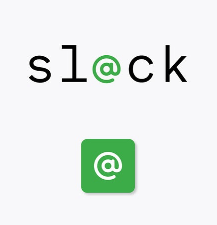
Where to even start with this gem? Why green? Why a monospaced font? (The lowercase L in this font looks a lot like the digit 1, which makes the whole thing look like a bad password — “s1@ck”. Why an “@” symbol? Slack already was strongly identified with a standard punctuation character — the “#” hash mark. If anything, the “@” in the middle of “Sl@ck” is reminiscent of an email address — but Slack’s entire raison d’être is to serve as a superior alternative to email for group and team collaboration. Slack is not at all like email but can be a replacement for email. Whoever crapped this logo out clearly didn’t even know what Slack is.
Then there’s this collection of monochrome marks, with the caption “Logo explorations for the octothorpe”:
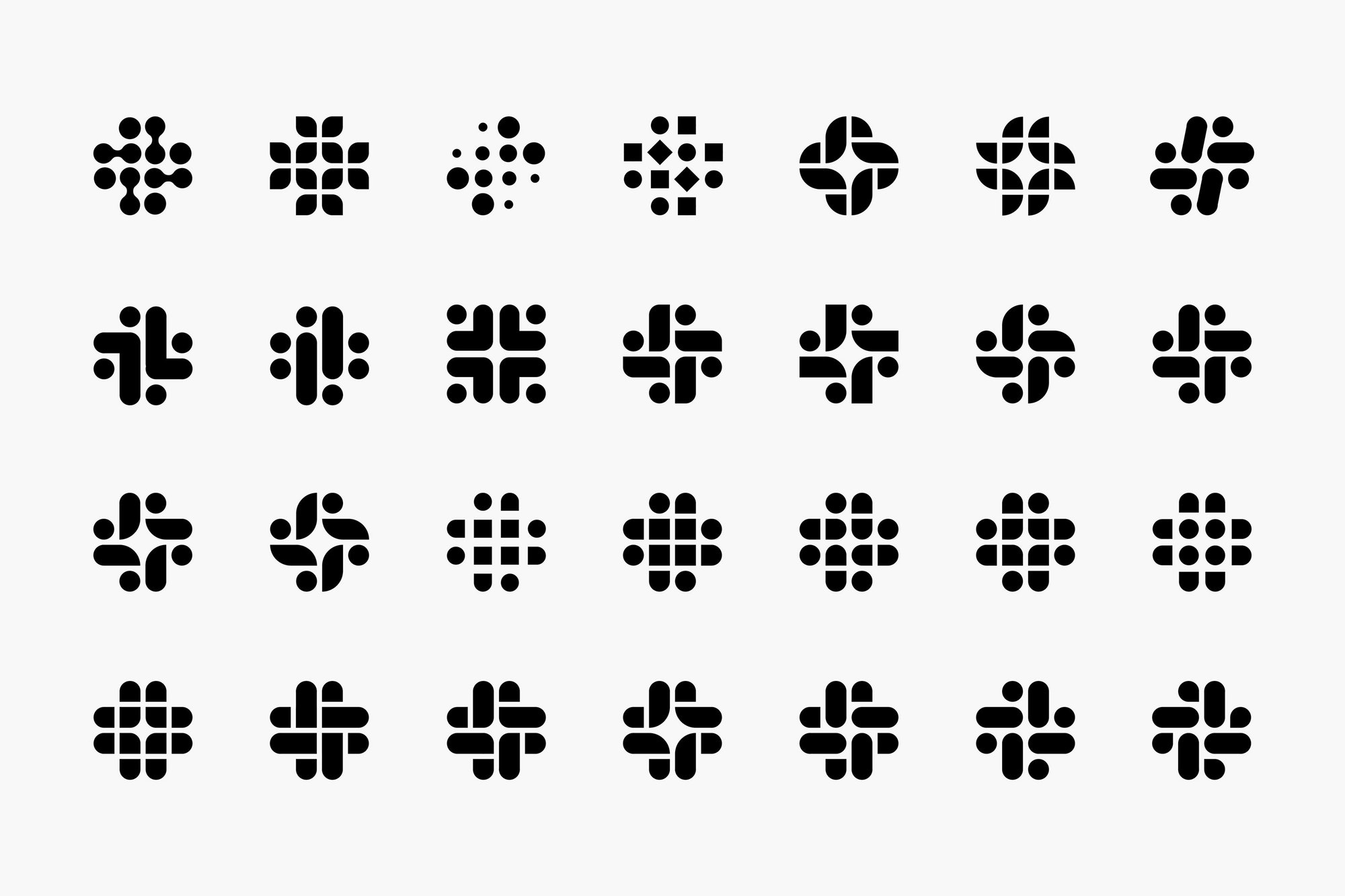
Only one of these 28 marks resembles an octothorp/pound sign/hash mark/whatever you want to call “#” (row 4, column 2). Maybe two or three if you squint. None of them are good marks. Most of them are terrible. This one looks like a man bouncing a ball behind a barber chair:

Pentagram proposed an ad using the new identity conceptually based on chat bubbles — and perhaps that’s what those squirts in the corners of the new logo are supposed to represent. (To me they look more like this.) But Slack doesn’t use chat bubbles. I suppose this new identity might presage a UI overhaul in which Slack will display chat bubbles, but if not, it again suggests Pentagram doesn’t even use Slack.
If I were on Slack’s marketing team and Pentagram showed me these proposals, I’d look around the room for hidden cameras, presuming that I was being pranked. If I weren’t being pranked, I’d be furious, because this is the oldest trick in the designer’s book — making one real proposal and then a bunch of throwaway garbage proposals to create the illusion of multiple directions for the client to choose from, and assuming the rube client will happily accept the real one and consider themselves smart for knowing which one was the best.1
Louie Mantia spent 10 minutes doodling and came up with a mark that:
- looks like Slack;
- looks good; and
- addresses all of the purported problems Slack had with their old mark.
It’s not finished work but it’s a better start than anything Pentagram proposed. What Pentagram has revealed indicates a total disregard for what Slack is and was — a brand which users have genuine affection for — and their new mark is nothing more than an unmemorable, unpleasant shape.
-
I’d be furious as well if I were being pranked. ↩︎
| Previous: | On Getting Started With Regular Expressions |
| Next: | The R-Word |