By John Gruber

OpenAI, Anthropic, Cursor, and Perplexity chose WorkOS over building it themselves.
Bad UI: MacOS 10.14’s Software Update Release Notes
Wednesday, 3 April 2019
[Update 23 April 2019: So the screenshots below were from the release notes for the MacOS 10.14.4 update. Turns out the issue this whole post is about was fixed in the 10.14.4 update — you can now select and copy text and click URLs in the release notes. Insert something-something about Murphy’s Law here. But the point still stands that Apple, of all companies, never should have shipped software like this in the first place.]
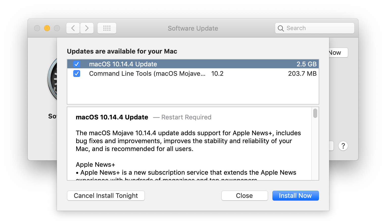
I’m far from the first person to notice this. It’s such bad design it’s obvious to anyone trying to read the release notes of a MacOS Mojave 10.14 update:
The release notes for the 10.14.4 update are quite long, as you can see from the relative size of the scroll. That’s good — there’s a lot new in this update and the release notes should mention everything new or different. But the sheet containing the release notes can’t be resized. You see about 9 lines of text at a time, and there’s nothing you can do about it.
Worse, the text can’t be selected, so you can’t even copy and paste it into TextEdit or some other app to read it comfortably. They even have URLs at the bottom of the note, pointing to support pages on apple.com which contain even more details about the update — but the URLs aren’t clickable. Can’t copy them, can’t click them — the only way to actually open these URLs is to retype them manually.
It was a good idea to move system software updates out of the App Store app and (back1) into a System Prefs panel. System software updates aren’t from the App Store, and System Prefs is — duh — the correct place to manage the system. But everything about the presentation of release notes in this sheet is obviously bad. Macs have displays ranging from large to giant, but these release notes are displayed in a fixed-size pane that shows less text than an iPhone SE. Seriously. The rigidity and clear lack of thoughtfulness makes it feel like a dialog box from some other operating system, like an old version of Windows. If this sheet were part of a student’s assignment in an intro to Mac programming class, a good teacher would send it back and explain how to make a sheet resizable, how to make text selectable (and thus copy-able), and how to make URLs clickable.
But this isn’t a student assignment. It’s MacOS system software.
-
Which is where Software Update properly resided in Mac OS X 10.0 through 10.7, before moving to the App Store app in 10.8. ↩︎

