By John Gruber

OpenAI, Anthropic, Cursor, and Perplexity chose WorkOS over building it themselves.
The Curious Design of Mail’s Message Action Toolbar in iOS 13
Friday, 25 October 2019
David Ingram, writing for NBC News:
Shannon Watts always replied to emails the same way: by touching the reply icon, tucked in a familiar spot near the bottom right corner of her iPhone. Then, one day a few weeks ago, the icon wasn’t there — and neither was the email. It was deleted by accident.
It’s happened dozens of times since, frustrating Watts and many other iPhone users who’ve been tripped up by a minor change rolled out last month by Apple, a company renowned for its forward-thinking design.
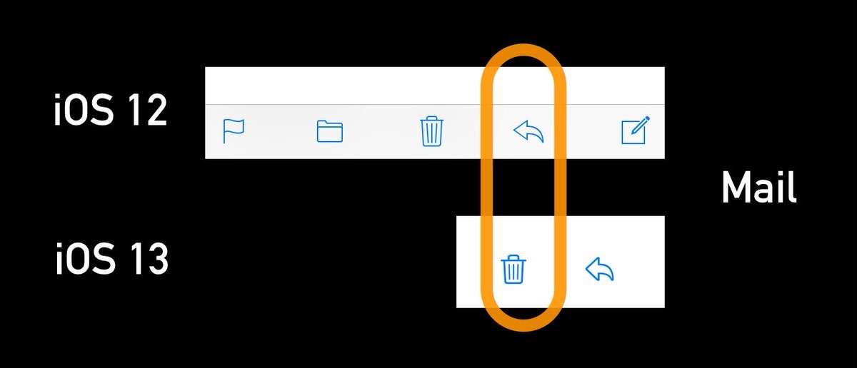
In the newest version of the iPhone email app, the trash icon is now where the reply icon used to be. And they’re too close together for some people.
The change is perfectly illustrated and summarized in this tweet by Craig Hockenberry:
Muscle memory is a bitch.
Things worth noting:
- You can long-press on the Trash icon to get an option to Archive instead.
- You can change the default from Trash to Archive in Settings → Passwords & Accounts. Tap on an email account and navigate to Mail: Advanced, and you can change the default action for “Move Discarded Messages Into:” from Deleted Mailbox to Archive Mailbox.
- Trashing and Archiving are undoable actions. Just shake your iPhone or use the new three-finger swipe gestures for Undo and Redo. But as this NBC News article makes clear, most people don’t know that Undo is pervasive system-wide on iOS.
The new toolbar in iOS 13 Mail is just strange. The old toolbar had discrete buttons for Flag, Move, Trash/Archive, Reply, and New Message. Now it’s just Trash and Reply, with all of the other functionality stashed in the new Reply action sheet, pictured here half-height and full-height. That new “Reply” action sheet is really a “Do Something With This Message” sheet — I’m not sure what the icon for this should be, but the Reply icon seems like an odd choice. I know a few people who assumed that iOS 13 removed the ability to move messages to other mailboxes because the folder button was removed from the toolbar. They — reasonably! — never thought to look for it by tapping what clearly looks like the old familiar Reply icon.
The Print command has long been stashed in the Reply action sheet — so arguably it’s always been more of a “Do Something With This Message” button than just a “Reply or Forward” button. But the iOS 13 Mail toolbar takes this to an extreme. It’s one thing to put new features (for which there’s no room on the toolbar) in the Reply action sheet; it’s another to move commands like Flag and Move that already had positions on the toolbar.
I like the new “Do Something With This Message” action sheet in and of itself a lot — it’s an interesting design to fit more functionality in the limited screen real estate of the iPhone. There are a lot of apps that have run out of space in their toolbars that could borrow from this design. I particularly like that in the new action sheet, all the actions are labeled with words in addition to icons. But iOS 13 should have included a first-run explainer showing users where these features moved to.
And it just seems odd to me that they moved all these features there in the first place. The iPhone really only has room for five toolbar buttons. Flag, Move, Trash, Reply, and New Message seemed like good ones. What’s the point of having only two buttons and all that unused whitespace on the left side? In addition to the fact that it’s not intuitive to look for Flag and Move commands behind a button that clearly looks like “Reply”, it’s also a bit frustrating to me that there’s no longer a way to just create a new message from this screen — you have to go back one level in the navigation controller to the list of messages to create a new (non-reply) message.
At the very least, if the toolbar is only going to have these two buttons, why not place the Trash button on the far left, and put the whitespace between the two buttons? That would eliminate inadvertent taps on the Trash button from either pre-iOS 13 muscle memory or from proximity to the Reply button.

