
By John Gruber

WorkOS MCP: Manage your auth platform from any AI agent.
The 24-Inch M1 iMac
Tuesday, 18 May 2021
The return of vibrant hardware color options to the iMac lineup immediately brings to mind the G3 iMacs that Apple sold from 1998 to 2003. 20 years is a long time, but I’ll go back further, to the original Macintosh from 1984. Those original Macs were sold in any color you wanted, so long as it was beige, but the whole point of that original Mac was that it was supposed to look good. It was a thing you’d want to put on your desk just to have it on your desk — let alone what you could actually do with it.
Those G3 iMacs from 20 years ago brought back that same spirit. Totally different design language, of course, but that same intention of making a device that looked great — and cutting edge — in and of itself. The “cutting edge” part was the fatal flaw of something like the 1993 Color Classic — it didn’t look good or charming, it just looked dated and weird. Early ’90s Apple knew that they were missing something that mid-’80s Apple had, but they whiffed on what it was that they were missing. Personal computers aren’t like, say, wrist watches, where you hit on a good design and it can remain timeless for decades. Computer form factor design needs to move forward in conjunction with the underlying technology.
Computers need to look new.
The 24-inch iMacs look new.
Adjectives that spring to mind after using one for the last week: bright, elegant, cheerful, fun, lightweight. That last one — lightweight — is a weird one for the iMac. It’s a desktop, not a portable. I’ve actually not picked it up or moved it since setting up. So I don’t even remember if it actually feels lightweight, but it looks lightweight. It looks refreshing. These new iMacs are objects that interior designers will love to place in a room — whether that room is an office, a bedroom, a kitchen, or a living room.
According to Apple, compared to the 21-inch Intel iMac, the new M1 iMac’s volume has been reduced by more than 50 percent, and its overall footprint reduced by 30 percent — even though the display size increased from 21.5 to 23.5 inches. The volume reduction is what makes it look sleeker, but it’s the footprint reduction that makes it more versatile.
Apple sent me the orange model (which was my preference), and it looks a bit different in person than it does in Apple’s product photos. I suspect that’s true of all these colors — there’s a satiny metallic aspect to the aluminum surfaces that just can’t be captured photographically. It’s a “looks good in photos, looks even better in person” sort of thing.
Is it a cheat to make the power supply external? Sure, maybe. But great designers know how to cheat right. The external power supply could have been internal, glommed onto the back behind the hinge somehow. There’s no doubt in my mind that this actual design — with the external power supply enabling the iMac itself to be as thin as possible and universally flat across the entire back — is a superior idea. The power supply will, in most people’s setups, be hidden out of sight. Why not hide something that’s even just slightly ungainly? All sorts of ungainly stuff, everywhere in life, is hidden out of sight. That’s a design cheat.
Why use an external power supply with a non-portable desktop computer? I think that’s the wrong question. The right question is: Why should MacBooks and iOS devices be the only devices that look as thin as possible? Apple has, in fact, done this before, but only sporadically. The 20th Anniversary Mac (1997), G4 Cube (2000), and the first few generations of Mac Mini (2005–2009) all had external power supplies. These M1 iMacs, I suspect, won’t be the last.
The result of putting the Apple TV-sized power supply out of sight is that the M1 iMac itself looks like it’s just a display. Maybe that’s true of the Intel iMacs too, but the M1 iMac not only looks like it’s just a display, it looks like it’s a very thin display. It’d be hard to believe there’s a powerful desktop-performance-class computer in there if I hadn’t spent the last six months using an M1 MacBook Pro.
The display itself looks excellent. Bright and crisp and spacious. Sound is excellent too. Apple’s audio team continues to make surprisingly big deep sound emit from seemingly tiny speakers. I would have killed to have had this iMac as my TV set back when I was living in a college dorm, or in my bedroom growing up.
I enjoy the fact that the corners of the display remain sharply rectangular. It feels like a proper distinction between Macs and iOS devices.
I know a lot of people are concerned that the white bezel surrounding the display will be distracting. In practice, I found that it just disappears. If there can be such a thing as a muted white — a white that most certainly looks white, not light gray, but yet not white white, this white is that white. I didn’t need time to get used to it — I just never really noticed it while using the iMac. Same thing with the pastel-orange chin. The entire front face of this iMac looks of a piece with the white-accented keyboard, mouse, and trackpad. The aluminum parts of the Magic Mouse and Trackpad are a lighter shade of orange than the back and sides of the iMac, but a darker shade than the chin.
Speaking of the chin, there are two surprises. The first is that the chin is there at all. I, for one, thought M1 iMacs would ship chinless. I think it’s there because the overall design is so thin — there has to be a place for the iMac’s (excellent) speakers, its cooling system and the jack for the power cable. Hell, even the Thunderbolt and USB ports are in the chin region of the back. It’s not a display with a computer behind it, it’s a display with a computer below it. And, in the flesh, it looks right — I feel silly for having thought they might get rid of it. The second surprise is that there’s no Apple logo on the chin. Nor does it say “iMac”. It’s just purely unadorned, without indicia of any sort on the front face. I never disliked the Apple logo on previous iMacs’ chins, but I don’t miss it at all on this one.
Famous last words, but it feels like a decent bet that this design is as thin as you’d want an iMac to get. It’s as thin as the original iPhone, and so thin Apple had to put the Ethernet jack in the power adapter. Every other all-in-one PC — including the previous iMacs — looks bloated in comparison. Most dedicated displays look bloated in comparison.
Performance
I’ve been testing the $1,500 configuration, with 8 GB of RAM and 256 GB of storage. The M1 iMac benchmarks very similarly to every other M1 computer I’ve tested, at least according to Geekbench. Geekbench is not an extended benchmark — it doesn’t run long enough to trigger the fan, which is why the numbers are nearly identical for the fan-equipped M1 computers and the fan-less ones (like, say, the MacBook Air). Nor does it seem to hurt Geekbench scores that this iMac has just 8 GB of RAM.
What else is there to say about that? The M1 is just an amazing chip, and everything feels instantaneous.1 Like the other M1 devices, this iMac wakes from sleep so fast it feels like it was never actually sleeping. At a technical level, that’s true: the M1 is so efficient that it really doesn’t go to sleep in the sense that Intel-based Macs do. Again, great designers — including chip designers — know how to cheat well.
In every way I can think to test it, it really is the same fundamental computer as the other M1 Macs to date. This iMac is all about new design ideas the M1 enables. Whereas the models released back in November, based on existing form factor designs, were all about the M1 itself and MacOS’s transition to the Apple Silicon architecture. It’s not that the M1 is old news, but it’s not new news either.
Touch ID Magic Keyboard
The new Touch ID keyboard is good. If you like the feel of Apple’s recent keyboards, you should like this one too. I got the smaller one, without the numeric keypad. My only layout gripe: I wish Apple would have gone back to the inverted-T arrow key layout that they brought back to the new MacBooks. (The new keyboard with numeric keypad has the inverted-T arrow key layout because there’s enough room to make all four arrow keys full-sized.)
The keyboard flaked out on me once. I wanted to spend time testing the Touch ID button, so I moved an application to the Trash, which requires authentication. That worked. Then I tried to move the app back to the Applications folder, and ... Touch ID just didn’t work. After 30 seconds of trying, I realized the whole keyboard just wasn’t working. I turned the keyboard off and on again, and boom, everything has been normal since — including Touch ID recognizing my finger very quickly.
The Touch ID button looks like a regular key, but it clicks like the Touch ID button on MacBook keyboards.
My question is, why go with Touch ID on the keyboard instead of Face ID on the iMac itself? Is it about the way the iMacs look — not wanting to mar the front face with a larger sensor array than the FaceTime camera’s single hole punch? If that’s the answer, that might be the real downside to these iMacs’ white bezels. A black bezel (like on iPads) can hide a bigger sensor array. But maybe there’s something about Face ID on Macs that wouldn’t work as well as it does on iOS devices. Is the typical user’s face too far from the iMac display? Is it cost? The $1,300 base model iMac doesn’t come with Touch ID; upgrading to the Touch ID Magic Keyboard — which is included by default on the $1,500 (256 GB storage) and $1,700 (512 GB storage) configurations — costs $50. Maybe there was no way to make the margins work with Face ID and still ship a base model that starts at $1,300.
Is it just a thing where they tried both and decided Touch ID on the keyboard provided a better overall experience? When you need authentication to confirm actions — making purchases, deleting protected files — you need some sort of confirmation besides Face ID, to prevent the user from accidentally confirming a confirmation unknowingly, just because they were looking at the display. Confirmation needs to be deliberate. On iOS devices with Face ID, that confirmation is a press of the power button. On the new Touch ID Magic Keyboard, the power button is the Touch ID button.
Miscellanea
The FaceTime HD camera looks really good. Apple is calling it the best camera ever in a Mac, but that’s like saying Larry Bird was the best basketball player to come out of Indiana State University, or that Alec is the most-talented Baldwin brother. The M1 MacBooks made the same old MacBook camera look better through vastly superior image processing; the M1 iMac has that same image processing power and better camera hardware. The built-in microphones are also very good. Not just “good for built-in components”, but good period.
The OS is color coordinated with the hardware. The default desktop backgrounds are the ones you see in Apple’s promo photos. But also: the default accent and highlight colors are set to something new in MacOS: “This Mac”. It looks so right. In all the years I’ve been using a Mac, I’ve never been more tempted to stick with the default desktop background and accent/highlight colors.
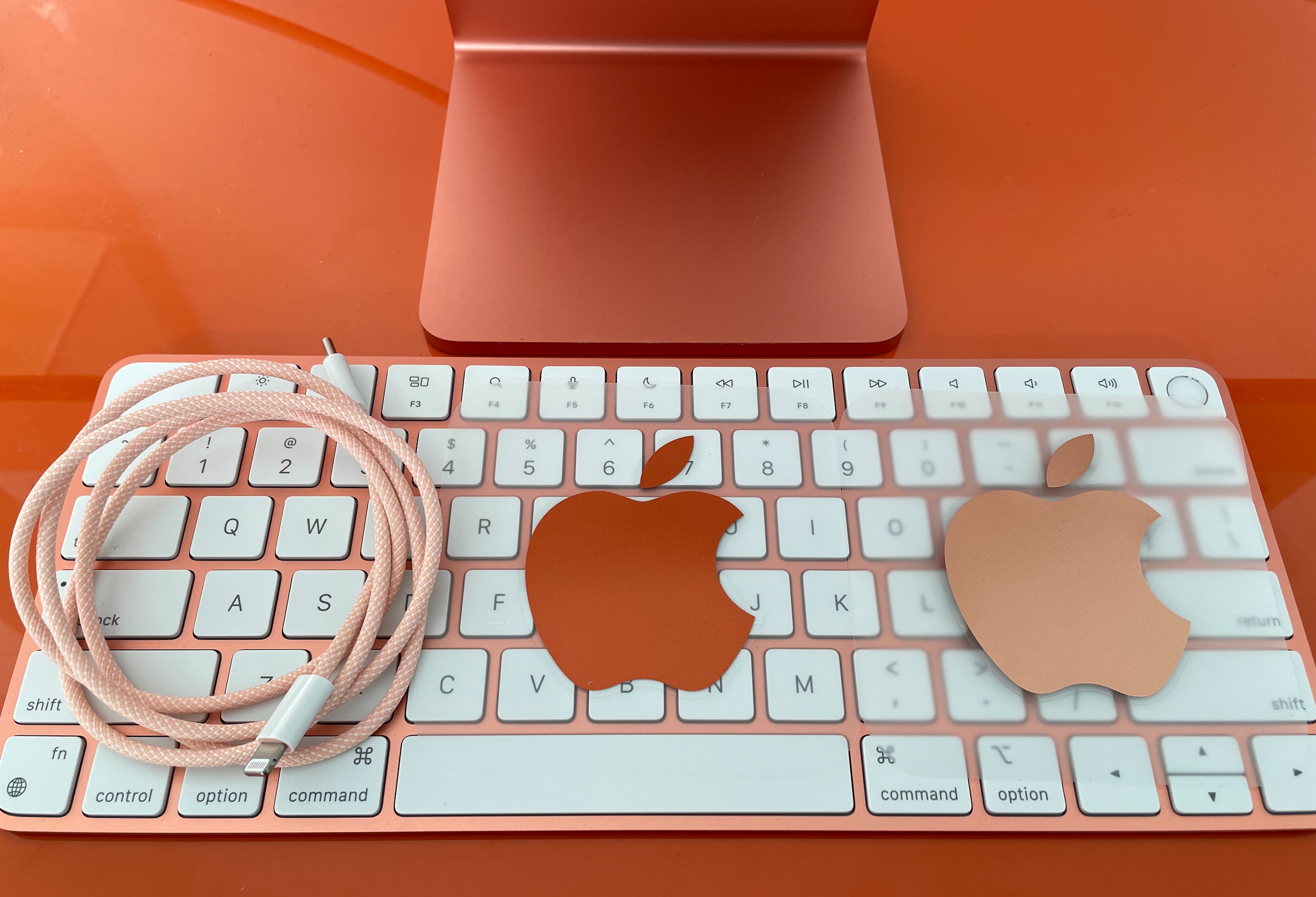
More color coordination: Apple includes not one but two logo decals — one light, one dark — in the same colors as your iMac.2 They also ship a color-coordinated USB-C-to-Lightning cable, which uses a braided fabric3 that of course perfectly matches the iMac’s power cord. That’s fun.
Conclusion
It’s risky to use a device for a week and declare that it’s an iconic design that will stand the test of time for years to come, but I’ll do it. The 24-inch M1 iMac is an iconic design that will stand the test of time for years to come.
And it augurs very well for the Apple Silicon-based Mac designs yet to come.
-
It did feel slow for me once, when I needed to restart the machine after installing the MacOS 11.3.1 update. The attempted restart beachballed for a bit, because the Music app needed to be force quit. (Shocker.) That’s a problem with Apple’s Music app, though, not the M1. ↩︎
-
Just in case you’re wondering, the decals are too big to stick on the iMac’s chin without extending into the white display bezel. If Apple wanted a logo on the chin they’d have put a logo on the chin. ↩︎︎
-
All of Apple’s Lightning cables should be made with this braided fabric. Apple, of all companies, shouldn’t be making any cheap-feeling cables. ↩︎︎