
By John Gruber

What’s more powerful: pen,
pencil, or AI magic wand?
Find out at TextJam.com
Apple Watch Series 7
Wednesday, 13 October 2021
Caring — really caring — about watches is a mixed blessing. It’s a fun hobby. It’s also a curse. You notice little things. Really little things. And if those minute details please you, they bring you joy. But when they annoy you, even just one little thing can ruin an entire watch for you. Most people buying a new watch don’t really care about the minute details. But that doesn’t mean those minute details don’t matter. The affection a particular watch engenders is the result of all those details, regardless of whether the beholder notices any of them in particular.
At a glance, all Apple Watches — from the original “Series 0” in 2015 to the new Series 7 models shipping this week — have more or less looked the same. Unlike any other product Apple has ever made, they really nailed the basic shape and look, the gestalt, on the first try. It was birthed as an iconic design.
Give them more than a glance though, and you can spot a significant evolutionary schism between Series 0–3 and Series 4–6. With Series 4, the displays went round-cornered (à la the iPhone X, and subsequent iPad Pros), which, side-by-side, makes the square-cornered displays on the Series 3 and prior look crude in comparison. (This is one reason it’s such a shame that the Series 3 remains the entry-level $200 model.) Apple did its best to hide this crudeness in the early years of WatchOS, by using black backgrounds exclusively on nearly all of the then-available watch faces.1 Because Apple Watch has always used OLED displays, and OLED blacks are utterly black, a watch face with a black background effectively disguises the border between the display and its surrounding black bezel.
The Series 4–6 display wasn’t just more graceful, with its round corners, but also just plain bigger. That’s the first thing any observer would notice about the Series 4 through 6 models compared to the Series 0 through 3. But look carefully and you can see a clear difference in the case shapes, too. The Series 0–3 cases were like rectangular boxes with round sides and corners; the Series 4 introduced a new case shape that defies easy description. It was more capsule-like, more elliptical. More organic, like a water-worn pebble. The three-dimensional equivalent of the way that iOS (and, sadly, now Mac) app icons are not simple roundrects, but in fact super elliptical squircles. Another example: the fascinating shape of the iPhone X notch.
You don’t have to care deeply about the details of these shapes. Most people don’t. But designers at Apple do, because that’s the job of a designer: not just to sweat the little details but to really sweat them. But I think even a casual observer would notice the change in case shape between Series 3 and 4, if you pointed it out to them. Apple Watch was born rounded, but got more rounded (and more complexly rounded) with Series 4.
Which brings us to Series 7.
The knock on Series 7 is that there’s nothing new but a bigger display. But it’s a much bigger display. It’s the one new thing that everyone will notice, and it’s very noticeable. Nothing new but a bigger display is enough to establish Series 7 as a landmark new design. This graphic from Apple’s “Compare” page for Apple Watch is, to my eyes, very fair. (The Apple Watch SE is, effectively, a Series 6 without the always-on display and ECG and blood oxygen sensors. It’s the lack of an always-on display that, in my opinion, retards the SE.)
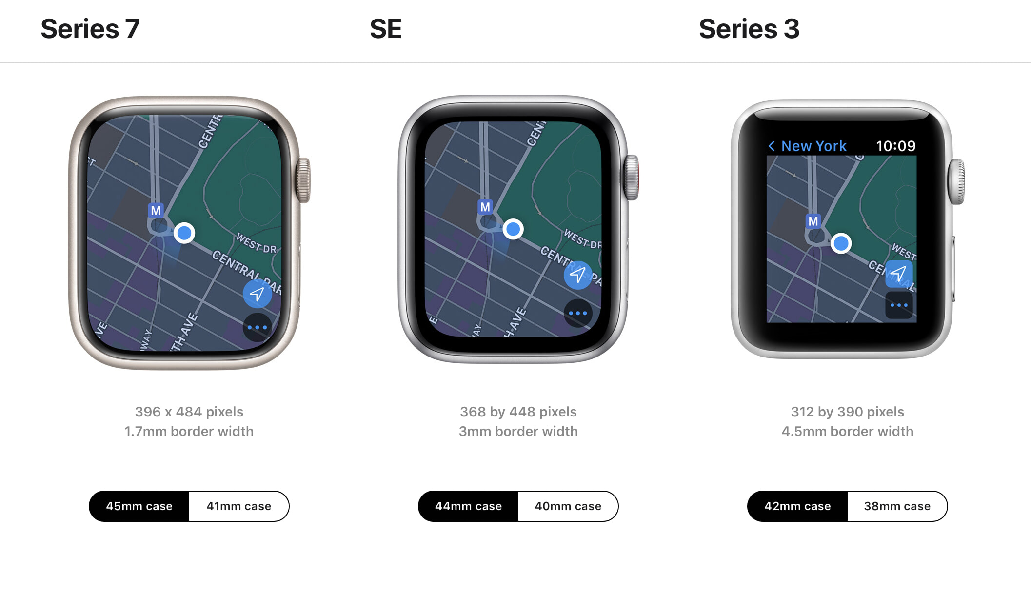
The thing most people will not notice, at least not by merely looking at the Series 7 next to a Series 4–6 (or SE), is that the case shape is all new too. It’s ever so slightly bigger; hence the change in description from 44 / 40 mm to 45 / 41 mm, respectively, for the larger / smaller models. These sizes represent the heights of the watch cases, not the display sizes. The Series 7 watch cases are slightly wider, too, by about 1 mm.
1 mm is a minor difference by the scale of most devices. A new MacBook or iPad that grew by one single millimeter in height and width would be hard to notice. It might be barely noticeable for a phone. But 1 mm is a meaningful difference at watch scale. The Series 7 watch sits slightly bigger on the wrist. It’s a subtle difference, to be sure, but it is noticeable. This is neither a complaint nor a compliment. You might like the bigger presence on your wrist, or you might not. It is different though. And because every other Apple product’s “size” is determined by the display, not the case, many people might assume — wrongly — that the changes from 44 to 45 mm and 40 to 41 mm are only about fitting larger displays into the same size cases. With Series 7, the displays are a lot bigger; but the cases are a little bigger too.
So too with the watch faces on Series 7. They’re all slightly bigger, not merely scaled to fill the bigger displays but redrawn to properly accommodate the bigger displays. To be in accordance; to be proportionally precise. This changes the character of the existing watch faces in subtle ways. My go-to watch face has been unchanged since 2015: Utility, with no numeric indexes. My first few days wearing the Series 7, my gut reaction was less that the watch itself had grown too large, but rather that the Utility watch dial had grown too large. Now, one week in, I’ve grown used to it. I needed time to adjust. Everything is bigger on the Series 7 watch faces, including the complications.
A couple of subtle details regarding the new display. The way that the outer edges of the display extend under the curves of the crystal is attractive. It’s a neat refractive effect. There’s no utility to it; it just looks cool. But it also means WatchOS app developers need to consider a new set of “safe area” layout guidelines. As per Apple’s developer documentation, buttons and images should extend to the very edges of the display, but text should not. The Series 7 always-on display mode is noticeably brighter than on my personal Series 5 watch — the first Apple Watch that offered an always-on mode.
A new feature exclusive to Series 7 is a QWERTY on-screen keyboard. I found this keyboard very frustrating to use. If you’re a swipe-typer on iPhone — I’m not — you might find it more useful, but if I need to enter text on my watch, I still find it way faster and way more accurate to dictate by voice. If I could disable this QWERTY keyboard, I would. The text entry user interface is better on the Series 4–6 watches because they don’t waste so much space with this too-small keyboard. And I’m using a 45 mm Series 7; I can only imagine how finicky the keyboard is on the 41 mm models.
With the slightly bigger cases and significantly bigger displays, for those people who find themselves on the fence between the larger and smaller sizes, more people than ever will prefer the smaller 41 mm size. With the original Series 0–3 form factor, it felt like the 42 mm size was “regular” and the 38 mm was “small”. That evened out with the Series 4–6 form factor. With Series 7, I suspect the 41 mm size will seem “regular” and the 45 mm will seem “large”. (I use the verb suspect here because I haven’t seen a 41 mm Series 7 in person yet.)2
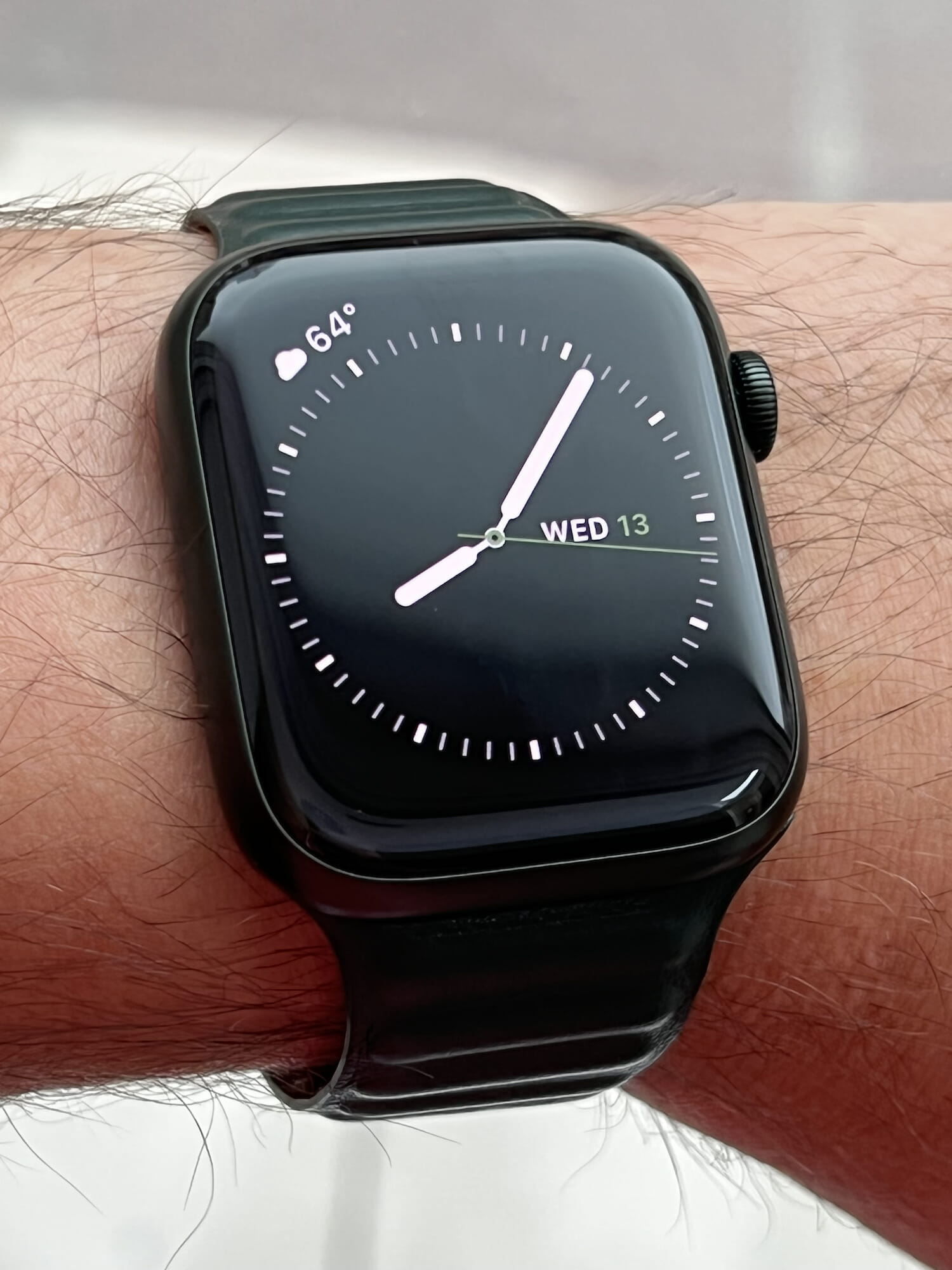
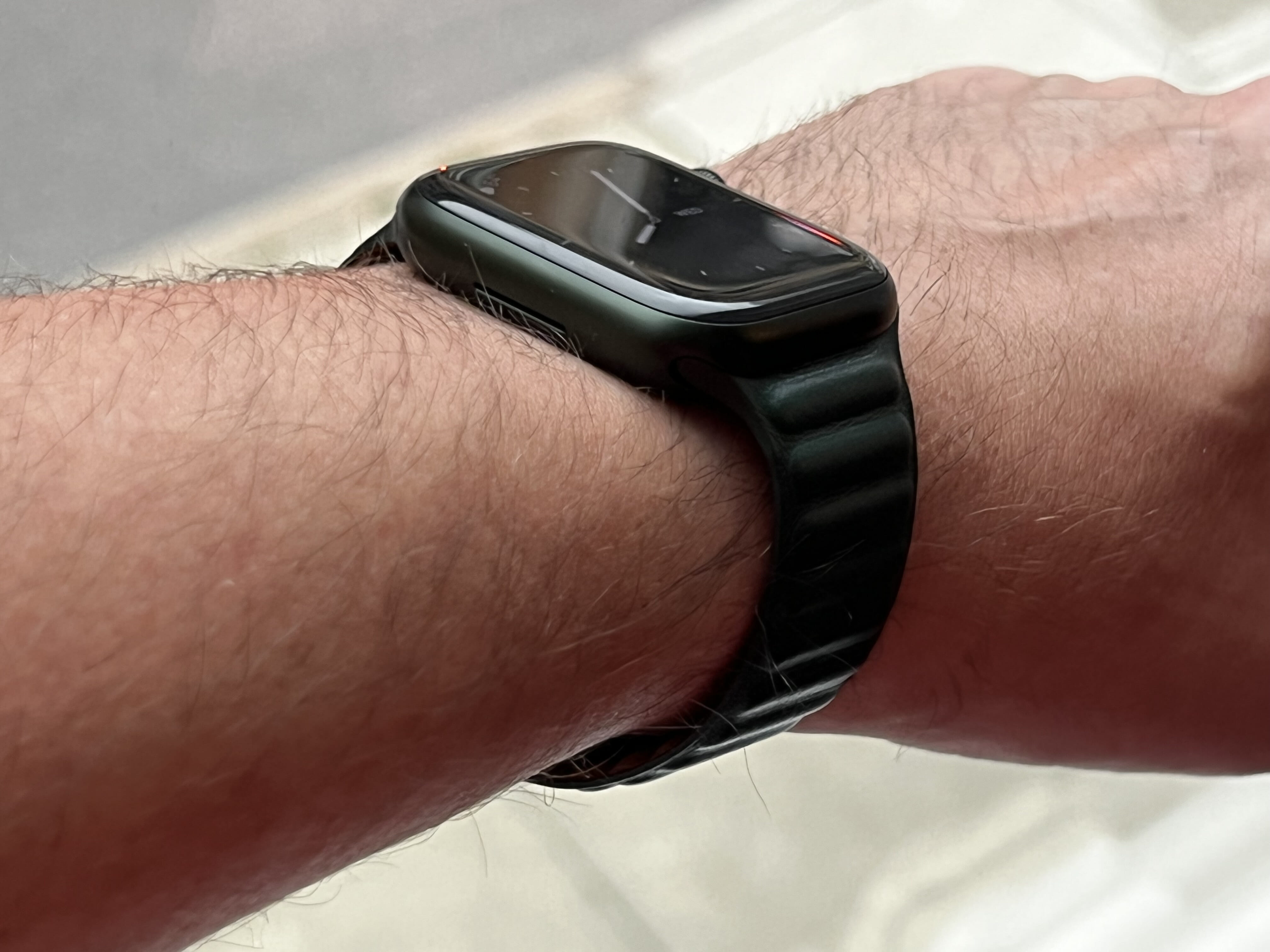
Apple sent me the aluminum green Series 7, along with the green Solo Loop and Leather Link bands. I particularly like it on the Leather Link band, which is among my favorite straps Apple has made to date. The green leather has a sort of matte finish that pairs nicely with the non-glossy aluminum finish. The anodized green aluminum is really dark — much darker in person than Apple’s product photography would suggest. It plays as black or near-black in most lighting conditions. I like this green watch much more in person than from how it looks on Apple’s website — because it is so dark. If you’re hoping for a more verdant green, though, you might be disappointed. I highly suggest looking at — and trying on — the new watches in person, even if you’re already an Apple Watch owner.
For existing Apple Watch owners, there are very few reasons to consider buying a Series 7 other than the reasons why anyone ever buys a new watch: because you like the way it looks. Apple Watch is a watch that happens to be a computer, not a computer that you happen to wear on your wrist. Evaluate the upgrade decision like you would a computer or even a phone and you’re missing the point.3
Seven generations in, it seems clear that Apple has pursued a consistent Platonic ideal for Apple Watch from the start, in terms of its shape, size, and display. Series 4 was a major refinement, with significant changes that brought Apple Watch quite close to that ideal. Series 7 is a minor refinement, not major, but that’s because the Series 4 redesign got Apple Watch so close to what it was meant to be from the outset. Perhaps someday Apple will release an altogether re-imagined Apple Watch — a new ideal. But perhaps not. Apple Watch has always known what it wanted to be, and Series 7 is closer to that than ever.
-
The Photos watch face was the notable exception, and my understanding is that there was much debate within Apple as to whether to ship that watch face with the original Apple Watch. On the one side were those who wanted all of the watch faces to have black backgrounds, to maintain the illusion that disguised the display’s actual edges. Also, to maintain complete control of every pixel on every watch face. On the other side were those who argued that many people always use photos of their family and loved ones as their “background” on every device they use, and they’d demand them for their watches, too. Not offering a Photos watch face would be like not allowing custom wallpapers on iOS or desktops on MacOS. (This would not have been unprecedented: the original iPhone shipped without any choices for wallpaper — you got a black home screen background and you liked it.) Apple obviously did ship the Photos watch face with the original watch, and has since improved upon it with the new Portraits face, but the overall mindset that watch faces ought to be designed by Apple, that they should all be in accordance with and representative of the Apple Watch brand, is the main reason why WatchOS still doesn’t and likely never will support third-party watch faces. ↩︎
-
Watch straps and bands from the original 2015 models continue to fit the new Series 7 perfectly, and look right at home. That’s really something. ↩︎︎
-
The new faster charging is a nice purely-technical improvement, though. If you charge your watch overnight, it’s no big deal. But if you wear your watch to sleep — whether for sleep tracking purposes or just to be able to check the time if you wake up mid-sleep — faster charging is meaningful. ↩︎︎