
By John Gruber

Paper — The connected canvas for teams shipping with agents
Fox’s New Scorebug Graphic Design, and Our Innate Resistance to Change
Monday, 10 February 2025
A scorebug is industry jargon for the sub-genre of chyron (itself jargon) that shows ever-present information about a televised sporting event while you’re watching. These graphics display the teams, the score, the time remaining, and other metadata pertaining to the current situation. The current ball/strike count in baseball. The down and yards-to-go in football. The shot clock in basketball. That sort of thing.1
Fox was the broadcast network for Super Bowl 59 yesterday, in which the Philadelphia Eagles utterly embarrassed the Kansas City Chiefs 40-22 (but which felt like a score of 114-0). The NFL rotates the Super Bowl annually between the networks that broadcast games. Fox has a tradition of unveiling updated on-screen graphics packages when it has the Super Bowl. This year, they didn’t just tweak the design, they completely re-thought it and redesigned it.
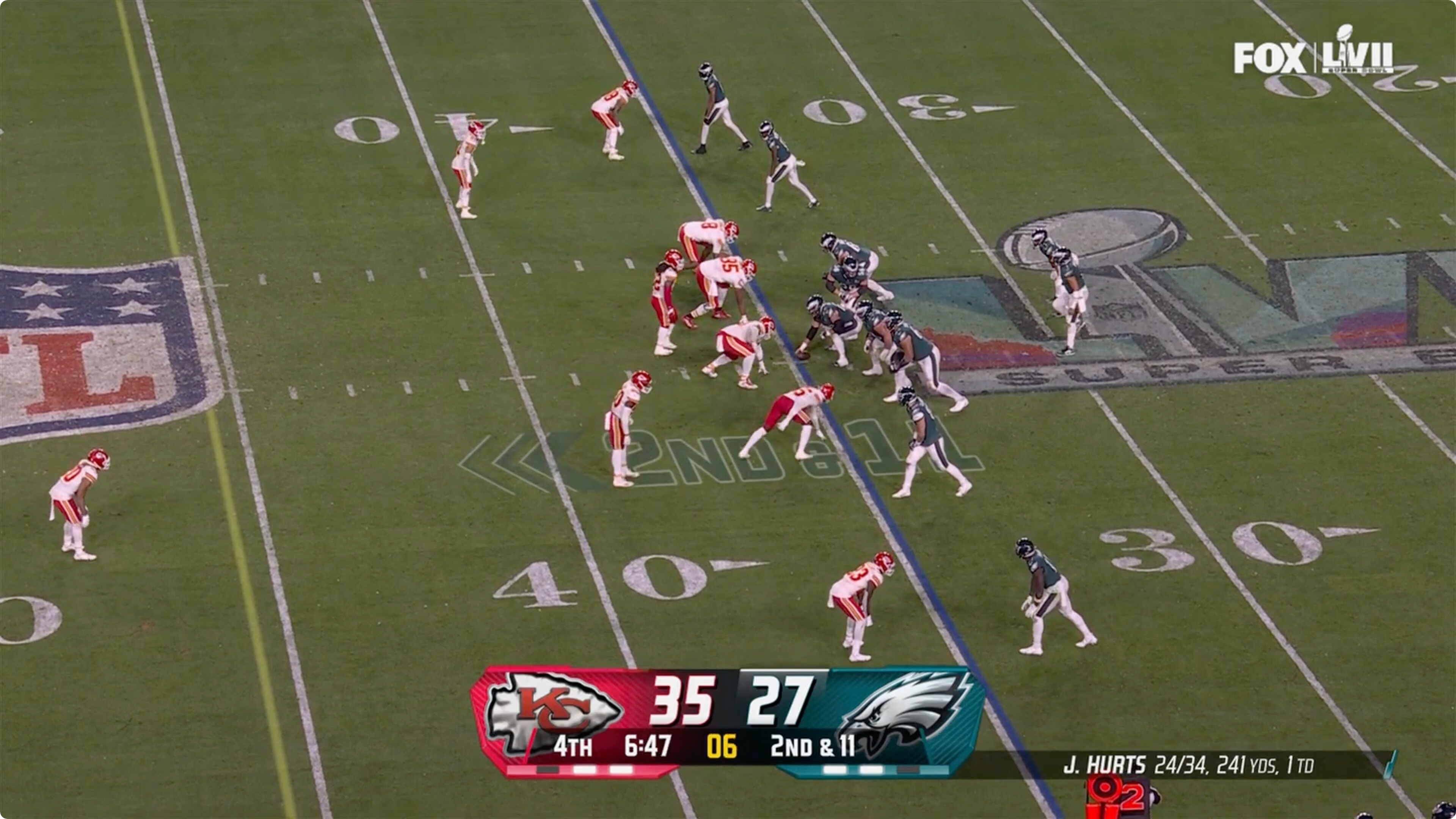
First, here’s Fox’s familiar old scorebug, as captured from their broadcast of Super Bowl 57, a game that also pitted the Eagles against the Chiefs two years ago.2
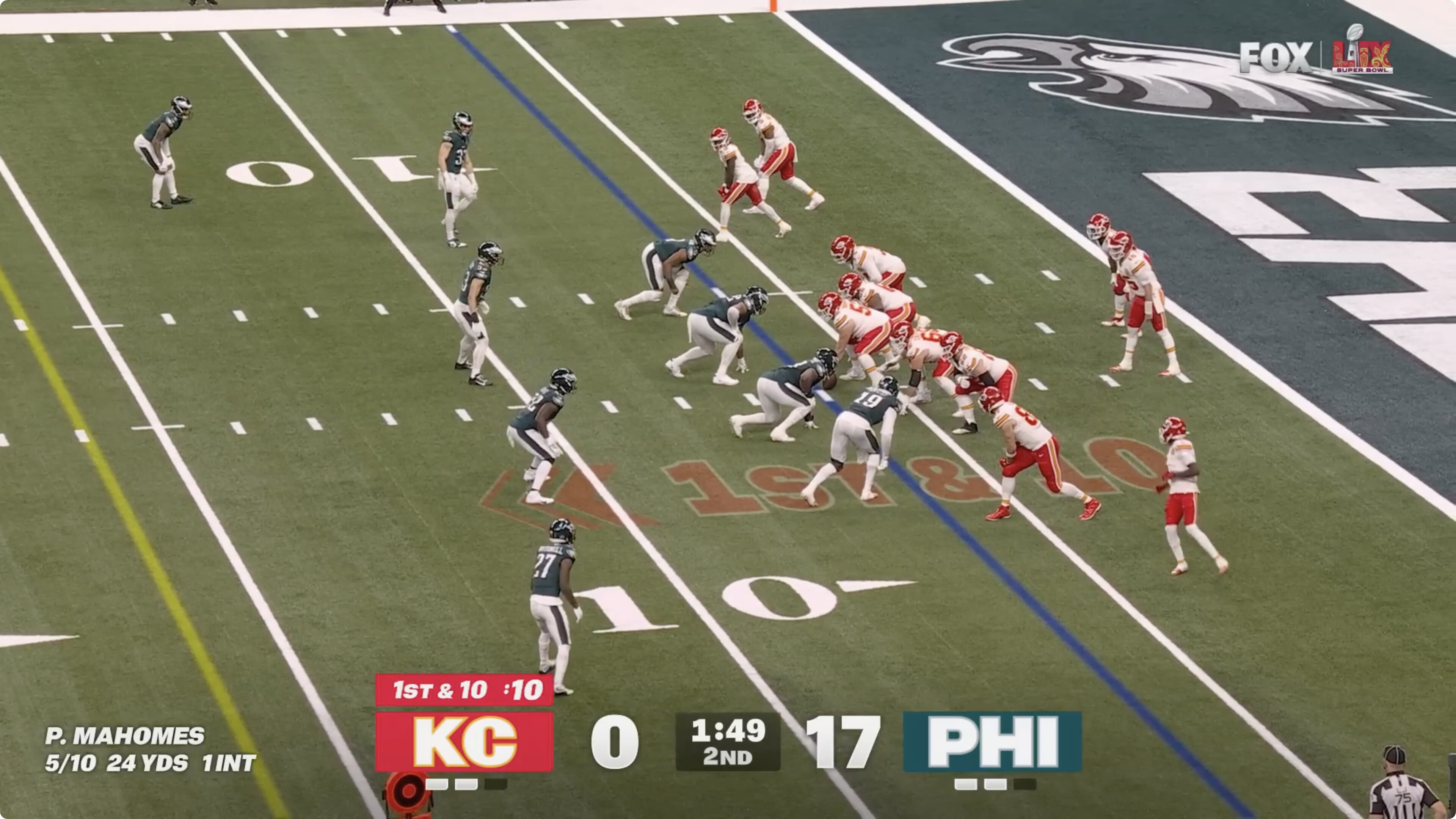
Here’s the new scorebug they debuted last night, in front of the biggest sports audience of the year:
I noticed the change immediately (of course), and my knee-jerk instant reaction was negative. Too big, too bold, too different. Don’t like. That’s natural. Human beings evolved to be alarmed by change. If everything looks the same as usual, everything is probably as safe as usual. If something looks jarringly different, it might be a sign that you’re about to be killed. (Evolutionarily speaking.)
So I started studying and considering the changes to Fox’s scorebug. I quickly not only warmed up to the new scorebug, I decided I really like it. It’s better than Fox’s old one, and better than every other network’s (which all largely look the same), in almost every single regard.
I like the new scorebug so much I (cross-)posted about it to social media during the game. My posts, in order of engagement: Threads (~6,600 likes, ~700 replies and reposts), Bluesky (~3,900 likes, ~600 replies and reposts), and Mastodon (179 likes, 53 replies and reposts).
No change an app developer can make will generate more commentary and emotional feedback from users than changing the app’s icon. Everyone sees an app’s icon, and has an opinion about them. That opinion, after a change, is usually “I like the old icon and hate the new one.” Likewise with a game broadcast’s scorebug — everyone sees them, and everyone has an opinion when they change. Most reactions to Fox’s new scorebug were negative, and many of those were really negative. Yahoo Sports ran a story under the headline “Super Bowl: Fox Sports Debuts New Scorebug, to Universally Negative Reaction”. The sports media-focused site Awful Announcing ran a take by Drew Lerner under the headline “Please Stop Debuting New Scorebugs During the Super Bowl” (subhead: “Can’t I just watch one Super Bowl without having to learn a new graphic?”). I have not even come close to reading all the replies to my social media take (well, except on Mastodon — it was quick to catch up there), but if you peruse them, you’ll be quick to see that most replies are from people who despise the change. A representative tasting:
“It looks as if they just let an intern knock something up in PowerPoint and didn’t bother having someone check it first. Awful. 👎”
“Lol. Muted for being a dumbass.”
“It’s hideous, and its overbearing size distracts from the actual content of the game.”
“The scorebug is absolutely horrible! I really hope they don’t adopt this for the 2025 season, or I will riot. Horrible design and very distracting especially the score, this looks like something out of Fortnite.”
“Looks like something out of Fortnite” isn’t the dis the last commenter thinks it is. A lot of people play and love Fortnite.
Here’s an expanded (from what I posted to social media) version of why I like, perhaps even love, the new scorebug. First, the primary items: who’s playing and what’s the score:
- Team initialisms: Huge.
- Team logos: None. Colors say enough.
- Score: Huge.
- Game clock: Big enough and centered.
- Needless chrome: None.
Every team in the league is known by fans by a 2- or 3-letter abbreviation of its home location, sort of like airport codes or stock tickers. They’re all obvious (unlike many airport codes). The Dallas Cowboys are DAL. The New England Patriots are NE. For the two cities which have two teams, New York and Los Angeles, the cities conveniently abbreviate to two letters and a third letter is drawn from the team nicknames: the Giants and Jets are NYG and NYJ; the Rams and Chargers are LAR and LAC.
Team logos are not as instantly identifiable, especially at small sizes. A bunch of teams have angry bird mascots: Eagles, Seahawks, Falcons, and Cardinals. Do you remember the Tennessee Titans’ logo? Or the Houston Texans’? The Cleveland Browns don’t even have a logo to speak of. (And they’re also not brown.) But I guarantee you know which teams are TEN, HOU, and CLE.3
And, importantly, these team initialisms are not represented by typography alone: they are in a box with the team’s primary color. That use of color does all the branding work necessary, and does it more effectively, at small sizes or viewed from far distances, than the team logos. (One small niggle I have is that the team initialisms are big white letters but are outlined by the team’s secondary color. If you look closely at my screen capture from yesterday’s Super Bowl above, you’ll see that “KC” is outlined in yellow and “PHI” in silver. This has the effect, at a normal viewing distance, of making the initialisms look a little fuzzy. The secondary color outlines are too subtle to have their intended effect of further branding the teams, and instead have the unintended effect of making the text look poorly rendered on screen. I bet Fox tweaks this by next year.)
The elimination of all needless chrome is arguably the most striking change of all, because Fox’s old scorebug had the most chrome with the most superfluous “3D” styling and textures. This isn’t minimalism, per se, but it’s a strike against needless decoration — reminiscent to my mind of Jony Ive’s radical redesign of iOS 7 a decade ago. Elements that can be conveyed by type and color alone are expressed by type and color alone.
Other noteworthy features:
Timeouts remaining: Prominent but not distracting. Seeing how many timeouts a team has remaining was a huge problem with Fox’s old scorebug, and with most other networks’ current scorebugs. (Remaining timeouts are very important in close football games.)
Current down and yards to go indicator (e.g. “1st & 10”): Placement atop the team initialism conveys which team has the ball. Fox’s old scorebug did have a “possession” indicator, but scroll back up to look at it, and see how long it takes you to figure out what it is. I’ll put the answer in a footnote.4
Typography: Classic, legible, bold, timeless. It is also very “Fox” — the C in “KC” looks like the O in the classic “FOX” wordmark, and the zero (a digit Chiefs fans became very familiar with until the final seconds of the third quarter, because that’s how many points they’d scored until then — the Eagles cycled through a bunch of different digits en route to taking a 34-0 lead) looks pretty much exactly like the uppercase o in “FOX”.
Bigger and bolder typography adds clarity. But removing the background chrome lets viewers “see through” to any game action that happens at the bottom of the screen. To me, after just one game, the old Fox scorebug looks hopelessly dated; old-fashioned without any nostalgic charm. If anything, the new typography-first design is the one that looks timeless, evocative of the graphics from classic NFL Films productions.
Here’s the thing. NFL broadcasts didn’t always have scorebugs. I don’t mean that they had smaller score indicators on screen. I mean they had none at all. This was true for all major sports on TV, not just football (e.g. the premise of this gag from Ferris Bueller’s Day Off). Until 1994, the networks would show the score and time remaining when they cut to a commercial break, and then show it again when they came back from commercials. But while the game played, there was no score on screen. Part of that is technology: game telecasts were low-fidelity over-the-air transmissions to relatively small TV screens that were viewed from across the room. Go back far enough and there wasn’t even color. But a bigger aspect is inertia. Not showing the score at all times was the way games were always broadcast, so it was the way they were still broadcast.
Then came Fox.
For decades, there were three major TV networks in the US: ABC, NBC, and CBS. CBS had the Sunday game rights to the superior National Football Conference. “Superior” for the related reasons of team popularity and team market size, which matters for ratings. Chicago, Philly, Washington, Dallas, Frisco. NBC had the Sunday game rights for the American Football Conference with teams from generally smaller cities. Pittsburgh, Kansas City, Miami. Good teams, but smaller cities. (In 1993, though, NFC teams had won 9 consecutive Super Bowls.)
Rupert Murdoch’s Fox network was an attempt — soon enough proven successful — to establish a fourth US network. At the time of their debut in 1987, Fox only had prime time programming on one night a week (Sundays, conveniently). In 1993 Murdoch and Fox upended the world of sports broadcasting by outbidding (stupid, tightfisted, hubristic) CBS for the rights to broadcast the NFC games on Sundays.
In 2018, Bryan Curtis published at The Ringer a comprehensive oral history of the deal and its consequences: “The Great NFL Heist: How Fox Paid for and Changed Football Forever”. If this sort of thing interests you at all, read that. It’s a great story, well told.
But so in 1994 Fox took over the NFC broadcasts. They poached from CBS all the announcers, cameramen, directors, and producers. (CBS didn’t need them anymore, because they had no football games to broadcast.) But while the voices announcing the game were familiar (including the best duo ever to do it: John Madden and Pat Summerall), the look and feel of the broadcasts was intentionally new and fresh and, well, because it was Fox, brash. This included an innovation they called the “Fox Box”. Quoting from Curtis’s oral history at The Ringer:
David Hill’s most controversial idea about the NFL was his simplest: He thought the score and clock should have a permanent home on the screen — a feature that became known as the “Fox Box.” A noisy group of critics and rival executives thought the Fox Box was a terrible idea. It would clutter the screen and drive people away from blowouts. But Hill was convinced, because he’d created a proto–Fox Box after a frustrating afternoon watching soccer in the U.K.
Hill: We’d been out walking our dogs. We’d come in, got a cup of tea, and switched the BBC on. I watched the game for a good 15 minutes. I don’t know what the score is. I’m thinking to myself, “Shit, I’d really like to know what the score is.” So I thought, “That’s easy. On a chyron, I’ll just put it up in the corner.” So I did it.
Madden: Instead of saying, “No, that’s a stupid idea, we got other things we have to do,” he said, “If the score and the time is the most important thing, why don’t we just put it up and leave it there?” That’s where the Fox Box came from. That was David Hill.
Dolgin: All the networks told us, “You’re screwing this up. You’re idiots to do this.”
Albert: The thought was, some networks won’t leave the time and score up because it’s a blowout and they didn’t want you to know it’s a blowout.
The “Fox Box” idea wasn’t just controversial, it was widely panned as stupid. The networks literally thought it would be better if many viewers didn’t know the score. And when the Fox Box appeared, many critics agreed. Here’s Dan Cox’s review of Fox’s opening week broadcast for Variety, in September 1994:
The network also still insists on that annoying see-through clock and score graphic in the upper-left corner of the screen throughout nearly the entire game. Fox Sports prexy David Hill has said it’s important to know the score and how much time is left when you sit down and the game is already on.
Well, yes. But how about those who actually watched the beginning of the game and would rather have their screen clear of graphics.
Who seems stupid now? Imagine the outcry if Fox had broadcast yesterday’s Super Bowl without any scorebug at all — you know, for those who would rather have their screen clear of graphics.
Change of any sort is always going to raise alarm, whether it’s actually better or not. When smoking bans started going into effect in cities 30 years ago, people loudly claimed that it would put restaurants and especially bars out of business. Smokers want to smoke and would stay home if they couldn’t, the argument went. Turns out, if you force smokers to go outside in the cold or even rain to smoke, they’ll do it. And a lot of other people — who had been staying home because they despised the stench of cigarettes — started going out more often. In hindsight banning cigarettes from shared public spaces (airplanes, for chrissake!) was obviously the correct decision. But change is hard to accept, no matter how obviously for the better.
I say Fox’s new scorebug is better, and raised a ruckus only because it’s so much better that what most viewers noticed is only that it’s so different. When you get used to it, you’ll see. This new design, with bigger bolder type but less needless chrome, pulls off the remarkable feat of conveying key information with more clarity both on the biggest of big screens — TVs in public spaces like bars and restaurants, which are viewed from a distance — and the smallest of small screens, our phones.
Different doesn’t always mean better. But better necessarily implies different.
-
You know how when you’re watching most TV channels — not just sports, but any sort of show at all — they keep a logo for the channel in one of the corners of the screen? Those omnipresent logos are called bugs (perhaps because everyone knows they’re slightly annoying?). Hence: scorebug for an always-present score indicator. ↩︎︎
-
The DF Style Guide has no entry for “Roman numerals” because no obscenities or expletives are strong enough to convey the policy. ↩︎︎
-
The one matchup this design might not work great for would be a Rams-Chargers game, because in addition to sharing a city (and stadium), they even share the same team colors: blue and yellow. LAR and LAC in two same-colored boxes doesn’t give much clarity. I’m curious how Fox will handle this if they ever broadcast that matchup. It’s solvable — here are some examples with different color treatments from a similar scorebug for the English Premier League. Maybe one of the teams would get yellow letters, the other white. Or even a yellow background with blue letters. ↩︎︎
-
It’s the thin white bar above the offensive team’s score. In the screen capture above from the 2023 Super Bowl, that’s the Eagles. This is so visually subtle and unintuitive that it’s inarguably a bad design. ↩︎︎
| Previous: | Nike’s ‘So Win’ Won the Super Bowl |
| Next: | Golfo del Gringo Loco |