
By John Gruber

Paper — The connected canvas for teams shipping with agents
Joe Caroff, Designer of the James Bond 007 Logo, Dies at 103
Monday, 18 August 2025
Mike Barnes, The Hollywood Reporter:
For his first movie job — he would work on more than 300 campaigns during his career — United Artists executive David Chasman hired him to design the poster for West Side Story (1961), then asked him to come up with the letterhead for a publicity release tied to the first Bond film, Dr. No. (Chasman had designed the poster for the 1962 movie.)
“He said, ‘I need a little decorative thing on top,’” Caroff recalled in 2021. “I knew [Bond’s] designation was 007, and when I wrote the stem of the seven, I thought, ‘That looks like the handle of a gun to me.’ It was very spontaneous, no effort, it was an instant piece of creativity.”
Inspired by Ian Fleming’s favorite gun, a Walther PPK, Caroff attached a barrel and trigger to the 007 and for his work received $300, the going rate for such an assignment, he said. Even though the logo, though altered in subtle ways, has been featured on every Bond film and on millions of pieces of merchandise, he received no credit, no residuals, no royalties.
The logo did, however, bring him “a lot of business,” he said. “It was like a little publicity piece for me.”
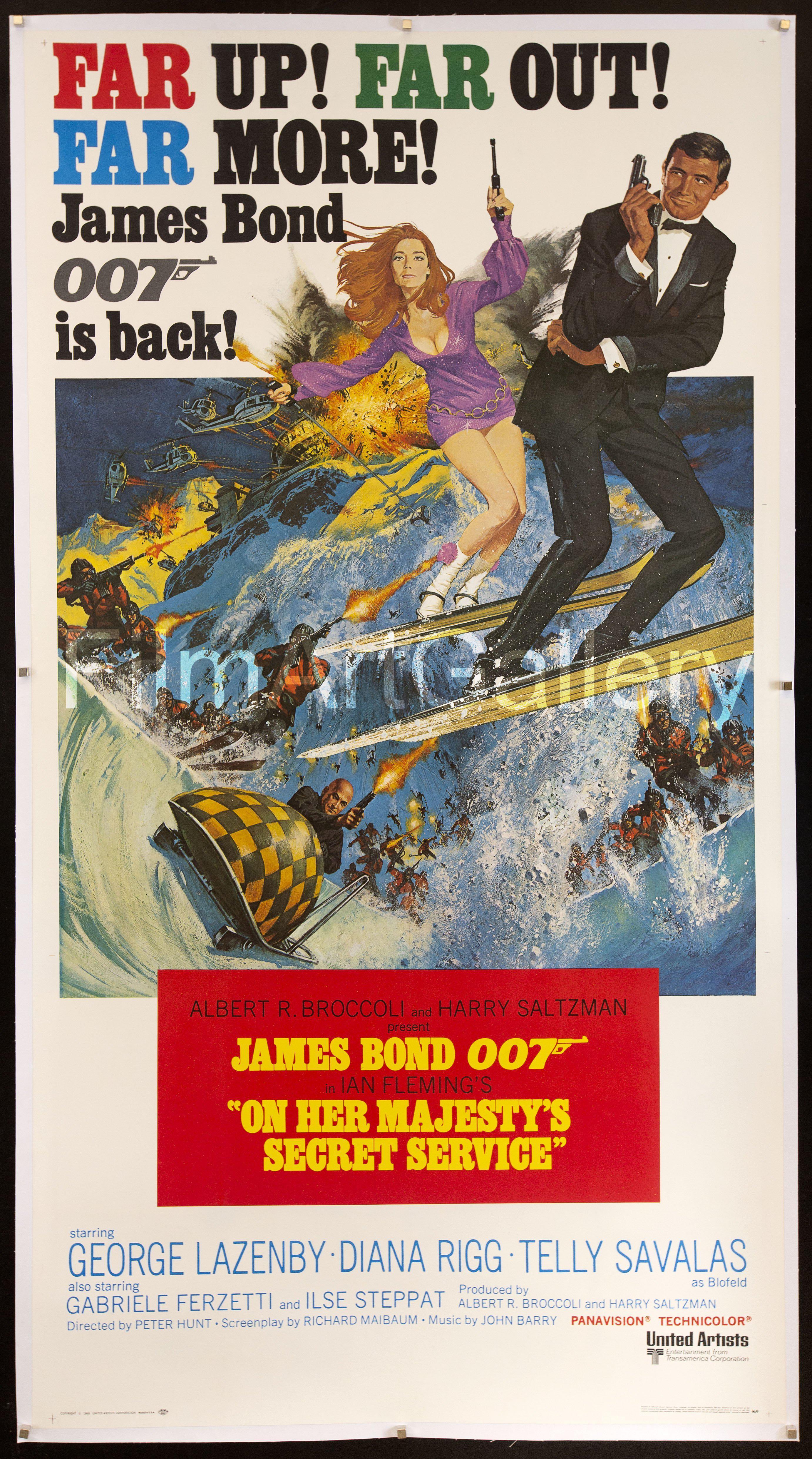
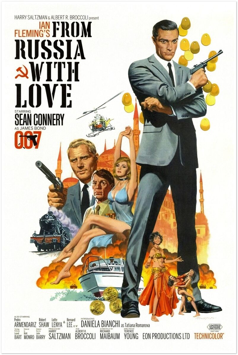
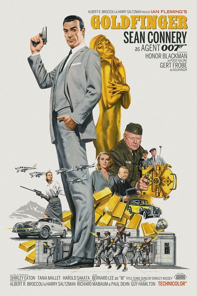
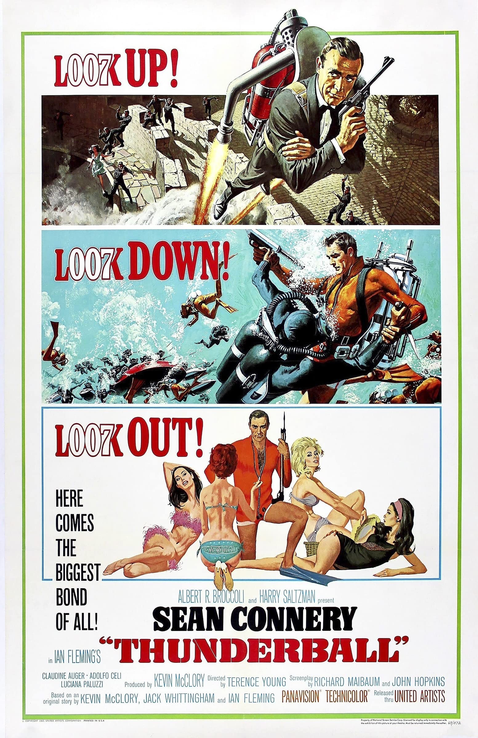
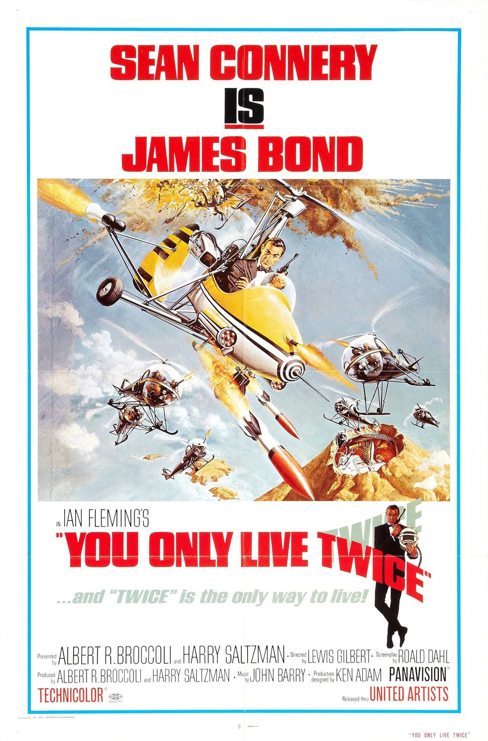
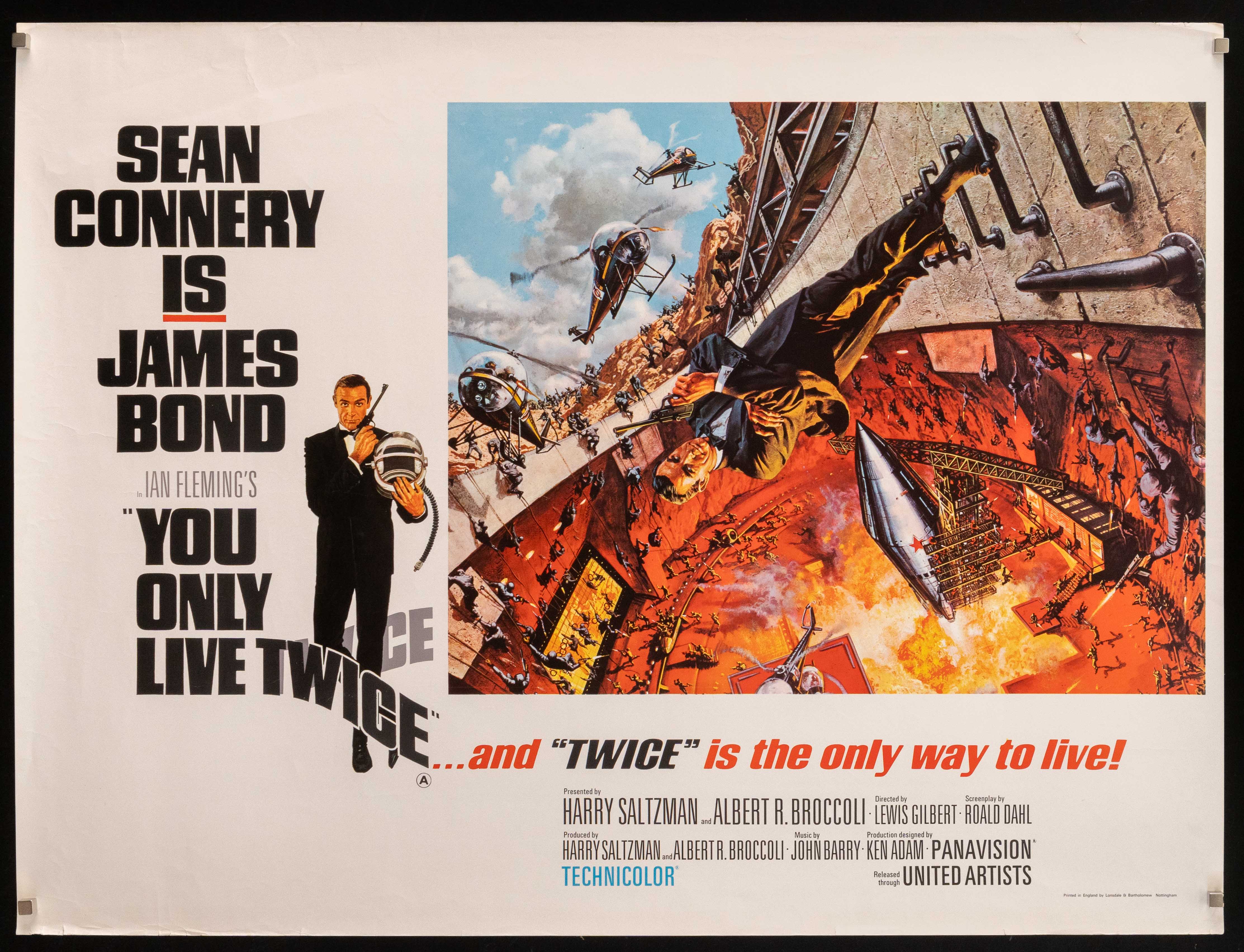
It’s rare for a logomark to have such staying power. Just a perfect logo. Kind of wild that it was created, initially, only as letterhead for stationery. Perusing vintage movie posters, it seems like EON didn’t really lean into using the logo consistently until On Her Majesty’s Secret Service (1969) — the sixth film, and the first without Sean Connery. EON had used the mark prior to that (including at least one excellent poster for Dr. No), but it didn’t appear on most of the posters for Connery’s initial run in the role: From Russia With Love, Goldfinger, Thunderball, and You Only Live Twice (variations A and B). Amongst those, the logo only appears on the Goldfinger poster. They used to make multiple posters for every movie back then, so there might exist examples for all of them with the logo. But I think until On Her Majesty’s Secret Service, EON leaned on Connery’s face as the symbol of the franchise. From that point forward, though, Caroff’s 007-cum-gun logo was the symbol of the franchise.1 I can’t seem to find an official movie poster after OHMSS that doesn’t feature it.
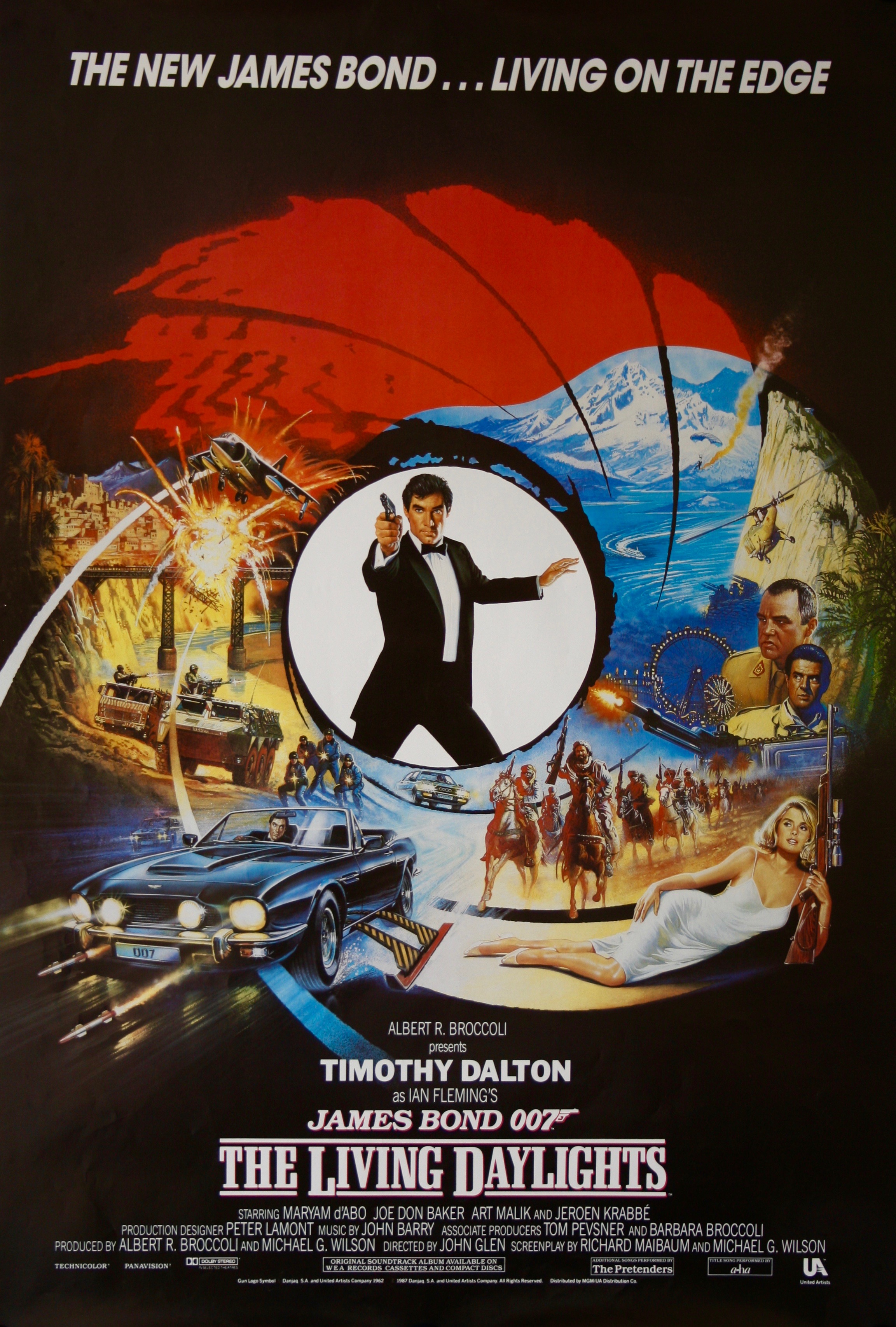
I will quibble with one detail from The Hollywood Reporter description above: the gun in Caroff’s original 007 mark clearly looked like a Luger, a rather distinctive German pistol with a long skinny barrel, not the more compact Walther PPK that Bond actually carried. Variations of the Luger-esque logo appear on the posters for all seven of the movies starring Roger Moore. EON updated the logomark to resemble a Walther PPK for The Living Daylights in 1987, the first (and better) of two Bond movies starring Timothy Dalton. As a kid it always bothered me — ever so slightly — that the logo resembled a gun that James Bond never actually used, but until today, researching this post, I never noticed that they addressed that in 1987. That said, I think the Luger-esque mark was a bit cooler. As a kid, that was my assumption: that “they” made it look like a Luger, not the sort of pistol Bond actually carried, because it looked cooler that way. I accepted that.
Caroff had a remarkably accomplished career. He created iconic posters for dozens of terrific films across a slew of genres. The fact that he created the 007 logo but only earned $300 from it is more like a curious footnote than anything.
From Jeré Longman’s excellent obituary for The New York Times (gift link), after observing that Caroff died just one day short of his 104th birthday:
Mr. Caroff’s designs were familiar, but his name was not. He did not sign much of his work and largely avoided self-promotion. He was not included among the more than 60 celebrated designers, among them like Saul Bass, Leo Lionni and Paul Rand, in the 2017 book The Moderns: Midcentury American Graphic Design, written by Steven Heller and Greg D’Onofrio.
“That he was unknown is shocking,” Mr. Heller, co-chairman emeritus of the Master of Fine Arts Design program at the School of Visual Arts in Manhattan, said in a recent interview.
Still, Mr. Caroff’s abundant output became widely recognizable for an interpretive style that could be bold, elegant, theatrical, whimsical, sensual and deceptively simple in promoting a book or movie and conveying its essence with a single image.
No better example of that reduced-to-its-essence genius than his 007 logo:
“I knew that 007 meant license to kill; that, I think, at an unconscious level, was the reason I knew the gun had to be in the logo,” Mr. Caroff said in a 2022 documentary, By Design: The Joe Caroff Story.
Mark Cerulli, who directed the documentary, said in an interview that the logo was a “marvel of simplicity that telegraphs everything you would want to know about 007.”
By Design is streaming on HBO Max. I’ve added it to the top of my to-watch list.
-
You will not catch me making any jokes about the fact that “007 cum gun” could serve as a three-word plot synopsis for many of the films in the Connery/Moore era. ↩︎