
By John Gruber

WorkOS MCP: Manage your auth platform from any AI agent.
A Sometimes-Hidden Setting Controls What Happens When You Tap a Call in the iOS 26 Phone App
Friday, 27 February 2026
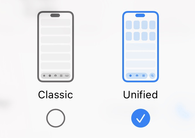
Back in December, Adam Engst wrote this interesting follow-up to his feature story at TidBITS a few weeks prior exploring the differences between the new Unified and old Classic interface modes for the Phone app in iOS 26. It’s also a good follow-up to my month-ago link to Engst’s original feature, as well as a continuation of my recent theme on the fundamentals of good UI design.
The gist of Engst’s follow-up is that one of the big differences between Unified and Classic modes is what happens when you tap on a row in the list of recent calls. In Classic, tapping on a row in the list will initiate a new phone call to that number. There’s a small “ⓘ” button on the right side of each row that you can tap to show the contact info for that caller. That’s the way the Phone app has always worked. In the new iOS 26 Unified mode, this behavior is reversed: tapping on the row shows the contact info for that caller, and you need to tap a small button with a phone icon on the right side of the row to immediately initiate a call.
Engst really likes this aspect of the Unified view, because the old behavior made it too easy to initiate a call accidentally, just by tapping on a row in the list. I’ve made many of those accidental calls the same way, and so I prefer the new Unified behavior for the same reason. Classic’s tap-almost-anywhere-in-the-row-to-start-a-call behavior is a vestige of some decisions with the original iPhone that haven’t held up over the intervening 20 years. With the original iPhone, Apple was still stuck — correctly, probably! — in the mindset that the iPhone was first and foremost a cellular telephone, and initiating phone calls should be a primary one-tap action. No one thinks of the iPhone as primarily a telephone these days, and it just isn’t iOS-y to have an action initiate just by tapping anywhere in a row in a scrolling list. You don’t tap on an email message to reply to it. You tap a Reply button. Inadvertent phone calls are particularly pernicious in this regard because the recipient is interrupted too — it’s not just an inconvenience to you, it’s an interruption to someone else, and thus also an embarrassment to you.
Here’s where it gets weird.
There’s a preference setting in Settings → Apps → Phone for “Tap Recents to Call”. If you turn this option on, you then get the “tap anywhere in the row to call the person” behavior while using the new Unified view. But this option only appears in the Settings app when you’re using Unified view in the Phone app. If you switch to the Classic view in the Phone app, this option just completely disappears from the Settings app. It’s not grayed out. It’s just gone. Go read Engst’s article describing this, if you haven’t already — he has screenshots illustrating the sometimes-hidden state of this setting.
I’ll wait.
Engst and I discussed this at length during his appearance on The Talk Show earlier this week. Especially after talking it through with him on the show, I think I understand both what Apple was thinking, and also why their solution feels so wrong.
At first, I thought the solution was just to keep this option available all the time, whether you’re using Classic or Unified as your layout in the Phone app. Why not let users who prefer the Classic layout turn off the old “tap anywhere in the row to call the person” behavior? But on further thought, there’s a problem with this. If you just want your Phone app to keep working the way it always had, you want Classic to default to the old tap-in-row behavior too. What Apple wants to promote to users is both a new layout and a new tap-in-row behavior. So when you switch to Unified in the Phone app, Apple wants you to experience the new tap-in-row behavior too, where you need to specifically tap the small phone-icon button in the row to call the person, and tapping anywhere else in the row opens a contact details view.
There’s a conflict here. You can’t have the two views default to different row-tapping behavior if one single switch applies to both views.
Apple’s solution to this dilemma — to show the “Tap Recents to Call” in Settings if, and only if, Unified is the current view option in the Phone app — is lazy. And as a result, it’s quite confusing. No one expects an option like this to only appear sometimes in Settings. You pretty much need to understand everything I’ve written about in this article to understand why and when this option is visible. Which means almost no one who uses an iPhone is ever going to understand it. No one expects a toggle in one app (Phone) to control the visibility of a switch in another app (Settings).
My best take at a proper solution to this problem would be for the choice between Classic and Unified views to be mirrored in Settings → Apps → Phone. Show this same bit of UI, that currently is only available in the Filter menu in the Phone app, in both the Phone app and in Settings → Apps → Phone:
If you change it in one place, the change should be reflected, immediately, in the other. It’s fine to have the same setting available both in-app and inside the Settings app.
Then, in the Settings app, the “Tap Recents to Call” option could appear underneath the Classic/Unified switcher only when “Unified” is selected. Switch from Classic to Unified and the “Tap Recents to Call” switch would appear underneath. Switch from Unified to Classic and it would disappear. (Or instead of disappearing, it could gray out to indicate the option isn’t available when Classic is selected.) The descriptive text describing the option could even state that it’s an option only available with Unified.1
The confusion would be eliminated if the Classic/Unified toggle were mirrored in Settings. That would make it clear why “Tap Recents to Call” only appears when you’re using Unified — because your choice to use Unified (or Classic) would be right there.
-
Or, Apple could offer separate “Tap Recents to Call” options for both Classic and Unified. With Classic, it would default to On (the default behavior since 2007), and with Unified, default to Off (the idiomatically correct behavior for modern iOS). In that case, the descriptive text for the option would *need* to explain that it’s a separate setting for each layout, or perhaps the toggle labels could be “Tap Recents to Call in Classic” and “Tap Recents to Call in Unified”. But somehow it would need to be made clear that they’re separate switches. But this is already getting more complicated. I think it’d be simpler to just keep the classic tap-in-row behavior with the Classic layout, and offer this setting only when using the Unified view. ↩︎