
By John Gruber

WorkOS Pipes: More context makes for smarter products.
‘Your Frustration Is the Product’
Wednesday, 18 March 2026
Shubham Bose, “The 49MB Web Page”:
I went to the New York Times to glimpse at four headlines and was greeted with 422 network requests and 49 megabytes of data. It took two minutes before the page settled. And then you wonder why every sane tech person has an adblocker installed on systems of all their loved ones.
It is the same story across top publishers today.
This is an absolutely devastating deconstruction of the current web landscape. I implore you to pause here, and read Bose’s entire amply illustrated essay. I’ll wait.
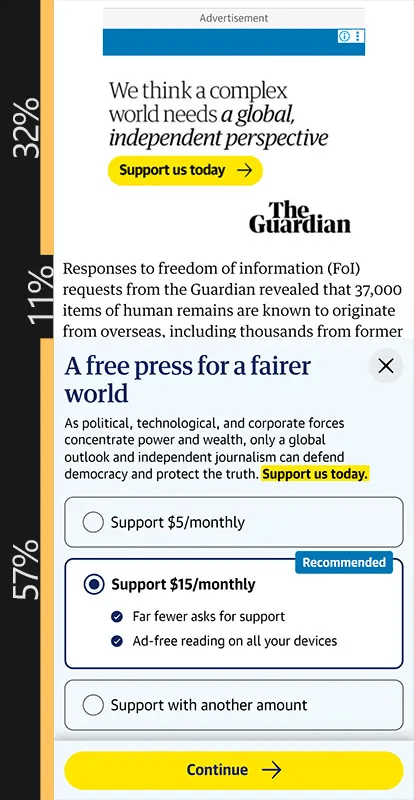
Even websites from publishers who care about quality are doing things on the web that they would never do with their print editions. Bose starts with The New York Times, but also mentions The Guardian, whose web pages are so laden with ads and modals that their default layout, on a mobile device, sometimes leaves just 11 percent of the screen for article content. That’s four lines of article text.
Bose writes:
Viewability and time-on-page are very important metrics these days. Every hostile UX decision originates from this single fact. The longer you’re trapped on the page, the higher the CPM the publisher can charge. Your frustration is the product. No wonder engineers and designers make every UX decision that optimizes for that. And you, the reader, are forced to interact, wait, click, scroll multiple times because of this optimization. Not only is it a step in the wrong direction, it is adversarial by design.
The reader is not respected enough by the software. The publisher is held hostage by incentives from an auction system that not only encourages but also rewards dark patterns.
I disagree only insofar as the reader isn’t respected at all. Part of my ongoing testing of the MacBook Neo is that I’ve been using it in as default a state as possible, only changing default settings, and only adding third-party software, as necessary. So I’ve been browsing the web without content-blocking extensions on the Neo. It’s been a while since I’ve done that for an extended period of time. Most of the advertising-bearing websites I read have gotten so bad that it’s almost beyond parody.
And even with content blockers installed (of late, I’ve been using and enjoying uBlock Origin Lite in Safari), many of these news websites intersperse bullshit like requests to subscribe to their newsletters, or links to other articles on their site — often totally unrelated to the one you’re trying to read — every few paragraphs. And the fucking autoplay videos, jesus. You read two paragraphs and there’s a box that interrupts you. You read another two paragraphs and there’s another interruption. All the way until the end of the article. We’re visiting their website to read a fucking article. If we wanted to watch videos, we’d be on YouTube. It’s like going to a restaurant, ordering a cheeseburger, and they send a marching band to your table to play trumpets right in your ear and squirt you with a water pistol while trying to sell you towels.
No print publication on the planet does this. The print editions of the very same publications — The New York Times, The Guardian, The Wall Street Journal, The Atlantic, The New Yorker — don’t do anything like this. The print edition of The New Yorker could not possibly be more respectful of both the reader’s attention and the sanctity of the prose they publish. But read an article on their website and you get autoplaying videos interspersed between random paragraphs. And the videos have nothing to do with the article you’re reading. I mean, we should be so lucky if every website were as respectfully designed as The New Yorker’s, but even their website — comparatively speaking, one of the “good ones” — shows only a fraction of the respect for the reader that their print edition does.
Without an ad-blocking content blocker running, one of the most crazy-making design patterns today is repeating the exact same ad within the same article, every few paragraphs. It’s hard to find a single article on Apple News — a sort of ersatz pidgin version of the web — that does not do this. The exact same ad — 6, 7, 8 times within the same article. How many 30-something blonde white women need hearing aids? It’s insane.
People are spending less and less time on the web because websites are becoming worse and worse experiences, but the publishers of websites are almost literally trying to dig their way out of that hole by adding more and more of the reader-hostile shit that is driving people away. The Guardian screenshot Bose captured, where only 11 percent of the entire screen shows text from the article, is the equivalent of a broadcast TV channel that only showed 7 minutes of actual TV content per hour, devoting the other 53 minutes to paid commercials and promotions for other shows on the same channel. Almost no one would watch such a channel. But somehow this strategy is deemed sustainable for websites.
The web is the only medium the world has ever seen where its highest-profile decision makers are people who despise the medium and are trying to drive people away from it. As Bose notes, “A lot of websites actively interfere the reader from accessing them by pestering them with their ‘apps’ these days. I don’t know where this fascination with getting everyone to download your app comes from.” It comes from people who literally do not understand, and do not enjoy, the web, but yet find themselves running large websites.
The people making these decisions for these websites are like ocean liner captains who are trying to hit icebergs.
| Previous: | Squashing |
| Next: | AppleScript: ‘Save MarsEdit Document to Text File’ |