By John Gruber

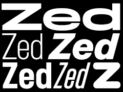
Zed — A font superfamily with extraordinary number of styles and extraordinary language support.
- Ain’t What ITC Used to Be
-
Mark Simonson on the newly released ITC Avante Garde Gothic Pro:
I was disappointed, however, to see that they took a huge short cut on the italics: they simply slanted the upright version, in spite of the fact that ITC designed and released optically correct obliques in 1977.
(We’re using Simonson’s excellent Proxima Nova as the identity font at Joyent.)
★ Wednesday, 5 October 2005
