
By John Gruber

WorkOS MCP: Manage your auth platform from any AI agent.
- Google+ iPhone App Hits App Store
-
An interesting app for a service I do not enjoy. It does not solve my fundamental problem with Google+, which is that it feels like work to use.
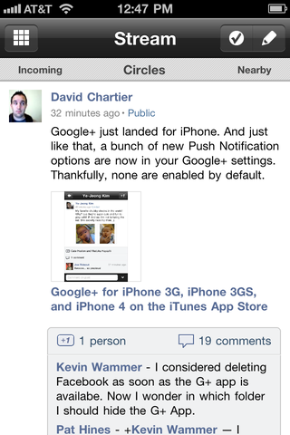
Google’s iOS mobile team has developed their own UI idioms for their iOS apps. Part of that is their own visual aesthetic, but there’s more to it than how it looks. It’s certainly not Android-like, but it’s not iOS-like either. For example, this Google+ app uses left-right swiping to change views in your “Stream”. I see three: Incoming, Circles, and Nearby. The idiomatic iOS design for this would be a tab controller at the bottom with three tabs, one for each view. Google+ has a thin header at the top of the view, showing all three, with the current view in the middle, in a slightly larger font size. To switch from, say, Circles to Nearby, you swipe left. But you can keep swiping left, left, left to cycle around, like a carousel.
I’m not going to argue that this sort of UI experimentation is wrong. It’s just that in this case, I don’t like it personally. Compare and contrast with, say, apps like Twitterrific and Tweetbot. Both those apps use custom controls and sound effects, but their customization is mostly aesthetic. At a wireframe level, both Twitterrific and Tapbots follow common iOS design patterns: you tap to change views, you swipe to move content within the current view.
The Google+ app feels like it was designed by people who don’t like the standard iPhone design idioms. And stuff like the button order here is just plain awful. Update: Bizarrely, the app doesn’t work on the iPod Touch; only iPhone 3G, 3GS, and 4.
★ Tuesday, 19 July 2011