
By John Gruber
-Dark.png)
Mux — Video API
for developers.
Build better video.
Linked List: May 18, 2016
Wednesday, 18 May 2016
- The Verge’s Overview of the Google I/O 2016 Keynote ★
-
I watched most of the keynote and came away very impressed. My short take:
Under the new Alphabet organization and Sundar Pichai’s leadership, Google has focused itself on the things Google is actually good at, and which people will actually want to use. No more pie-in-the-sky stuff like Google Glass. Google is clearly the best at this voice-driven assistant stuff. Pichai claimed that in their own competitive analysis, Google Assistant is “an order of magnitude” ahead of competing assistants (read: Siri and Alexa). That sounds about right. This might be like Steve Jobs’s 2007 claim that the iPhone was “5 years” ahead of anyone else.
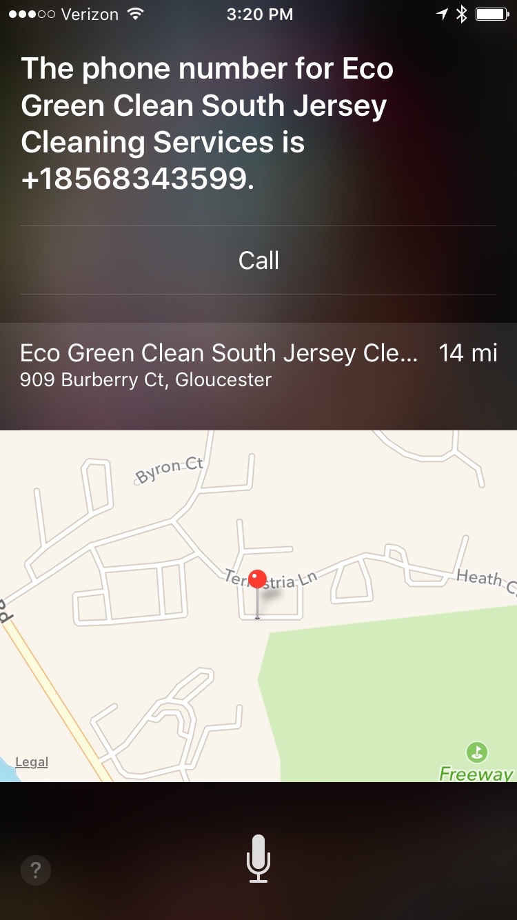
Pichai’s example of a query Google Assistant can handle but which “other assistants” cannot was asking “What is Draymond Green’s jersey number?” I tried that query in the Google app on my iPhone. Got the right answer: 23. I tried with Alexa on my Echo, and got the response “Hmm. I can’t find the answer to the question I heard.” I tried with Siri, and I got this.
Update: Wow. Dozens of DF readers have replied that Siri correctly answers that same question when they ask: exhibits 1, 2, 3, 4, 5, 6, 7, 8, 9, 10, 11, 12 on Twitter, and more via email. And lo, when I ask “What is Steph Curry’s jersey number?”, Siri nails it. But I’ve tried at least 20 times, on multiple iOS devices, with “Draymond Green” and Siri gets it wrong each time, usually sending me to that same dry cleaner in New Jersey, sometimes suggesting a Bing web search. I can’t get it to work even when I say “What’s the jersey number for Draymond Green of the Golden State Warriors?” Maybe it’s my Philly accent. I tried with Derek Jeter (retired), Larry Bird (long retired), and Tony Romo (2017 Super Bowl champ-to-be) and Siri correctly answered all three — quickly.
- Judge on Donald Trump’s Supreme Court Nominee List Has Mocked Trump on Twitter ★
-
I really liked this one.
-
Jacob Kastrenakes, writing for The Verge:
The key improvement here is the removal of the drop-down menu on the righthand side of the screen, which previously held all of the options that are now exposed in the lefthand menu. That’s a real help, but the lefthand menu doesn’t take over everything. You’ll still have to search through those top tabs to find major features, like Apple Music and the App Store. (There is, by the way, no one tab that says “Apple Music” — it’s actually a combination of the For You, New, Radio, and Connect tabs.)
Bringing back the sidebar is an improvement, but the fundamental problem remains: there’s no visual hierarchy to iTunes’s multitude of sections and features. Mail, for example, has a clear hierarchy: accounts → mailboxes → messages → message details. I’m not saying iTunes could or should copy Mail’s design, but it ought to be just as clear as Mail in terms of knowing where you are, or where to find something.
- MacRumors on Siri for Mac ★
-
Juli Clover, MacRumors:
In the menu bar, there’s a simple Siri black and white icon that features the word “Siri” surrounded by a box, while the full dock icon is more colorful and features a colorful Siri waveform in the style of other built-in app icons. Clicking on either of the icons brings up a Siri waveform to give users a visual cue that the virtual assistant is listening for commands, much like on iOS devices when the Home button is held down.
Why would Siri need both a menu bar item and an icon in the Dock?