
By John Gruber

Paper — The connected canvas for teams shipping with agents
- Google Makes It Ever So Slightly Easier to See and Share Publishers’ Real URLs From AMP Pages
-
Danny Sullivan:
As promised, Google is making a change to how it displays Accelerated Mobile Pages, so that users can easily view and share links that lead directly to publishers’ sites rather than to Google’s copy of the content.
A little easier, but I would argue that they shouldn’t be doing this in the first place, and the new UI they’ve exposed is deliberately obfuscated.
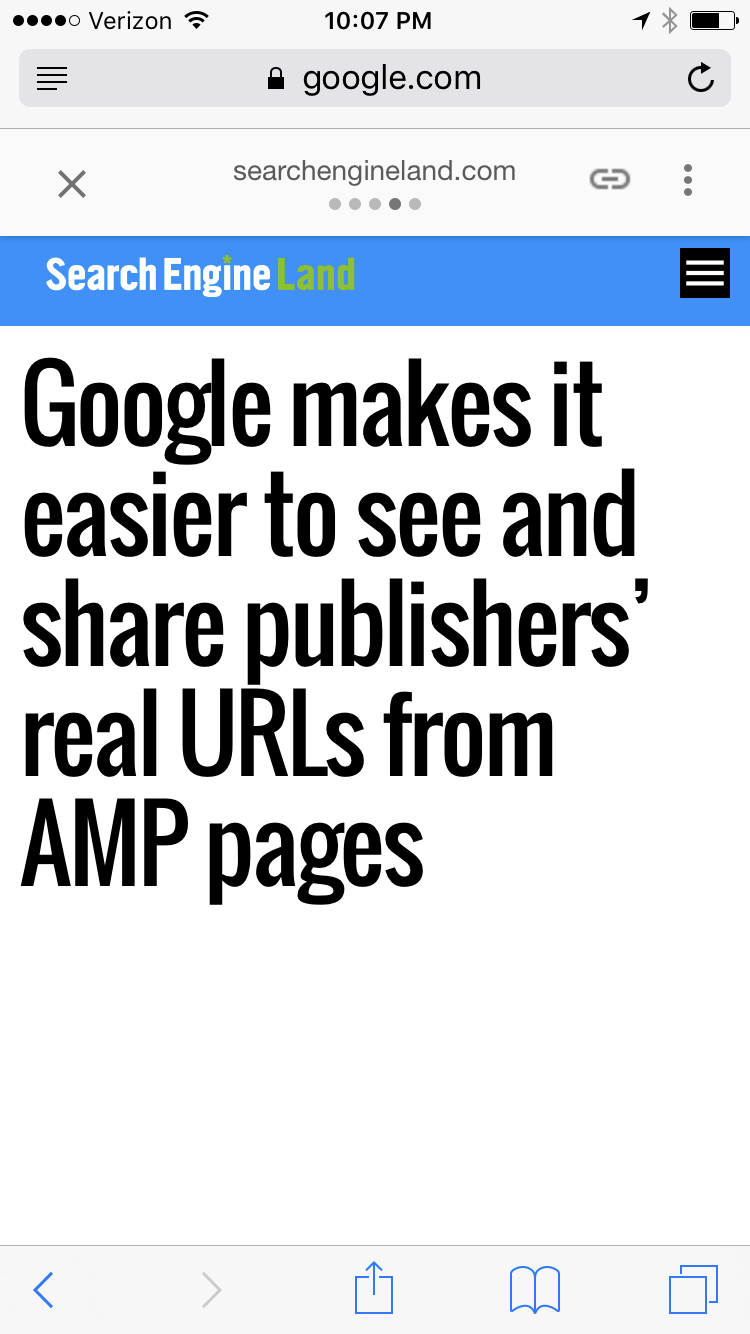
Now, the URL field of a browser will continue to show a Google URL. However, the AMP header area will display a link or chain icon, what it calls the “anchor” button. Clicking on this will make the publisher’s direct URL appear, so that it can be easily copied and pasted.
This new “anchor” icon is cryptic, and I think deliberately so. It looks like nothing I’ve ever seen before. I wouldn’t have guessed that it was a button to show the real URL, and I am a designer who studies iconography and a critic of AMP’s google.com silo. I’ve wanted this feature to exist ever since AMP debuted but I wouldn’t have guessed that this was it. Lord only knows how many regular people will figure it out. (And, bizarrely, the icon isn’t even retina resolution. It looks like a blurry smudge on the screen.)
For those who hold down on the anchor button, Google says it will trigger the native share feature of the browser being used. With Safari, that means easy access to things like Twitter or Facebook. With Chrome, it lacks native share, so nothing should happen.
That’s not how it works for me. When I hold down on the anchor button, I get an alert that says “JavaScript” with buttons for Open and Cancel. To get to the iOS sharing sheet, I have to tap the anchor button, then press and hold on the URL that is revealed in a popover, then choose “Share…” from Safari’s contextual menu. A tap, a long press, and then another tap. Three steps — just to get to the system sharing sheet.
This is what you call a begrudging UI. Google wants you to pass around the google.com-hosted AMP URL, not the publisher’s original URL. If they wanted to make it easier to share the original URL, the anchor button would be a direct link to the original URL. No need for a JavaScript popover. You could then just press the anchor button to go to the original, and press and hold for Safari’s contextual menu. And they could just use the word “Link” or “URL” instead of a cryptic icon.
Better than nothing (which is what we had before), but weak sauce nonetheless.
★ Tuesday, 7 February 2017