By John Gruber

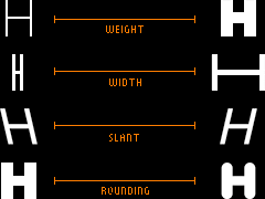
Zed — A font superfamily with extraordinary number of styles and extraordinary language support.
Linked List: January 23, 2020
Thursday, 23 January 2020
- Interesting Stats on the U.S. Streaming Service Market ★
-
This links to a Wall Street Journal story about the fact that two-thirds of Amazon Prime’s content is user-uploaded, and a lot of it is (unsurprisingly) sketchy. Interesting.
But what caught my eye was this graphic halfway down the page, showing “Q4 2019 U.S. customer base by service”, sourced to Ampere Analysis. Their numbers, in millions:
- Netflix: 61.3
- Amazon Prime: 42.2
- Apple TV+: 33.6
- Hulu: 31.8
- Disney+: 23.2
If that’s even close to accurate I’d say Apple TV+ is a roaring success. Yes, of course, surely most of those customers are using it free of charge for the first year. But that’s the point of this “buy any Apple device, get a free year of TV+” promotion. Apple wants people to take advantage of it — it’s the answer to the question of how you launch a paid streaming service with no content other than 11 original shows. Make Apple TV+ a habit now, get paid later. Apple can afford to be patient.
I’ve been curious how many people who qualify for TV+ know about it, and realize just how easy Apple’s TV app makes it to start your year-long free subscription. Apparently, a lot.
It’s worth noting that Disney+ didn’t launch until November 12, halfway through the quarter; I expect Disney+ to eventually take the number one spot on this list.
(Apple News link for News+ subscribers.)
Update: Neil Cybart thinks the Apple TV+ number is way too high, and thinks Ampere Analysis got the number simply by estimating how many people in the U.S. qualify for the free year, not how many people have signed up.
- The Talk Show: ‘Fake Faces’ ★
-
Special guest Glenn Fleishman returns to the show. Topics include iPhone encryption, the privacy implications of widely-available reverse image search for faces, deep-learning-powered algorithmically-generated faces, and Jeopardy’s “Greatest of All Time” tournament. The show notes are an epic reading list.
Brought to you by these fine sponsors:
- Clear: Get through security even faster. Get your first 2 months free with code talkshow.
- Squarespace: Make your next move. Use code talkshow for 10% off your first order.
- Hover: Find a domain name for your passion. Get 10% off your first purchase.
- George Soros to Start $1 Billion School to Fight Nationalists, Climate Change ★
-
Katherine Burton, writing for Bloomberg:
Soros also once again criticized Facebook for its failure to police the social media network.
“There’s nothing to stop them, and I think there is a kind of informal mutual assistance operation or agreement developing between Trump and Facebook,” Soros said. “Facebook will work together to re-elect Trump and Trump will work to protect Facebook.”
Bingo.
- 98.6 Degrees Fahrenheit Isn’t the Average Anymore ★
-
Jo Craven McGinty, reporting for The Wall Street Journal:
Nearly 150 years ago, a German physician analyzed a million temperatures from 25,000 patients and concluded that normal human-body temperature is 98.6 degrees Fahrenheit. That standard has been published in numerous medical texts and helped generations of parents judge the gravity of a child’s illness. But at least two dozen modern studies have concluded the number is too high.
The findings have prompted speculation that the pioneering analysis published in 1869 by Carl Reinhold August Wunderlich was flawed.
Or was it?
In a new study, researchers from Stanford University argue that Wunderlich’s number was correct at the time but is no longer accurate because the human body has changed. Today, they say, the average normal human-body temperature is closer to 97.5 degrees Fahrenheit.
- JetBrains Mono ★
-
New free and open source typeface for developers. I’m not sure it’s for me, but I do appreciate it. It has a much higher than usual x-height, and an emphasis on rectangular oval shapes for round characters. One idea I haven’t seen before: it comes with ligatures for punctuation combinations frequent in code; for example, the ligature for
->(hyphen + greater-than) looks like a two-character-wide→. Certainly worth a download if, like me, you’re a hoarder of monospaced fonts.Via Gus Mueller, who correctly notes that the website JetBrains created for the font is perhaps more interesting than the font itself. Absolutely worth checking out even if you have no interest in the font itself.
- Google Search Results Zip Up Leather Jacket, Strap On Water Skis ★
-
Danny Sullivan — who for years wrote about search engines independently, but is now Google’s “Search Liaison”:
Last year, our search results on mobile gained a new look. That’s now rolling out to desktop results this week, presenting site domain names and brand icons prominently, along with a bolded “Ad” label for ads. Here’s a mockup.
To say that this design blurs the line between real search results and sponsored items is an understatement. They’ve been inching toward this for a decade, but I’d say this marks the line where they’ve gone too far. Yes, they still have an “Ad” label next to sponsored results, in the spot where legit results now show a small site logo, but to paraphrase a wise man, what’s wrong about this design isn’t the think of it but the feel of it. I haven’t seen anyone react well to it, and most think the problem is that it makes ads look more like search results.
That’s not quite right though. Craig Mod put his finger on it precisely:
There’s something strange about the recent design change to google search results, favicons and extra header text: they all look like ads, which is perhaps the point?
That’s it. It’s not that ads look like legit results but that results look like ads too. It’s genius, but perverse. Google is losing the soul of its crown jewel.
