
By John Gruber

WorkOS Pipes: More context makes for smarter products.
- Apple Is Fighting Trademark for Prepear’s Pear-Shaped Logo
-
Apple, in its legal filing:
Consumers encountering Applicant’s Mark are likely to associate the mark with Apple. Applicant’s Mark consists of a minimalistic fruit design with a right-angled leaf, which readily calls to mind Apple’s famous Apple Logo and creates a similar commercial impression, as shown in the following side-by-side comparison.
Here’s the comparison. I could actually see this being a reasonable objection if Prepear were selling computers or phones or watches. But they’re a recipe app. Their logo clearly looks like a pear, not an apple, and their pear does not even look like an Apple-logo-like pear.
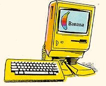
Back in the old days Apple didn’t even pursue legal action against the Banana Junior series of personal computers, and their logo was a six-color banana.
★ Sunday, 9 August 2020