
By John Gruber

WorkOS MCP: Manage your auth platform from any AI agent.
- Amazon Tweaks Their New iOS App Icon
-
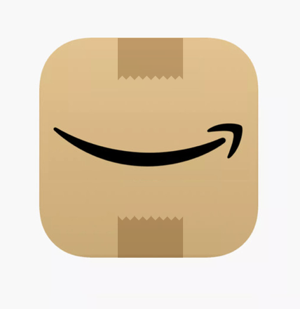
I know, opinions about app icons are like assholes — everyone has one and they generally stink. But Amazon’s previous iOS app icon was, objectively, terrible. For one thing, the only thing about it that branded it as Amazon’s was the word “Amazon”. When your icon is your name, you’ve probably got a problem. But the other problem was the shopping cart. The whole point of Amazon being an online store is that you don’t need a shopping cart. They’ve been stretching this metaphor for over two decades but it’s not a good one.
I love the idea of using a cardboard box as the icon. That’s the iconic real-world object we all associate with Amazon. Sure sometimes you’re just getting something boring like toothpaste or deodorant. But sometimes you get something great — like a new book you preordered a few months back and sort of forgot about. Sometimes a box from Amazon is fun. So hell yes, make the app icon a fun cardboard box.
My problem with the new icon isn’t that the tape looked like a Hitler mustache. (They could’ve solved that by just putting tape on both ends of the box — boxes need tape on the bottom too.) It’s that the ethos of utterly flat design robs the concept of fun. Look at how much better the MacOS standard installer package icon looks than Amazon’s new icon. Just for a boring installer. Amazon is doing the right thing by today’s design trend — it’s the trend that’s wrong, and designers need to start asserting otherwise.
In the land of the blind, the one-eyed man is king; in the land of militantly flat design, a little bit of depth will spark joy.
★ Tuesday, 2 March 2021