By John Gruber
WorkOS: How SSO works and the fastest way to add it.
Linked List: March 22, 2023
Wednesday, 22 March 2023
- Welcome Back, Hipstamatic ★
-
Remember Hipstamatic, the original retro filter camera app for iPhone? At its peak in 2012, photographer Ben Lowy shot the cover image for Time magazine using it. Hipstamatic never really disappeared, but it seemingly lost relevance.
Well, they’re back — recognizable, for sure, but different. New: a photo-sharing social network, ad-free, algorithm-free, and monetized only by a paid membership tier. Hipstamatic co-founder Lucas Buick, on Product Hunt:
But why bring back Hipstamatic now, after it faded from popularity over a decade ago? The answer lies in the growing dissatisfaction with the current state of social media. The recent controversies surrounding Facebook and Meta, as well as concerns over data privacy and the addictive nature of technology, have sparked a desire for something different.
Hipstamatic represents a return to the roots of mobile photography, a time before algorithms and AI ruled the day. It’s a reminder that technology can be used for fun and creativity, not just profit and engagement. The app’s member-supported community is proof that there are people out there who still value genuine connections and the simple pleasure of taking and sharing photos.
I dig it. Not sure about the fact that photos posted to Hipstamatic expire after 4 weeks, but that’s certainly different. Worth installing on your iPhone just to get that icon on your Home screen.
Update: What I love about Hipstamatic is how ambitious it is, UI-wise. Or perhaps better put, how ambitious it remains. There’s an exuberance the app wears on its proverbial shirt sleeve. It unabashedly tells you, from your first impression down to the smallest details in its settings, that it’s supposed to be fun. When people speak of Apple’s foundational iOS 7 redesign a decade ago, the primary adjective bandied about is flat. iOS 7 certainly did get flat. But in hindsight, I’d argue that the operative adjective is whimsy. iOS 1—6 were full of whimsy, iOS 7 took it all out, and the entire industry followed Apple’s lead. Everything everywhere looks like iOS 7 today: Android, MacOS, Windows, the web. Hipstamatic’s re-launch is a statement that whimsy and fun and panache have their place in UI design, and I am happy to co-sign.
- Recommended: ‘Bono & The Edge: A Sort of Homecoming With Dave Letterman’ ★
-
Is this a U2 special with Letterman emceeing, or a Letterman special featuring Bono and The Edge playing stripped down versions of some of U2’s best songs? Yes. It felt perfectly balanced to me. Funny but not a comedy, wonderful music but not at all a concert film. More like this, please.
(Would love to see Letterman do this with Mick and Keith, Page and Plant — or, my god, Paul and Ringo.)
- Microsoft Loop : Notion :: Teams : Slack ★
-
Tom Warren, writing for The Verge:
Microsoft is now letting anyone preview Microsoft Loop, a collaborative hub offering a new way of working across Office apps and managing tasks and projects. Much like Notion, Microsoft Loop includes workspaces and pages where you can import and organize tasks, projects, and documents. But what sets the two apart is Loop’s shareable components that let you turn any page into a real-time block of content that can be pasted into Microsoft Teams, Outlook, Word on the web, and Whiteboard.
Loop components are constantly updated and editable for whoever they’re shared with. Imagine a table that you’re working on with colleagues; you can drop that as a Loop component into a Teams message or Outlook email, and any edits to the table will be reflected wherever it’s embedded or shared.
For some reason I’m having flashbacks to a college internship, when I had to read the spec for OpenDoc. It was like a phone book in size but less readable.
Microsoft Loop is designed with collaboration and co-creation in mind. The main interface looks a lot like Notion, a workspace app that is used by Adobe, Figma, Amazon, and many other businesses.
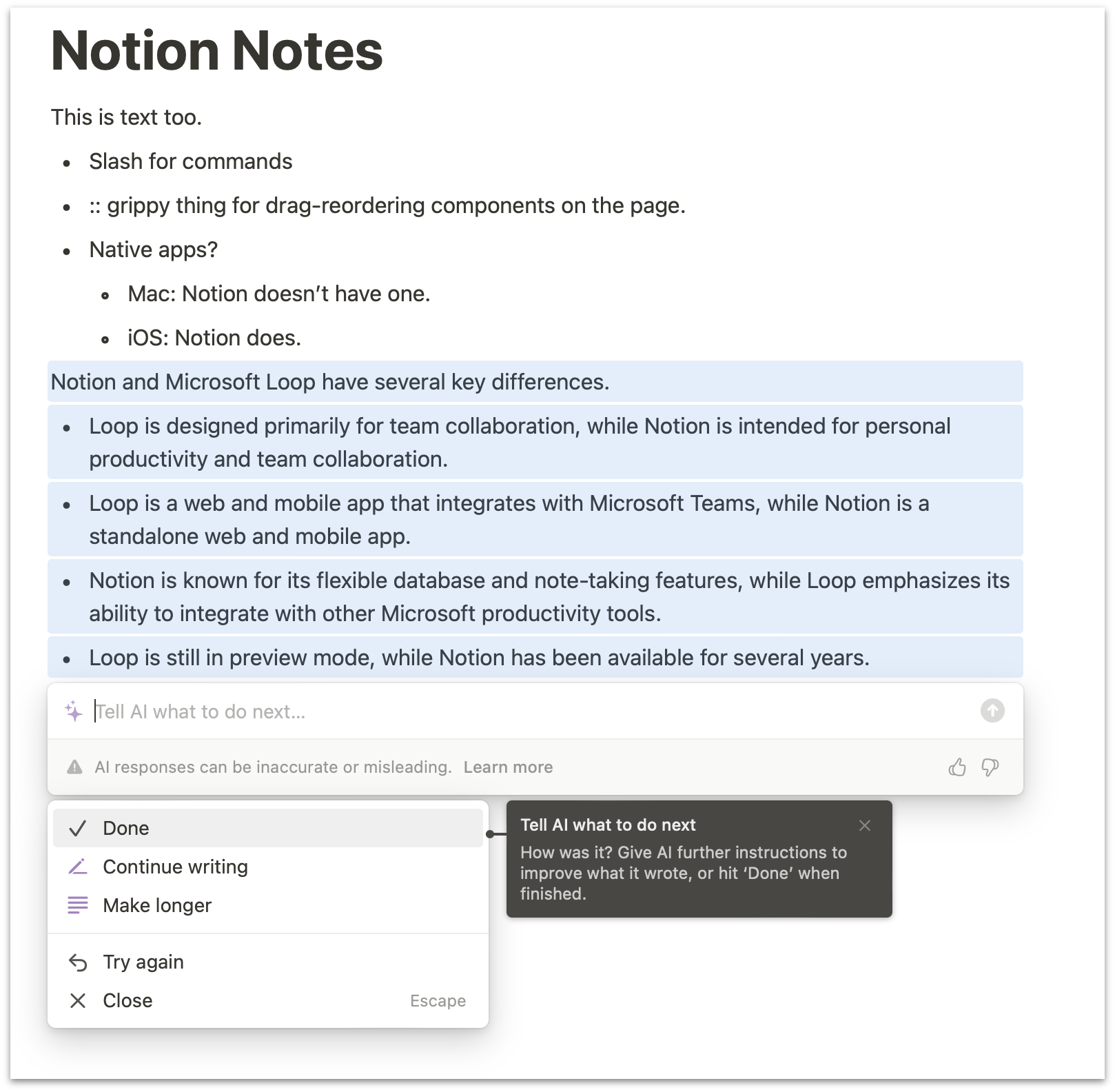
Is Loop a Notion rip-off, or simply in the same space? As ever with Microsoft, they are unafraid to copy. Teams doesn’t just do similar things as Slack — it looks like Slack. Likewise, Loop looks like Notion. I’m not a Notion user so I’m not super-familiar with it, but Loop feels very similar. Loop has the same “::” grippy indicator for dragging components on a page up and down to reorder them, and more tellingly, the same “just type /” slash key trigger for shortcuts. But Slack uses slash the same way and Microsoft copied Slack years ago with Teams.
Notion makes it easy to share a page as a public website (Hipstamatic’s relaunch press release that I linked to an hour ago is on Notion); Loop doesn’t seem to have that feature. Both Notion and Loop are only available on the web on the Mac, but both do work in Safari. [Update: Whoops, wrong, Notion does offer desktop apps for Mac and Windows from their website, but it’s an, err, notional “app” at best — really just an Electron wrapper around their web app. Still, though, we regret the error.] Microsoft’s ChatGPT-powered Bing chat not only doesn’t work in Safari, it requires the bleeding-edge “dev” builds of Edge. [Correction: Bing Chat does work in Safari, but you need to set the user agent string to Edge in Safari’s Develop menu.] Notion has mobile apps for iOS and Android, and Microsoft does too, albeit in beta. Notion’s AI assistant, curiously enough, is more advanced. (Microsoft’s Copilot is coming to Loop, but seemingly isn’t available there for me yet.) I asked Notion’s AI “What are the differences between Notion and Microsoft Loop?” and got a reasonable answer — impressive considering that Loop was only announced today.
If you create software that gains traction in work environments, it’s inevitable that Microsoft is going to follow.
- Amazon Layoffs Will Shut Down Camera Review Site DPReview After 25 Years ★
-
Andrew Cunningham, reporting for Ars Technica:
Amazon has plans to lay off at least 27,000 workers this year, including 9,000 that were announced in an internal email Monday morning. One unexpected casualty: Digital Photography Review, also known as DPReview, is losing its entire editorial staff, and the site will stop publishing on April 10.
The announcement post, written by DPReview General Manager Scott Everett, says that new pieces will continue to be posted through April 10, and “the site will be locked” afterward. It’s unclear what will happen to the site’s content afterward — the post promises only that the site’s articles “will be available in read-only mode for a limited period afterwards.” [...]
Founded in November 1998, DPReview is one of the few active review sites as old as Ars Technica. Amazon purchased it in 2007, and the site’s team has been located in Amazon’s hometown of Seattle since 2010.
The “DP” in “DPReview” stands for “digital photography”. The site is so old that that was necessary, because in 1998 most pro and prosumer photography equipment still revolved around shooting on film. DPReview went all-in on digital photography at a time when many photographers were deeply skeptical of its potential, because the technology was nascent. I’ve bought a fair amount of photography kit over the last 25 years, and never once bought a camera or lens without first reading and watching what DPReview had to say about it. I just bought my first new standalone camera in years a few weeks ago — the Ricoh GR IIIx — and DPReview’s review was the one that sealed the deal for me.
Layoffs are brutal, always, but it feels especially cruel that Amazon is noncommittal regarding keeping DPReview’s content around in perpetuity. Why only keep it available “for a limited time”? How much could it cost to just keep it around forever? Did they even try to sell it? How about letting the staff take over the site as part of their severance?