
By John Gruber

Paper — The connected canvas for teams shipping with agents
- iOS 17.2 (Beta) Sticker Reactions Stink
-
Jason Snell, writing at Six Colors on the new “use an emoji as a sticker reaction in Messages” feature in iOS 17.2, which just came out today as a public beta:
Instead, to send a sticker response you have to tap and hold on a message and then choose Add Sticker from the resulting contextual menu, then choose a sticker or emoji. It’s an extra step that really shouldn’t be necessary and makes stickers feel like an afterthought, which they apparently are.
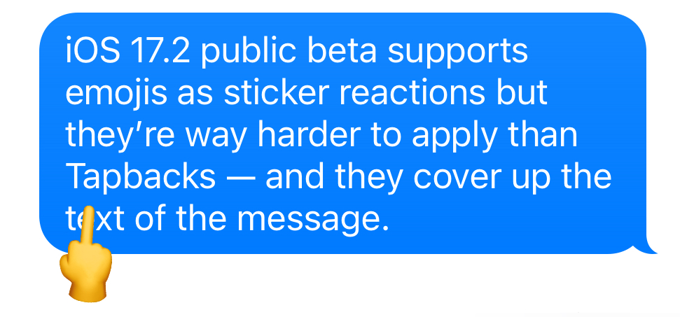
It gets worse. When you add a sticker reaction, it’s placed on top of the message you’re reacting to, obscuring part of the text! Why in the world would Apple choose a placement that makes it impossible to read the text being responded to? The right placement for these reactions is … wait for it … the same place that Tapbacks appear, in a little bubble snuggled up against the message that’s being reacted to.
This design feels more than a bit spiteful to me. I suspect there are two contingents inside Apple: the “Tapbacks are perfect just as they are” side (who prefer there are only six of them — heart, thumbs-up, thumbs-down, ha-ha, “!!”, and “?” — and who insist that they’re monochrome), and the “Jesus H. Christ, every single other popular messaging platform in the world lets users react with any emoji they want, in full color” side. This new emoji-as-stickers feature is a small win for the latter contingent, but the Tapbacks-are-perfect side is calling the shots, and keeping Tapbacks as the only reactions that (a) are super-easy to apply, and (b) don’t obscure the text of the message.
I’ve been playing with the feature, and the one emoji I’ve found that only barely obscures the text of the message it’s applied to just happens to be the perfect emoji to express my feelings about how this feature currently works: 🖕.
★ Friday, 27 October 2023