
By John Gruber

WorkOS Pipes: More context makes for smarter products.
- The European Union’s Interinstitutional Style Guide on Boldfacing for ‘Emphasis’
-
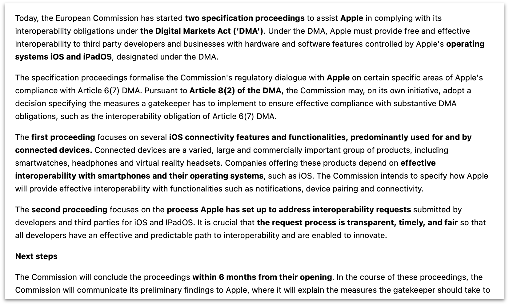
Here’s an interesting bit of follow-up. Last month, when linking to the European Commission’s announcement of “two specification proceedings to assist Apple in complying with its interoperability obligations under the Digital Markets Act”, I wrote a sidenote on the EC’s seemingly willy-nilly use of boldface text:
Honest question: Can someone explain to me the Commission’s use of boldfacing? In the first 265 words of the press release, 66 of them are bold, across 13 different spans. They seemingly use boldfacing the way Trump capitalizes words in his tweets: indiscriminately. I find it highly distracting, like trying to read a ransom letter. It’s not just this press release, they do it all the time.
It turns out, the EU publishes an Interinstitutional Style Guide, and it has an entire entry on emphasis:
Bold type is often used in titles and headings. It can also be used in running text to show changes of subject, to highlight keywords or for emphasis in the same way that some other languages use italics. However, it should be used sparingly.
If the text is already in bold roman, words to be emphasised should be in light roman characters.
Do not overuse typographical variations for emphasis. It can have a detrimental effect on getting the message across quickly and clearly, as shown in the following examples.
Their examples, showing how overuse of boldfacing makes text harder to read, look exactly like the announcement that prompted my sidenote. Whoever writes these announcements from the Commission should read the EU’s own style guide and follow its advice.
See Also: The EU style guide’s entry on italics, which they reserve for purposes other than emphasis.
★ Thursday, 17 October 2024