
By John Gruber

Paper — The connected canvas for teams shipping with agents
- Sorry, MacOS Tahoe Beta 2 Still Does the Finder Icon Dirty
-
Stephen Hackett:
Our 14-day national nightmare is over. As of Developer Beta 2, the Finder icon in macOS Tahoe has been updated to reflect 30 years of tradition:
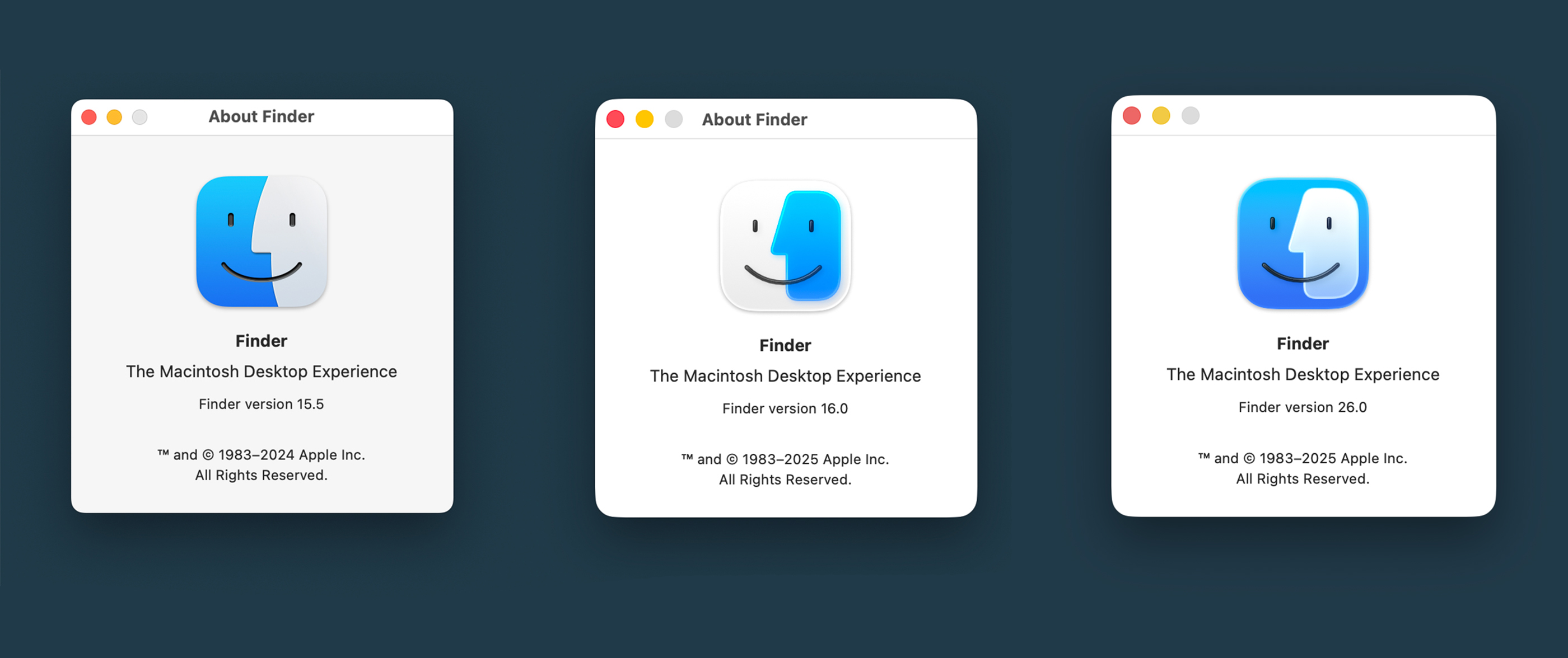
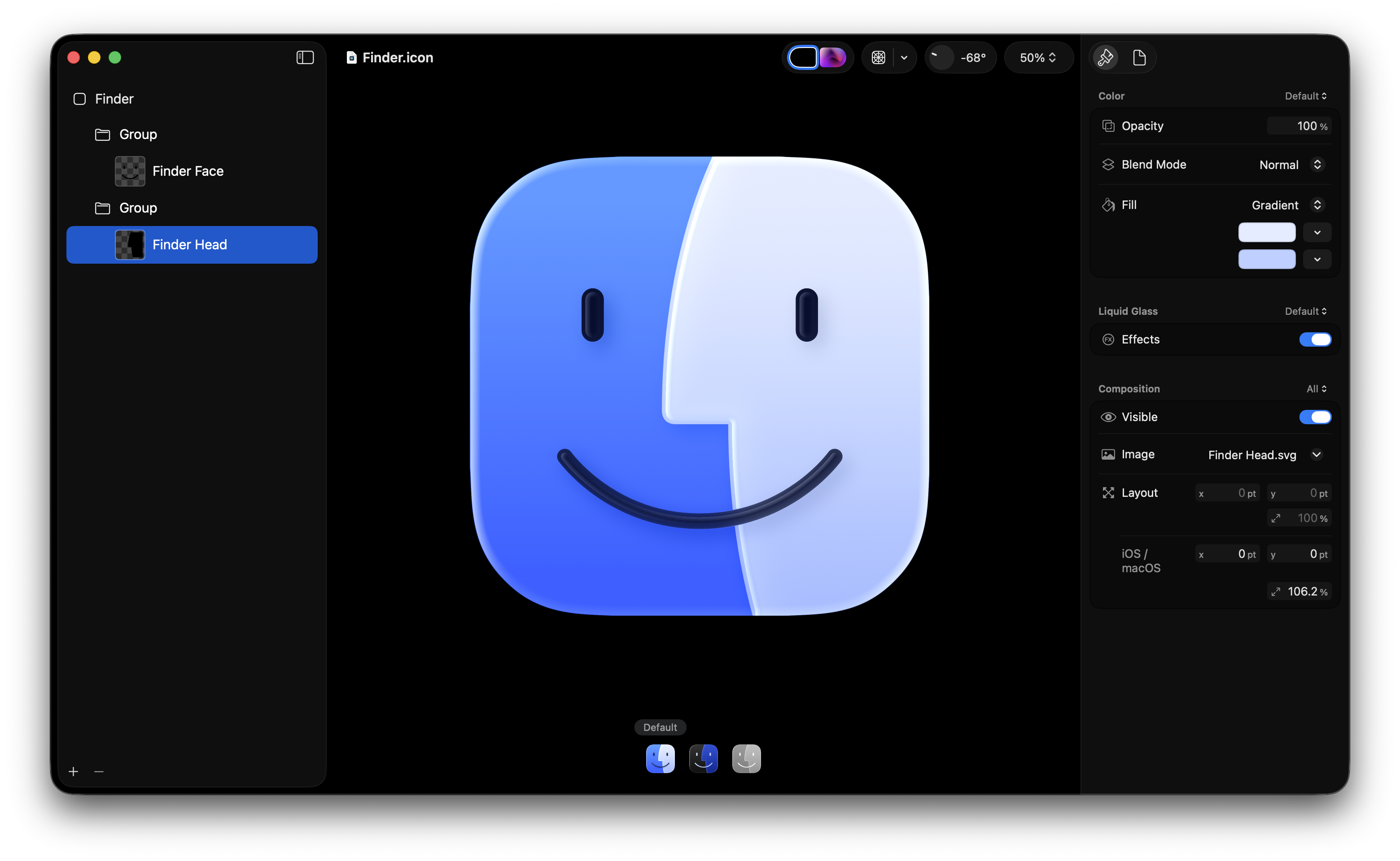
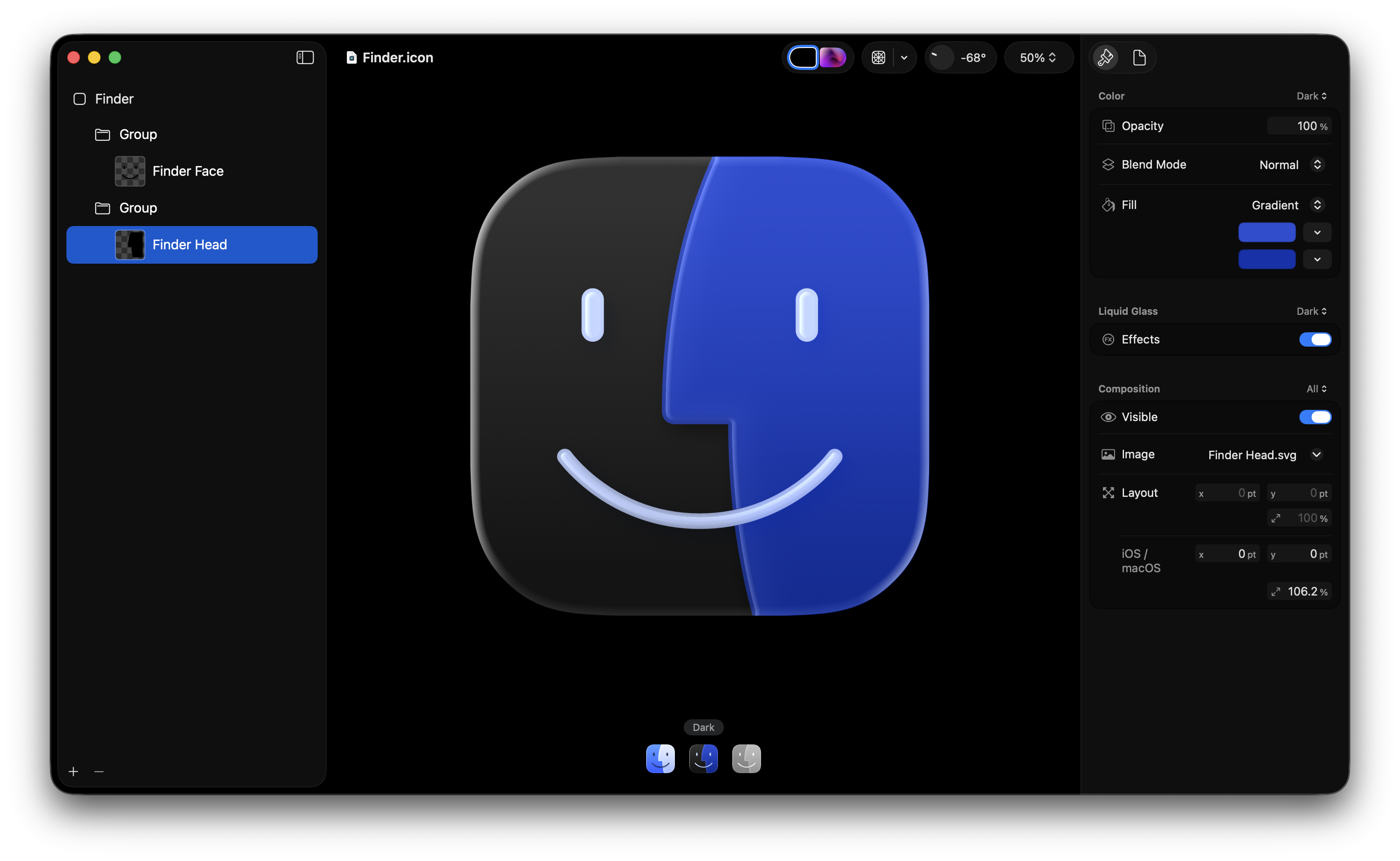
I’m going to strongly disagree here. The Tahoe beta 2 Finder icon is slightly better, but seeing it this way makes it obvious that the problem with the Tahoe Finder icon isn’t whether it’s dark/light or light/dark from left to right. It’s that with this Tahoe design it’s not 50/50. It’s the appliqué — the right side (the face in profile) looks like something stuck on top of a blue face tile. That’s not the Finder logo.
The Finder logo is the Mac logo. The Macintosh is the platform that held Apple together when, by all rights, the company should have fallen apart. It’s a great logo, period, and the second-most-important logo Apple owns, after the Apple logo itself. Fucking around with it like this, making the right-side in-profile face a stick-on layer rather than a full half of the mark, is akin to Coca-Cola fucking around with the typeface for the word “Cola” in its logo. Like, what are you doing? Why are you screwing with a perfect mark?
There are an infinite number of ways Apple could do this while remaining true to the original logo. Here’s a take from Michael Flarup that glasses it up but keeps it true to itself:

Especially in the field of computers, no company can be a slave to tradition and history. But you ought to respect it. This new Finder icon doesn’t.
Update: And here are some excellent takes on an updated Finder icon by Louie Mantia, along with some astute commentary. Mantia writes:
I really, really do not like spending my time pointing this out. I could write a whole blog post but I don’t want to seem angry about it. I just think the right solutions are simpler than what they’re doing.
No surprise, but Mantia’s icons look perfect to me. Perfectly Liquid Glass-y, perfectly Finder-y.
★ Tuesday, 24 June 2025