
By John Gruber

WorkOS: How SSO works and the fastest way to add it.
- Stock UI in MacOS 27 Eschews Clarity
-
“Thibault”, in post on Mastodon responding to Brent Simmons’s “stock Mac UI” post that I just linked to:
It reminded me of my own explorations with the macOS design language, especially the modern title/toolbar which I believe is one of the most foundational design regression on the platform.
I played with the idea of redesigning the Finder with the original hierarchy but keeping the current Liquid Glass styling. Though it’s still far from what I’d like to see on my Mac, I thought I’d share.
Here’s his subtle mockup:
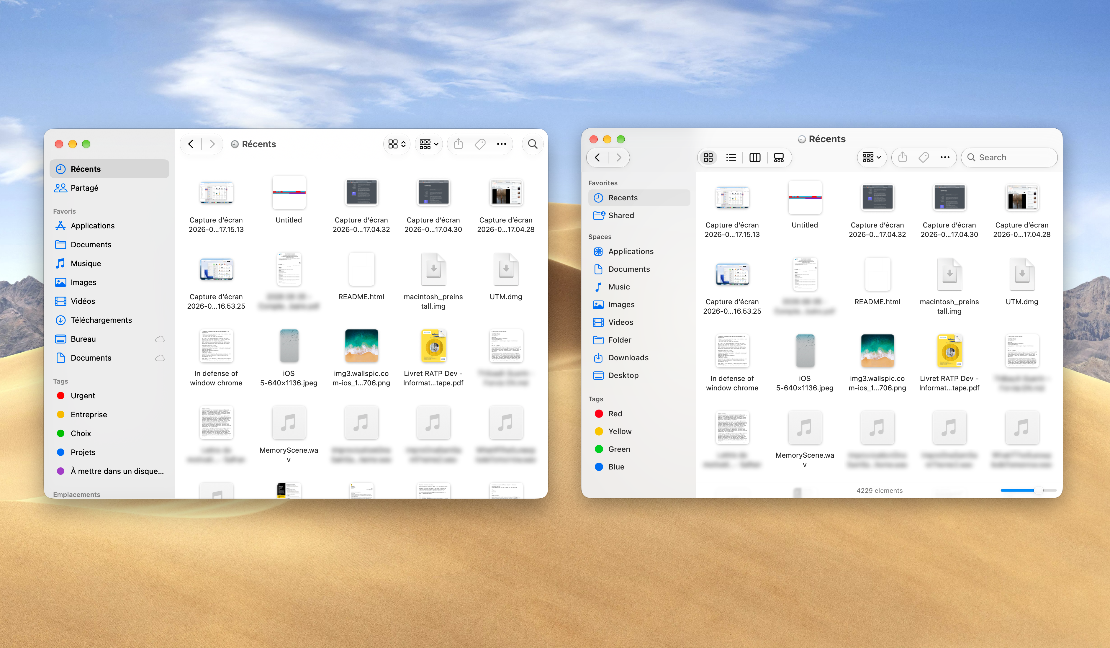
The changes in Thibault’s redesign, if you describe them verbally, sound minor. But looking at the differences feels like a huge — and much needed — breath of fresh air. It relaxes my nervous system to see obvious differentiation for window chrome at the top. The hierarchy is clear: this area is the window, this area is the content of the window.
Apple’s MacOS 27 Golden Gate stock UI deliberately does away with that differentiation, for no good reason. I crave clarity, and Apple’s current MacOS design language rejects clarity. Like: where exactly can you click to drag a window around? That ought to be obvious; instead it’s literally a guessing game. And Thibault’s simple example also shows that the problem has nothing to do with “Liquid Glass” controls.
★ Friday, 25 September 2026