By John Gruber

Day One — The journal you actually keep. Start with a chat, end with a journal entry. ⭐ 4.8 (400k)
Graphic Communication
Thursday, 4 December 2003
A lot of reader email this week on two points:
Criminal or Just Dumb, You Be the Judge
With regard to the last of Tuesday’s suggested alternative slogans for the brothers Neistat, a number of you expressed skepticism as to whether there was, in fact, anything “criminal” about it. I.e. that the iPod ads they stenciled over were only “wild posters”, posted independently and unofficially as a guerrilla-marketing tactic, and, thus, fair game for defacement.
OK. Could be.
But somehow I doubt it’s flat-out legal. At best, I suspect, it’s illegal but not enforced. But my point was not that I expected the NYPD to burst into the Neistat residence and take the lads into custody; the point was simply that this is not the sort of activity a wise person commits to videotape.
And check out the top photo on this page at Rachelle Bowden’s weblog. Apple obviously paid for the billboard; it strikes me as plausible that they also paid for the rights to post bills on the same site.
Charter
With regard to Monday’s posting of Panther-vs.-Jaguar usage amongst Safari-using Daring Fireball readers, a slew of readers wrote in requesting a graphical display of the data, rather than simple tables of numbers.
That’s a grand idea, and, on the whole, I’m all in favor. The reason I only posted numbers isn’t that I dislike graphs, but that good graphs are hard to make. Not just in terms of aesthetics, but in terms of presenting truly useful and accurate representations of the data.
E.g., with regard to Monday’s browser-usage statistics, I think a simple line-graph based on the percentage column would be a bit misleading, because it wouldn’t take into account the number of readers each day: higher-traffic days are probably more accurate than lower-traffic days.
Of course, the whole exercise is utterly unscientific and fraught with inaccuracy. The malleable nature of web server stats means even the raw numbers should be considered only roughly accurate, so why not produce a roughly accurate graph to accompany them?
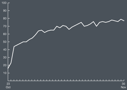
Several intrepid readers took it upon themselves to do so. My sincere thanks to all of you. My favorite of the bunch is this one, from Nate Cook:
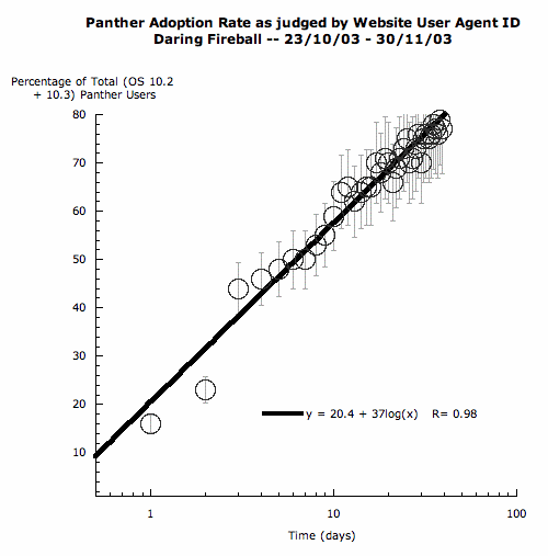
“Gummi” went one step further, and plotted the numbers on a logarithmic scale: