
By John Gruber

WorkOS MCP: Manage your auth platform from any AI agent.
Star Star
Thursday, 11 August 2005
For most of the 14 months or so that I’ve been publishing the Linked
List, I’ve been using small stars as the permalink markers for each
entry. Instead of small graphic images for the markers, I use a
Unicode HTML entity: ★, a.k.a. Black Star.
They’re supposed to look like this:

However, when viewed using Safari on my new Mac Mini (running a stock installation of 10.4.2, with no third-party fonts, and all of the fonts that shipped with the Mini enabled), they looked like this:

My first thought was that it must be a problem with my CSS, that I’d
somehow introduced a bug that caused the permalink class to be
rendered too small. But after bumping up the font size a few clicks I
could see that it wasn’t even the correct star shape — it’s a less
angular, more childish star:

Testing on a few different Macs, all running Safari 2.0 and Mac OS X 10.4.2, produced inconsistent results. Some displayed the stars as intended, others didn’t. With Camino and Firefox, however, the stars displayed correctly on every system. Only in Safari did the results vary.
Most of the characters in the Unicode character set aren’t represented
in most typefaces; so, when you ask for one of them and the “current
font” has no glyph to represent the character, the system uses an
appropriate glyph from a font that does represent the character.
Common text fonts like Helvetica, Times, Georgia, and Verdana (my text
font here at Daring Fireball) don’t have built-in glyphs for the
★ star.
So, I copied the star character displayed in Safari and pasted it into TextEdit. I then opened the Fonts palette to see which font was being used to display the glyph. On the systems where it displayed correctly, the font for the star was Hiragino Kaku Gothic Pro, a Japanese sans serif.1 On the systems where it displayed incorrectly, the font was Mshtakan, an Armenian typeface.
So, the problem is that when Mshtakan is available, and the “current font” doesn’t contain the black star glyph, Web Kit uses the (ugly) glyph from Mshtakan rather than (correct) glyph from Hiragino Kaku Gothic.
The problem probably isn’t Web Kit’s fault, though. Using the Character Palette, if you insert a black star in TextEdit while using a font that doesn’t contain the glyph, you’ll get the star from Mshtakan (if Mshtakan is available). What sucks about this is that of all the fonts that contain a glyph for this character,2 Mshtakan is the only font that could be considered a poor choice.
The star varies slightly in size depending on the font (it’s a little smaller in Zapf Dingbats, for example), but only in Mshtakan is it significantly smaller, and only in Mshtakan is it a differently-shaped star.
Goat’s Head Soup
The workaround was simple: in my CSS, I now ask for specific font
families for my permalink class:
font-family: "Hiragino Kaku Gothic Pro", "Osaka", "Zapf Dingbats";
Web Kit will now try to use the star from those fonts before resorting to Mshtakan.
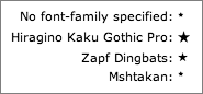
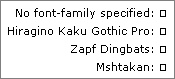
I’ve put together this simple example to demonstrate the problem.
Using Safari 2.0 on a 10.4.2 system with the Mshtakan font available, it looks like this:
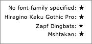
Using Safari 2.0 on a 10.4.2 system that doesn’t have Mshtakan, it looks like this:
And using either Camino or Firefox, regardless if Mshtakan is available, it looks like this:
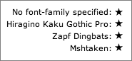
Note that the Gecko renderer (used in both Camino and Firefox) chooses the exact same star glyph, regardless of the specified font. I consider this more desirable than Web Kit’s “I’ll show you different stars depending on which fonts you have available” behavior.
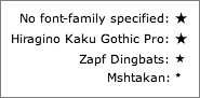
Update
If you turn on Safari’s “Use ATSU for All Text” option (via the Debug menu), Safari will display a proper star glyph by default, even when Mshtakan is available:
(Thanks to Matt Deatherage for pointing this out.)
I can’t recommend turning Safari’s ATSU rendering option on, however, as it results in generally unsightly kerning.
Also, for the curious, Nat Irons sent the following screenshot of the demo page as displayed by IE 6 running on Windows 2000:
Just lovely.
-
Hiragino Kaku Gothic is apparently “Japan’s Helvetica”. ↩︎
-
If you look in the Font Variation section of the Character Palette, you can see every font that contains any particular character. ↩︎
| Previous: | Trusted |
| Next: | The GUIdebook Interview |