By John Gruber

WorkOS FGA: The
authorization layer
for AI agents
If It’s Wednesday, It Must Be Time for New Apple Product Announcements
Wednesday, 19 October 2005
Same thing as last week; a bullet list of observations and comments regarding today’s announcements. Check back for updates (and send your own clever observations via email, por favor.)
Aperture
I was skeptical when I heard the rumors of an “Apple Photo Pro” app, because I thought it unlikely that they’d directly confront the U.S.S. Photoshop. But looking at what Aperture really is, it seems obvious. Aperture is clearly not a Photoshop killer: it’s not a paint app or design app. It’s targeted specifically and only at photographers. It’s an entire app built around a segment of the Photoshop market. And, frankly, it’s hard to imagine that anyone who buys Aperture isn’t also Photoshop user.
Apple’s Aperture web site section is gorgeous and very well designed and organized. One of the best product web sites I’ve ever seen.
The Quick Tour movies are just terrific. I’ve never seen it in person, but just from watching these movies, I feel like I already “get” Aperture.
There’s a lot of R2-D2-esque beeping in the Quick Tour movies, however — beeping and chirping over every thing UI element the mouse moves over. I’m not sure whether this is just something added to the Quick Tour movies, or if it’s something you actually get when you use Aperture. If the latter, surely this can be turned off — but my guess is that it’s the former, and these sounds are only present in these demo movies, not the app itself.
At the end of profile of Sports Illustrated photographer Heinz Kluetmeier, talking about the Aperture’s ability to let you tweak and choose between different versions of the same shot, Kluetmeier concludes, “Stanley Kubrick would be jealous.”
The Aperture UI is gorgeous, and judging from the tours, quite clever. And while as I stated above, it’s not a direct competitor to Photoshop, they’re certainly going to be compared and contrasted. In terms of UI aesthetics, Aperture blows Photoshop away. Aperture looks like what Mac apps are going to look like in the future; Photoshop looks like what Mac apps used to look like years ago.
Another major difference is windowing. Photoshop, like the entire Adobe line-up, is all about palettes. Aperture, on the other hand, and like most of the modern Apple line-up, is about one main window, with tools anchored around the sides of the window. I think well-designed single-main-window designs are a better way to implement “workflow” applications. Aperture looks less cluttered than Photoshop.
Aperture’s revision control only stores the instructions, not entire files for each version. So the only file on disk is your original RAW image, and each “version” is a set of instructions applied to the original file. This both saves space (RAW images are huge) and pretty much guarantees that anything you do in Aperture will never alter or destroy your originals.
A big point of Aperture is that it pretty much gets you out of the business of manually managing files by hand. With Photoshop, you’re still stuck with doing a bunch of Save As’s to get different versions of the same picture to compare.
Apple says Aperture is fast, but at least one way they’ve achieved this is by not allowing it to run on anything other than top-of-the line hardware. The recommended system is a dual-G5 Power Mac running at 2.0 GHz or faster, with at least 2 GB of RAM and a good video card. The minimum requirements are any G5 Power Mac or iMac, or a PowerBook G4 running at 1.25 GHz, and 1 GB of RAM.
If Aperture is fast, then why is iPhoto still so slow?
Power Macs
They don’t come with Front Row.
The new Power Macs have PCI Express expansion slots, and aren’t compatible with regular PCI and PCI-X cards. These moves always raise the hackles of people with major investments in expansion cards that suddenly aren’t compatible. People who need PCI-X support can still purchase the single-core dual 2.7 GHz Power Mac G5; on the “Select your Power Mac G5” Apple Store page, follow the “Need PCI-X?” link at the top of the page.
There aren’t any ATI video cards, even as build-to-order options. If you don’t like Nvidia, you’re on your own.
Dual Gigabit Ethernet is standard across the line. Useful for people who want to set these things up as servers.
Now support up to 16 GB of RAM. Finally, Power Mac owners with thousands of dollars budgeted for RAM can comfortably open both Safari and iPhoto at the same time.
The new Power Mac G5s can drive up to four 30-inch or eight 23-inch Cinema Displays. That’s some serious pixels.
Not only have the Power Mac G5s still not gotten to 3 GHz, they’re actually further away than before, topping out at 2.5. The dual core technology means these are faster machines, but, still, clock speed does matter.
The Power Macs really are “pro” machines. For people doing CPU-comprehensive work — photo, audio, and video professionals, for example — and who are using software that has been designed to take advantage of multi-processor architectures, these new Power Macs are probably going to be pretty popular.
Apple’s new Power Mac page shows some pretty serious improvements in real-world application performance. Most impressively, they claim a 76 percent improvement in Xcode build times compared to a previous-generation dual 2.7 GHz Power Mac. If you’ve ever used Xcode, or listened to a developer who does, you’ll realize that there are a lot of Mac developers out there clicking “buy” today.
But for typical consumer and enthusiast use, I don’t think these are great machines, bang-for-the-buck-wise. That’s not a complaint — Apple certainly isn’t promoting them as such.
PowerBooks
They don’t come with Front Row, either.
I love the simplified product line-up. Three models: 12-, 15-, and 17-inch, each separated in price by $500, and that’s it. No more decisions about which 15-inch PowerBook to get, just pick a size and configure which options you want. This means, for example, that you get the backlit keyboard with any 15-inch PowerBook; previously you had to order the $2499 model to get the fancier keyboard.
Speaking of PowerBook options, there are two different $200 hard drive upgrades: 120 GB at 5400 RPM, or 100 GB at 7200 RPM. I’m curious what the trade-off is for the 7200 RPM drive — it’s faster, of course, but also hotter and probably harder on battery life. But how much hotter, and how much harder on the battery? I’d love to hear from anyone with an informed opinion on this. (Emphasis on informed, please.) My gut tells me I’d be better off with a 5400 RPM drive.
Update: Lots of feedback on this, thanks to everyone who wrote. The consensus seems to be that 7200 RPM drives offer a noticable performance difference (duh), and don’t significantly worsen operating temperature or battery life. They use more juice while reading and writing than slower drives, but because they’re faster, they spend less time reading and writing, and it more or less evens out. The issue is whether they’re too noisy; some say yes, some say not noticably.
It would help if Apple would say which brand and model drive you get, but they don’t. All you know is that it’s 100 GB and 7200 RPM. These benchmarks from Bare Feats indicate that 7200 RPM drives are a lot faster, and only ever-so-slightly noisier.
So, I’m now leaning toward getting the 7200 RPM BTO option.
Speaking of battery life, it’s up an extra hour on each model. That’s not bad, especially considering that display brightness is up, too (46 percent brighter on the 17-inch lunch tray, 20-some percent brighter on the 15-inch).
And speaking of displays, the extra pixels on the 15-inch and 17-inch PowerBooks are clearly the most important new features. At what point will UI elements start getting too small, though? I don’t think Apple can squeeze more pixels-per-inch into their displays than this, without supporting scalable UI elements in Mac OS X. (And there is preliminary support for this in Tiger.)
This is no longer surprising, but it’s pretty clear now that there’s never going to be any such thing as a “PowerBook G5”. This is probably true for all Mac hardware, but the PowerBook was the one line-up where I thought maybe there was a chance for one more major PowerPC-based product update before switching to Intel, simply because the current PowerBook G4 generation has been around for so long.
The first-generation of the aluminum PowerBook G4s hit the market over two years ago. Even if the PowerBook line switches to Intel (and new form factors) in the middle of 2006, they’ll have been around for three years.
More so than the new Power Macs, I think these PowerBooks are going to be a real test of the Osborne Effect. People who can take advantage of the performance improvements in the new Power Macs won’t even hesitate before buying them — 76 percent improvements in Xcode building, 40 percent improvements in Final Cut Pro rendering — these are significant performance gains. But the improvements in the PowerBook line are relegated mostly to the displays: performance is more or less the same as the last ones.
I think they’ll sell. At the very least, I think they’re going to sell at least one 15-inch PowerBook to me. Display improvements are no small thing, and if you’re tempted to wait for Intel-based PowerBooks, at this point, I think you might be waiting for a long time. Intel-based PowerBooks certainly aren’t coming “soon”.
The 12-inch PowerBook was only nominally modified. The screen is the same size and brightness as before, as is battery life. All you really seem to get now that you couldn’t get last week is a SuperDrive, standard-issue. The 12-inch still doesn’t even have the backlit keyboard.
Apple Store
If you bought a PowerBook or Power Mac within 14 days of yesterday, Apple is letting you change your order or return it if it was already shipped.
Nat Irons emails:
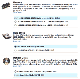
I find it interesting that the Apple Store’s product pages aren’t using pop-up menus anymore for BTO options. Smart. Also, they’ve introduced an Ajax recalculation of price and estimated ship dates. It’s a lovely implementation; turn off JavaScript and you get an “update subtotal” button at the top and bottom of the page.
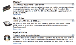
What’s curious about Nat’s “no more pop-up menus” observation is that I still see pop-ups when I go to the store. Here’s what I see when I go to configure a PowerBook (click for a larger view):
And here’s what Nat sees, and what I see when I follow one of the store URLs he gets:
If anyone can figure out why I’m not getting this new UI by default, let me know. (Notes: Nat and I are both using Safari 2.0.1, and both of us have JavaScript turned on.)
The new Ajax-y configuration UI is indeed nifty. You can click anywhere in the radio button label text to toggle the buttons, just like a regular radio button elsewhere in the OS. (Typically, on web page forms, you’ve got to click exactly in the tiny radio button itself.)
| Previous: | The Life |
| Next: | Notes on Membership Information |


