
By John Gruber

Sentry — Catch, trace,
and fix bugs across your entire stack.
Highly Selective
Friday, 4 August 2006
There are two models for selecting multiple items in a list using the keyboard: anchored and unanchored.
Anchored: The selection grows in one direction, and shrinks in the other. In the anchored selection model, if you select two or more items in a list using Shift-Down, then pressing Shift-Up will deselect items from the bottom of the selection range. (And vice versa: if you start by selecting items with Shift-Up, Shift-Down will deselect from the top of the selection.)
Unanchored: The selection grows in both directions and never shrinks. In the unanchored selection model Shift-Down always extends the selection range downward and Shift-Up always extends it upward.
The debate between these two models arose at the tail end of “Standing in Line With Mr. Jimmy” two weeks ago, when I mentioned a gripe from Tim Bray about message selection in Apple Mail, which gripe is that Mail uses the unanchored model. I agree with Bray that unanchored selection is frustrating, but I also pointed out that because the unanchored model is the default behavior of Cocoa’s NSTableView control as well as the Carbon Data Browser control, it is in fact used in more applications than the anchored model.1 A few common examples include Mail’s message list, Safari’s bookmarks list, iChat’s Buddy List window, the Finder’s list and column views, and the song and browser lists in iTunes.
There are counter-examples where the anchored model is used, but among the apps I regularly use, I’ve only been able to assemble a rather short list: Firefox (e.g. in its bookmarks window), and Bare Bones Software’s BBEdit, TextWrangler, and Mailsmith.2 Cell selection in Microsoft Excel and AppleWorks works this way as well, and spreadsheet tables are really just two-dimensional lists.
This sparse assortment might seem like damning evidence against the anchored model. Firefox and Microsoft Office aren’t typically heralded as exemplars of proper Mac user interaction and interface design, and AppleWorks was left to wither on the vine several years ago. And while one’s knee-jerk response to BBEdit and its siblings’ use of the anchored list selection model might be to chalk it up to the fact that they’re Carbon and old, I’ll point out that other venerable Carbon apps such as Eudora, Interarchy, and Fetch now handle keyboard list selection using the unanchored model. Both Fetch and Interarchy now use the Carbon Data Browser list control; but Eudora doesn’t, and I believe Eudora has always worked this way. (BBEdit does not use the Carbon Data Browser for its lists.)
I’m sure there are other examples of Mac apps that offer anchored list selection, but the point remains that the vast majority of software now follows Apple’s lead and uses the unanchored model for list item selection. If “Mac-like” means “what most other Mac software does”, then in this case the Mac-like behavior is wrong, or at the very least, worse.
Crux of Entire Argument: The primary advantage to anchored selection is that it allows you to easily, instantly, and intuitively compensate for mistakes: If you hit Shift-Down one too many times, just hit Shift-Up to compensate. Whereas with the unanchored model, it is impossible to recover from a “gone too far” mistake without either (a) starting the entire selection over from scratch, or (b) using the mouse.
In a footnote in the “Mr. Jimmy” piece, I asked:
Does anyone actually prefer this behavior? This is one of the most baffling design decisions in all of Mac OS X, because I just can’t see how anyone would want it to work this way.
I received not a single email from anyone who claims to prefer this behavior. Not one. Perhaps the unanchored list selection aficionados will start jumping out of the woodwork now, but I doubt it. The only feedback I received from DF readers was from those who wished to second my thoughts on the matter, conveying in no uncertain terms their frustration and puzzlement regarding Mac OS X’s default keyboard list selection behavior.
That means we’re left with a situation where almost all Mac software handles keyboard-based list selection in a way that almost everyone — or at least everyone who cares — considers suboptimal.3
When I ask whether anyone prefers the unanchored model, the question is at least somewhat rhetorical: clearly someone at Apple prefers this behavior, because that’s how NSTableView and the Data Browser controls work.
Why? DF reader Stuart Lamble offered this explanation via email:
With the UI as Apple currently has it, there’s no ambiguity: it’ll expand the selection to that item. With the other way, you don’t know. Maybe it’ll reduce the selection, maybe it’ll expand it. It depends on where the first item selected happens to be in the list.
I’m not saying that I believe it’s the right choice to make, but I can understand why a UI designer might make that choice.
I agree that there’s a certain cogency to this argument. The idea here is that anchored selection involves an invisible marker: you can’t tell just by looking at a selection of multiple items in a list which end is the anchor point. E.g. imagine you sit down at a computer and you see four items selected in the middle of a list, but you don’t know how the selection was made (Shift-Down? Shift-Up? with the mouse?). In this situation, you wouldn’t know what would happen if you hit Shift-Up or Shift-Down. With the unanchored model, on the other hand, you always know: Shift-Up will extend at the top, Shift-Down will extend at the bottom.
This strikes me as a contrived scenario, however, and therefore a poor justification for unanchored selection. How often do you come back to your computer, or switch back to an app that’s been in the background for an extended period, and decide to begin extending an existing multiple-item list selection? I think selections are almost always made in one step, and so in practice, anchored selection is never confusing.4
The more obvious justification for unanchored selection is that it allows you to make a multiple-item selection by starting with an item in the middle of your intended range. This too seems somewhat contrived, however. I, for one, never do this.
Neither justification for unanchored selection is sufficient to put aside the aforementioned key advantage of anchored selection: that it allows you to easily correct mistakes without reaching for the mouse, because it allows you to both extend and shrink the selection using the keyboard.
There is nothing wrong with using the mouse to select (or deselect) items in a list — I do so frequently, when my hand is already on the mouse. But you shouldn’t have to switch from using keyboard shortcuts to the mouse just because you selected one too many items.
The ease with which you can recover from mistakes is a good barometer for the overall usability of software. Two good rules of thumb: it should be easy to recover from mistakes; and it should be difficult to make mistakes that cannot easily be undone (e.g. asking for confirmation before emptying the trash).
Multiple-item selection with the mouse is very forgiving of mistakes. If you’re using the mouse alone, you select multiple items in a list by clicking and dragging to select a range of items. If you click on the first item, then drag down but go too far, you can drag back up (while still holding down the mouse button) to correct your range. In other words, mouse-only selection is anchored, and that’s good, because it allows for making corrections easily.
Using the mouse and keyboard together to select items, however, is unanchored: if you select one item, then Shift-click both above and below that item, both Shift-clicks add to the selection range. In this case, though, unanchored selection is clearly what is called for. If you make a mistake while Shift-clicking or Command-clicking, you can correct the mistake simply by Shift-clicking or Command-clicking again. Using the mouse and keyboard together is clearly the most expressive means of creating a multiple selection, because it allows you to select discontinuous items, something that can’t be done with the keyboard or mouse alone. This expressiveness comes at the expense of complexity, however; those of you reading this are likely well aware of these Shift-click and Command-click selection actions, but many Mac users aren’t.
There’s no reason why you should have to start over or switch to the mouse-plus-keyboard shortcuts just because you overshot your intended range by a few items while using the keyboard-only (Shift-arrow) shortcuts. The keyboard-only shortcuts should use the anchored behavior for the same reason the mouse-only shortcuts do use the anchored behavior: to make it easy to recover from mistakes.
Think of the rubber-band selection mode in the Finder’s icon view (and from older versions of the Finder’s list view): it grows and shrinks as you drag back and forth. It would be goofy if it only grew and never shrank — but yet that’s exactly how the unanchored keyboard-only selection shortcuts behave.
Another reason to use anchored selection for keyboard shortcuts in lists is to be consistent with the selection model in text views. When selecting a range of text with the Shift and arrow keys, reversing direction deselects, both left-right and up-down. I’m not aware of a single text editing UI for the Mac where keyboard-based text selection is unanchored. [Update: Eudora is an exception; it uses the unanchored model for keyboard-based text selection. Crazy.] One aspect of consistency in UI design is that similar things should behave in similar ways. Selecting text with the keyboard and selecting items from a list with the keyboard are not the same — e.g. there’s no such thing as an insertion point in a list, and while text can be seen as an ordered list of characters, it can also be traversed as a series of words, lines, paragraphs, etc. — but they are fairly similar. And, at a basic level, the keyboard shortcuts for these tasks are largely similar: holding down Shift while pressing an arrow key extends the selection in the direction of the arrow key, for both lists and text. But in text views, you can compensate for mistakenly going too far by reversing your direction; in lists, you can’t.
I almost hesitate to draw attention to this analogy between text selection and list item selection, lest whoever it is at Apple who favors unanchored selection for lists mandate that text selection in NSTextView and friends be changed from anchored to unanchored, for the sake of consistency — I’d rather the current inconsistency remain than see text selection changed to the unanchored model.
In short, Apple has made a poor trade-off by choosing unanchored selection for lists. You suffer a large penalty (when you overshoot your intended range) in exchange for a small benefit (being able to grow both ends of the selection range).
Unfortunately, there’s no way to settle this argument based on a plain reading of the Apple Human Interface Guidelines, because, at least insofar as I can tell, the HIG is silent on the issue of anchored vs. unanchored keyboard-based selection in list views.
The HIG does, however, cover the issue with regard to text views. Keyboard-only text selection in Mac software, as mentioned previously, almost universally follows the anchored model, and this behavior is explicitly prescribed in the HIG’s section on “Extending Text Selection With the Shift and Arrow Keys”:
Reversing the direction of the selection deselects the appropriate unit. In the previous example, if the word stop is selected and the user presses Shift–Option–Right Arrow, so stop time is selected, and then presses Shift–Option–Left Arrow, time is deselected and stop remains selected.
Even though the HIG does not explicitly cover Shift-plus-arrow-keys selection for lists, this phrase, “Reversing the direction of the selection deselects the appropriate unit,” could logically be applied to lists, where “unit” would simply mean a list item.
Mouse-only text selection — via click-and-drag without the use of any keyboard modifiers — is universally anchored in Mac software, and this too is prescribed by the HIG. But with regard to using both the mouse and keyboard, the HIG describes two models, which differ in terms of what happens when you Shift-click on the other side of the starting point. Imagine a text field containing the word “foobar”, with the insertion point located in the middle, between the “o” and the “b”. If you Shift-click after the “r”, you will have “bar” selected. But what happens if you then Shift-click before the “f”? In the addition model, the selection is extended and the entire word “foobar” is now selected. In the fixed-point model, the selection is changed from “bar” to “foo”.
These terms — addition and fixed-point — come from the HIG section on Selecting, and correspond, respectively, to the unanchored and anchored terms I’ve chosen for this essay.5 The HIG allows for both models, but the addition model is endorsed for the following reason:
When considering which model to use in your application, keep in mind that the addition model provides more flexibility by allowing users to extend a selection in both directions.
Most Mac apps adhere to this advice, using the addition/unanchored model for mouse-with-keyboard-based text selection. For one thing, it’s the default behavior for NSTextView and NSTextField, so it’s also the default behavior for nearly all Cocoa apps. But it’s also the way Shift-click selection works in BBEdit, iTunes, and the Finder.
The fixed-point model for Shift-click text selection can be seen in Adobe Photoshop and InDesign, Microsoft Word and Excel, and the main editing view in TextMate (which uses Cocoa but uses a custom control instead of NSTextView for its main text editing view, which in turn means that while TextMate uses the fixed-point model in its main text views, it uses the Cocoa-standard additive model for all of the little text fields in its dialog boxes, because those controls are regular Cocoa text fields — in the apps from Adobe and Microsoft, the use of fixed-point mode is consistent throughout the apps).
Despite the fact that the HIG allows for both conventions, I consider the addition — a.k.a. unanchored — model clearly superior for Shift-click text selection. On top of the HIG’s point that addition mode allows for extending the selection in both directions, it also allows for shrinking the selection with a single Shift-click. Returning to our “foobar” example, if you place the insertion point between the “o” and the “b”, and then Shift-click after the “r”, you get “bar” selected. But if it was your intention only to select “ba”, you can simply Shift-click again between the “a” and the “r”.
I.e. when selecting a range — either characters of text, or items in a list — there are two primary ways you might wish to adjust an existing selection range: deselecting from the end of the range, and selecting additional items (or characters) at the beginning of the range. With the addition model for Shift-click mouse-with-keyboard selection, you can do both, and this makes it easy both to add to the selection at either end, and to trim the selection at either end.
But with keyboard-only selection, there’s no way to allow for both — or at least there’s no way to allow for both without assigning one of the actions a keyboard sequence other than Shift plus the reverse of the current arrow direction.6 Likewise, there is no way to allow for expanding and trimming both ends of the selection using only the mouse.
So, what should be done?
From my reading of the HIG, the current recommended rules for selection behavior are as follows:
| Mode | List | Text |
|---|---|---|
| Mouse-only | Anchored | Anchored |
| Keyboard-only | ? | Anchored |
| Mouse-plus-keyboard | Unanchored | Unanchored (preferred) |
Ideally, Apple should update the HIG to recommend the anchored model for keyboard-only selection in lists, and the NSTableView and Data Browser controls should be revised accordingly. (Apple could add a hidden system-wide defaults preference toggle for this behavior, leaving the default behavior as-is but making anchored selection an option for nerds who care; but I’m not sure they could do this with one setting that works in both Cocoa and Data Browser-based Carbon apps.)
It’s a two-fold argument for consistency: (1) keyboard-only selection in lists ought to be anchored because keyboard-only selection in text views is anchored; and (2) keyboard-only selection ought to be anchored because mouse-only selection is, because keyboard-only selection is in general terms very similar to mouse-only selection — you get one button (the mouse button or the Shift key) and a current direction (the pointer movement or an arrow key).
I do not recommend holding your breath while waiting for Apple to change this.
As for third-party developers, I can see it both ways. On the one hand, they certainly should not feel obligated to override or modify the default selection behavior of Apple’s standard list controls. A big part of the appeal of Cocoa and the standard Carbon UI controls is that they should “just work”. Developers save time, effort, and lines of code by not having to define and handle (and debug) their own behavior for controls, and users wind up with consistent controls that work the same way everywhere.
On the other, I don’t think developers should avoid implementing anchored keyboard list selection in their software just because it isn’t the default. The HIG is silent on this particular issue, which makes it fair game. AppKit is not the HIG.
There’s certainly a consistency argument to be in favor of using the Apple-supplied default selection behavior, regardless whether you personally agree with it. The idea being that by using the default behavior, list selection will work the same in your software as it does almost everywhere else. And if Apple does change the behavior in some future version of Mac OS X, your software will pick up the new default behavior “for free”.
But Cocoa developers, including Apple’s own, frequently break with the AppKit defaults: light blue backgrounds and gradient selection bands on source lists, custom button controls — none of these things are standard in Cocoa, but it’s considered perfectly acceptable to break with these defaults. The justification for these visual customizations boils down to: Apple does it, and it looks good.
If you’re willing to break with the default visual appearance for something that looks better, I don’t see why you wouldn’t be willing to break with the default behavior for something that works better.
Sticking to the default behaviors that most other apps adhere to is, in principle, good doctrine. It’s not quite fair to make an “If everyone else jumped off a bridge, would you?” argument for non-conformity in this particular case, because Apple’s use of unanchored keyboard-based selection in lists, while clearly inferior to anchored selection, is certainly not bridge-jumpingly bad.
What I will say, though, is this: I sincerely doubt that any developer who changed this would get even a single email from a user asking them to restore the default (unanchored) keyboard-based list selection behavior. Unlike with other areas of debate regarding Cocoa’s default behavior — e.g. the click-though issue7 or text selection drag-and-drop — I don’t believe there are two opposing camps here. It’s not controversial; it’s just baffling.
Postscript, 20 Feb 2008: Apple changed the behavior of Cocoa’s NSTableView to the anchored model in Mac OS X 10.5 Leopard.
-
In many situations, multiple item selection is disallowed; in such cases this discussion is moot. For the sake of brevity, I’m using “list selection” to mean “multiple-item list selection”. ↩︎
-
But, notably, not in Yojimbo, which uses the default NSTableView behavior for list selection. ↩︎
-
It’s also possible that those who prefer unanchored selection don’t even realize they prefer it — because so much of the current software for Mac OS X only uses unanchored selection in lists, they might not even realize there’s another way. I do not believe this, but it’s only fair to mention it. ↩︎
-
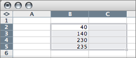
It’s worth pointing out that Excel doesn’t suffer from this particular flaw — the first cell you select is highlighted differently than other subsequent cells that you select, which means you can tell what will happen just by looking at the current selection. This visual feedback is particularly helpful in a spreadsheet, where you can extend a selection in two dimensions. For example, if you select cell B2 and then hit Shift-Down three times:
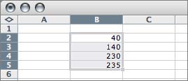
If you then hit Shift-Right once, you get:
Spreadsheets aren’t exactly like regular NSTableView-style two-dimensional lists, but perhaps this idea could be extended to lists. Imagine some sort of special visual treatment for the first item in a multiple-item selection — a darker color, perhaps? — that would serve as a visual indication of the anchor point. ↩︎
-
“Fixed-point” and “anchored” strike me as semantically synonymous, but “unanchored” seems to me a more accurate description than “addition” for the other model. Both models are additive in some sense, the difference is whether they can add to both ends of the selection range. Hence my decision to go with anchored/unanchored. ↩︎
-
Older versions of BBEdit used to make this possible, so that you could both expand and shrink *either* end of the selection range using only the Shift and arrow keys, using a sequence of keystrokes that nearly everyone found to be confusing. ↩︎
-
Covered extensively here on Daring Fireball three years ago in “The Problems With Click-Through” and “Much Ado About Click-Through”. ↩︎