By John Gruber

OpenAI, Anthropic, Cursor, and Perplexity chose WorkOS over building it themselves.
Anti-Aliasing on the iPhone
Saturday, 1 December 2007
Back in July when I wrote about the fonts available in the iPhone OS, I speculated in a footnote that the iPhone was using sub-pixel anti-aliasing to render text.
(Quick Interpolation on the difference between sub-pixel and standard anti-aliasing: with standard anti-aliasing, black text on a white background is “smoothed” using pixels set to various shades of gray; with sub-pixel anti-aliasing, instead of gray, pixels are set to various colors. Sub-pixel anti-aliasing is a visual trick that takes advantage of the way LCD displays work. Mac OS X’s “Light”, “Medium”, and “Strong” font smoothing settings in the Appearance panel in System Preferences use sub-pixel rendering; “Standard” does not, which is why it’s described as “best for CRT”. I wrote about anti-aliasing in great detail, with a slew of examples, back in 2003 when Mac OS X 10.3 came out.)
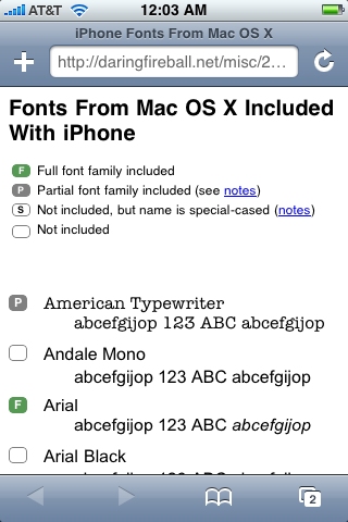
Anyway, ends up I was wrong. The iPhone never uses anything other than standard anti-aliasing. I figured this out months ago, using Erica Sadun’s iPhone screenshot utility, but hadn’t written about it until now. Here’s a screenshot I took of MobileSafari rendering my font test page:

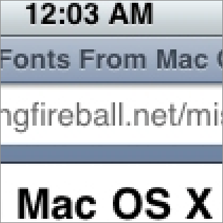
Open that image in Preview and zoom in, and you can clearly see it isn’t using sub-pixel anti-aliasing. Here it is at 300 percent magnification:

My erroneous guess that the iPhone was using sub-pixel anti-aliasing was based on the fact that on-screen text rendered on the iPhone looks so damn good. On Mac OS X, to my eyes, Medium sub-pixel anti-aliasing really is “best for LCD”, and, given that the iPhone uses an LCD, my thought was “Why wouldn’t they use it?”
But it’s not that simple, even on Mac OS X. There are all sorts of spots where Mac OS X falls back on standard anti-aliasing, even on systems set to use sub-pixel rendering. Dashboard widgets, the new Leopard menu bar, and, apparently, just about all text rendered in Core Animation views.1 Sven-S. Porst has a nice report about this, and he concludes that sub-pixel anti-aliasing is, ultimately, a clever hack that will eventually fall by the wayside as display resolutions improve. I suspect he’s right.
What makes text look so good on the iPhone compared to a Mac is simply the density of the pixels on its screen. When you look at an iPhone screenshot rendered at full-size on a Mac, there’s nothing special about the text rendering. Current Cinema Displays offer roughly 100 pixels per inch, most MacBook screens are around 110-120, and the high-resolution 17-inch MacBook Pro offers 133. But the iPhone offers 160 ppi.
That’s apparently the point where standard anti-aliasing — simpler and easier to compute and render — is sufficient to produce good-looking on-screen type.
-
That the iPhone makes heavy use of Core Animation may be another reason it doesn’t use sub-pixel anti-aliasing anywhere. ↩︎
| Previous: | DUM |
| Next: | ‘message:’ URLs in Leopard Mail |
